
Is your e-commerce email game a hit or a miss?
Or are your e-commerce emails falling flat?
Don’t worry; you’re not alone.
We’re here to walk you through the best practices for high-converting email designs.
We’ll unravel the secrets of crafting high-converting email campaigns for your store’s success. 🚀
So, let’s dive in and master the art of email design for e-commerce triumph!
11 Design Elements Of High Converting Emails
Think of an email like a puzzle, with each part contributing to the big picture of success.
Where every pixel matters in crafting high-converting email campaigns!
Let’s first break down the email design into bite-sized blocks for the ultimate recipe for ecommerce triumph!
A high-converting email should have the following elements:
- #1 A stunning hero banner
- #2 Intriguing subject line & preview line
- #3 Header strip & logo
- #4 Hero text
- #5 Email layout
- #6 Compelling product images
- #7 Call to action
- #8 Email offer
- #9 Email design optimization
- #10 Elements to boost your email marketing
- #11 Advance email design
Now we’ll break it all down, from single email components to block-based design, and even creating your own checklist for that picture-perfect email.
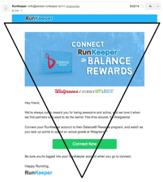
#1 A Stunning Hero Banner
Just like the title of the book or the trailer of any movie catches the user’s attention first.
Similarly, the hero banner of an email is the first thing that catches the audience’s attention.
Craft an email that packs a punch with a stunning Hero Banner! 🌟
Now what makes your hero banner stand out?
Hero Image
Picture This – Your hero image should be like a magnetic force pulling readers in.
For instance, if you’re selling fitness gear, show someone breaking a sweat.
Benefit?
Instant emotional connection!
PRO Tip: Use lifestyle images that connect with your message.
Headline
Your headline is the star of the show. Make it snappy and relevant.
Example: “SAVE 40% on Teeth Whitening”, “Get Fit, Get Happy!” or “New Arrivals”
Benefit??
Capturing attention from the get-go
Hero Subhead
Think of it as your headline’s trusty sidekick. It should elaborate just enough to pique interest.
For instance, “Unlock 50% Off on All Workout Essentials.”
Benefit?
Clear & irresistible offers.
Offer Details
This is where you spill the beans. Provide specifics like discounts, deadlines, and any exclusions.
Example: “50% off all workout gear until Friday! Excludes accessories.”
Benefit?
Zero confusion and maximum conversions.
PRO Tip: Don’t forget to mention the coupon code.
CTA First Fold CTA
Your Call to Action (CTA) should be bold, clear, and above the fold.
Something like “Shop Now” or “Grab Your Discount.”
Benefit?
No scrolling is needed to take action.
#2 Intriguing Subject Line & Preview Line
The subject line and preview text of an email play a pivotal role in grabbing the recipient’s attention and enticing them to open the message.
Crafting these elements effectively can significantly impact the success of your email campaigns increasing the click-through rate.
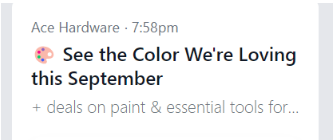
Compelling subject Lines
A captivating subject line should be concise, relevant & should evoke curiosity.
For instance, “Your exclusive offer waiting inside 👉”
The above example not only informs recipients about potential savings but also entices them to learn more by opening the email.
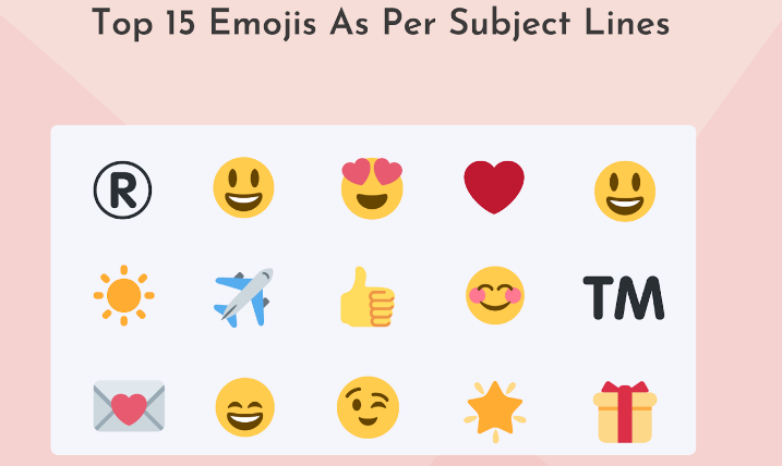
Use Emojis
Emojis can add flair and personality to your subject line but use them smartly.
They can visually represent emotions or actions, like a smiling emoji to convey happiness or a pointing finger emoji to direct attention.
For example, “🌟 Don’t Miss Out on Our Summer Sale!” adds a touch of excitement.
Nail Your Pre-header Text
Your pre-header text complements the subject line, providing a sneak peek into the email’s content.
Make it concise and engaging, like “Shop Now for Summer Styles” following a subject line about a fashion sale.
This combo creates a seamless invitation to open and explore your email.
Another critical aspect of creating effective emails is ensuring they are powerful and actionable. Most people skim through their emails, and if your email does not stand out, they won’t even bother opening it.
PRO Tip: Use CoSchedule’s email subject line tester to test our subject lines.
#3 Header Strip & Logo
In the realm of email marketing, the first impression is everything, and that’s where the header strip and brand logo become the two most important factors.
They’re the digital equivalents of a warm smile and a firm handshake when someone opens your email.
Let’s explore why they’re vital for making a lasting impression.
Header Strip
Placing a header strip at the start, often with the shipping policy, reassures customers about the transparency and reliability of your brand.
For instance, “Fast & Free Shipping on All Orders – Guaranteed!” provides clarity and peace of mind.
Brand Logo
Your brand logo is your digital signature. It’s the visual cue that instantly connects recipients to your brand’s identity.
Whether it’s Nike’s iconic swoosh or Amazon’s recognizable smile, a well-placed logo reinforces brand recognition and trust.
#4 Hero Text
The hero text is like the glue that holds everything together – it’s the secret to maintaining a seamless flow of communication.
Imagine your email as a captivating story, with the hero banner setting the stage, but limited by space.
That’s where the hero text comes in, just below the banner.
It’s the persuasive powerhouse, connecting with the banner and extending the narrative with compelling lines that drive your message home.
With this dynamic duo, your emails not only look good but also convey their purpose efficiently, making sure your audience stays engaged every step of the way.
#5 Email Layouts
Ready to step up your email marketing game? The key lies in a well-crafted email layout that grabs attention and converts.
It’s all about crafting a design that not only looks great but also drives engagement.
Here, we’ll unravel the art of a well-structured email layout that ensures your message is not only seen but also heard loud and clear!
Understand How Emails Are Read
Unlock the secrets of email reading habits
But before we embark on the exciting journey of crafting stellar emails, let’s take a quick peek behind the email-reading curtain.
Most people spend just 11 seconds skimming through sales emails, according to a Nielsen Norman’s Group eye-tracking study.
That’s roughly 37 words’ worth of attention – so all those beautifully crafted paragraphs might’ve been missed (cue the copywriter’s woes).
Now, which parts get the spotlight?
- Headlines.
- The initial 1-2 lines of text.
- Those bullet points. Fun fact: Readers adore the first bullet point and the opening words of each bullet.
- Links and buttons. They’re like the flashy stars of the email show, often dressed in blue and underlined.
But wait, there’s more! Knowing where your subscribers are checking their emails is key.
Believe it or not, a whopping 85% of folks turn to their trusty cellphones for email checking, says Adobe.
As we dive into the art of crafting irresistible ecommerce emails, let’s keep these email insights close to heart, shall we?
Make Your Email Mobile Friendly
Get Your Emails Mobile-Ready!
Make sure your emails shine on those tiny screens – because let’s face it, most of your subscribers are probably scrolling through their phones.
Here’s your mobile-friendly game plan:
- Go Vertical
When your email’s on the phone stage, it’s all about that single-column spotlight. Make your content flow seamlessly from top to bottom.
- Size Matters
The text should stand tall and proud! Headlines and subheadings aim for the 22-26px sweet spot, while body text rocks it at 14-16px.
- Click It Good
Your Calls to Action (CTAs) should be like shining beacons. Place your first CTA button in the hero section, right under that captivating image or subhead. Add a couple more below for good measure. Remember, bigger is better – aim for CTA buttons at least 45 x 45 pixels for maximum visibility.
- Image Insurance
Alt text to the rescue! Not only does it make your email more accessible, but it’s also the backup singer when images decide to play hide and seek.
- Embrace the Dark Side
Don’t forget to give your crucial info a makeover for dark mode enthusiasts. It’s all about making sure your content looks good in every email dimension.
Some examples:
So, there you have it – your ticket to mobile email stardom! 🌟 Ready to dazzle those subscribers on the go?
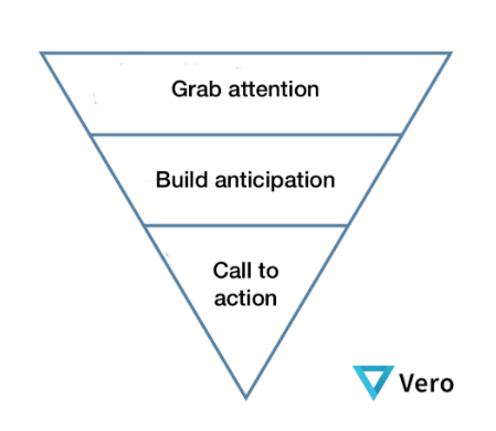
Inverted pyramid model
Imagine you’re crafting an email, and you want your message to hit immediately. That’s where the inverted pyramid method in email marketing swoops in like a superhero.
Picture your email as a juicy scoop of ice cream. The inverted pyramid method is the cherry on top that ensures your subscribers get the tastiest bits first. 🍦🍒
In this clever approach, you start with the most important stuff right at the beginning. Just like a news article, your headline grabs the main focus.
Let’s say you’re selling concert tickets – your email’s top scoop could be “50% Off Exclusive Concert Tickets!”
Then, you sprinkle the yummy details, like the date, venue, and artist, down below.
Finally, add some tempting extras, like exclusive VIP perks, for those who read all the way to the end.
Result? Subscribers are hooked from the get-go, and your email becomes the flavor they can’t resist.
For Example:
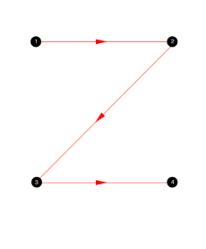
Z Pattern
Imagine your email is a treasure map, and your readers are on a quest for valuable information. That’s where the Z pattern method swoops in as your guiding compass. It’s like leading your readers through a thrilling adventure, where their eyes follow a Z-shaped path across your email.
The Z pattern is the secret path to buried gold in your subscribers’ inboxes.
Here’s the deal- readers naturally follow a Z-shaped pattern when scanning emails.
Start strong at the top left corner with an eye-catching headline, like “Hot Summer Deals Inside!” Then, guide them diagonally across with a teaser sentence or image, hinting at the treasure within – say, “Get ready for sizzling discounts.”
Now, zigzag them down the other diagonal with the juiciest details, like product highlights and enticing offers.
Finish strong with a clear Call to Action (CTA) at the bottom right, leading them straight to the X marks the spot – your website or checkout page.
Result? Subscribers embark on a thrilling journey, and your email becomes their treasure map to irresistible deals. ⛵💰
According to the graphic designer, Mary Stribley, “An angular layout is both enticing to look at as well as functional to order lots of information and imagery.”
For Example:
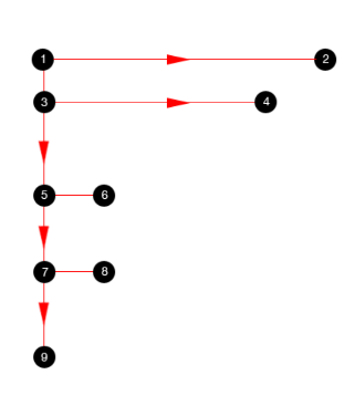
F Shape Layout
Have you ever wondered how people really read your emails? It’s a bit like following a treasure map; the X that marks the spot is the F-shaped scanning pattern! 🧐📧
Imagine you’re sending out an email packed with content.
But here’s the twist – readers follow an F-shaped scanning pattern.
They start at the top-left corner, sweep horizontally, shift down a bit, and do another horizontal scan, stopping earlier each time. Until all your content is unveiled.
But here’s the kicker- this pattern suggests scanning, not reading. So, stash your key info at the top, where it’s likely to be devoured.
Less important stuff? Tuck it away on the left.
And for those text-heavy emails? Spice ’em up with visuals to keep the adventure alive! 🌟🗺️
This means you should probably avoid large blocks of text in an email.
Example:
One Column
Imagine your email as a one-man show, where the spotlight is on the star of the stage – the One Column Layout! 🌟💌
Here’s the scoop- one column emails are like the Swiss Army knife of email marketing.
They play nice on both desktop and mobile, effortlessly adapting to whichever screen your reader’s got. It’s like having a magician who knows all the tricks!
Think about it! On your smartphone, they gracefully scale images and gracefully fit the screen.
On your desktop, they exude simplicity and elegance. No confusion, no chaos.
What’s even cooler?
The one-column design acts as a guide, effortlessly directing your readers’ gaze to what matters most. It’s like having a GPS for your email, showing your audience exactly where to go next.
For example- your email’s got a fresh product launch. With a one column layout, you can spotlight that shiny new product at the top, followed by its juicy details and a crystal-clear call to action.
No distractions, just pure engagement!
So, whether your readers are on their laptop, tablet, or smartphone, the one column layout is your trusty sidekick, ensuring they leave your email feeling informed, delighted, and ready to take action! 🚀📱🖥️
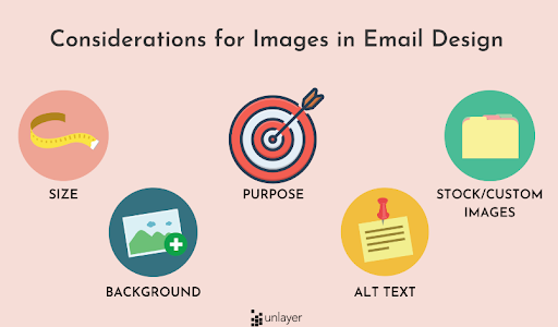
#6 Compelling Product Images
In email marketing, it is safe to say that images are one of the most important elements when it comes to designing emails. Interestingly, 65% of readers prefer emails that contain images.
A picture is worth a thousand words, and compelling product images are your storytelling superheroes.
They’re the visual hooks that draw your audience into the narrative.
Here, we’ll unveil the art of creating & picking product images that captivate your readers and make them eager to click “Buy Now.”
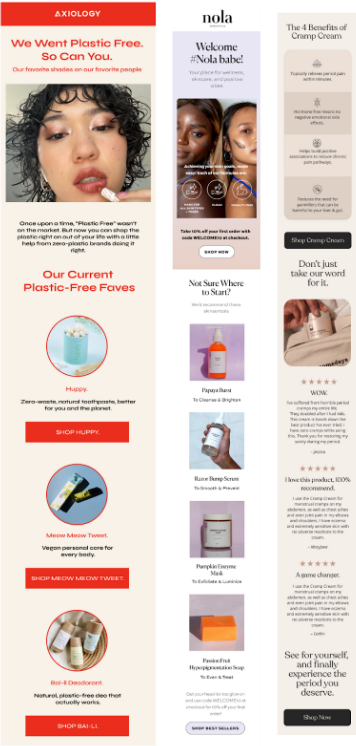
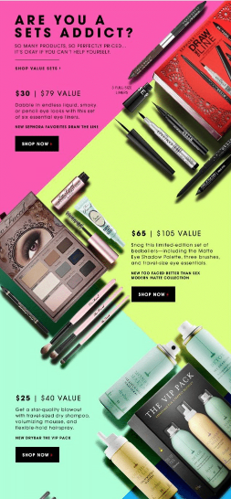
The Product Carousel
Imagine a virtual catwalk for your products, showcasing them in all their glory.
A product carousel allows you to feature multiple items within a single email, like a curated fashion collection in a trendy boutique.
High-Quality Images
Think of your product images as the stars of your email show.
High-quality, crisp, and clear visuals ensure that your products shine, just like a professional photoshoot that makes fashion items look stunning.
Size
The size of your product images matters.
Strike a balance between large enough to showcase details and small enough to keep the email mobile-friendly.
Ensuring your customers can see the product without endless scrolling.
Though large, high-resolution photos take longer to load, and load times directly influence audience patience.
So, keep them engaged by choosing images that have a high resolution, in PNG format, and under 1MB in size.
Stock vs. Custom Images
Stock images can be cost-effective, but custom images add authenticity.
For instance, a restaurant showcasing its chef preparing a dish with real photos feels more genuine than stock food images.
Creating and using original images is ideal when getting your branding and messaging across the way you want them to.
But if you have to use stock images, make sure your competition isn’t using the same ones or something too similar.
Background
The right background can make your product pop.
Whether it’s a clean, white backdrop for a minimalist vibe or a lifestyle setting that tells a story, the background sets the stage, just like a movie set that complements the actors.
If you put words over an image, make sure you’re not choosing a picture that’s overly patterned, complex, or doesn’t feature a contrasting color to the text itself.
Failing to do so will make the words harder to read and may discourage readers from digging deeper into the email.
Alt Text
Alt text is like the narrator in an audiobook for visually impaired readers.
It describes the image’s content, ensuring accessibility and improving SEO.
For example, “Men’s Leather Wallet – Brown” for an image of the said wallet.
If you have to implement one point from this entire article, we suggest adding alt text to the images included.
A great percentage of people have their images turned off.
Without alt texts, they wouldn’t know what you’re talking about and hence, will result in them clicking on the unsubscribe button.
Alt texts also add credibility to an email when it is being sent for the first time.
Brand Images vs. Lifestyle Images
Brand images focus on the product itself, while lifestyle images showcase the product in use.
Imagine a sports brand highlighting its running shoes in a marathon versus someone wearing those shoes while running.
Both have their place in your email storytelling.
With these image-enhancing techniques, your product visuals will become the stars of your email marketing, captivating your audience and driving them to take action.

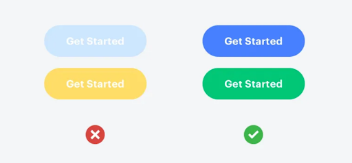
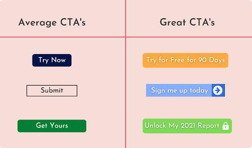
#7 Call To Action (CTA)
Boost Engagement with your CTA!
It’s all about the Call To Action (CTA), and trust us, it’s a game-changer!
Call to action is hugely important to email campaigns and designs. By including a single CTA, you can witness an increase in clicks by up to 371% 🚀
But here’s the scoop- CTAs don’t need to be fancy. They just need to get the job done. Here are some golden rules to keep your CTAs irresistible:
- Keep it snappy and action-packed. Short, meaningful, and bursting with “let’s do this” energy.
- Aim to keep CTAs above the fold, so they’re front and center, ready to rock.
- Size and color matter! Make sure your CTAs pop without stealing the spotlight.
- One is the magic number. Stick to one CTA per email, maybe two if it’s a must, to keep your readers’ focus razor-sharp.
- Match your CTA with the email’s theme. Consistency is key for a seamless user journey.
Optimize Your CTA
Optimizing your Call to Action (CTA) is like giving your email marketing superpowers. It’s the ultimate game-changer! 🚀
Your CTA is the guiding star, leading your readers to the desired action, whether it’s making a purchase, signing up, or clicking a link. If it’s not compelling, you’re leaving potential on the table.
For instance, changing a bland “Click Here” to “Unlock 50% Savings Now” is like flipping a switch. It’s all about clarity, urgency, and irresistible appeal.
In the world of email marketing, a well-optimized CTA is your golden ticket to higher click-through rates and a happier, more engaged audience. 🎫💥
So, whether you’re selling gadgets, promoting a blog, or just spreading good vibes, remember – your CTA is your email’s superhero, here to save the day! 💥💪
#8 Email Offer
The email offer is like a sweet treat –that all the customers look forward to and to make it enticing & easy to redeem we need to convey the offer correctly. 🎁🕒💫
The key to success in email marketing lies in conveying the offer in the right way. It’s about more than just words; it’s a delicate dance of persuasion, timing, and presentation.
Here, we’ll unlock the secrets to crafting email campaigns that make your offer irresistibly appealing.
The Offer
Picture your email offer as the star of the show. Clearly state what’s up for grabs, whether it’s a discount, a freebie, or an exclusive deal.
For instance, “Get 20% off your next purchase!” spells it out, making it impossible to resist.
Coupon Code
Make it feel exclusive. Share a snazzy coupon code that your readers can use to claim their prize.
It’s like their golden ticket to savings. “Use code SAVE20 at checkout” adds that extra sprinkle of excitement.
Exclusions
Transparency is key. Mention any exclusions or limitations upfront.
If your offer doesn’t apply to certain items or has a minimum purchase requirement, spill the beans.
Honesty builds trust and avoids disappointment.
Timer
Create urgency with a timer. Let your readers know when the offer expires, adding a countdown for extra drama.
“Hurry, offer ends in 24 hours!” amps up the excitement and nudges them to take action.
It’s always best to display the timer right at the starting section of the email “the header strip”. So that as soon as the user sees the email, a sense of urgency is conveyed to the user.
#9 Email Design Optimization
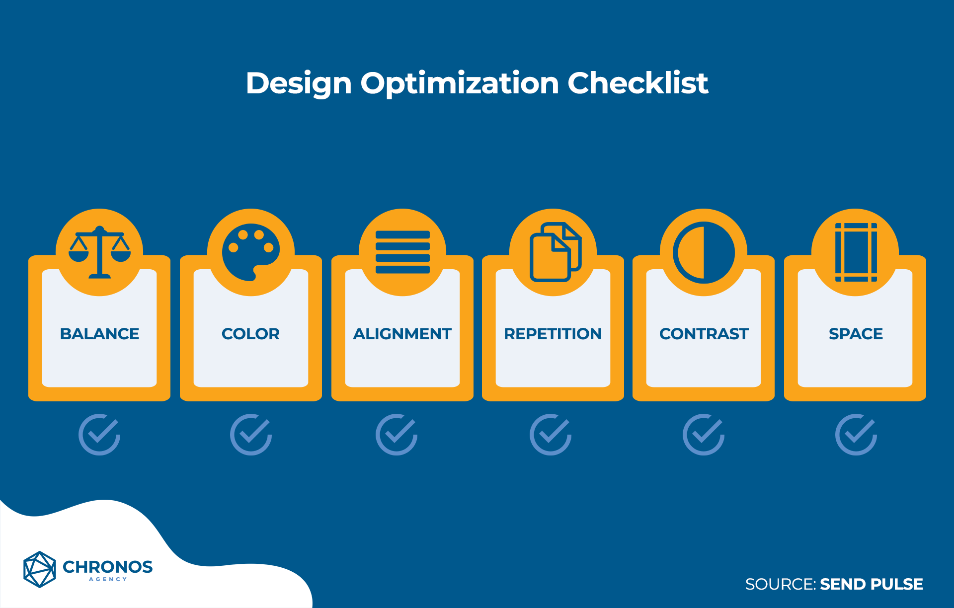
Gear up for email marketing success with our Email Design Optimization Checklist! 📧✨
Imagine your emails as a canvas, and this checklist as your trusty brush. It ensures your emails are visually appealing, mobile-friendly, and irresistible.
While it’s tempting to just go with a design that has been used countless times by other eCommerce brands just because they work, it’s important to stand out from the crowd by taking that big step into a new direction.
If you’re in doubt then you can always conduct A/B testing with your marketing email designs.
So don’t be afraid to experiment with different ideas while sticking to your company brand.
The more unique your designs are, the more that recipients will enjoy looking forward to your next emails!
The Visuals
As discussed above in the “compelling image section” the visuals are the hooks that draw your audience into the narrative.
Obviously, nobody wants an email without an interesting and luring visual.
Also, don’t forget- as you create your overall email design, ensure that it matches the brand.
An email without any visuals is like having a cupcake without any frosting.
Sounds boring right?
So, let’s see how we can make our email more interesting with all the possible visuals.
- Videos
Videos bring your content to life and engage your audience. They’re like the pop of color in a black-and-white world of text.
Whether it’s a product demo, a behind-the-scenes glimpse, or a heartfelt message, videos create a personal connection that text alone can’t match.
So, go ahead, hit that play button, and make your emails unforgettable! 📧✨
- Images
High-quality images are your visual storytellers. They capture attention, convey professionalism, and engage your audience.
These images aren’t just pixels; they’re the first impression that can make or break your message.
So, always opt for crisp, clear visuals to ensure your emails shine and leave a lasting impression.
- GIFs
Adding GIFs to your email is like injecting a burst of life and excitement.
GIFs are the animated exclamation points that make your emails stand out and create memorable experiences for your subscribers.
They grab attention, convey motion, and add that extra touch of fun to your messages.
Ideally, a GIF of 5MB in an email will be enough to add the charm.
- Animations
Animation is the secret ingredient that turns static messages into engaging experiences.
It’s like adding a dash of magic to captivate your audience’s attention and make your emails memorable.
Animated elements bring your content to life, fostering deeper connections and boosting conversion rates with a touch of interactive charm.
The White Space
White space is the unsung hero of email marketing design. It’s the empty canvas that lets your content shine, making your email not just visually appealing but also highly effective.
Here’s how the white space helps:
- Neat & Tidy Appearance
White space provides structure and organization, preventing your email from looking cluttered. It’s like tidying up your workspace for a productive day.
- Clear Margins
It’s like drawing a boundary around your content, ensuring that everything stays in its place. This clear separation helps guide your readers’ eyes and focus their attention.
- Improved Readability
White space around text elements makes reading effortless. Just like paragraphs in a book, it breaks up the content, enhancing comprehension.
- Product Visibility
When showcasing products, a well-planned white space directs the spotlight where you want it. It’s like a stage for your products, ensuring they take center stage.
Branded Colors & Fonts
In a world of visual noise, branded colors, and fonts are your beacon, guiding recipients to your brand’s message amidst the clutter.
They infuse personality, consistency, and clarity into your emails, making them not just stunning but also irresistibly captivating.
Imagine your email as a canvas where your brand’s personality comes to life.
That’s where branded colors and fonts step in, painting a captivating picture that’s uniquely yours.
- Be Bold with Your Designs
Branded colors and fonts give your emails a strong, consistent identity. They instantly connect recipients to your brand, making your emails memorable.
Whether it’s the striking red of Coca-Cola or the sleek typography of Apple, these elements set the tone for your brand’s story.
- Contrast Ratio
Effective use of color contrast ensures that your content is readable and visually appealing.
It’s like the difference between a blurry photograph and a sharp, vivid image.
High contrast makes headlines pop, buttons stand out, and calls to action irresistible.
- Use Color Blocking to Highlight Information
Just like using a highlighter to emphasize crucial points in a book, color blocking directs attention.
It makes key information, promotions, or offers impossible to miss.
For example, a bright yellow background for a limited-time discount creates a sense of urgency.
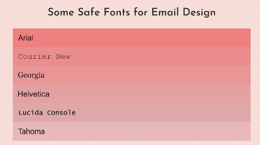
- Web Fonts
Branded fonts ensure your emails are consistent with your website and other marketing materials.
They’re like the signature handwriting that’s instantly recognizable.
Web fonts also provide flexibility in design, allowing you to showcase your brand’s personality.
Section Headings
Distinctive section headings are like the chapter titles in a gripping book—they pique curiosity, offer direction, and keep readers engaged.
They not only break the monotony but make your emails more visually appealing.
Ultimately, more effective in conveying your message.
So, here’s why they leave a significant impact:
- Action-Driven Headings
Think of section headings as mini invitations to explore your content further. Action-driven headings, like “Discover Our Exclusive Deals” or “Grab Your Discount Today,” entice readers to take a closer look. They’re like signposts pointing your audience towards their next move.
- Division By Color
Using color to differentiate headings is like creating a roadmap within your email. It guides readers through your message, making it easier to navigate. For example, using a bold, eye-catching color for headings amidst a sea of text creates a visual hierarchy, ensuring your key points stand out.
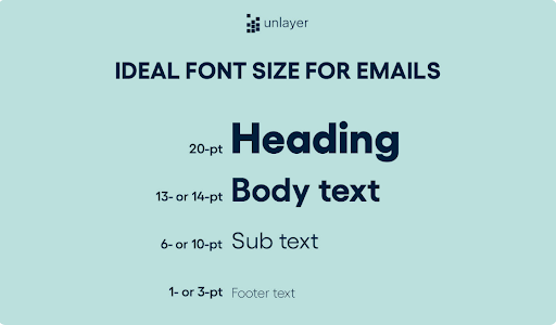
- Ideal Font Size For The Email
Set font sizes and line heights to be responsive as well. At least use 13- or 14-pt font for the body text and 20-pt for the titles.
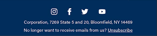
Footer
Let’s talk about why having a well-crafted footer block in your e-commerce brand’s emails is as vital as having a strong foundation for a skyscraper.
It’s the unsung hero that ties everything together.
So, remember a well-structured footer not only ensures compliance but also fosters trust and engagement, making it an integral part of your email marketing strategy.
- Social Media Links
Your social media links in the footer are like the breadcrumbs that lead your customers on a delightful journey through your brand’s online world.
By providing easy access to your social platforms, you’re inviting them to stay connected and engaged.
They can follow you, share your content, and become part of your online community, ultimately strengthening their bond with your brand.
- Unsubscribe Link
While it may seem counterintuitive, the unsubscribe link is a crucial element in the footer.
It gives your subscribers the freedom to opt-out if they wish. Ensuring this link is easily accessible and hassle-free demonstrates transparency and respect for their choices.
This builds trust and goodwill, which can actually encourage some hesitant subscribers to stick around.
- Address
Your brand’s physical address in the footer adds a touch of authenticity.
It shows you’re not just a faceless entity lurking in cyberspace but a real, legitimate business.
This transparency can make potential buyers feel more secure, especially if they have concerns about your credibility.
#10 Elements That Will Boost Your Email Marketing
Email marketing is like the trusty old friend of your marketing strategy – always reliable and ready to make an impact. But to supercharge your email game, you need to sprinkle in some secret ingredients. We’re talking about the magic trio: social proof, brand USPs, and shopping policies.
Social Proof
Social proof, is like a digital pat on the back for your brand, letting customers know they’re making a wise choice.
It builds trust, minimizes doubts, and ultimately nudges those indecisive shoppers to click that “Buy Now” button.
So, when it comes to email design, make sure that social proof block shines as bright as a neon sign on a dark night – because it’s a surefire way to convert browsers into buyers!
Now let’s talk about why having a social proof block in your e-commerce brand’s email is as essential as having sprinkles on your ice cream – it just makes everything better.
- Reviews
Imagine you open an email from your favorite online store, and right there, you see shining 5-star reviews from folks who’ve bought the exact product you’re eyeing.
It’s like getting a virtual high-five from fellow shoppers, and it reassures you that you’re making a smart choice.
Reviews provide real-life testimonials that act as trust-builders, easing the hesitation that often comes with online shopping.
- Social Media
Now, let’s talk about social media. Including snippets from your brand’s Instagram, Twitter, or Facebook, where people are flaunting their purchases or sharing their experiences, is a game-changer.
It’s like saying, “Look at all these cool cats loving our stuff!” Social media proof taps into the FOMO phenomenon.
When potential buyers see others enjoying your products, it tempts them to jump on the bandwagon and make a purchase.
USPs Of The Brand
Your brand is unique, and your emails should shout it from the digital rooftops.
Unpacking your Unique Selling Propositions (USPs) is like letting your subscribers in on the coolest secrets.
Remember, your USPs aren’t just fancy words; they’re the heart and soul of your brand.
When your subscribers see these unique qualities in your emails, it tempts them to hit that “Add to Cart” button.
So, in your email design, make sure that the USP block shines as brightly as a Hollywood star – because it’s the magnet that converts curious clickers into loyal customers!
Let’s chat about why having a USP block in your e-commerce brand’s email is like putting a cherry on top of your sundae.
It makes your brand stand out and leaves a lasting impression.
- Brand Distinction
Your USPs are like the superhero cape your brand wears.
They tell your customers what sets you apart from the competition.
Whether it’s unmatched quality, unbeatable prices, or exceptional customer service, your USPs make your brand memorable.
- Building Trust
Trust is the secret sauce of e-commerce success.
When you highlight your USPs in your emails, you’re essentially saying, “Hey, we’ve got your back!” Customers appreciate transparency and knowing what to expect.
If your USPs include free shipping, easy returns, or eco-friendly practices, it reassures buyers that they’re making a wise choice.
- Tempting Offers
Your USPs can be irresistible hooks.
If you’re offering limited-time rebates, a special guarantee, or exclusive products, your USP block is where you dangle these delicious carrots.
It’s like saying, “You won’t find this anywhere else!”
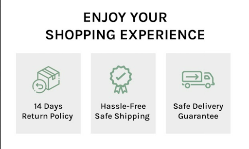
Shopping Policies
Though shopping policies might not sound exciting. Still, they’re like the sturdy foundation of a skyscraper.
When your subscribers know they can trust your shipping, returns, and privacy policies, it builds confidence and encourages them to take action.
So, in your email design, don’t shy away from that shopping policies block.
Make it as clear and accessible as your favorite road signs, because it’s the guiding light that converts potential buyers into confident shoppers and keeps them returning for more retail adventures with your brand!
Let’s dive into why having a shopping policy block in your e-commerce brand’s email is like having a map when exploring a new city – it keeps you informed, safe, and confident in your choices.
- Trust Building
Shopping policies are the foundation of trust in the online shopping world.
When your customers know that their personal information is safe, that they can return a product hassle-free, and that your shipping is reliable.
It’s like handing them a warm, cozy blanket of confidence.
This trust is essential for converting casual browsers into loyal buyers.
- Decision Easing
Shopping policies help ease the decision-making process.
Imagine getting an email showcasing a must-have product, and right below it, you see clear policies regarding returns, refunds, and shipping.
It’s like saying, “Don’t worry, we’ve got your back, no matter what.” This reassurance can be the nudge hesitant shoppers need to complete their purchase.
- Transparency
Being upfront about your shopping policies demonstrates transparency and integrity.
For example, offering a generous return window or free shipping on certain orders shows that you genuinely care about your customers’ satisfaction.
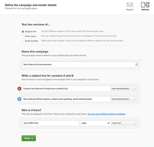
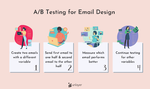
Continuous Ab Testing
Continuous A/B testing is your compass in the email marketing wilderness.
It helps you navigate towards higher engagement, better conversions, and a deeper understanding of what your audience loves.
Let’s chat about why A/B testing is like the secret sauce of your email marketing recipe.
It’s not just a one-time thing; it’s an ongoing journey towards email perfection!
- Subject Lines
Your subject line is the red carpet of your email.
A/B testing means finding the magic words that make subscribers click ‘Open.’
Testing different subject lines allows you to discover what resonates with your audience. Is it humor, urgency, personalization, or a combination?
The results guide you to send emails that are more likely to get noticed and read.
- Hero Copy
The hero copy is your email’s superstar content, and A/B testing helps you discover what lines pack the punch.
It’s about fine-tuning your messaging to engage and persuade.
Through testing, you’ll learn if concise or detailed copy, a friendly or formal tone, or benefit-driven versus feature-focused content works best for your audience. - Email Design
A/B testing your email design isn’t just about aesthetics but functionality and user experience.
Testing different layouts, color schemes, and visual elements helps identify what grabs attention without overwhelming it.
It ensures your emails are visually appealing and easy to navigate, ultimately leading to higher click-through rates and conversions.
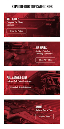
The Store category
It’s very convenient to add your store’s categories to your promotional emails. But you must remember that an email is not a website – there is no navigational bar.
It transforms your emails from a mere promotion into a personalized shopping experience, making it easier for your customers to find their next favorite item.
Having a store category block in your e-commerce brand’s email is like having a treasure map in a vast inventory of products.

- Easy Navigation
Imagine you open an email from your favorite online store, and right there, you see neatly organized categories like “New Arrivals,” “Best Sellers,” or “Clearance.”
It’s like having signposts in a busy mall. Shoppers can quickly find what they’re looking for without getting lost in the retail wilderness.
- Personalization
By tailoring categories based on customer preferences or past purchases, you’re saying, “We know what you love!”
This personal touch guides buyers to products they’re more likely to be interested in, increasing the chances of making a purchase.
- Increased Conversions
The store category block simplifies the shopping journey.
It streamlines the decision-making process and reduces friction, making it more likely for shoppers to click, browse, and buy.
It’s like putting the products they desire right at their fingertips.
#11 Advanced Email Design
Advanced email design is your ticket to impressing your customers with needs and what they prefer that will help you stay ahead in the email marketing game.
Let’s dive into why embracing advanced email design– it’s all about staying ahead of the curve and wowing your customers.
But how???
Personalized Email Content
Advanced email design lets you go beyond the “one-size-fits-all” approach.
Personalization is like the secret sauce that makes your emails stand out. You can tailor content based on customer behavior, preferences, and even location.
For example, sending product recommendations based on past purchases or offering discounts on items left in the cart.
Personalization shows you know your customers, and it boosts engagement and conversions.
Dark Mode
Dark mode is more than just a cool trend; it’s a practical feature that many email users love.
Advanced email design ensures your emails look fantastic whether your customers prefer light or dark backgrounds.
A well-optimized dark mode design enhances readability and user experience, catering to a wider audience.
Interactive Emails
Think of interactive emails as the difference between watching a movie and being in the movie.
They engage recipients in a two-way conversation, letting them click, swipe, and explore right within the email.
You can include product carousels, interactive surveys, or even gamify your emails.
Interactive elements elevate user engagement and encourage actions like clicking, shopping, and sharing.
Conclusion
In reality, our inboxes are flooded with emails from brands fighting to win their attention. Take the easy way out and instantly awaken their curiosity by following the above-discussed email design best practices.
Designing really good emails is easy when you follow the tips given above.