Effective email marketing is a game-changer for businesses, but it’s the Call to Action (CTA) that seals the deal.
Did you know an average email has a click rate of 0.5% to 1%? This means that only 1% of your total audience will click your email.
Now Imagine getting double the click which would result in double the conversions, which could result in…what?
Yeah, that’s right, double the revenue for making one simple change in your email campaign i.e. the ‘CTA‘.
I’ve seen many ecommerce brands invest hours in crafting the perfect email, only to have their CTA fail to engage.
Like no one is clicking, leaving these e-commerce brands wondering where they went wrong.
Sound familiar??
But don’t worry I’m not here to point out the problems and leave you hanging!
I’ll give you the exact solution by sharing 3 key secrets to a winning email campaign with irresistible CTAs.
In this article, I’ll be covering 3 things you need to focus on while inserting CTAs in your email campaigns or automation flows:
- Copy of the CTA
- Design of the CTA
- Placement of the CTA
So, if you want to boost your revenue with those high-converting CTAs then keep reading till the end because I’m going to share 5 practical tips that you can start using right away to supercharge your email CTAs.
#1 Copy Of The CTA
A better CTA copy can captivate your audience, and motivate progress toward a specific and desired action defined by you.
If a headline delivers a promise, a CTA fulfills that promise.
As Michael Aagaard explains:
“The copy you use in your buttons has a major impact on your prospects’ decisions. Button color and design are important visual cues that tell the prospect where to click. But in the last critical moment, the copy itself is what impacts the prospect’s final decision. In other words, your CTA copy answers the question, ‘Why should I click this button?'”
So one thing is clear if you get your copy wrong, it can cost you hundreds, thousands, even millions of dollars in lost conversions. Period.
But the question arises of how to write CTA copy that converts!
You just need to follow these six simple steps, no matter what type of CTA you are crafting.
1. Identify the conversion intent
You need to know your target audience’s conversion intent i.e. how likely are they to convert, and on what offer?
For example, someone who has never heard of you before and who isn’t in the market will convert differently.
Than someone who is actively seeking products or services you offer right now.
Like CTA for a cold audience would be something like:
– Discover More
– Request a Demo
– Get Started for Free
– Join our Community
– Subscribe for Updates
On the other hand, CTA for hot audiences will be
– Upgrade your Plan
– Reorder your Favorites
– Refer a Friend
– Claim your Discount
– Visit us Again
Consequently, both will require different offers and CTAs.
So, writing an effective call-to-action is to align your copy with your target audiences’ conversion intent.
2. Define your conversion goals
Every conversion goal needs a CTA.
Now what’s a conversion goal?
Your conversion goal is the offer you want your subscribers to convert on.
A high-converting email campaign only has one conversion goal because keeping too many conversion goals might dilute your conversion resulting in fewer total conversions.
Remember at this stage, you should already know the funnel stage of your target audience.
Now all you need to do is match both with the right offer.
For example:
– The Bogo Offer
– Free delivery
– Tiered sale Offer
– Free Gift
3. Start with a strong verb (actionable CTA)
A strong verb is a specific verb, not a generic verb; it gets to the point immediately and motivates action.
Most importantly, a strong verb communicates value, not effort i.e. receiving, not giving.
Why? Because not all actions are created equal.
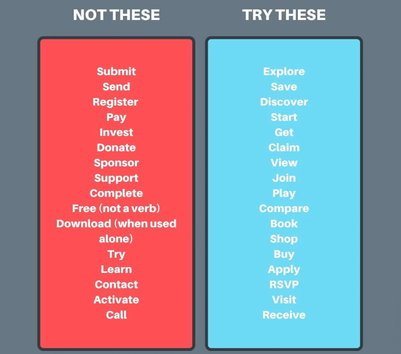
For example, words like submit, start, activate, learn, pay, earn, or go are all action-oriented words.
Unlike words like receive, get, view, enjoy, discover, see, or play, these words represent calls to effort, not calls to reward.
For example, in this table, notice the verbs in the left-hand column vs. the verbs in the right-hand column.

The verbs to the left emphasize giving that will heighten anxiety;
Whereas the verbs to the right emphasize receiving which will reduce anxiety.
3. Handle Objections
Here, you need to handle the objection by your audience very smartly. I.e your audience can have tons of objections about your product & offers.
The goal is to make sure you solve the problem and give a specific answer to your audience’s objection.
How you can do that? Simply by giving a more clear and specific CTA.
For example:
CTA: Get a free proposal.
Objection: But how long is this going to take?
Handled CTA: Get proposal in 2 minutes.
CTA: Download PDF.
Objection: Ugh, I don’t feel like checking my email for this. I want it now.
Handled CTA: Download it instantly.
CTA: Try free
Objection: But free what? I really need X, Y, and Z.
Handled CTA: Get Pro Plan Free
In my experience handled CTAs work 100 times better.
5. Test your pronouns to make it more personalized
When it comes to pronouns and CTAs, you can opt for first-person, second-person, or third-person pronouns:
For example:
- First-person: Get my proposal
- Second person: Get your free proposal
- Third person: Get a free proposal
Though I always recommend testing variants, according to numerous A/B tests, first-person CTAs, typically perform well. First-person pronouns make visitors feel like the experience is personalized to them, which makes them feel in control and helps them visualize the next step.
Personalizing those CTAs increases the click-through rate by 90% which results in high conversion.
6. Keep it short
After working with 50+ brands and launching 1000+ email campaigns, I recommend limiting your CTA to 3-4 words.
Your CTA should deliver a motivating nudge not a long sentence which typically falls between 5-6 words.
In short, your CTA should be clear and concise. Avoid long, confusing phrases that make your readers scratch their heads.
#2 Design Of The CTA
Your call to action button should stand out in your email campaign.
And to do that every ecommerce brand needs to keep these four things in check.
1. Create a button
You can still use hyperlinked text in your message, but not as the sole call to action.
Make a button with a call to action. Using a button instead of a hyperlink can increase conversion rates by up to 28%.
2. Pick a unique color
Make the email call to action a color that isn’t, or is rarely, used in your email to make it stand out.
But make sure to choose the color within your brand’s color palate.
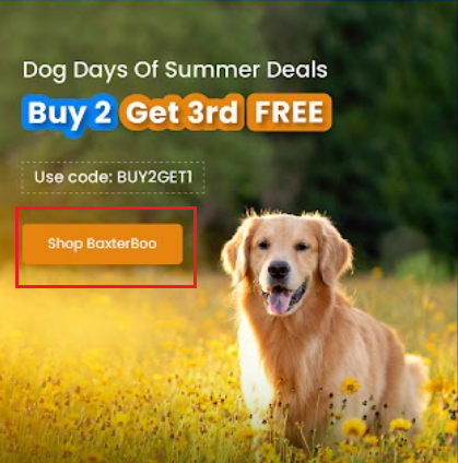
For example, look at the CTA here <<example demo>>
In a nutshell, the idea here is to grab your audiences’ attention while they scroll down your email campaign.
3. The size of the CTA button matters!
Make sure the size of the CTA button is appropriate.
Preview your email after it’s designed to make sure the call to action fits with your overall presentation.
4. Use the white spacing to your advantage
Leaving white space around your call to action draws the eye, focusing attention on the essential message.
It enhances readability, reduces visual clutter, and ensures that your CTA stands out prominently.
This strategic use of white space can boost user engagement, increase click-through rates, and ultimately drive conversions.
5. Mobile Optimization
Mobile optimization is crucial when crafting CTAs for email campaigns.
With over half of email opens happening on mobile devices, neglecting mobile-friendliness can alienate a significant portion of your audience.
A poorly optimized CTA on a small screen can frustrate users and hinder conversions.
Prioritizing mobile responsiveness ensures a seamless and user-friendly experience, increasing the chances of success in your email marketing efforts.
#3 Placement Of The CTA
Once you have your CTA ready the next crucial part comes is the placement of that CTA and how many CTA to include in one email campaign.
To answer this I would say that there is no fixed pattern or template to do the placement of the CTA.
However, after shooting 5000+ email campaigns, I strongly advise placing your CTA in multiple locations within a single campaign.
The idea is that as your subscribers scroll through the email campaign, they should be able to click on a CTA button.
Now speaking of the placement of the CTA. I’ve broadly categorized it into three sections:
1. First Primary CTA
I highly recommend placing the primary CTA right at the main block of the email campaign i.e “the hero banner”
I’ve already discussed the hero banner in detail, in my 👉 Email Design Article.
The hero banner is the face of any email campaign so make sure to place your “first primary CTA” in the hero banner.
It should be compelling, visible, and prominent in order to get enough clicks.

2. Last Primary CTA
This is the second primary CTA which holds equal importance as the first primary CTA.
I recommend placing this CTA just above the footer. So that when the subscribers scroll down the campaign.
They have an equal opportunity to click and make a purchase.
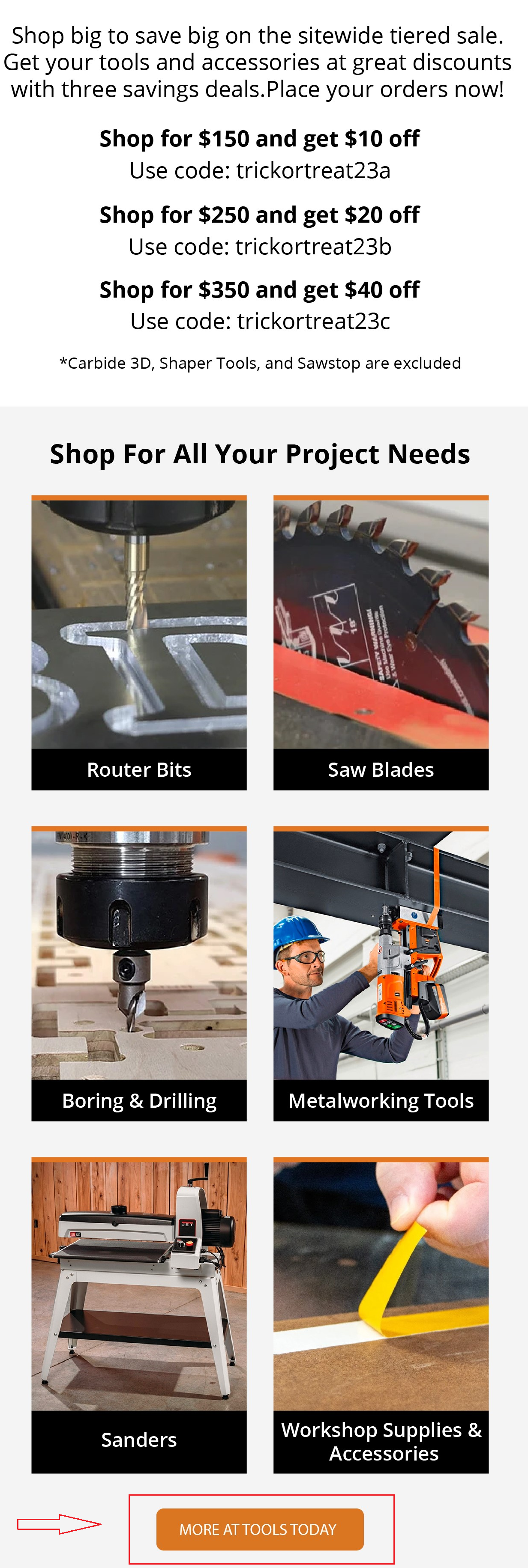
Also, remember to keep the width of both ‘first primary’ & ‘last primary’ CTA the same.
Doing this will make your email campaign look more even & aligned.

3. Secondary CTAs
The placement of a secondary CTA in an email campaign is strategic. It should complement the primary CTA, offering an alternative action for users who might scroll down the email campaign.
Strategically placing a secondary CTA in an email campaign is essential for success.
Whether it’s promoting products, enticing with special offers, or guiding readers to valuable blog content, the secondary CTA complements the primary action.
Position it where it seamlessly aligns with the email’s content, ensuring that recipients have a clear and convenient path to engage with your various offerings.
Enhancing the overall impact of your email campaign.

#5 Practical Tips
Before leaving, take a look at my 5 practical tips that will help you start right away to supercharge your email CTAs.
1. Use action words
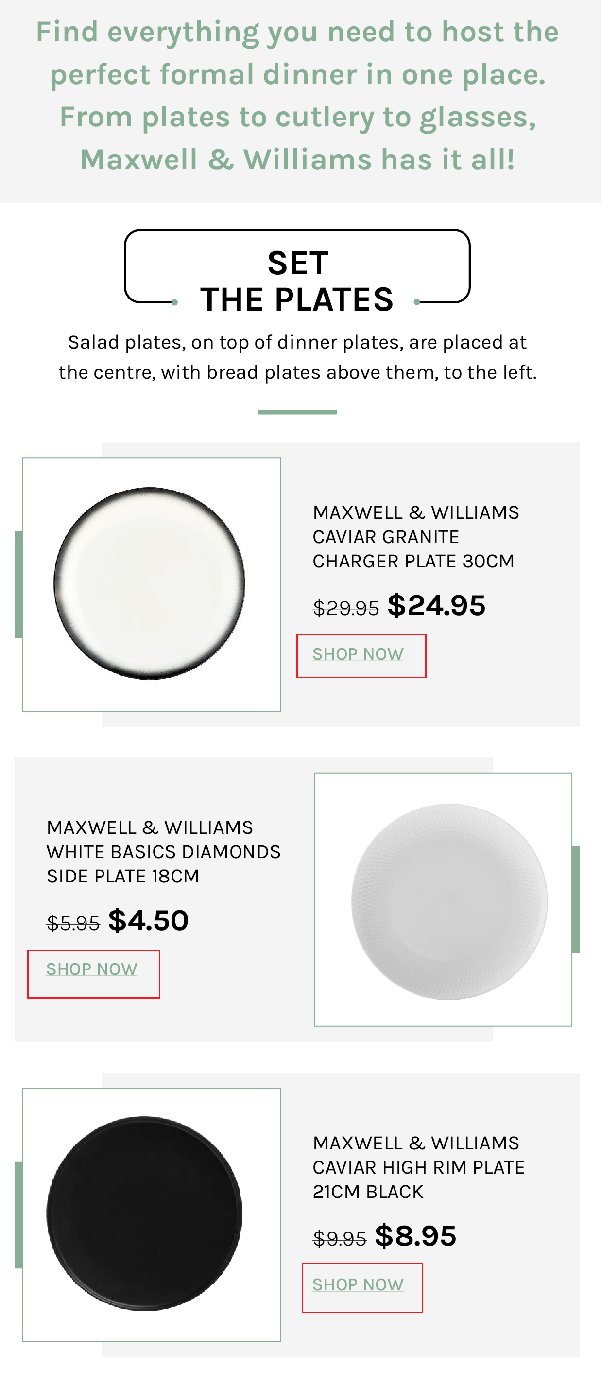
Make your email CTAs more effective by using strong, action-packed words like ‘Shop Now,’ ‘Subscribe Today,’ or ‘Get Started.’
These words encourage your readers to take action, which can boost your click-through rates.
2. Create a sense of urgency
Increase the urgency of your CTAs by adding phrases like ‘Limited Time Offer’ or ‘Ending Soon.’ This urgency can motivate your readers to click right away, fearing they might miss out.
3. Segment your audience
Customize your CTAs for different groups within your audience. Not everyone responds the same way, so tailor your call to actions to fit the interests and needs of specific segments.
4. Test & Analyze
Experiment with A/B testing for your CTAs. Try different variations to see what works best for your audience.
Analyzing the results helps you fine-tune your approach and improve engagement.
5. Build trust
Enhance the credibility of your CTAs by including trust-building elements like security badges or customer reviews nearby.
Building trust can make your readers more comfortable taking the desired action, leading to better results.
Conclusion
Enhancing your email’s CTAs with these jaw-dropping strategies can truly transform your email marketing success.
By implementing the power of compelling CTA copy, eye-catching design, and strategic placement, you’re on your way to doubling your click-through rates and revenue.
But here’s the real gem, the journey doesn’t stop here!
Keep testing, keep fine-tuning, and keep innovating…
The world of email marketing is ever-evolving, and your commitment to improvement will ensure that you stay ahead of the game.
So, remember, it’s not just about improving your CTAs; it’s about continually striving for excellence and delivering value to your audience.
