AB testing is an essential part of email marketing, helping you discover what truly drives clicks and conversions.
When we think of AB testing in emails, the subject line often steals the spotlight.
However, it’s time to debunk the myth – email marketing’s AB testing is a whole lot more than just tinkering with subject lines.
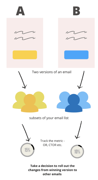
Dive in to unravel the secrets of AB testing in email marketing, where the magic goes beyond those catchy phrases.
In this article we will discuss:
- 4 Things To Note Before A/B Testing
- 10 Types Of AB Tests.
- Tools Analyze The Results.
4 Things To Note Before A/B Testing
Before diving into the world of A/B testing for your email marketing, there are four important things to keep in mind.
Think of it as the ABCDs of email AB Testing!
We’re here to break it down for you in simple terms, so you can make the most of your email campaigns while doing the AB test.
Let’s explore these key factors that can either make or break your A/B testing of email marketing.
1) Need To Have A Clear Hypothesis
AB testing should not become a lack of decision-making.
When it comes to running an email campaign, having a clear hypothesis for your AB testing is like having a recipe when you’re cooking.
It guides you to the perfect dish & in this case, the “perfect email”.
It basically follows the structure: “If I change this, it will have this effect.” It should be aimed at getting some insights.
Let’s say you’re promoting a new fitness app. You want to test two different call-to-action (CTA) buttons in your email:
one saying “Start Your Free Trial Now”
and another saying “Learn More.”
Your hypothesis could be something like:
“I believe that using the CTA ‘Start Your Free Trial Now’ will lead to more sign-ups and active users compared to ‘Learn More.'”
By having a clear hypothesis like this, you can track which CTA drives more engagement and conversions.
It’s like having a secret ingredient that makes your email campaign a recipe for success!
2) Test One Thing At A Time
Test one thing at a time to get a clear picture with accurate results.
AB testing in email campaigns is like experimenting in the kitchen. When you’re doing A/B testing in your email campaign, think of it like making a pizza.
You wouldn’t put all the toppings on at once, right?
It’s the same with testing. Test one thing at a time, like the sauce or the cheese.
If you throw in too many changes at once, like changing the CTA placement and shortening the copy,
It’s like tossing all the toppings and hoping for the best – you won’t know what made it delicious or not!
So, test your CTA first and then the copy.
Remember one step at a time!
Also, pick a data management tool that plays well with your A/B test results. It’s like having the right oven to bake your perfect pizza.
3) Prioritize Your A/B Tests
Think of A/B testing in your email campaign like trying on different outfits.
You can’t try them all at once, right?
Prioritize which elements to test first.
For example, start with the subject line to headlines & images then move to the CTA button.
This way, you’ll figure out what really works without overwhelming yourself. It’s like picking the best outfit that makes you look your absolute best.
4) Sufficient Traffic
AB testing in email campaigns is like taste-testing at a food festival.
You need enough people to try the samples to get reliable feedback.
If you test with a tiny group, like just your family, it won’t represent everyone’s preferences.
So, make sure you have sufficient email recipients. It’s like having a bustling food festival with lots of tasters which may lead to more better results!
10 types of AB Tests That Can Help To Scale Up Your Email Campaigns
#1 Flows Path Testing
Imagine you’re the captain of a ship, and your mission is to make sure your crew gets to their destination smoothly and efficiently.
Flows Path Testing in email automation is a bit like that. It’s all about ensuring those emails you send out are on the right path, just like guiding your ship in the ocean.
First, you’ve got to have a “Flows Timing Test” Think of it as setting the schedule for your ship’s stops along the way.
You want to make sure your emails arrive at the perfect times, not too early or too late, just like your ship docking precisely when it’s supposed to.
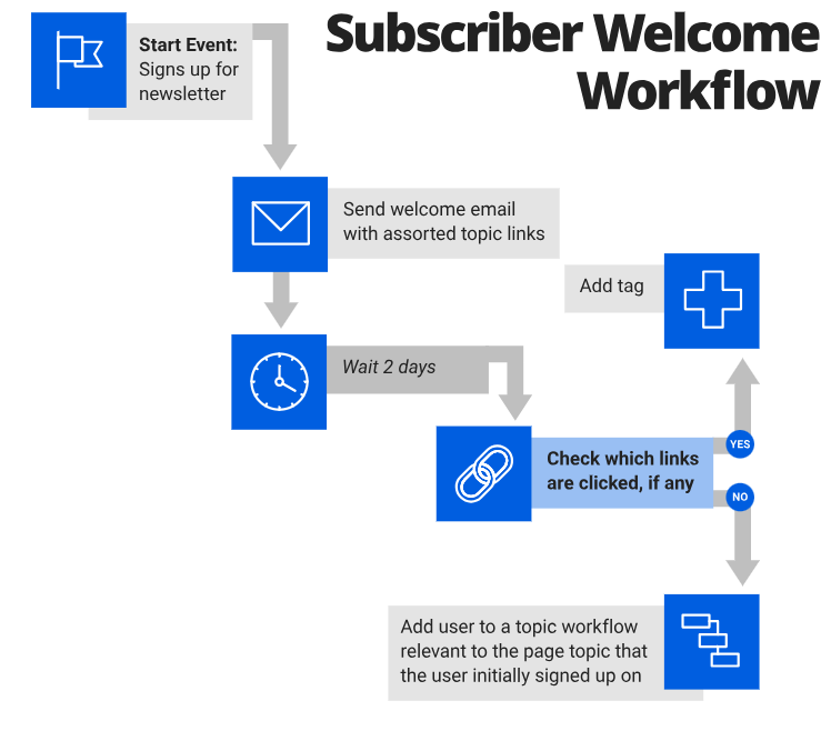
For example:
- Should you test sending after 2 hours or 4 hours?
- Should we give the coupon code after 1 day or 3 days?
- Should the last email be sent after 7 days of action or 21 days of action?
Flow timing test helps you with the exact time to send the email for maximum performance.
Next, we’ve got to have “Conditional Testing” which is like having different routes for passengers based on their ticket value.
If someone bought a high-ticket item, you might want to send them different emails compared to those who bought low-ticket items. It’s all about personalizing and prioritizing the journey.
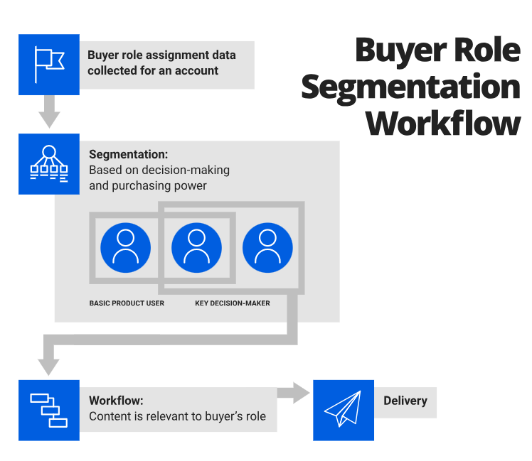
For example:
- Should I promote exclusive high-ticket products to the subscribers or general audience?
- Should I promote the accessories to everyone or the person who just bought the relevant product?
- Should I promote the bundles to the high-ticket audience or the low-ticket audience more?
Now, let’s talk about “Conditional Splits”, imagine you’ve got a group of travelers, and you want to send half of them on one adventure and the other half on a different one.
This is like when you want to test different strategies on a random 50% sample of your subscribers to see what works best.
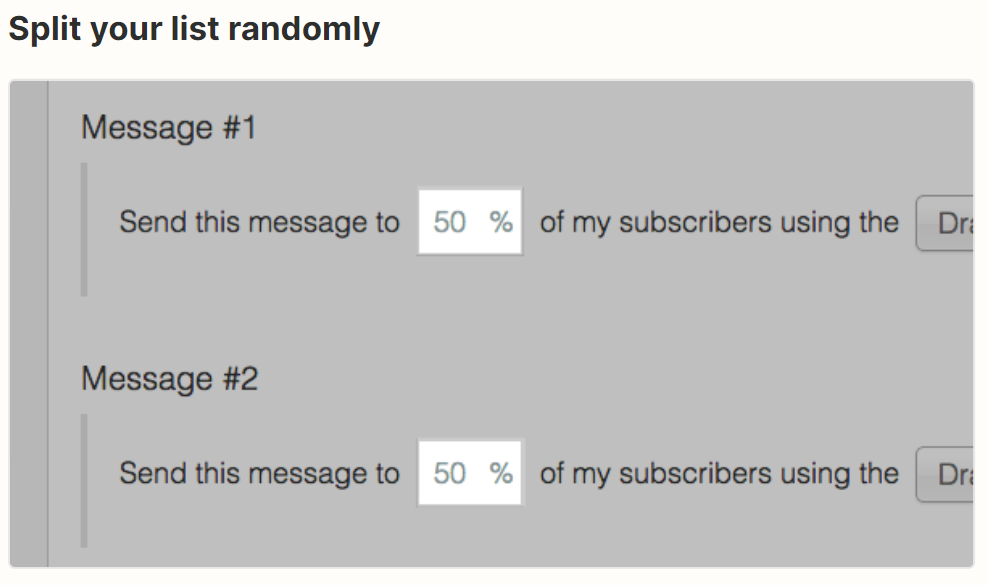
For example:
- Should I send the new arrival campaign to active users or only subscribers?
- Should I promote the BOGO offer to all subscribers or just active subscribers?
- Should I send the sale reminder to all subscribers or only active subscribers?
Finally, “Conditional Split International vs. Domestic” is like deciding whether your ship should go on an expedition toward the East or stick to exploring the West.
You can test different approaches for your international and domestic subscribers to make sure everyone has a good experience.
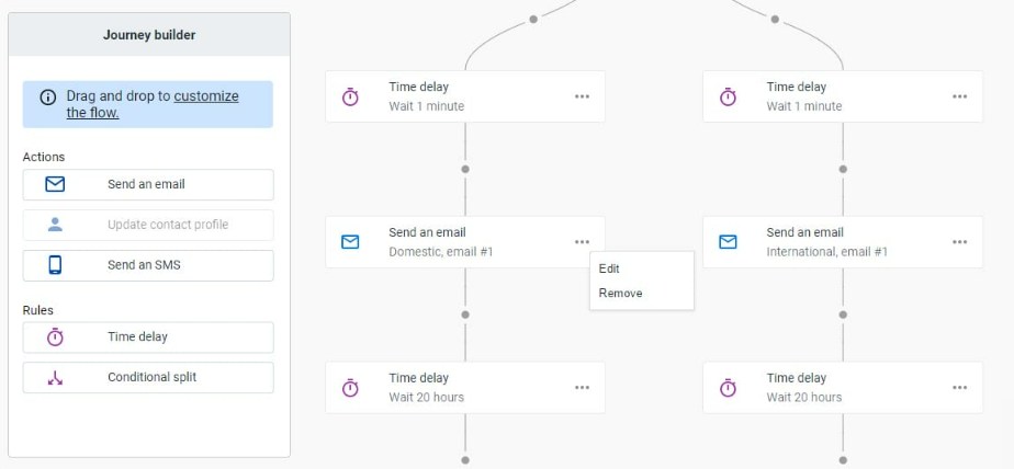
For example:
- Should I promote this campaign to the international audience or only to the domestic audience?
- Should I offer the BOGO deal to the domestic audience only or the international audience as well?
- Should I promote the new arrivals only to the US audience or include the international audience as well?
#2 Content Copy Tests
Ever wondered what makes your email campaigns truly stand out in a crowded inbox?
Well, that’s where testing the content copy, as part of your AB testing strategy, comes into play.
It’s like the secret hack that makes your emails irresistibly click-worthy.
Imagine you have two brilliant ideas for your email content- one with a heartwarming story.
And another with a clever twist!
By testing both you can see which resonates more with your audience.
But it’s not just about ideas; it’s about how you present them.
You can test different headlines to see which one grabs your audience’s attention faster.
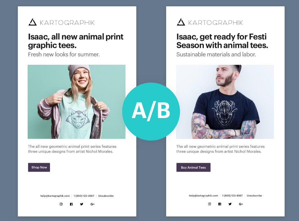
Apart from testing the headlines, you can experiment with the length of your copy as well i.e. – along detailed copy vs a short punchy one.
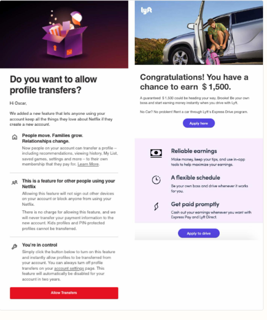
Similarly, personalization is a key too! You can test whether adding a recipient’s name makes a difference in engagement.
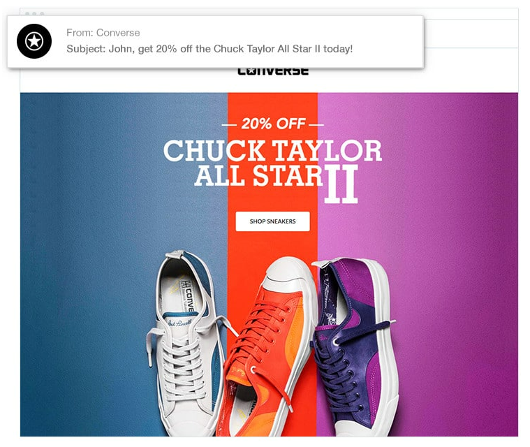
And yes, don’t forget the tone! Try out different tones to see what resonates best with your audience, whether it’s casual and friendly or more formal.
The tone you use in the body copy of your email campaigns can have a big effect on the number of click-throughs you receive.
Studies show that, when you incorporate positivity into your copy, you engage your reader’s brain in a much more powerful way, enabling them to easily understand your key messages and increasing their motivation to click through and purchase your product.
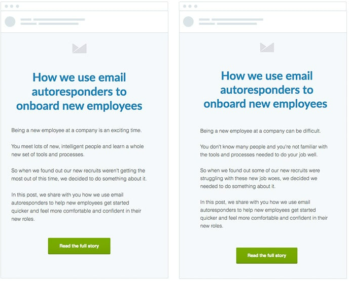
About reviews and testimonials? Well, they can be an absolute game-changers.
Here we can test whether including them boosts the audience’s trust and increases conversions.

Lastly, when it comes to the call to action (CTA), test variations to find the magic words that encourage more clicks.
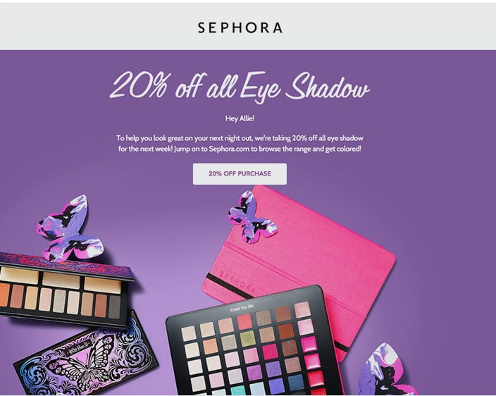
Your calls to action are one of the most important parts of your email marketing campaigns.
They help increase your email click-through rate by making it clear to readers exactly what the next step is.
Sephora uses them well in their email campaigns, including a prominent call to action that ensures readers know exactly what they need to do next.
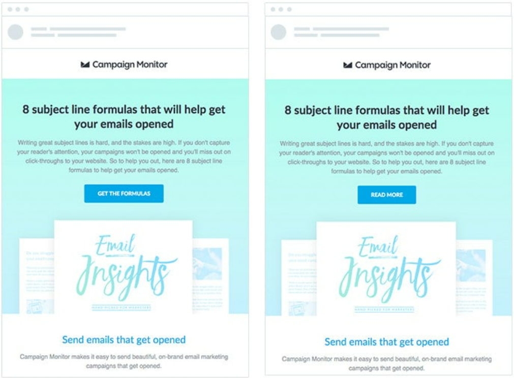
So, in a nutshell, content copy testing is your trusty sidekick in crafting emails that get noticed, clicked, and loved by your audience.
#3 Pop Up Testing
When it comes to email marketing, A/B testing is an essential ingredient that can turn a good campaign into a great one.
But here’s a little tip that can take your email game up a notch: Don’t forget to test the popup!
Yes, that little window that pops up when someone visits your website can be a game-changer too.
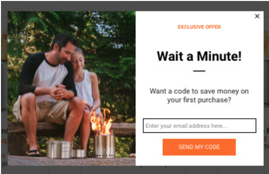
First off, let’s talk about ideas!
When testing your popup, get creative! Try different messages or offers.
For example, if you’re promoting a sale, one popup could say, “Get 20% off today!”
while the other could be, “Don’t miss out on our exclusive discount!”
See which one gets more sign-ups or conversions.
Next, is the popup image 🤩
A picture’s worth a thousand words, right?
Test different images to see which one resonates with your audience. Maybe a smiling face, a lifestyle image, or a simple product shot works better than a generic graphic.
Lastly, don’t forget the CTA (Call to Action)!
Test variations like “Sign Up Now”, “Get Started”, or “Claim Your Deal”.
As the wording can make a big difference in conversion rates.
So, remember, when you’re doing A/B testing for your email campaign, don’t neglect that popup—it could be the cherry on top of your marketing sundae to build your email list.
#4 Content Design Test
As we discussed this earlier A/B testing isn’t just about subject lines and headlines—it’s about the whole package, and that includes your content design as well.
Testing your email content design can help you understand what resonates best with your audience and boost your overall click rates.
Let’s break down why testing your email content design is a total game-changer.
Ideas
Your content design ideas can drastically affect the clicks. The choice of images or graphics is a critical factor that should be tested.
For instance, when deciding on an image, consider whether a lifestyle image showcasing your product in use would resonate better!

Or a product-focused image highlighting its features and details is more effective.

Images or No Images
Visuals speak volumes. Test emails with images against text-only emails.
Sometimes, a captivating image can boost click rates, while minimalistic text might work better in other cases.
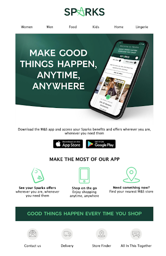
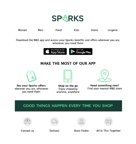
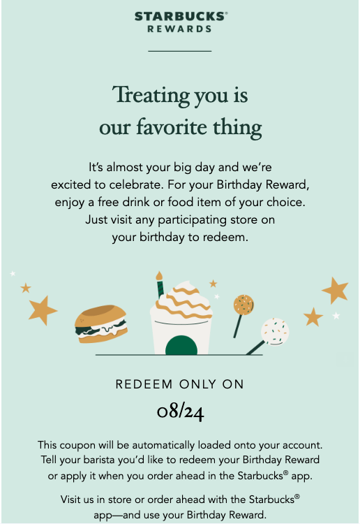
On the flip side if we talk about any sale teaser email or a birthday email, in such emails mostly text emails work better.
Style
Test different styles of writing and typography of the email.
Testing various styles and fonts for each block, right from the headline to CTA. To ensure which style, fonts, or size looks better and thus increases the readability.
On the other hand, when it comes to mentioning the T&C line generally adapting the smaller fonts is mostly preferred. The purpose is to just mention there in the email, not highlight it or focus on it for the audience’s attention.
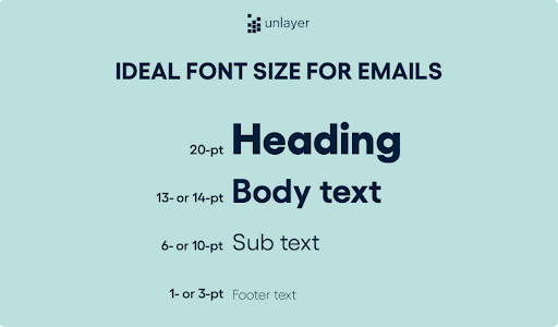
The font & style can influence readability thus affecting the click rates
Email Layout & Design
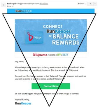
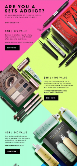
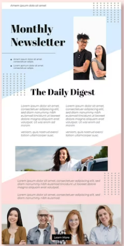
Experiment with the layout of your email. Try variations with single-block email versus multiple-block email.
Some subscribers might prefer a clean, single-block layout with an F pattern as it’s easy to read and navigate.
On the other hand, others may find it exciting to have multiple interesting blocks mostly placed in a Z pattern or in an inverted pyramid model.
Here each block has a compelling CTA that gives them more options and choices.
So, testing all these layouts & designs to see which performs better could really help in getting better results.
Also, make sure your design aligns with your brand and resonates with your audience.
CTA (Call To Action)
The Call to Action (CTA) is crucial. Along with a different CTA copy (like “Shop Now” vs. “Discover Deals”).
Testing the design and placement of the CTA is equally important.
Various CTA designs can play differently depending on the email. However, highlighting the CTA and ensuring that is clearly visible to the audience is the main focus.
Then be it placing the CTA right below the headline or at the end of the block with a button design or simply written in text!
All of these play an important role in making the email campaign better and high converting.
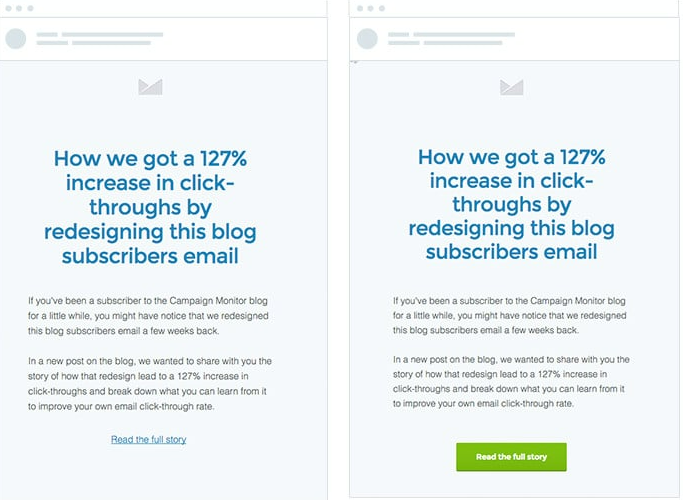
Thus a right CTA can significantly impact click rates.
#5 Subject Lines Testing
Testing your email subject lines through A/B testing is like finding the perfect key to unlock your audience’s curiosity and boost those open rates.
By experimenting with ideas, length, word order, email length cues, content hooks, and personalization, you’ll discover the key to higher open rates and a more successful email campaign.
So let’s unlock why it’s essential:
Ideas
Your subject line idea can be a game-changer. Test different approaches, like being informative, teasing curiosity, or using humor.
For instance, compare a subject line that says “New Product Launch” with one that teases “Guess What’s Coming!”
Length
Experiment with subject line length. Shorter lines often grab attention, but longer ones can provide more context.
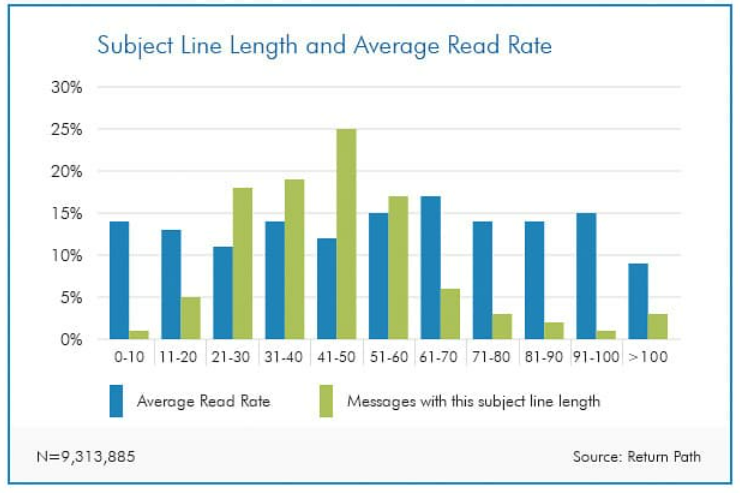
Discover which length resonates better with your audience.
Word Order
The order of words matters. Test variations to see if “Unlock Exclusive Deals” performs better than “Exclusive Deals Unlocked.”
The golden rule says, that if you’re mentioning the offer in the subject line then it’s best to display the offer first.
For example, “Enjoy 20% Off on your next purchase.”
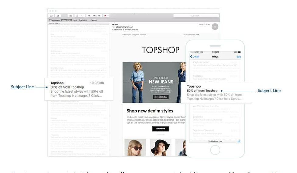
This helps to grab your audience’s attention quickly.
Email Length
Subject lines can set expectations for email length.
Test subject lines that hint at content length to manage reader expectations and increase open rates.
It’s like giving the trailer of what is coming ahead. This also creates curiosity and thus tempts the audience to open the email.
Multiple Content Hooks
If your email includes various content, test subject lines that highlight different hooks.
For instance, try “Recipes, Tips & More” for a cooking newsletter with multiple sections.
Personalization
Personalized subject lines, like “Hey [Name], Special Offer Inside,” often yield higher open rates.
Test personalized and non-personalized versions to see the impact.
For example:
personalized subject line

Non-personalized subject lines

To make the subject lines look more personalized we can also test writing the subject lines in a causal running flow, like as if we’re writing a normal text message to a close friend.
Rather than adopting a general form of writing the subject line in a capitalized form.
#6 Testing The Preview Text
Don’t underestimate the power of testing the preview text alongside your subject line in A/B testing—it’s a dynamic duo that can work wonders for your email campaign!
The preview text, that sneak peek readers see after your subject line, is your second chance to grab their attention.
Experiment with different preview texts to complement your subject line.
For instance, if your subject line teases a sale, your preview text could create FOMO, like “Grab your items today!”
This dynamic duo can significantly impact open rates 📈
A compelling subject line coupled with an enticing preview text creates a one-two punch that piques curiosity and encourages readers to click. 🤩
On the other hand, mismatched or lackluster preview text can lead to missed opportunities, even if your subject line is strong.
In a nutshell, testing your email’s preview text is the secret sauce to boosting open rates.
When the subject line and preview text harmonize, it’s like music to your readers’ eyes, leading to higher engagement and a more successful email campaign.
For example:

#7 Offer Testing
Testing your email offers during A/B testing is like discovering the magic ingredient that turns lukewarm responses into a hotbed of clicks and conversions.
By meticulously testing your email offers you can discover the winning combination that triggers a surge in click rates.
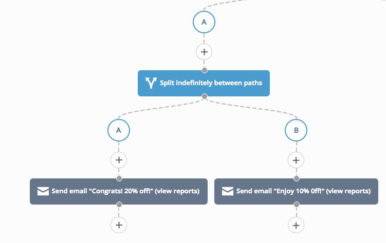
It’s like finding the golden ticket to email marketing success, where your audience can’t help but click, convert, and keep coming back for more.
Ideas
The offer itself is the heart of your email campaign. Test different offer ideas to see what resonates best with your audience.
For example, compare a “20% discount” with a “buy one, get one free” deal.
The right offer can be the clickbait your subscribers can’t resist.
Email Body
How you present your offer within the email body matters. Experiment with different ways to showcase your offer!
Whether it’s through engaging storytelling, highlighting benefits, or creating a sense of urgency!
A well-crafted email body can significantly impact click rates.
Pop-ups
Coordinating your email offer with pop-ups on your website can be a game-changer.
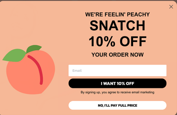
Test various pop-up designs and timing to ensure they align seamlessly with your email campaign, providing a consistent and compelling user experience.
#8 Testing The Landing Page
Testing your landing page is like putting the final piece of the puzzle in your email campaign.
It’s a game-changer that creates a seamless user experience that drives more clicks and conversions.
It’s like a well-choreographed dance, leading your audience from the email to the landing page, and ultimately, to the desired action.
Ideas
Your landing page should seamlessly continue the story you started in your email. Test different ideas to make your landing page more engaging.
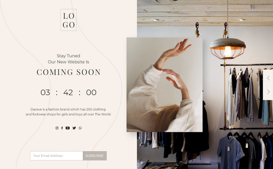
For instance, if your email teases a product launch, your landing page should provide a sneak peek, exclusive details, or even a countdown timer to build excitement.
Product Page vs. Category Page Links
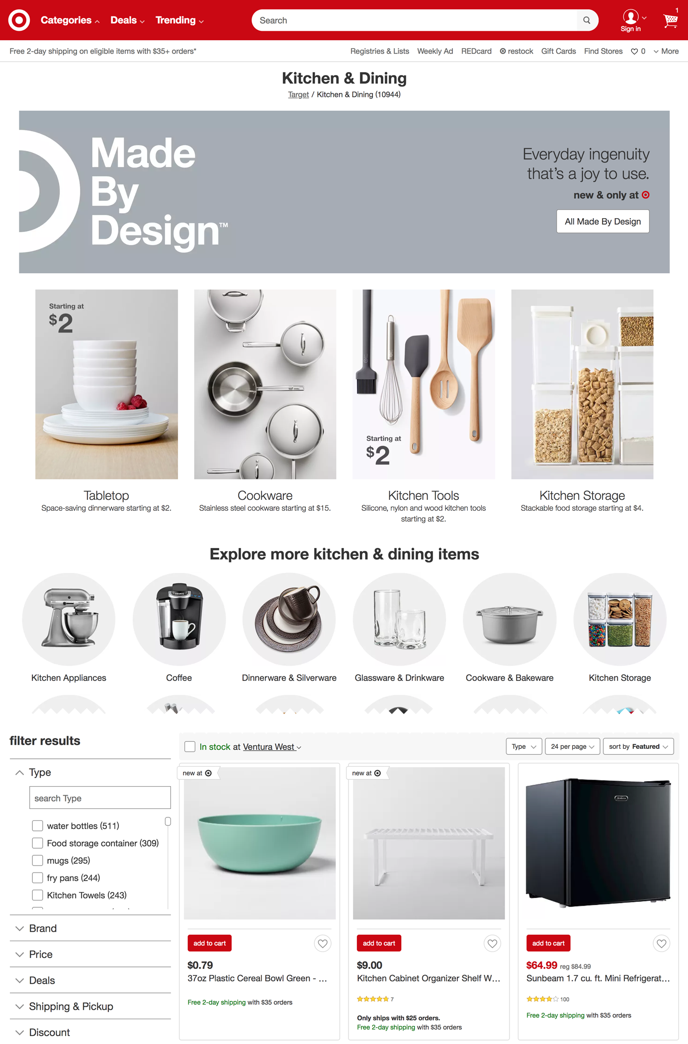
Decide whether to link directly to a product page or a category page in your email.
A product page link is more specific, and ideal if you want to showcase a particular item.
In contrast, a category page link is broader and suits emails highlighting various options.
The golden rule says to test both to see which drives more clicks and conversions.
Home Page vs. Detailed Page
Consider where you want your email recipients to land!
Linking to the home page provides an overview of your brand, while a detailed page offers in-depth information about a specific topic.
Test both options to see which aligns better with your email’s message of the particular block.
Thus which results in higher click rates.
For example, showcasing the Brand’s USP in a block can be beneficial but often the question arises of where to redirect the audience upon clicking the USP block.
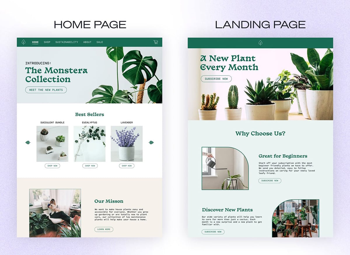
So, here the best option is to link the USP block straight to the homepage of the brand’s website.
Where the audience has wider options to click and explore.
#9 Testing The Schedule Time Of The Email Campaign
Testing the delivery day and time of your email campaign is like finding the sweet spot for catching your audience’s attention.
By strategically testing delivery days and times, you can ensure your emails land in subscribers’ inboxes when they’re most likely to engage.
It’s like serving a piping hot pizza right when your friends are hungry 😋
Just remember timing is everything 🔔
This optimization can lead to higher click rates and greater success for your email campaign.
It’s best to keep experimenting and serving your emails at the perfect hour!
Ideas (for the best time)
Different days and times work best for different audiences.
It’s best to test various combinations to determine when your subscribers are most active and engaged.
For instance, sending a promotional email on a Saturday morning might work great for some businesses, while a Tuesday afternoon could be more effective for others.
Observing Open Rates
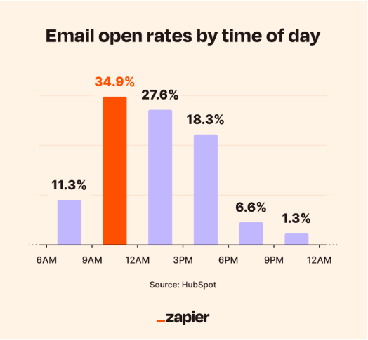
Keep an eagle eye on open rates throughout the day. Notice when your emails get the most opens.
It might be early in the morning when people check their phones, during lunch breaks, or in the evening when they relax after work.
This insight can help you pinpoint the ideal delivery times.
#10 Audience Testing
Testing your audience is like tailoring a perfect outfit! It ensures your email campaign is the right fit for your subscribers.
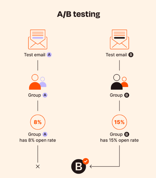
This process can have a significant impact on click rates and here’s why:
Imagine you’re a clothing retailer, and your email campaign showcases trendy summer wear.
Testing your audience means segmenting your list, sending one version to fashion-forward subscribers and another to those interested in outdoor activities.
What will be the result?
Obviously, higher click rates because you’re speaking directly to their interests.
By understanding your audience’s preferences, demographics, and behaviors, you can send emails that resonate with them.
Whether it’s personalizing content or crafting different messages for various segments, audience testing boosts engagement.
It’s like finding the perfect style for each subscriber, leading to more clicks and a successful email campaign.
Therefore, always remember to tailor your emails to your audience’s tastes because it’s the key to click-rate success!
Analyze The Results
Analyzing the results after conducting A/B testing for your email campaign is like deciphering the secret code of your audience’s preferences.
Analyzing these key metrics helps you understand what works best for your audience and fine-tune your email campaigns accordingly.
It’s like having a treasure map that leads you to higher engagement and better results.
It’s crucial and can greatly impact your email campaigns.
So, here’s what you need to follow:
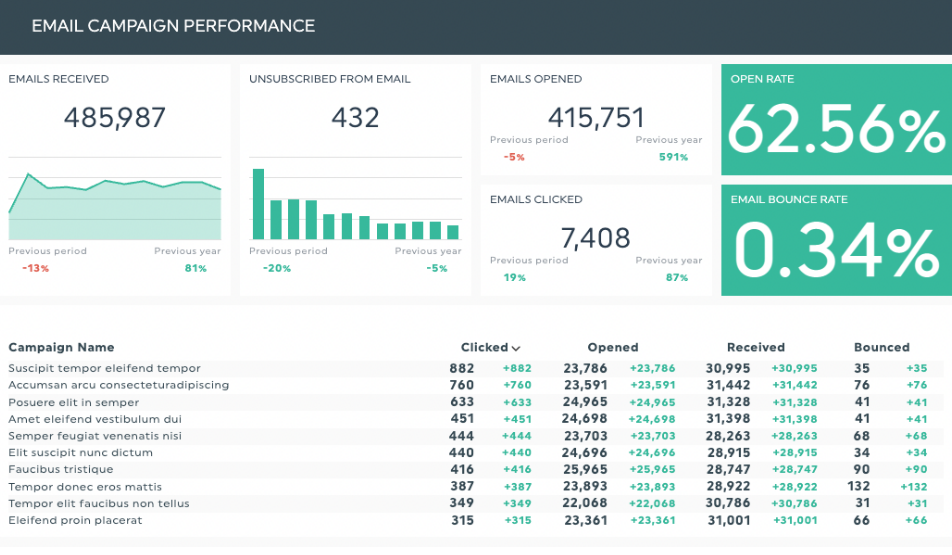
Open Rate
Start by examining the open rate.
If version A had a significantly higher open rate than version B. It means your subject line or sender name in A resonated better with your audience.
For example, if version A had a subject line that said, “Don’t Miss Out on Our Exclusive Sale,”
And version B had a subject line that said, “Shop Our Sale Today,” you can observe which approach got more open rate.
Click-Through Rate (CTR)
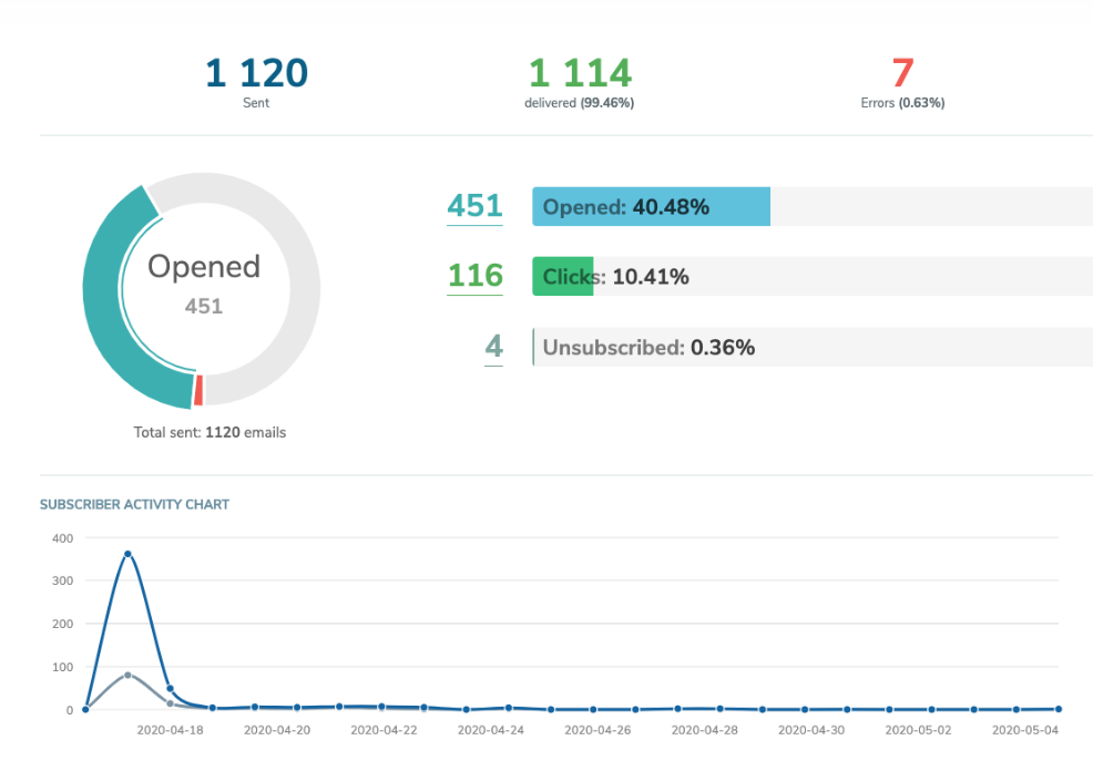
Let’s dive into the click-through rate next.
If version A had a higher CTR, it suggests that the content, images, or call-to-action in A were more appealing and engaging.
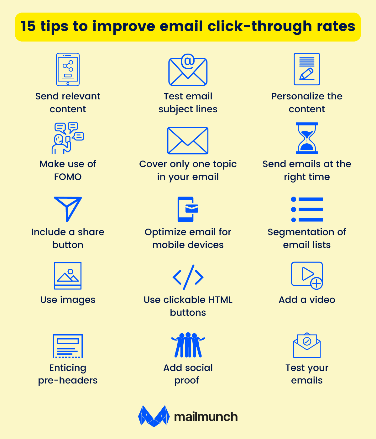
For instance, if version A included a captivating image of a product and version B had a generic graphic, the image in A likely contributed to the higher CTR.
Conversion Rate
Finally, check the conversion rate once subscribers land on your website.
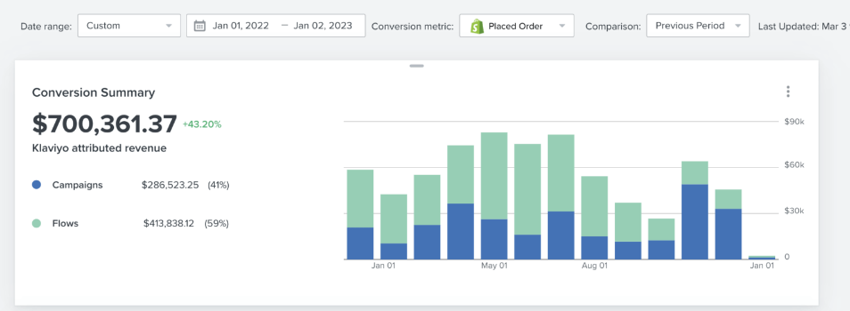
If version A led to more conversions, it means the entire user journey from email to website was more effective.
For example, if version A’s email offered a clearer value proposition and a well-placed CTA, it likely drove more conversions.
So, remember don’t skip this essential step as it’s the key to your email campaign success!
Conclusion
A/B testing isn’t just a one-time process! It’s a journey that never stops, no matter if you’re a newbie or a popular big brand!
You see, these online trends and people’s behavior are always changing, so it’s pretty challenging & crucial to stay in the loop.
So, always remember to keep experimenting & observing what clicks with your audience and what falls flat.
Doesn’t matter whether your email list is small or you’ve grown into a household name, the key is to test early and keep testing frequently.
It’s like being a chef who keeps refining their recipe, adding a pinch of this or a dash of that for the best results.
So, stay curious, keep testing, and watch your email campaigns thrive!

