Building Email Capturing System
Given the countless ways to ask for an email from a customer, any website can’t implement all ideas. Depending on the business, you need to experiment and see which capturing method works best for your audience without pissing them off.
Think of it as the starting of a relationship. You can’t ask for their number without showing genuine interest in them. Other person should also see value in your relationship before sharing their contact information with you.
Push too hard, and you might come as aggressive.
Go slow, and you might come as not even interested.
So eventually, we need to strike the right balance to start a relationship on the right foot.
Goal and metrics of email capturing system –
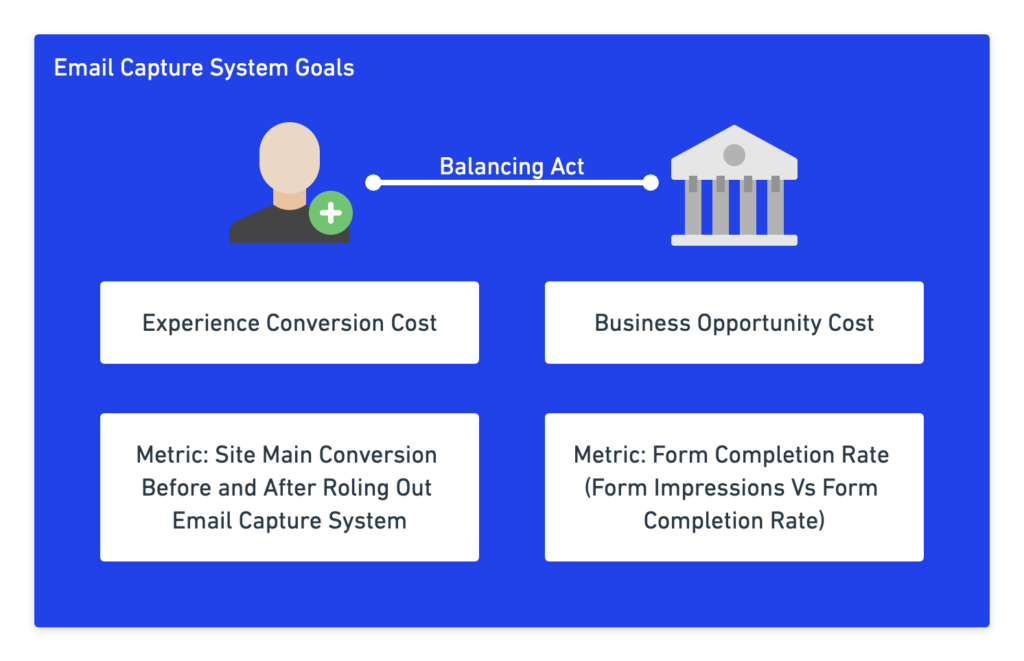
Email capturing system needs to have two goals for which you need to optimize.
It’s a balancing act between optimizing for business goals without compromising on the customer experience.
- Experience conversion cost Risk of turning off a genuine customer. Customer who might have given you their email address in future, given they were asked at the right time. Wrong timing turned them off, causing you to lose the communication medium to reach the customer in future.
Metric – Overall website conversion rate before and after implementing the capturing system. Rollout using A/B tests for best results. - Business opportunity cost The numbers of users you miss out on your platform for not asking them for their email address. Business loses any possible ways to connect with them ever again till you spend money on FB to bring them back again.
Metric – Form completion rate [Form Visibility To Form Completion]
Pillars of email capturing system –
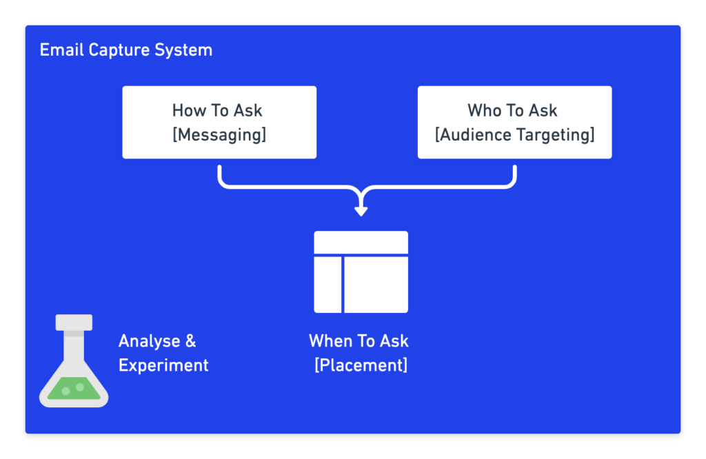
Great email capturing system without compromising business conversion rate and customer experience stands on four pillars –
- When to ask [Placement]
- Who to ask [Audience Targeting]
- How to ask. [Messaging]
- How to optimise. [Experimentation]
You just need 1-2 or max 2-3 most effective ways to capture email without compromising conversions or disturbing users.
When To Ask For Email [Placement]
When is the right time to ask for email? There is no easy answer.
Although placement plays a huge role in the success of the email capturing system, most people with the right messaging and offer also miss out on all the vital placement ideas.
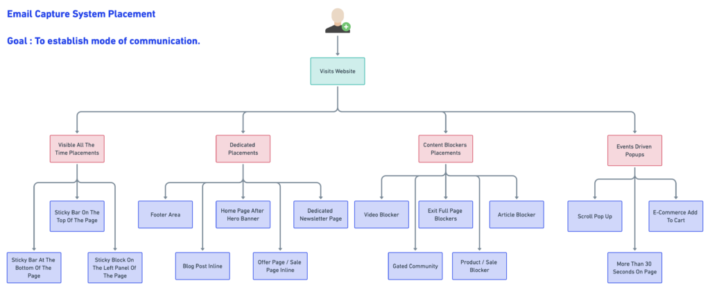
My recommendation is to use each placement type to see what works best for your audience. Generally, we break down into main four categories –
- Visible All The Time Placements
- Dedicated Placements
- Content Blockers Placements
- Events Driven Popups
1. Visible All The Time Placements
Placement is visible all the time. These are the second most effective placements after blockers.
To walk to the tight rope between conversion-friendly and effective, they are best to go for.
They are more like a part of the page. These are most effective on desktop screens given ample space, and mobile versions can also be implemented after testing.
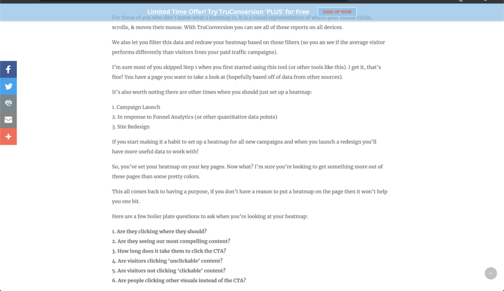
1a. Sticky Bar On The Top Of The Page
Hello Bar is proving very successful and low intrusive to the customer. They are visible all the time and work best for the mobile view as well.

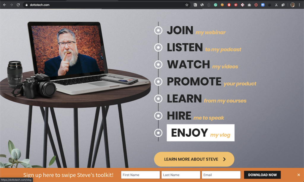
1b. Sticky Bar At The Bottom Of The Page
Footer is also effective as done on this website –
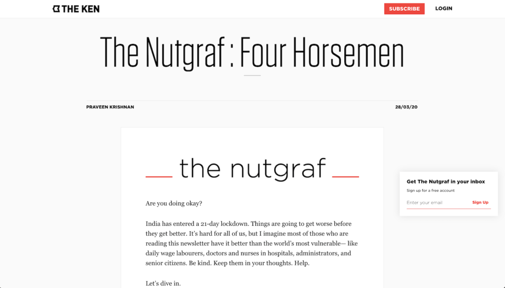
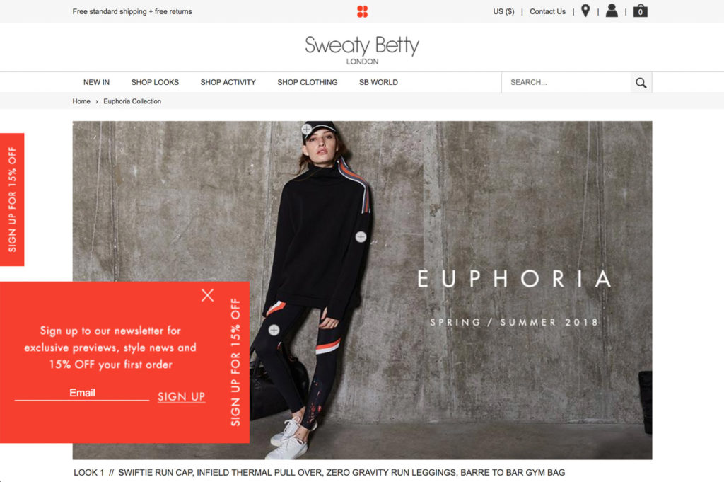
1c. Sticky Block On The Left/Right Panel Of The Page
Sticky blocks are always visible for the customer as they scroll the page.
I would prefer them on the left side, as users generally have more focus on the left side of the page. Still, brands use them on both sides.
2. Dedicated [Inline/OnPage] Placements
Sometimes on the website, you want to sign up for the newsletter and can’t find the placement.
It’s like with a credit card in hand, and there is no one at the billing counter.
Totally non-intrusive, but still captures leads for you in an effective manner. Sometimes inline placement works best for capturing the emails without any popups, without creating any pressure on the customer.
Recently, I closed all emails requesting pop-ups on a website as I was still consuming the content. Once done with the content, I was impressed with the author.
I wanted to enter my email address to receive more content from the author.
I looked at the menu. I looked at the footer.
Nada.
No place to enter an email address as the most capturing system was about popups and blockers.
Eventually, I opened their website in incognito, they played their pop-up game, and then entered my email address.
Too extreme example. I know. The content was that good! I don’t do it for most.
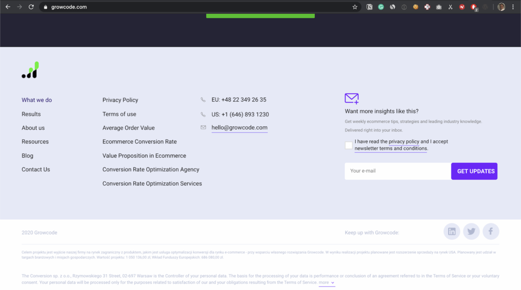
2a. Footer Area
Reliable footer area. You can always showcase email capture forms to capture leads in the footer area, a universally accepted place to ask for email.
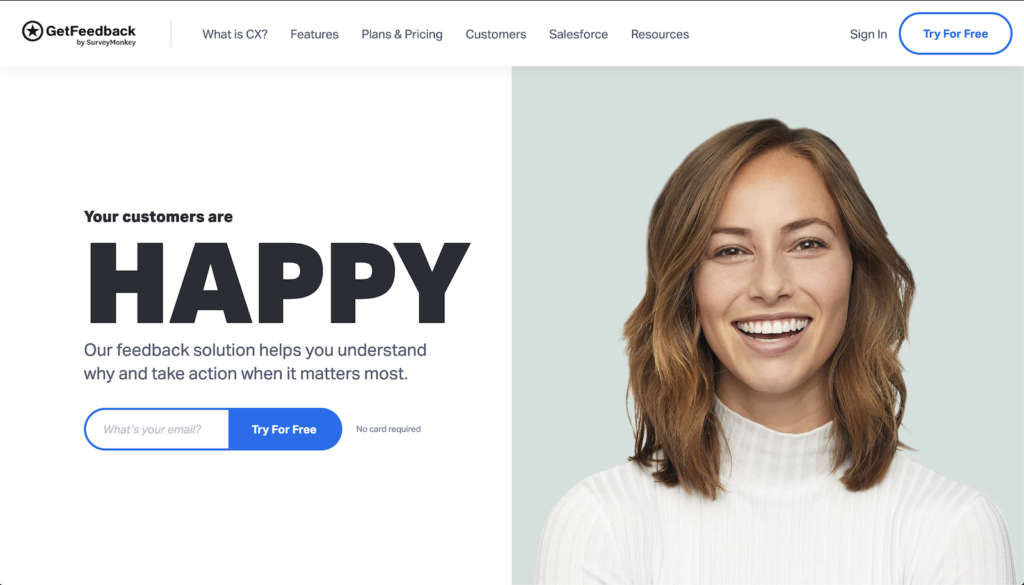
2b. Home Page After Hero Banner
The home page can be a perfect place to ask for email. The brand story is most engaging on the home page.
Given your messaging works for the customer, the home page can be an excellent place to ask for constant communication with the customer.
2c. Blog Post Inline
What’s a better way to ask for an email once users have read your article. They are fully engaged and looking for more information about the topic. Hopefully!
2d. Offer Page / Sale Page Inline
Sale pages have a very high sign ups rate. People are already looking for deals and discounts on sale pages. Offering some coupons in exchange for an email is a win-win for everyone.
You can highlight deal exclusivity for offering signups.
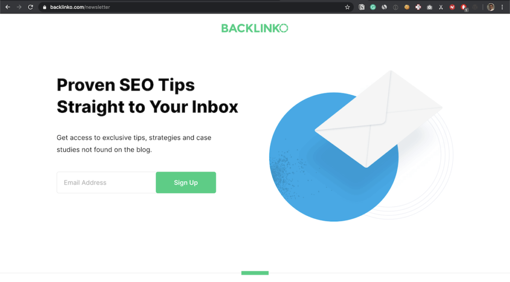
2e. Dedicated Newsletter Page
Having a dedicated newsletter landing page also gives a lot of space for building a case for the newsletter. You can showcase exclusive areas in the newsletter.
3. Content Blockers Placements
Blockers have a negative connotation in their name, although they are highly effective and extensively used. The name of the game is balanced with blockers. Blockers should be rolled out slowly with a keen eye on website’s overall conversion rate.
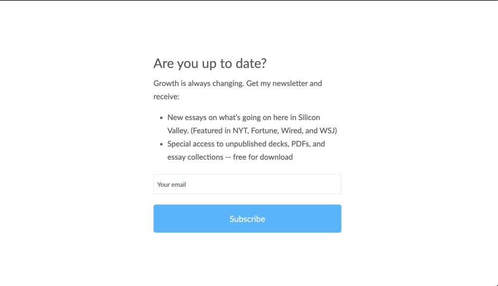
3a. Exit Full Page Blockers
Exit intent banners are useful as people are “done” with the website.
They have the least negative impact on conversions and customer experience.
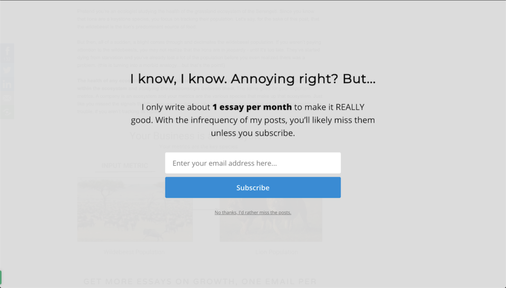
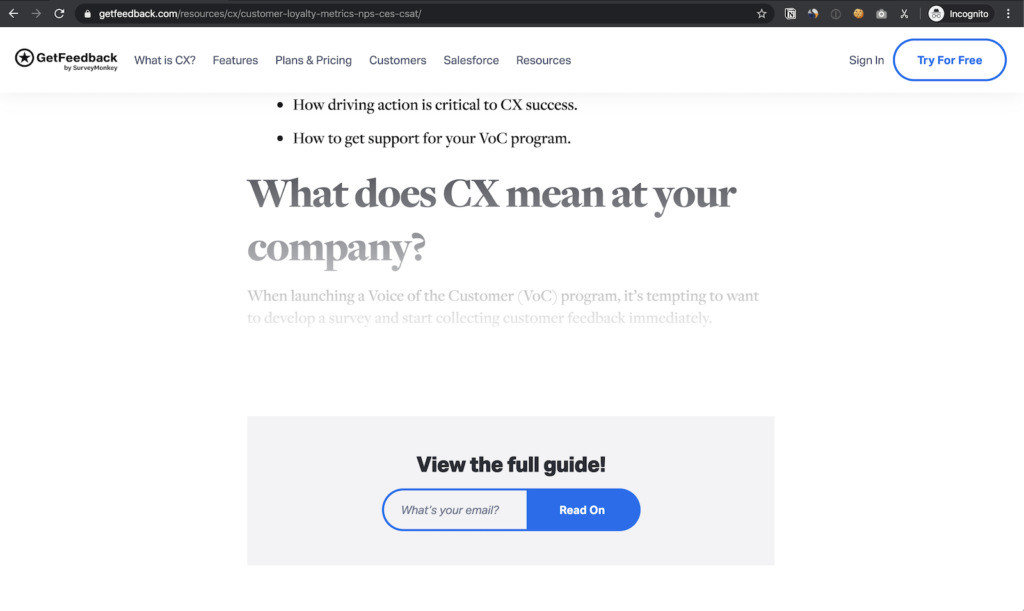
3b. Article Blocker
Most content websites will show a snippet of content and then ask for the signup. Smart techniques and most people will share given they are engaged with the content.
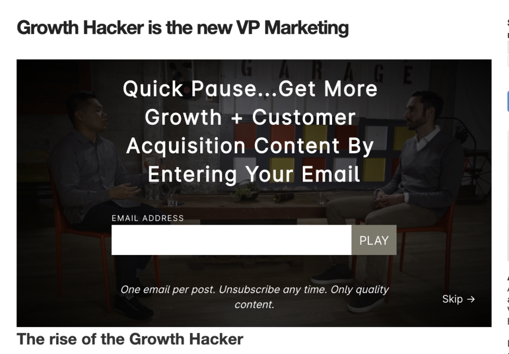
Wistia gives this functionality. You can pause the video to ask for the user’s email address to continue. Most users will not mind given content is engaging.
3c. Video Blocker
Video blocker are new and highly effective.
Self video hosting platforms provide this functionality to ask for email in the middle of the video.
1 min under the video, you will be asked to share your email address to continue watching.
3d. Product / Sale Blocker
Exclusive product or exclusive sale can be accessible to the people subscribed to the newsletter.
3e. Gated Community
Blocking complete access without sign up. Some websites smartly block access to a certain section of their websites.
4. Events Driven Popups
These are the last category of email capturing system for highly engaged customers.
They are triggered on by rule engine.
Based on triggers done by customers, so unlimited permutations and combinations possible on this one.
4a. More Than 30 Seconds On Page
Sometimes users are looking at a page and confused with the options available on the website.
4b. Scroll Pop Up
While scrolling the website, once a user has engaged with a certain % of the page, we can trigger these popups.
Scrolling shows engagement from the customer side and they are more likely to subscribe to the newsletter.
4c. Ecommerce Add To Cart
There can be multiple events driven popups for the customer. Like –
Ecommerce adds to cart.
They are effective as they are rarely intrusive, and users are already engaged in some activity on the website.
List of not at all exhaustive in the events driven popups. Possibilities are endless to try in events-driven popups, but my recommendation is always to go slow on events-based popups as they can go out of hand at scale very rapidly.
Who to ask for email [Audience Targeting]
As for who to ask, the simplest answer would be to people who haven’t signed up yet.
Sadly most sites ask incessantly even when you have already subscribed.
Audience Segmentations –
Users about to leave the website
Exit intents have the least impact on the conversion rate and work as a last shot at the customer.
Full page blockers are usually triggered when the customer is about to leave the website.
Users who have already spent some time on the website.
More like 30+ seconds on the website. More time means more engagement shown by the user.
Scroll placements which appear on the right side of the page like a chat window works best with it.
Users on desktop
For sticky placements, the mobile experience can be tricky. Given the low screen size, sticky placements can start taking too much real estate on the website.
Use desktop targeting for sticky placements for minimum impact on customer experience.
Traffic Source
- Users who are landing from Search / Direct traffic than arriving from paid traffic. Conversion risk is lower for search users.
Referral traffic has seen higher signups for the newsletter as the user is already coming from some source of trust.
How to ask for email? [Messaging]
Messaging is an essential part of the whole process. As mentioned at the start of the article, it’s the start of a relationship.
Like every relationship, there is a genuine give and take. Also starting sets the tone for future communication.
Given the email is the identity of the user and highly spammed activity, users are looking for a fair transaction.
Broadly to increase the subscription conversion rate, we can do the following –
Discount
Who doesn’t love a good deal? Logically works best for ecommerce websites, but SaaS businesses can also give offers on annual plans.
Discount should not be more than 10-20% otherwise you are starting a relationship on a wrong foot. 80% discount create doubts in customer mind as it’s not normal for them to see on a day to day basis.
Remember Me
This is also a great technique. You can ask the user to save their work or have a better browsing experience. Without affecting any bottom line, people appreciate it when you offer them a reason to give them your email id.
Content Guides
It’s a winner method for SaaS and b2b business. Key is to offer value and set the stage for the long term. So offer only something which is original and revolve around your area of expertise.
Quizzes / Tool Based
Beardbrand has a famous case study of running a small survey and showing which beard will look good on people. Any interesting quizzes can work for the brand.
Some tools offer initial assessment kind of offering to capture emails. It works well for ecommerce and SaaS tool.
You can give a sneak peek of the tool without pressuring the user to start the trial.
Contests Giveaways
Contests are also a cool way to ask for email. People love contests and part of some event. Create an event or contest to align people around your product and services.
Given the best offer available with the brand, you can customise the offering.
Keep in mind –
- Offer need to contextual with the placement. A user on the home page will react to a different level than a user on the sales page.
- Offers should not repeat to an existing user to improve conversion rate and website real estate.
Messaging CTA and Other Healpful material
How to Optimise? [Experimentation]
Given the techniques, we are spoilt for choices.
Remember the goals discussed at the top of the article. We need to device a very fine balance between customer experience and business goals.
We can’t throw all the customers without knowing what’s working and what’s not working.
We need to ensure maximum return from minimum intrusion.
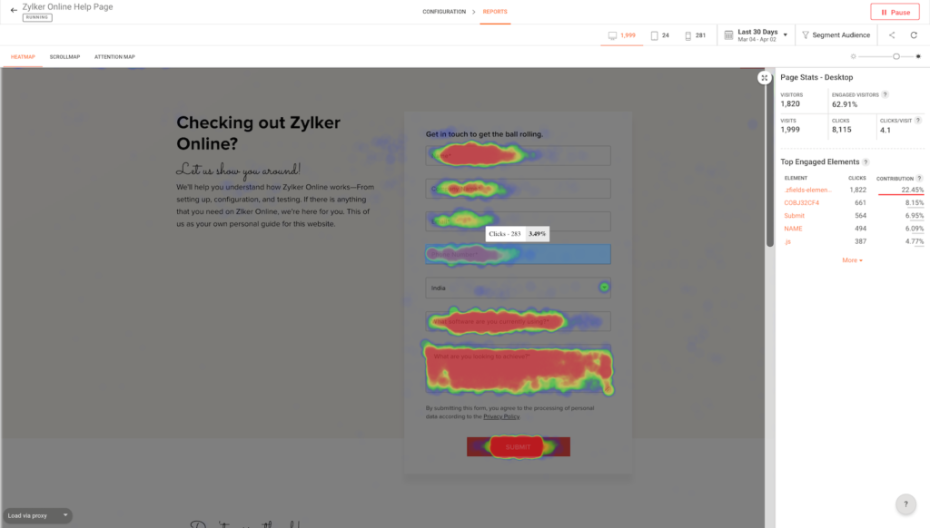
Heatmap Analysis Of Form
Analyze heatmaps of the forms to check for their effectiveness and their ease of usage. Key areas to look for the heatmap –
- Click areas in the form other than the CTA why people are clicking on somewhere other than CTA.
- How many people are clicking on the exit button?
End Of The Funnel Conversion Rate
Always optimise for the actual purchase and lifetime value of the customer.
Email capturing systems are notorious for starting on the wrong foot.
You need to be consistent in the messaging with the end goal of the customer journey
Monitor each list separately to see their effectiveness in the long term.
Some lead sources might be more effective than others. These things happen due to messaging and communication on the list.
$Image of graphics of two lists showing different results in the long term $
Run Good Welcome series
Capturing email is not the end result. It’s the start of a journey.
Run an exciting welcome series. Feel them welcomed. You can check how to customise welcome series.
Drop Non-Performing Placements
In the end, we don’t want to waste space on the website for ineffective forms.
Always keep on pruning low performing placements and try something new. Keep the records of the experiments done on the system.
Going Live on Website
You have made this far, so let’s make it live. The whole system discussed earlier will give you a good footing, but for any results, we need to make it live.
We are hereby sharing two actionable guides to start with the system –
- Ecommerce Email Capturing System
- SaaS Email Capturing System
Ecommerce Email Capturing System
For eCommerce, let’s take two versions of the capturing system.
One is starting with conservative and the second one gradually increasing the pace.
Conservative Version –
- Sticky bar on the top of the page / Desktop Users / Discount
- Footer Area / All Users / Continued Communication /
- Add To Cart Event / All Users / Discount + Remember Me /
- Scroll Event / Users Spend More than 30 Seconds / Content Guide
Aggressive Version –
- Exit Intent Pop Up
- Dedicated Newsletter page
- Sale Page Inline
- Quizzes
- Contest
For eCommerce, the eventual purchase should be monitored. Email capturing systems are notorious for low-volume high-performance behavior.
You can use paid marketing as well to grow your list.
SaaS Email Capturing System
For SaaS as well, let’s start with two versions.
One for starting slow and second for all guns blazing.
Conservative Version –
- Sticky bar on the top of the page / Desktop Users / Discount
- Footer
- Video Blocker
- Scroll Pop Up
Aggressive Version –
- Home Page After Hero Banner
- Dedicated Newsletter Page
- Blog Blocker
- Exit Intent Pop-Up
Again, the main goal is the end of the funnel conversion. So for SaaS, eventual trial to paid success, churn rate should be monitored for the users.
For long-term metrics like churn, to play it safe, we can make it live for 15 days and then monitor the cohorts.
Eventually with both, the point is not to have the maximum number of capturing systems. Keep only the effective ones. Discard the rest.
Conclusion
Asking for email is intrusive if done wrong and welcoming if done right.
Email capturing is difficult, but with the right system in place, you can build an unparalleled army of subscribers to support and cheer your brand.
The goal of this guide was to set you up on the right path at the beginning of the customer-brand relationship.
Lastly, the total effectiveness of captured email lead also depends on the customer journey going forward. Setting up the right expectation and communication will increase the effectiveness of the subscribers base.
Given the effort it took to bring the customer in, customers are also very quick with the “Unsubscribe” button, so value the trust bestowed by them. Provide value to the customer as they have already shown their trust by sharing their contact details.
Give them a great experience.
Your turn
Given the vast techniques of capturing emails, let me know any strategy missing in the system?
What’s your favourite email capturing technique?
Which is email capturing experience do you hate the most?
Which email capturing technique has been most profitable for you?

