Key takeaways
- In Dan Ariely's Economist test, removing the option nobody picked dropped print and web from 84% to 32%. Your one-time price plays that role.
- Three subscription options and one one-time, at most. Iyengar's jam table sold to 30% of shoppers with 6 jams and 3% with 24.
- Pre-select subscription with the terms beside it. IM8 made quarterly its default, and its Jan 2026 cohort reached $587 by order 4.
The Economist once offered three subscriptions.
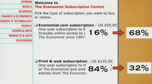
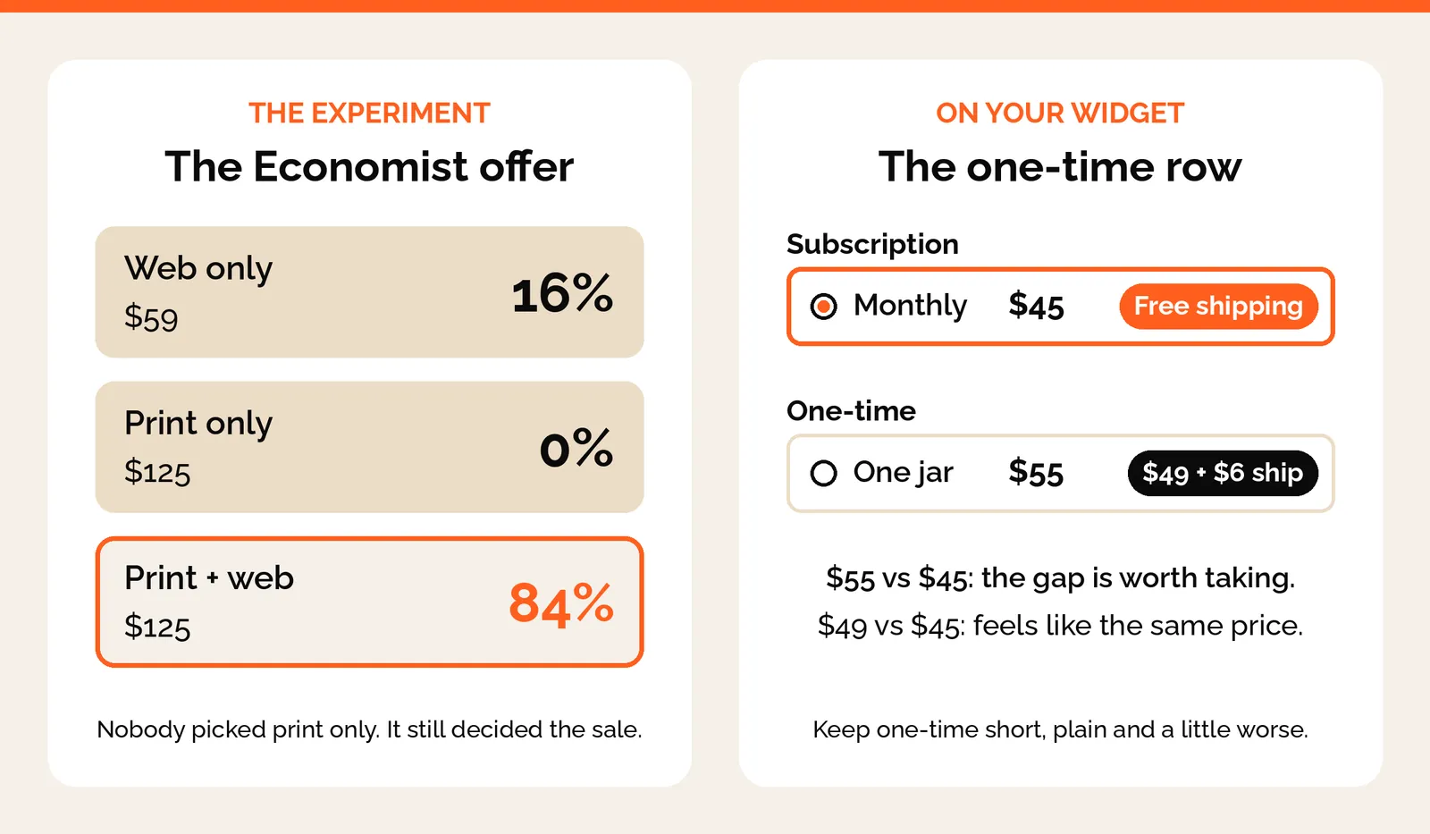
Web only for $59. Print only for $125. Print and web for $125.
Dan Ariely tested it on 100 students. 84 picked print and web. 16 picked web only. Nobody picked print only.
Then he took away print only, the option nobody wanted. Now 68 picked web only, and just 32 picked print and web.
Print only was never there to sell. It was there to make print and web look like a steal.
Your subscription widget runs the same kind of experiment on every visitor, and it runs five effects whether anyone chose them or not: the decoy, too many choices, the default, the anchor and the frame. This page is part of the subscription offer guide, which covers what you sell and at what price. This one is about how that price reads on the page.
Why people stay once they're in is a different book. That one is Atomic Habits, and it lives in the subscription habit article.
The decoy: why the one-time price stays on the widget
Your one-time price isn't really there to sell. It's there so the subscription looks like the obvious deal. So it gets the smallest row on the widget. And no options. No dropdown, no cost list. The option you don't want chosen should be the shortest row on the page.
One brand we work with wanted to drop the $6 shipping on one-time. We kept it. With shipping, one-time is $55 against $45 a month on subscription, and people notice the gap. Without it, it's $49 against $45. That feels like the same price, so why commit?
Let one-time carry its true cost
If subscription includes shipping, one-time has to show the shipping it doesn't include. Same with the unit. Pick one, per month, per serving or per day, and put it on every row, one-time included. One coffee brand we work with prices every row per cup. £1.30 a cup on one-time, £1.05 on subscription. Without that line on the one-time row, the buyer can't compare. So they default to the cheapest sticker.
Never knock the subscription on the one-time row
We once cut "No subscription, nothing to manage" from a one-time row. It tells the buyer a subscription is a chore. The one-time row carries price and cost per unit. That's it.
And taking one-time away costs you orders. Convertibles tested a subscription-only page for a food brand, and subscription went from about 2% of orders to 97%. But conversion fell 42% and revenue per visitor fell 58%. One brand, one month, a small sample. Still, the decoy only works while it sits on the page.
Some brands want one-time shown in full, for trust reasons. That's a fair call. One brand turned down one-time as a small link. Fine. Make it a full block, and keep the total at three blocks. The decoy still works as long as subscription is the better deal on the same unit.
Too many choices: three subscription options and one one-time
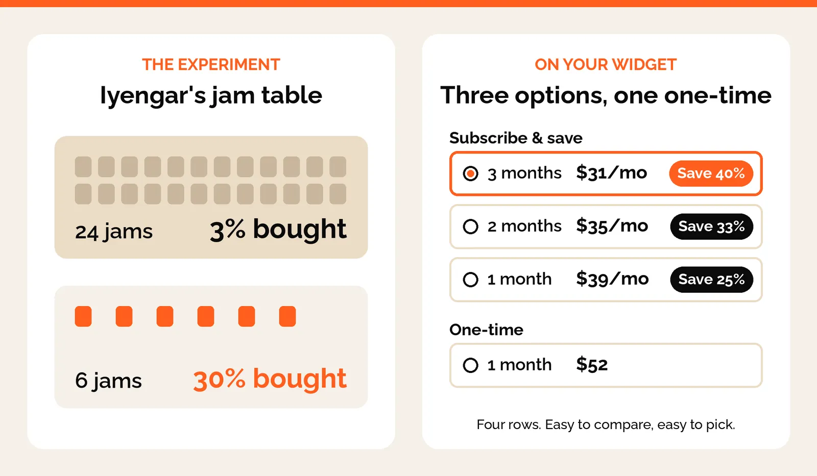
Too many choices make people freeze. Sheena Iyengar set up a jam tasting table in a grocery store. With 24 jams on it, 3% of people bought. With 6 jams, 30% bought.
More options feel generous, but people freeze and walk away. Keep it to three subscription options and one one-time, at most. Which three is an offer question, and subscription frequency covers how to pick them from how fast the product gets used.
Numbers can be too many choices too
One brand's widget showed 34%, 36%, 48% and 49% off, because two prices were crossed out on every line. The MRP and the one-time price. Two reference prices give you discount percentages nobody can hold in their head.
We took the MRP out. Now every line reads 25% or 40%. Easy to compare, easy to pick.
So one reference price, and make it the one-time. If a brand has to show MRP struck, it can go on the product page hero. It doesn't belong in the widget. Same with a volume discount. Give it its own chip, like "+10% for 2" beside a fixed "40% off". Then nobody has to do the maths.
The default: pre-select subscription and show the terms
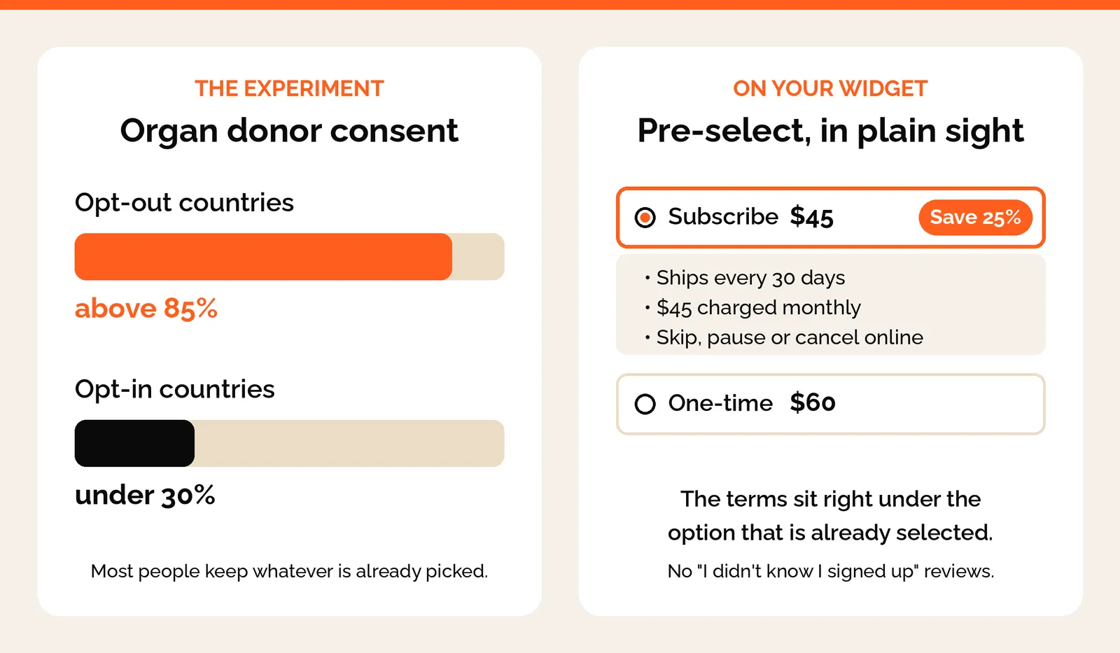
The default option wins. In countries where you're an organ donor unless you opt out, over 85% of people are signed up. Where you have to opt in, it's under 30%.
Most people go with whatever is already picked. So pre-select subscription. Create pre-selects its 3-month plan. IM8 made quarterly its default, and its Jan 2026 cohort reached $587 by order 4. That's one brand and one cohort. And it's the brand where 79% of new customers subscribe on the first order.
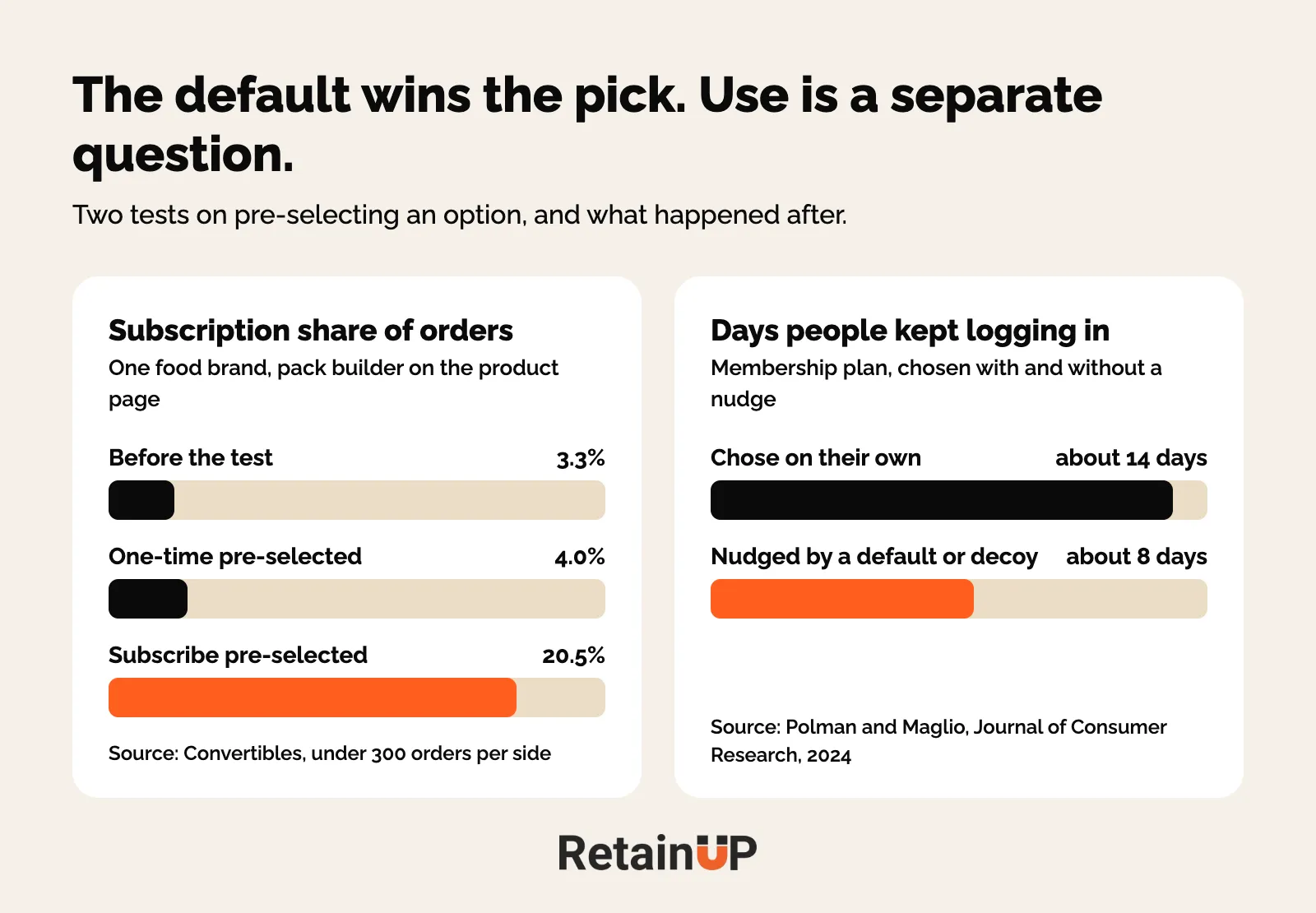
The same Convertibles write-up has a cleaner test, where a food brand pre-selected subscribe in its pack builder. Subscription went from 3.3% of orders to 20.5%. With one-time pre-selected, it reached 4.0%. Order value rose 46%. Conversion fell 37%, on under 300 orders a side. So it's a guide, not a benchmark.
A default nobody notices turns into a bad review
One warning. If people don't notice it's selected, you'll see "I didn't know I signed up" in your reviews. Put the delivery frequency and price right next to the selected option, so nobody is surprised.
RevenueCat has a good test for this. Would you be fine if it were used on your grandparent? A monthly price on a plan billed every 3 months fails it.
There's a catch in the research too. Evan Polman and Sam Maglio nudged people into a membership with a default or a decoy. They logged in for about 8 days. People who chose it on their own kept going for about 14. On a consumable, unused product turns into skips and "too much product" cancels. So judge a default by order 3. Day one won't tell you.
A default only holds when the terms are in plain sight. And the same honesty runs through the rest of the journey: the reminder before the charge, the cancel flow, the FAQ. Hide the terms on the widget and you pay for it later in chargebacks.
Put the badge on the tier you want sold
"Most popular" outranks "best value". Because one is social proof and the other is a claim. And put it on the tier you pre-select. Splitting the two badges across tiers points a recommendation at the option you're moving people away from.
The anchor: biggest pack first, then the price per day
The first number someone sees changes how they judge every number after it.
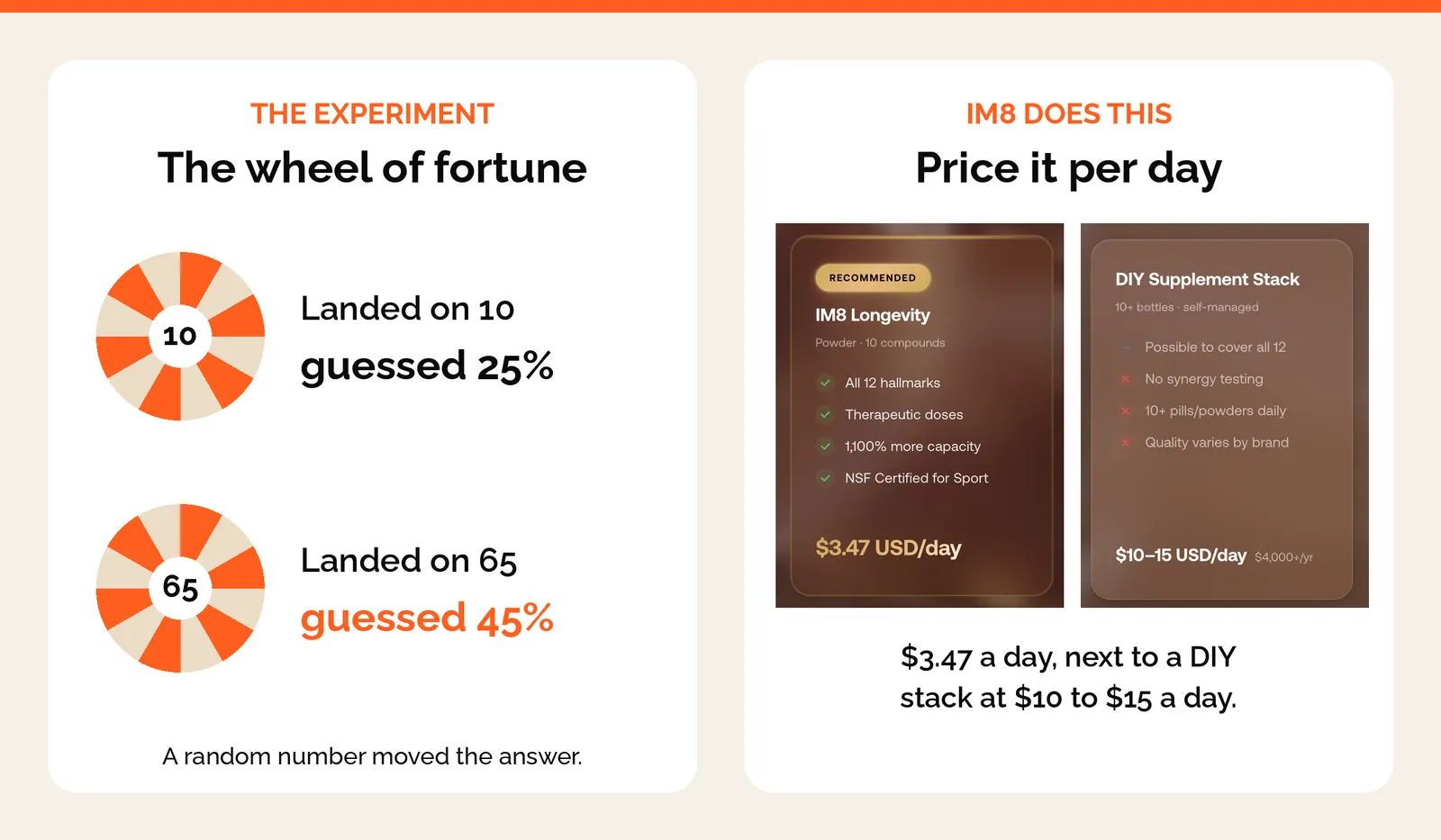
In one study by Tversky and Kahneman, people spun a wheel that landed on 10 or 65, then guessed how many African countries are in the UN. The 10 group guessed 25%. The 65 group guessed 45%. A random number moved their answer.
So show the biggest pack first, and the smaller ones feel easy after it. Reading down becomes a step down in price, and the first thing seen is the thing you want sold.
Break the price down to a day
$90 a month looks expensive. $3 a day doesn't.
IM8 charges about $90 a month but doesn't lead with it. It says $3 a day. Then it anchors it. $4.99 for your morning coffee. $14 to eat out once. By the time you see the price, you're comparing it to lunch. Same price. And IM8 runs it everywhere: product page, onboarding emails, cancel flow.
Most brands discount first. Reframe first. Then decide if you need a bigger subscription discount.
Strike the single period, never the pack
Anchors can backfire. Watch the crossed-out price. $33 a month against a struck $49 compares like for like. Striking $147 puts a quarter beside a month and makes your own price look inflated.
Cents and round numbers come last
Recharge's blog covers the smaller price tricks. A price just under a round number, like $44.95 for a $45 box. And $18 reads cheaper than $18.00. They're cheap to test. Test them after the five here, because a cent never beat a default.
The frame: say "3 months supply", not "3 months"
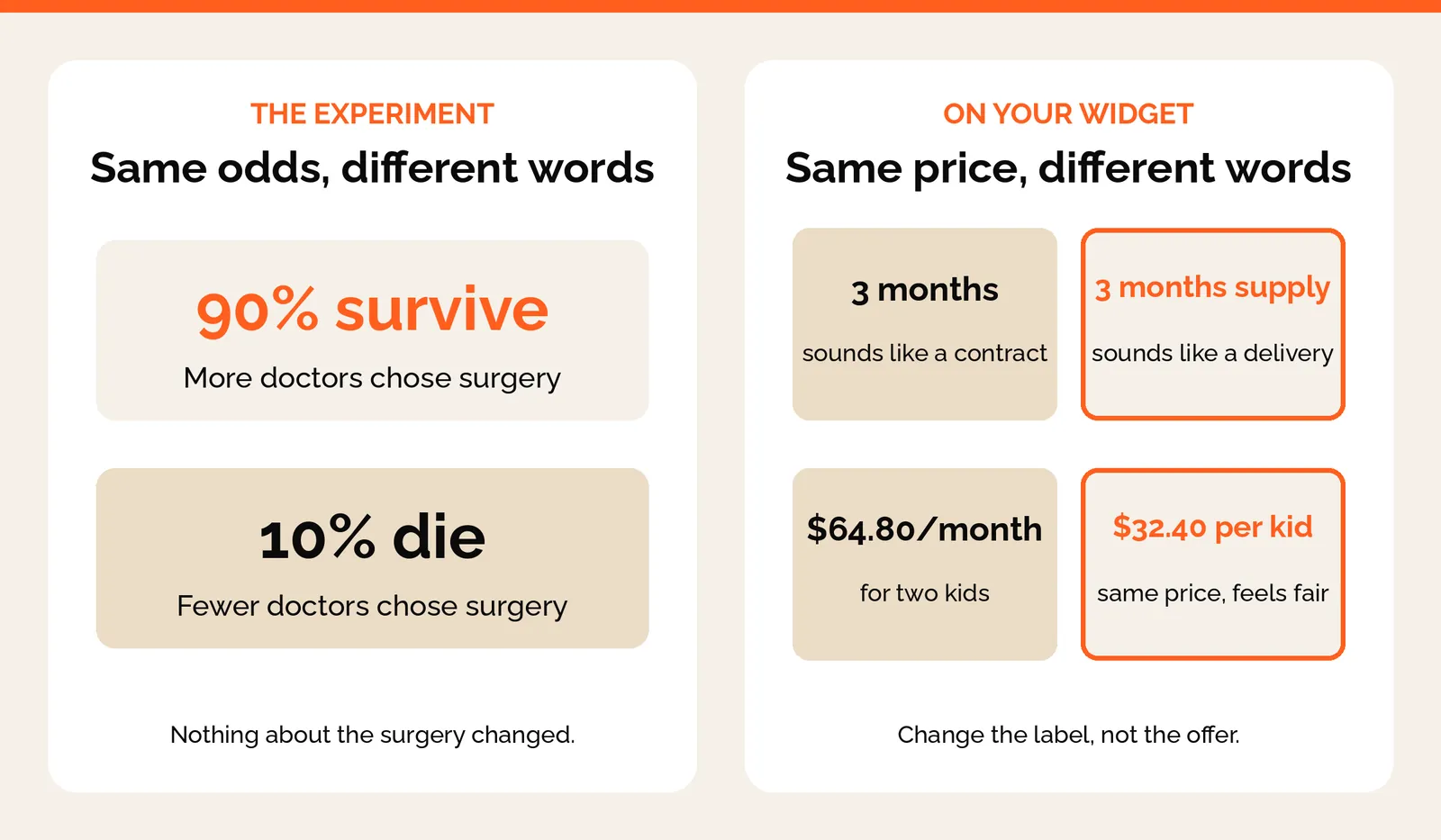
How you frame a number changes the choice. Doctors picked surgery more often when they heard "90% survive" than when they heard "10% die". Same odds, different words.
Your widget has the same problem. "3 months" sounds like a contract you're locked into. "3 months supply" sounds like a box arriving at your door. The commitment is the same. Prepaid and longer plans covers how to price it.
Counts work too. One brand we work with found "4 pouches" read better than a month count.
Price per person, not per basket
Same with families. One brand showed $64.80 a month for two kids, against $36 for one. It looked like the price went up when you added a second kid. Same money. Showing $32.40 per kid made it feel fair. And the bundle discount was finally visible.
So if the widget sells a family or a household, price it per person.
Ownership: give subscribers something to hold
People value what they already hold more than what they could get. Richard Thaler called it the endowment effect.
Put points in a customer's account and they start to treat them as theirs. Losing them feels worse than never having had them. This is why points that expire on Dec 31 hurt. Nobody tracks them. On Jan 1 they're gone, and it feels like a loss.
So give subscribers something to hold. A gift already sitting in their account for the next order. Milestone credit they earn by staying. A cancel screen that shows what they keep if they stay. What those gifts should be is in subscription perks.
The five effects on one widget
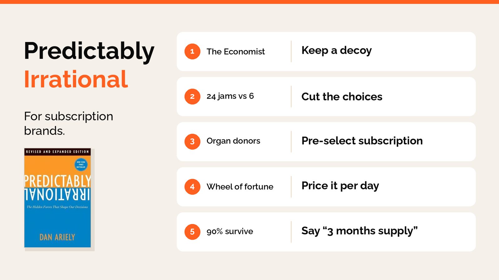
| Effect | The study | What to change on the widget |
|---|---|---|
| Decoy | The Economist: 84% to 32% once print only went | Keep one-time, smallest row, with its shipping and the same unit |
| Too many choices | Jams: 30% bought from 6, 3% from 24 | Three subscription options and one one-time, one reference price |
| Default | Organ donors: over 85% opt-out, under 30% opt-in | Pre-select subscription, terms next to it, badge on the same tier |
| Anchor | Wheel of fortune: 10 led to 25%, 65 led to 45% | Biggest pack first, price per day, strike the single period |
| Frame | Surgery: "90% survive" against "10% die" | "3 months supply", price per person |
None of this needs a redesign. Most of it is changing a label, removing a price, or choosing which option is selected first. The layout itself, row by row, is in the subscription widget guide.
Every widget runs these five. Most of them were set by whoever built the page, on the day they built it.
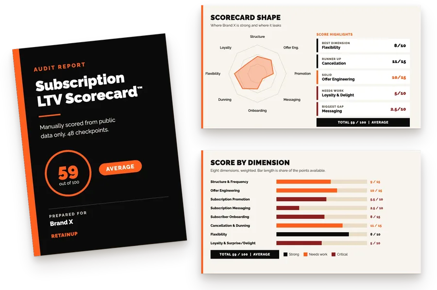
If you want these built for you, the Subscription LTV Maximizer™ sets up the offer, the widget, the cancel flow, the portal, payment recovery and pause and skip in Recharge, Skio, Stay AI or Loop, plus email and SMS, live in 30 days for $5,000. Or start with the free Subscription LTV Scorecard, which checks your widget against 48 checkpoints and sends back the top 3 leaks in 24 hours.
FAQ
Should I remove the one-time purchase option from my subscription widget?
No, keep one-time on the widget, because it makes subscription look like the obvious deal. Give it the smallest row and no options. One brand wanted to drop the $6 shipping on one-time and kept it. With shipping, one-time is $55 against $45 a month on subscription, and people notice that gap. At $49 against $45, why commit?
How many subscription options should a product page widget have?
Three subscription options and one one-time, at most. More options feel generous, but people freeze and walk away. In Sheena Iyengar's test, 3% bought from a table of 24 jams and 30% bought when there were 6. Numbers do this too, so use one reference price and keep the discounts easy to compare, like 25% or 40% off.
Should subscription be pre-selected on the product page?
Yes, pre-select subscription, because most people go with whatever is already picked. Create pre-selects its 3-month plan. IM8 made quarterly its default. But put the delivery frequency and price right next to the selected option. If people don't notice it's selected, you'll see "I didn't know I signed up" in your reviews.
What are best practices for family subscription pricing?
Price a family subscription per person, not per basket. One brand showed $64.80 a month for two kids against $36 for one, and it looked like the price went up when a second kid was added. Showing $32.40 per kid made the same money feel fair and made the bundle discount visible. Put that unit on every row, one-time included, so the buyer can compare.
Should I show the compare-at price on a subscription widget?
Show one reference price, and make it the one-time price. MRP plus one-time gives two crossed-out numbers and discounts nobody can hold, like 34%, 36%, 48% and 49% on one brand's widget. And strike the single period, never the pack: $33 a month against a struck $49 compares like for like, while a struck $147 makes your price look inflated.
One email a week on subscription retention: the numbers, the strategy, and what to fix first.

Rahi Jain
Rahi Jain is a subscription LTV specialist who helps $1M to $10M DTC brands reduce subscription churn and maximize LTV on Recharge, Skio, Stay AI and Loop.
More about Rahi