Key takeaways
- A subscription cohort chart needs three reads: horizontal for where the experience breaks, vertical for which acquisition cohort was worth it, and diagonal for seasonality.
- Month 2 and month 3 are the two biggest churn windows in a subscription cohort, and RetainUP targets 70% retention at month 3.
- Recharge puts the industry benchmark for monthly subscription churn at 5% to 8%.
Most subscription brands have a cohort chart.
In Triple Whale, in their subscription platforms Recharge/Skio/Stay AI and even in Shopify.
Most open it once, get confused, and never go back.
The chart is not complicated.
It requires three separate reads.
Each one tells you something different.
Horizontal: What one cohort does over time
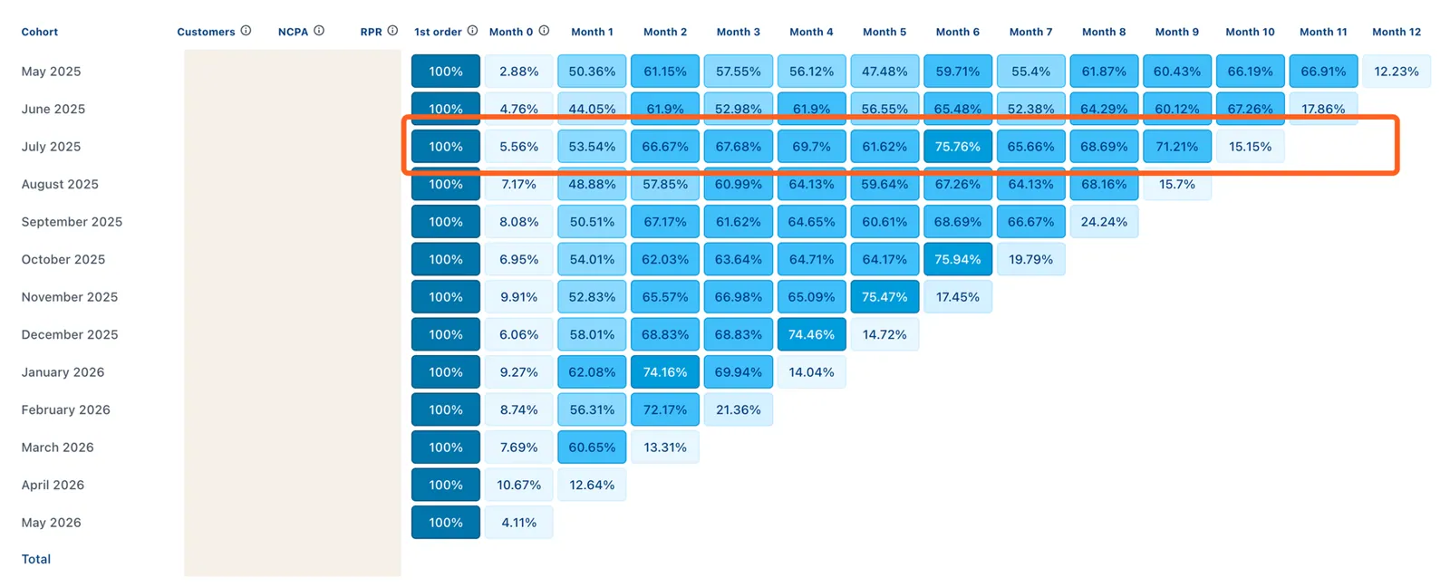
Pick any row. That is all customers who first bought in a given month.
Read left to right.
Month 1 is always 100%. Their first order, the baseline.
Watch month 2. That is the biggest churn window.
Most brands lose 30-40% of a cohort here. If month 2 drops to 70%, that is the leak.
The experience between delivery 1 and delivery 2.
Watch month 3. That is the second biggest churn window.
Most brands again lose 30-40% of a cohort here.
If month 3 drops to 50%, you already lost half of your subscribers.
We target month 3 retention at 70% for brands we work with.
Most brands see a 15-20% drop in the first 2 months.
Then 5-10% every month after.
Industry benchmark as per Recharge is 5-8% monthly churn.
Vertical: Which acquisition month performed best
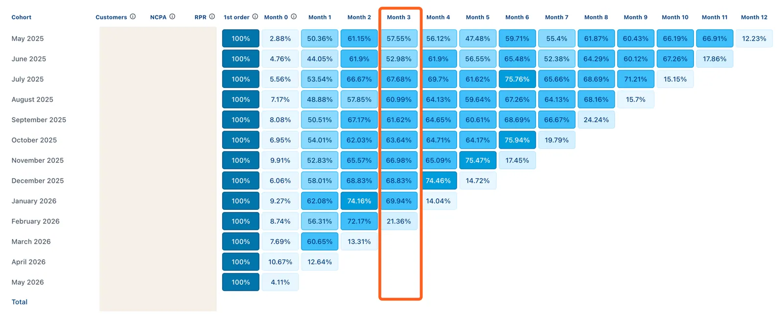
Pick any column. Month 2, for example.
Read top to bottom.
Each row is a different acquisition cohort. January, February, March.
You are comparing the same stage across different groups.
If one month looks better than the others, ask what was different.
Different offer, different campaign, different product leading the sale.
If one month looks worse, same question in reverse.
Who did that campaign bring in, and why did they leave faster?
Diagonal: What the calendar is doing to your numbers
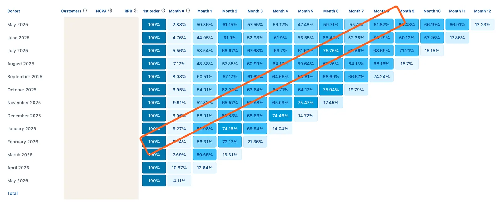
Read across the diagonal.
Same calendar month, different cohorts at different stages.
This is where seasonality appears.
If every cohort spikes in November regardless of when they were acquired, that is not retention.
That is Black Friday pulling purchases forward.
If every cohort dips in July, you have a summer behaviour pattern, not a product problem.
The diagonal separates what your brand does from what the calendar does.
In short:
Horizontal tells you where the experience breaks.
Vertical tells you which acquisition cohort was worth it.
Diagonal tells you what the calendar is hiding in your numbers.
Most brands look at the overall retention rate and stop there.
That number averages all three reads.
It buries the answer.
I analyze 10-20 new cohorts a month across different brands.
Book a call and bring a screenshot of your cohort. I will tell you which read reveals your biggest gap.
One email a week on subscription retention: the numbers, the strategy, and what to fix first.

Rahi Jain
Rahi Jain is a subscription LTV specialist who helps DTC brands maximize their LTV from subscriptions.
More about Rahi