Key takeaways
- Keep one-time on the widget, so subscription looks like the obvious deal.
- Cut it to three subscription options and one one-time.
- Pre-select subscription, and put the terms right next to it.
- Show the biggest pack first, and break the price down to a day.
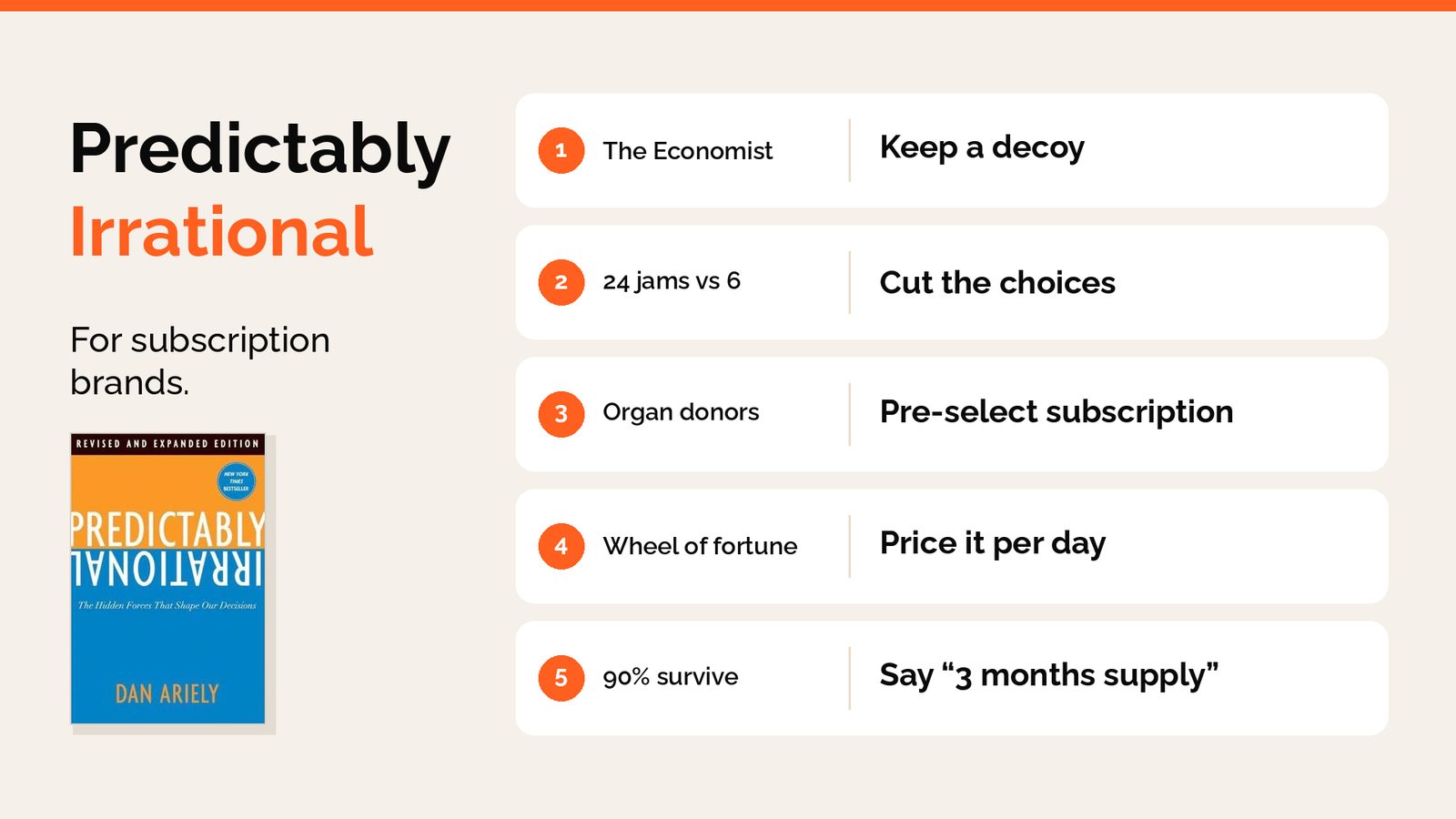
- Say “3 months supply”, not “3 months”.
The Economist once offered three subscriptions.
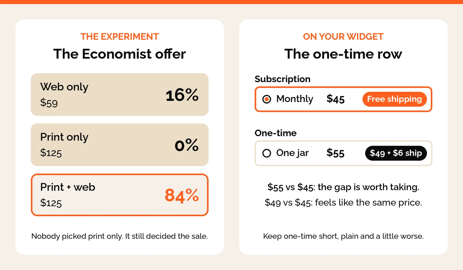
Web only for $59. Print only for $125. Print and web for $125.
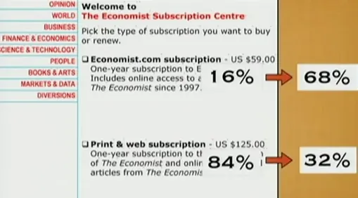
Dan Ariely tested it on 100 students. 84 picked print and web. 16 picked web only. Nobody picked print only.
Then he took away print only, the option nobody wanted. Now 68 picked web only, and just 32 picked print and web.
Print only was never there to sell. It was there to make print and web look like a steal.
Last week we looked at Atomic Habits and why subscribers stay. This week it’s Predictably Irrational, and why people subscribe in the first place.
1. The decoy
Your one-time price isn’t really there to sell. It’s there so the subscription looks like the obvious deal. That’s why it gets the smallest row on the widget and no options.
One brand we work with wanted to drop the $6 shipping on one-time. We kept it. With shipping, one-time is $55 against $45 a month on subscription, and people notice the gap. Without it, it’s $49 against $45. That feels like the same price, so why commit?
2. Too many choices
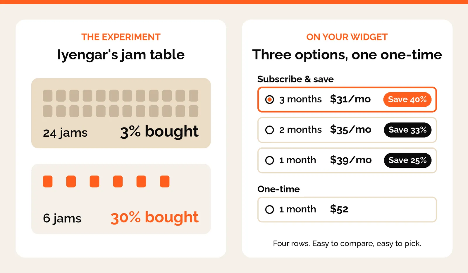
Sheena Iyengar set up a jam tasting table in a grocery store. With 24 jams on it, 3% of people bought. With 6 jams, 30% bought.
More options feel generous, but people freeze and walk away. Keep it to three subscription options and one one-time, at most.
Numbers do this too. One brand’s widget showed 34%, 36%, 48% and 49% off, because two prices were crossed out on every line. We took one out, and now every line reads 25% or 40%. Easy to compare, easy to pick.
3. The default
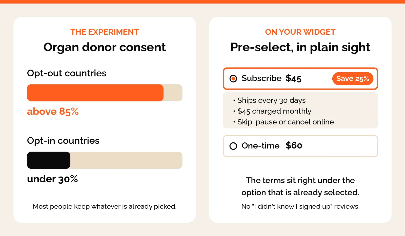
In countries where you’re an organ donor unless you opt out, over 85% of people are signed up. Where you have to opt in, it’s under 30%.
Most people go with whatever is already picked. So pre-select subscription.
One warning. If people don’t notice it’s selected, you’ll see “I didn’t know I signed up” in your reviews. Put the delivery frequency and price right next to the selected option, so nobody is surprised.
4. The anchor
The first number someone sees changes how they judge every number after it.
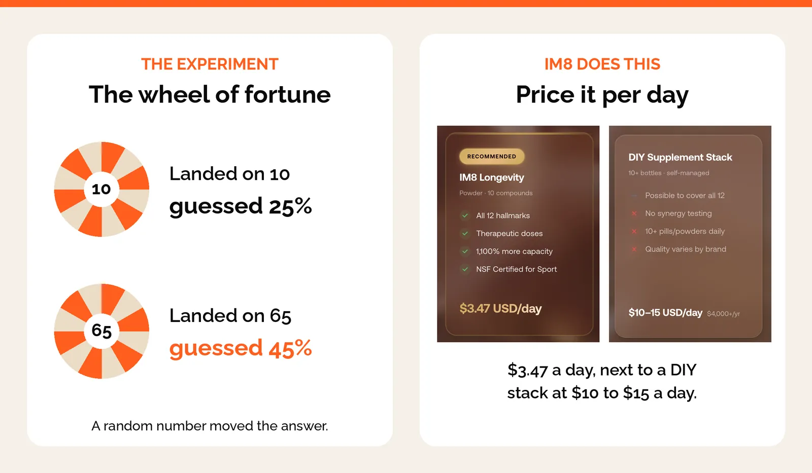
In one study, people spun a wheel that landed on 10 or 65, then guessed how many African countries are in the UN. The 10 group guessed 25%. The 65 group guessed 45%. A random number moved their answer.
So show the biggest pack first, and the smaller ones feel easy. Then break the price down to a day. $90 a month feels like a lot. $3 a day feels like less than a coffee.
5. The frame
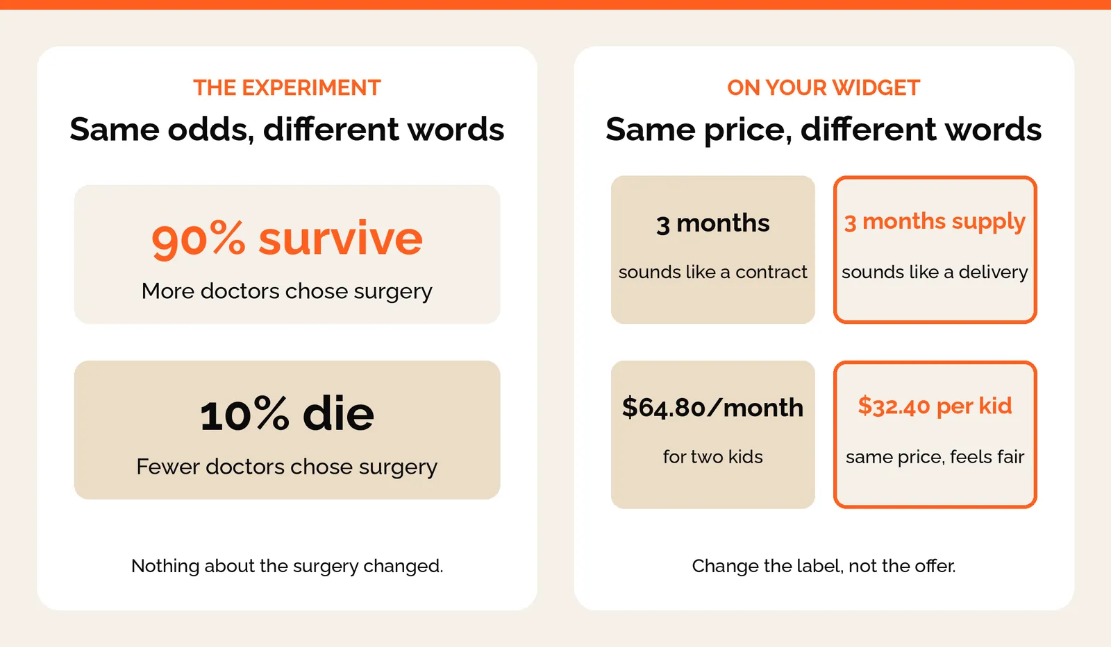
Doctors picked surgery more often when they heard “90% survive” than when they heard “10% die”. Same odds, different words.
Your widget has the same problem. “3 months” sounds like a contract you’re locked into. “3 months supply” sounds like a box arriving at your door.
Same with families. One brand showed $64.80 a month for two kids, and it looked expensive. Showing $32.40 per kid made the same price feel fair.
None of this needs a redesign. Most of it is changing a label, removing a price, or choosing which option is selected first.
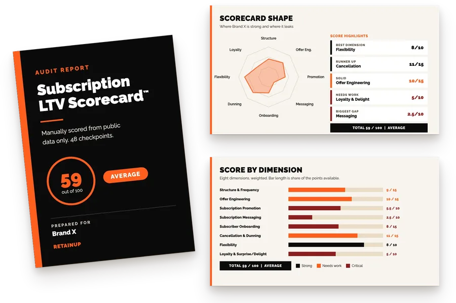
Want to know which of these your widget gets wrong? Request your free Subscription LTV Scorecard
Want more like this? Sign up for the newsletter
One email a week on subscription retention: the numbers, the strategy, and what to fix first.

Rahi Jain
Rahi Jain is a subscription LTV specialist who helps DTC brands maximize their LTV from subscriptions.
More about Rahi