
In the bustling world of email marketing, where the difference between a sale and a missed opportunity can hinge on a single click, the power of understanding your audience’s interactions is unparalleled.
Did you know that emails fine-tuned through segmentation and targeted content strategies can increase engagement, catapulting revenues by up to a staggering 760%? This isn’t just about sending emails; it’s about sending the right email to the right person at the right time.
Enter the game-changing technology of email click heatmaps, a revolutionary tool that peels back the layers of your email campaigns to reveal the hotspots of customer engagement.
Available on platforms like Klaviyo, these heatmaps don’t just track clicks; they unlock a treasure trove of insights, showing you exactly which parts of your email are drawing eyes and fingers, and precisely guiding your next move.
In this article, we will cover:
- What are Heatmaps?
- Benefits of Heatmaps
- Metrics that Come Under Heatmaps in Klaviyo
- Navigating klaviyo’s Email Click Heatmap Interface
- The Future of Email Marketing: Where AI and Click Heatmaps Converge
What are Heatmaps?
Heatmaps serve as a visual representation of data, highlighting areas of high and low activity within your email.
They use colors to indicate where users have clicked within an email, transforming raw data into a visual feast that reveals the users’ behavior patterns at a glance.
Essentially, heatmaps answer the “where” and “how often” of user clicks, offering a bird’s eye view of engagement hotspots.
Benefits of Heatmaps
The strategic application of heatmaps in email marketing offers a multitude of benefits:
- Enhanced Content Optimization– By identifying which parts of an email attract the most clicks, marketers can fine-tune content placement and design for maximum engagement.
- Improved Click-Through Rates (CTR)– Understanding what resonates with your audience allows for optimizing calls to action and links, potentially boosting CTR.
- User Experience Insights– Heatmaps can reveal how users interact with your email content, offering clues on how to streamline their experience.
- Segmentation Strategy Refinement– With detailed insights into which segments are engaging and how marketers can tailor their strategies more effectively to different audience groups.
Metrics that Come Under Heatmaps in Klaviyo
Klaviyo’s heatmap tool goes beyond basic click tracking, offering a suite of metrics that provide deep insights into user engagement:
- Click Density– This metric shows the concentration of clicks across different areas of your email, highlighting which sections capture the most attention.
- Click Distribution– Understanding how clicks are distributed throughout your email can help in evaluating the effectiveness of content layout and positioning.
- Engagement Over Time– Klaviyo can track how engagement changes over the lifespan of an email campaign, offering insights into when users are most active.
- Device Breakdown– Seeing how users on different devices interact with your email can inform mobile versus desktop optimization strategies.
- Link Performance– Beyond just which areas are hot, Klaviyo shows how individual links perform, allowing for a granular analysis of content engagement.
Navigating Klaviyo’s Email Click Heatmap Interface
When you log into Klaviyo and check your Email Click Heatmap, it’s like looking at a special map that shows you where people are clicking in your emails.
Think of it as a treasure map where the ‘treasure’ is the spot in your email that people find the most interesting or important.
Here’s how to read this map:
- Colors Show Importance:
- Klaviyo uses different colors to show where people are clicking the most. The warmer the color, like red or orange, the more people are clicking there. It’s a quick way to see which parts of your email grab the most attention.
- Klaviyo uses different colors to show where people are clicking the most. The warmer the color, like red or orange, the more people are clicking there. It’s a quick way to see which parts of your email grab the most attention.
- Hover for More Info:
- Imagine you could hover your mouse over different areas of the map and get more details. Klaviyo’s Email Click Heatmap does just that! Hovering over a spot reveals extra information, like the percentage of people clicking there. It’s like zooming in on the map to see specific details.
- Imagine you could hover your mouse over different areas of the map and get more details. Klaviyo’s Email Click Heatmap does just that! Hovering over a spot reveals extra information, like the percentage of people clicking there. It’s like zooming in on the map to see specific details.
- Desktop vs. Mobile Clicks:
- Not everyone opens emails the same way. Some use a computer (desktop), and others use their phones (mobile). Klaviyo’s map can even show you which parts are more popular for desktop users and which for mobile users. This helps you design your emails to look great and work well on both types of devices.
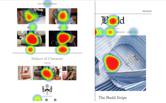
Take a look at the examples below :


How to Use this Information:
- Put Important Buttons Where People Click:
- The map helps you figure out where to put important buttons or links. If a lot of people are clicking in a specific area, it’s a great place for something like a ‘Shop Now’ button. It’s like putting signposts where lots of people walk.
Like in the example shown above the banner is the most clicked area. Therefore it’s best to place important elements like CTA, offer etc.
- The map helps you figure out where to put important buttons or links. If a lot of people are clicking in a specific area, it’s a great place for something like a ‘Shop Now’ button. It’s like putting signposts where lots of people walk.
- Create Content your audience Love:
- By checking the map, you can see which parts of your email are getting the most attention. This helps you know what your audience likes. You can then create more content similar to that, making your emails more interesting and enjoyable.
- By checking the map, you can see which parts of your email are getting the most attention. This helps you know what your audience likes. You can then create more content similar to that, making your emails more interesting and enjoyable.
- Make Emails for Everyone:
- Since people open emails on different devices, the map helps you design emails that look good on both computers and phones. It’s like making sure everyone can read your treasure map, no matter how they open it.
The Future of Email Marketing: Where AI and Click Heatmaps Converge
The future of email marketing lies in the intersection of AI and tools like click heatmaps.
AI can analyze the vast amounts of data generated by heatmaps to predict user behavior, automate content personalization, and even tailor email send times to when users are most likely to engage.
This convergence can lead to hyper-personalized, highly effective email campaigns responsive to the ever-changing patterns of user engagement.
Conclusion
Email click heatmaps are changing the game for how we send emails, turning guesses into smart choices.
With tools like Klaviyo, we can see exactly what catches our audience’s eye and use that info to make our emails better and more interesting.
It’s like having a map that shows where the treasure is hidden.
And the best part? As technology gets smarter, especially with AI, our emails will only get better at hitting the mark, making sure every click counts.
So, it’s the perfect time to start using heatmaps and get ahead in the email game.