
Key takeaways
- A customer worth $81 in month zero had spent $128 by month 12, a 50% bump on the first order.
- In one cohort of 1,034 customers, 42 bought again in month zero and 72 in month one, so most repeat orders land after about 30 days.
- Shopify’s cohort report needs about six months of data before it says much, so read it as a quarterly view.
The cohort process I use has lifted customer lifetime value by 10 to 30% for brands I work with. It needs no paid tool, only the reports already inside Shopify.
This post covers five of those reports and what each one tells you. The data comes from a real Shopify store I opened on camera.
Where to find the cohort report
In Shopify, open Reports and choose Customer cohort analysis. A dropdown lets you change the metric. I keep the window on the last 12 months.
GA4 has one too, under Reports, then Explore, in the cohort template. Shopify is easier, so I use it here.

A cohort is a group of customers who bought for the first time in the same month. A segment looks at a group all at once. A cohort adds time, so you watch the same people month after month.
Three ways to read the grid
Rows are acquisition months. Columns are months since the first order, and month zero is the month the customer first bought. I cover the chart itself in how to read a subscription cohort chart.
Across
Read a row left to right. You see one group’s buying pattern, month by month.
Down
Read a column top to bottom. You compare acquisition months and see which one brought the best customers.
Diagonal
Read the diagonal to see one calendar month across every cohort. Black Friday and summer show up here.
Report 1: Amount spent per customer
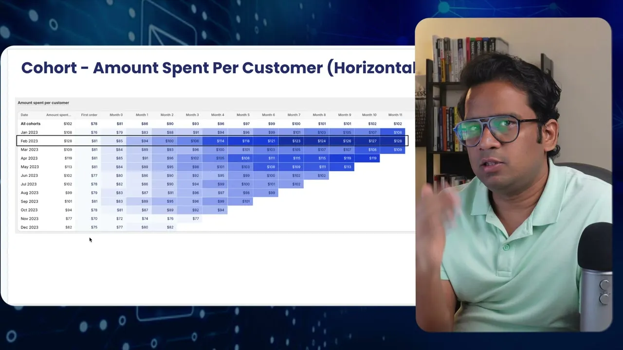
This report shows what a customer is worth over time. In the store I opened, a customer who spent $81 in the first month had spent $128 by month 12. That is a 50% bump on the first order.
Rows add up fast across a year, so check which acquisition month did best before you plan anything. Compare finished rows too. The February group was worth well more than March. Something you did in February worked, so find out what it was.
Report 2: Retention rate
Same grid, shown as a share of the cohort. In month zero, 4% bought again. In month one, 7%. Most people buy after about 30 days, and repeat buying held strong through month six.
So I would plan the post-purchase journey around those six months, then move people into the lapsed audience. In supplements I have seen a spike around 45 days.

Read down a column and patterns appear. A strong second month, a dull third, a spike in the fourth. In this cohort, month five dipped before it spiked.
The diagonal shows seasonality. Second month retention is usually weak for this brand, but Black Friday lifted every cohort at once. A customer acquired in May met that bump at month six.

A summer product works the same way. Acquire someone in November and you can still see a spike in March or April.
Report 3: Average order value
The first order here averaged $82, then the average dipped. Months two to four ran higher, which fits a brand selling yoga and fitness wear for women in summer.
The second order usually beats the first order. The first is a trial. By the second, the customer trusts the brand and buys bigger.
Report 4: Number of customers
This is retention in plain counts. The cohort had 1,034 customers, and that number never changes. In months zero to three, 42, then 72, then 38, then 44 bought again.
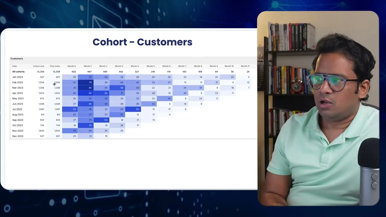
Counts tell you how many people are behind a percentage. That matters when you slice the data later.
Report 5: Net sales
Shopify also lists gross sales, net sales and total sales. Pick one and stay with it. This view puts dollars on the cohort.
The cohort brought in about $80,000 in its first month. Across the next months the same customers added another $50,000, and most of it came inside six months.
I call that strong for a store with no subscription. Subscription and membership brands usually sit at 70 to 80% on retention rate.
Split the report by channel or product
Break the cohort by first purchase channel. Google customers in this store had a lifetime value near $100 to $110. Instagram buyers differ from direct buyers, and direct runs higher because those customers trust the brand.
Another channel ran higher in some months but not steadily, since its volume was low. Referral, affiliate and organic audiences tend to hold on to customers better.
This is where lifetime value gets useful, because each channel gets its own number.
Do the same by product. A fashion store selling sandals and t-shirts can ask what share of sandal buyers come back, and what share of t-shirt buyers do. Run it on your bestseller first.
What the cohort report cannot do
It is slow. You need about six months of data before the grid says much, and a change to your offer means waiting another three to six months.
Change your product range or channels midway and the numbers stop lining up. So I use it for quarterly or yearly calls, not weekly ones.
If you want a second set of eyes on your own cohorts, get a free subscription audit.