Key takeaways
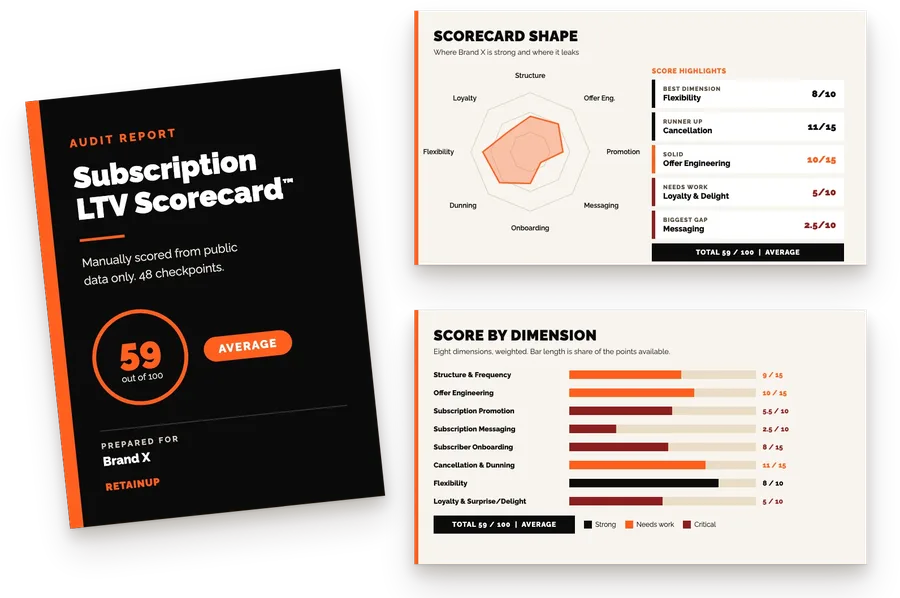
- Create scored 67.5 out of 100 on the Subscription LTV Scorecard™: 38.5 for getting people to subscribe and 29 for keeping them.
- The front half is strong: three frequencies priced per day, autoship as the default, and a second subscription offer in the cart.
- It loses most on cancellation, offer engineering and onboarding. Cancel help is hard to find, the bundles are a maze, and the discount changes by page.
Create sits in the Subscription Scorecard Library next to every other brand scored on the same 48 checkpoints.
Create took the most boring supplement in the gym, creatine. They put it in a gummy, wrapped it in bright colours, and sold it to people who would never take it, especially women.
$150M net revenue run rate. 100,000+ active subscribers. 250 million gummies sold. That is per co-founder Dan McCormick.
But open their help article on how to edit your subscription, and the comments are full of people saying they cannot find a way to cancel.
So I scored their whole subscription program on 48 checkpoints. 67.5 out of 100. They do some things better than most brands we have scored. And one of their scores is a 5.5 out of 10, on the dimension that should be their strongest.
Watch the full Create breakdown
A big thanks to Matthew Holman. The emails, portal and cancel screens below come from The Cancel Page, where he captured Create's full journey.
What is Create?
Create made the first creatine monohydrate gummy, launched in 2022 by husband and wife Dan and Sienna. "Creatine for Everybody."
One ingredient, three formats. Gummies, powder sticks and a creatine plus electrolytes mix, across 8 flavours. So the subscription keeps you on creatine, and the flavours keep it from getting boring. Mars Men sold one product. Create sells one ingredient in many shapes.
Dan has a big belief behind it: "There's about 2 million people in the US that supplement with creatine daily. One of our core beliefs is that number should be 50 to 100 times higher." He calls supplements "a really high consumption or repeat rate consumable product."
- Platform: Shopify, Recharge for subscriptions, Rivo for loyalty, Zendesk for help.
- Scale: $150M net revenue run rate and 100,000+ active subscribers, profitable for 12+ months, per Dan McCormick.
- Funding: a $20M Series B in March 2026, led by Alliance Consumer Growth with Unilever Ventures in the round.
- Retail: Target, GNC, Sprouts, Vitamin Shoppe and Wegmans.
The Create subscription scorecard: 67.5 out of 100
Scored 1 October 2026 and rescored 18 October 2026, from public data only. 8 dimensions, 48 checkpoints, from the product page to the cancel flow.
| Dimension | Score | Out of | Points lost |
|---|---|---|---|
| 1. Structure and frequency | 13.5 | 15 | 1.5 |
| 2. Offer engineering | 9 | 15 | 6 |
| 3. Subscription promotion | 9 | 10 | 1 |
| 4. Subscription messaging | 7 | 10 | 3 |
| Subscription growth | 38.5 | 50 | 11.5 |
| 5. Subscriber onboarding | 9 | 15 | 6 |
| 6. Cancellation and dunning | 8.5 | 15 | 6.5 |
| 7. Flexibility | 6 | 10 | 4 |
| 8. Loyalty and surprise/delight | 5.5 | 10 | 4.5 |
| Subscription retention | 29 | 50 | 21 |
| Total | 67.5 | 100 | 32.5 |
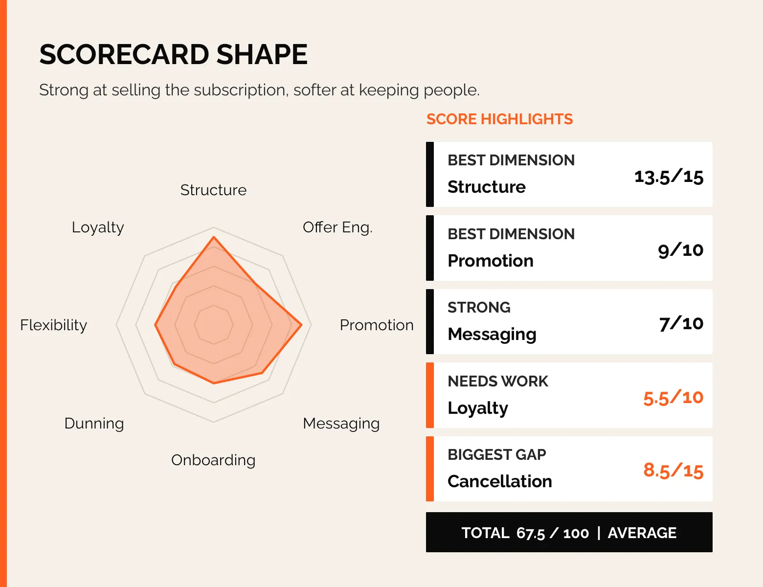
38.5 from getting you to subscribe, 29 from keeping you. Strong at the front, softer at the back.
Three things stood out
First, they sell days, not gummies. Every tier is priced per day, $1.93 down to $1.79, with a Week 1 to Week 4 timeline of what happens in your body.
Second, the best retention work happens in the inbox and the cancel flow, not on the site. The billing reminder lets you skip, delay or swap in one click. The cancel screen opens with a note from the founder. Neither shows up anywhere a shopper can see before buying.
Third, they built a full rewards program and then hid it. 3 points per dollar, milestones, a free ClassPass month. It lives on a page that is not in the menu.
1. Structure and frequency: 13.5 out of 15
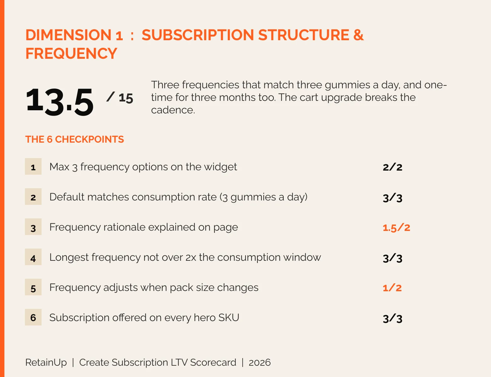
Here I look at how often the product ships and what choices you get. Their frequencies are right. Where they lose is the cart.
They offer three frequencies on the website: one month, two months and three months, and three months is pre-selected. Grüns gives you only one, every four weeks. It is three gummies a day and thirty packs a month, so the supply matches how you take it. And when you switch the size to 3 months, the plan switches to every 3 months. Cool.
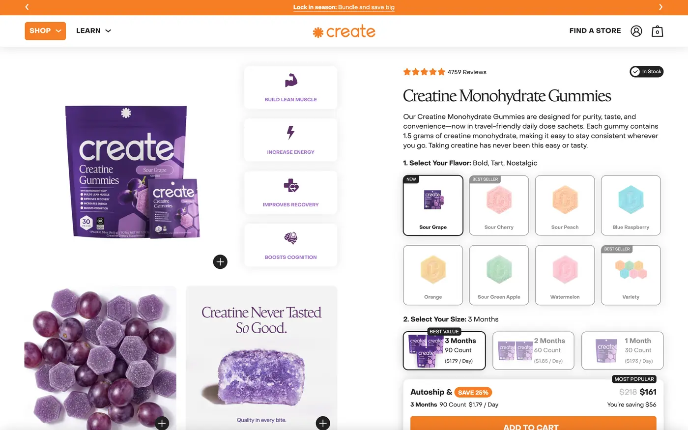
They also offer one-time for three months. So if someone wants to buy three months without subscribing, they can. Most brands do not give a three-month one-time option. Really cool.
But the cart upgrade is not working properly. Add three months one-time, click upgrade to subscription, and it moves you to a one-month frequency with three packs. So you pay $161 today, and then $174 every month, for a three-month supply. Minor. But it is a thing.
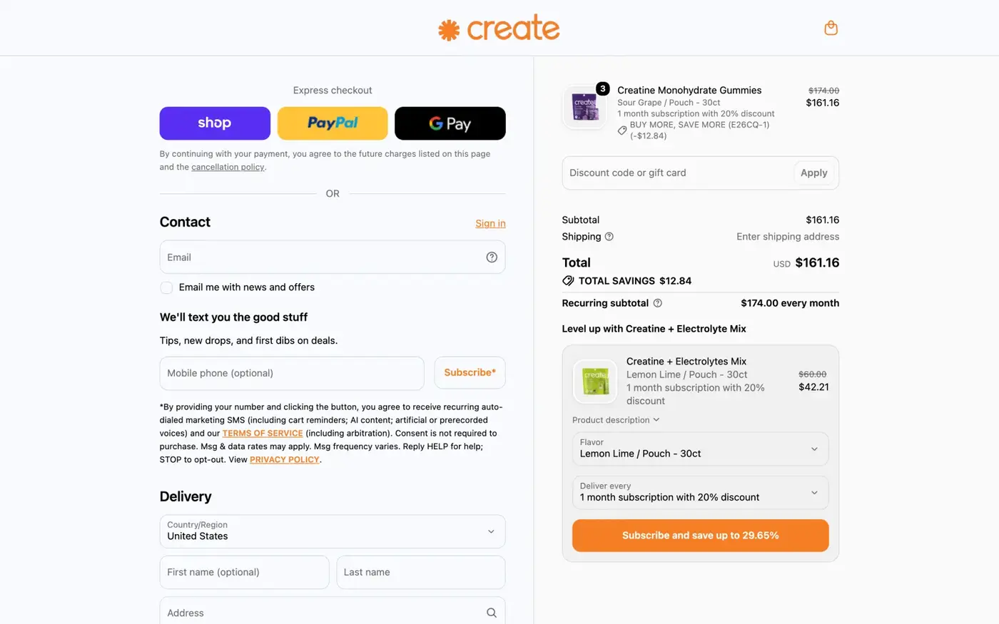
And on the checkout page, the upsell for the Creatine + Electrolytes mix offers subscriptions of 1, 2, 3, 4, 5 or 6 months. That is a little bit wrong.
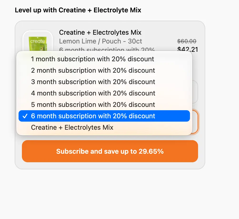
What I would change: keep the upsell frequencies the same as the product page, no six months at checkout. And keep the cadence when someone upgrades in the cart. Three packs should stay every three months.
A cart upgrade that turns a 3-month order into 3 packs every month is easy to miss and costly. The free subscription audit checks your cart and checkout on the same 48 checkpoints and flags it in 24 hours.
2. Offer engineering: 9 out of 15
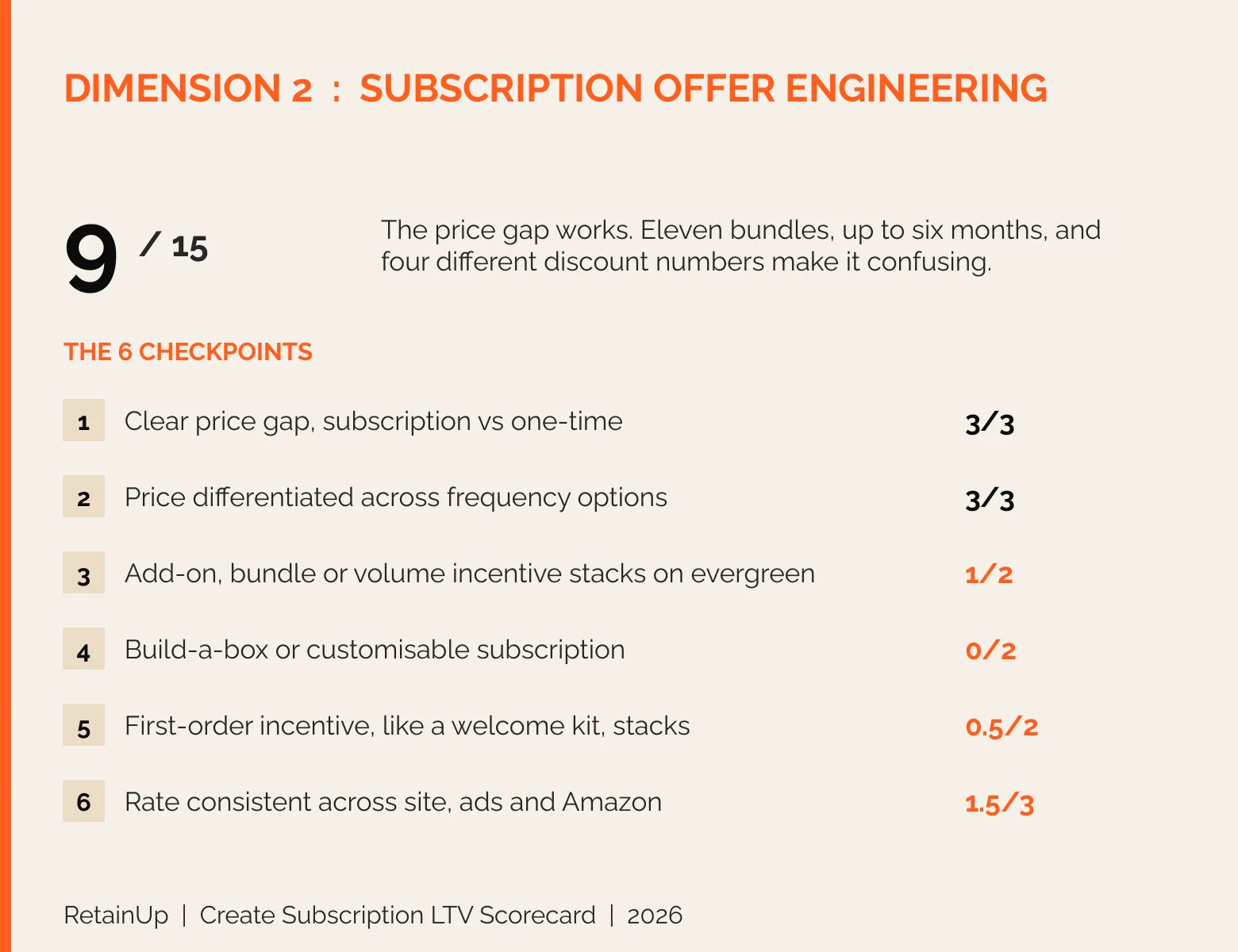
Here I look at how the subscription is priced and structured. The price is right. The bundles are confusing.
The price gap is there, $58 on autoship against $67 one-time, and the price drops with the commitment. Three months is $1.79 a day and one month is $1.93 a day, so the longer plan gets the better price. The add-ons are good.
But build-a-box is not there. On the bundle page there are eleven bundles to choose from. Duos, trios, juice bundles, each on its own plan. Where it could be a plus and minus picker, they give you five or six options. Not great UX. Let people pick their own flavours instead, the way Dr. Squatch builds a box.
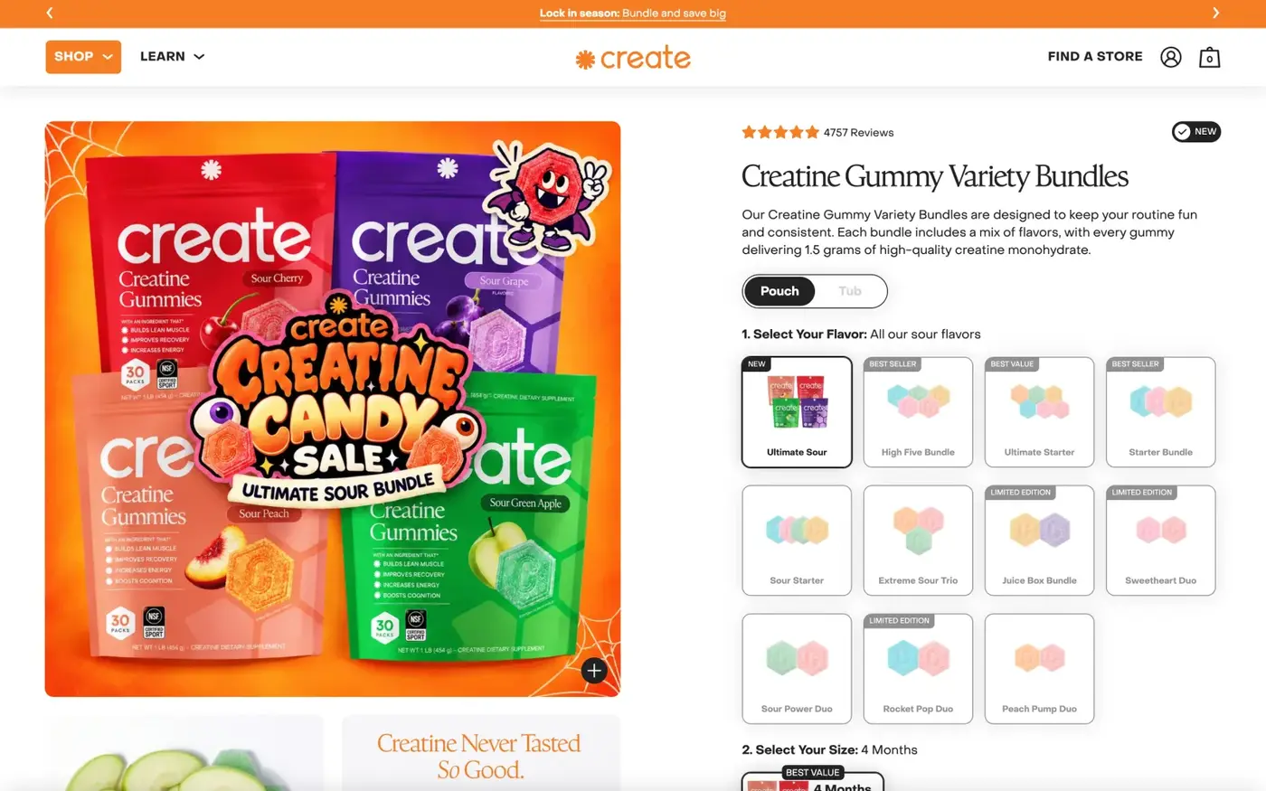
And some bundles run to five and six months. That is loading too much. For most of the brands we have seen, anything over three months starts hurting the subscription, and it needs checking on the cohort.
The welcome kit is weak. Very weak. Free shipping is there and a first-order discount is there, but nothing in the box makes the first order feel special.
And the discount changes depending on where you look. The badge says save 25%. The real gap on the 1-month tier is $58 against $67, about 13%. The cart upgrade says save 16%. A bundle says 29%. Landing page codes run from 25% to 47%, and Amazon sits at 10 to 15%. For a brand this big, that is too many numbers. Pick one.

What I would change: a plus and minus picker in place of fixed bundles. Cap bundles below five months and check those cohorts. Add a welcome kit to the first subscription order. And use one discount number everywhere.
Bundles you can build yourself, a welcome kit and one discount number are what the Subscription LTV Maximizer™ sets up: the offer, the product page widget and the first box, live in 30 days.
3. Subscription promotion: 9 out of 10
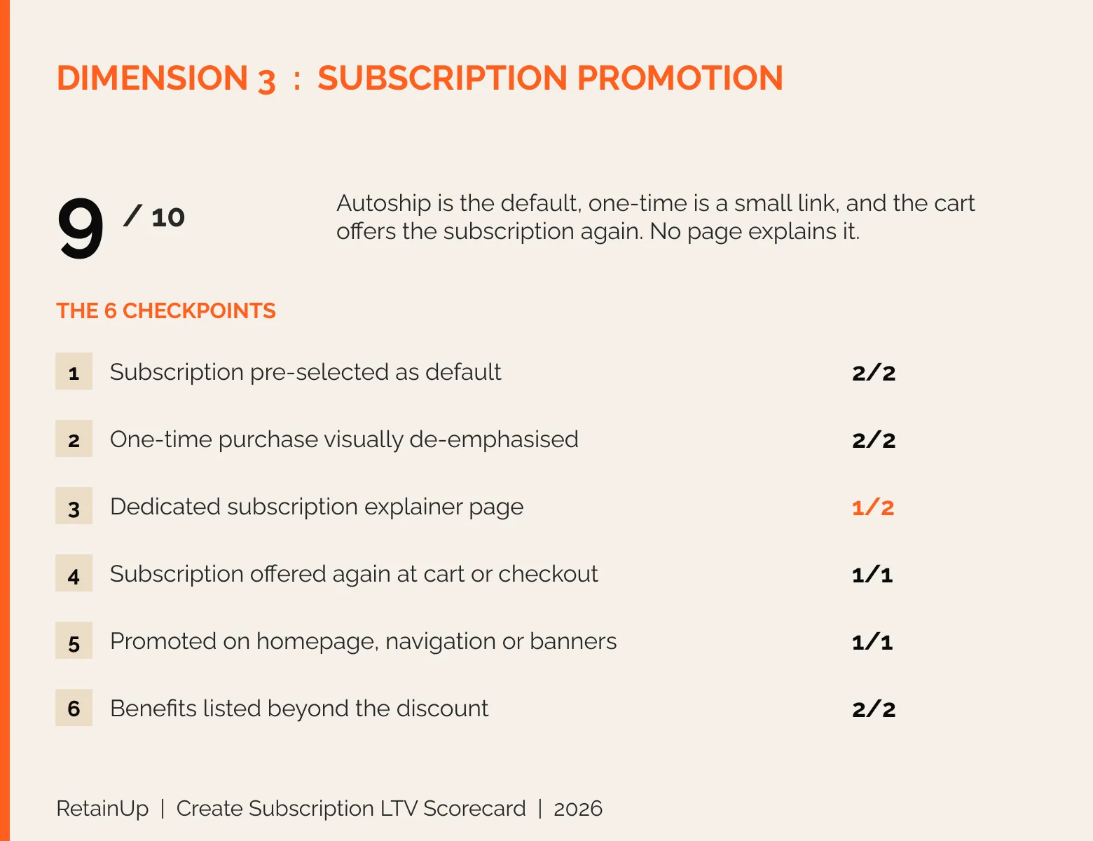
Here I look at how hard the site pushes subscription over a one-time purchase. Autoship is the default, and one-time is a small text link under the main box. Subscription is clearly the main option. The homepage promotes it. So does the navigation.
And if you add a one-time order to your cart, the cart shows why subscribe and save, and offers you an upgrade. Most brands only sell the subscription on the product page, so this is a good one to copy.
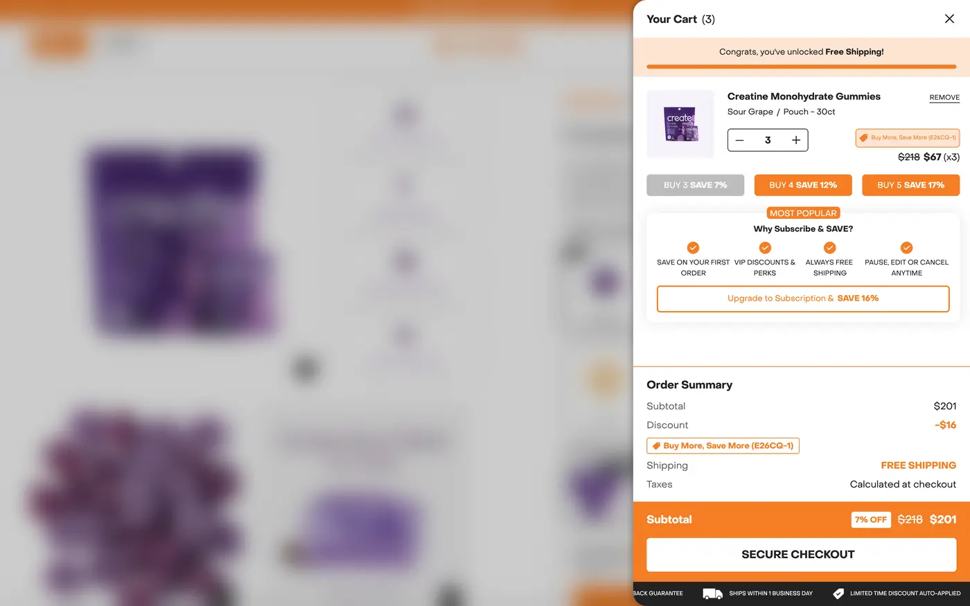
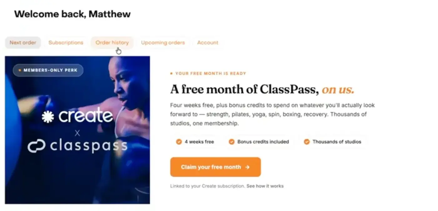
The benefits go past the discount: free first shipping, VIP perks, pause anytime, and a free ClassPass month waiting in the portal.
Where they lose: there is no page that explains how the subscription works. There is Creatine 101 and a Bundle and Save grid, but nothing on the program itself. And they call it Autoship. What do you mean by Autoship? Autoship is a tricky word, unless they have tested it.
What I would change: build one page that explains how the subscription works. Test "Subscribe and Save" against "Autoship", and use one name.
One page that explains how your subscription works is a small build with a big effect. The Subscription LTV Maximizer™ writes and builds it next to the widget.
4. Subscription messaging: 7 out of 10
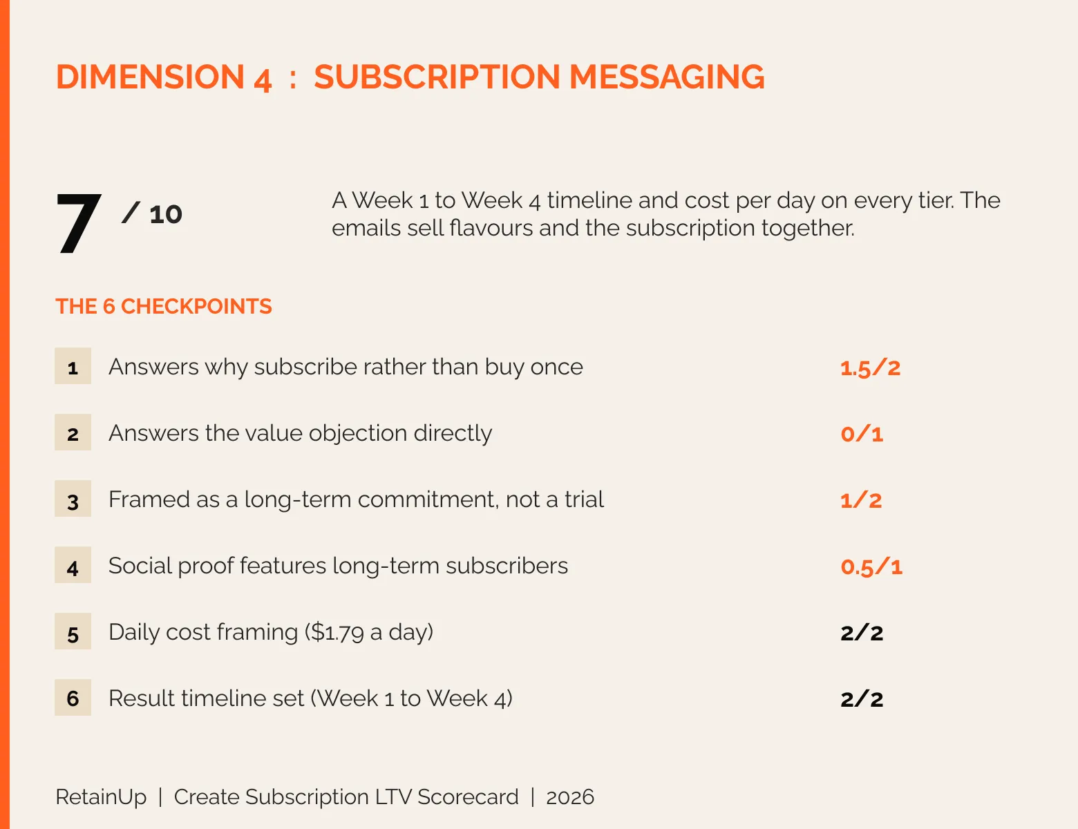
Here I look at what the copy says about why you should subscribe. The product page is fine. The emails are better.
On the product page, they give a Week 1 to Week 4 timeline of what is happening in your body. The timeline angle is good. Cost per day sits on every tier.
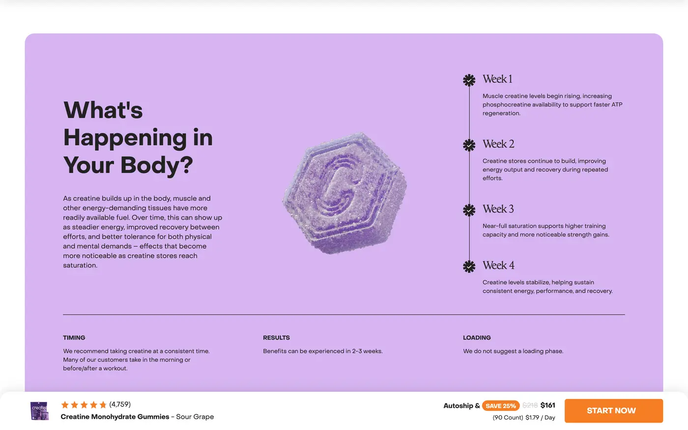
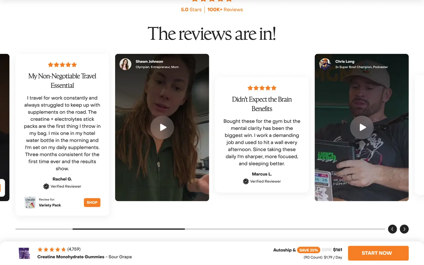
But they argue consistency and saturation without tying it to the subscription. Nothing past week 4. The reviews are fresh, with none from 6 or 12 month customers. And they never answer the obvious question: why a gummy costs about twice their own powder.
You can see the subscription angle in their emails. Most are about the flavours, the flavour of the month, and launches like the lemonade collection. Different from Dr. Squatch, they push the subscription too. Pick your flavours, the benefits, and in some emails the main button is subscribe and save. The best one is the flavour of the month email: "Rotate the flavor, not the routine." Each flavour is a 30-day supply.

The sour grape launch email just goes to add to cart, so it does not speak to new or existing subscribers. Five or six promotional emails, and they are not bad at all.
What I would change: tie the Week 1 to 4 timeline to the subscription and show the long term. Answer why a gummy costs more than powder.
5. Subscriber onboarding: 9 out of 15
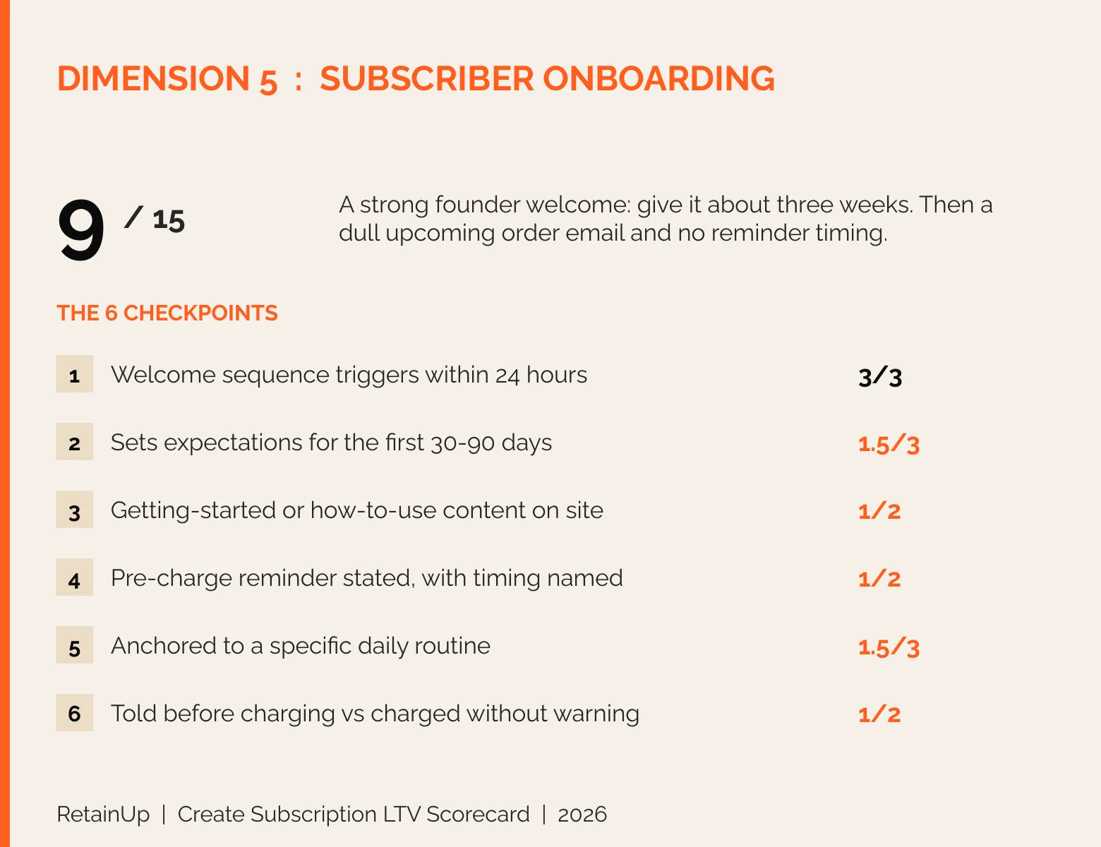
Here I look at what happens in the first 30 to 90 days after someone subscribes. The welcome is great. What comes after it is dull.
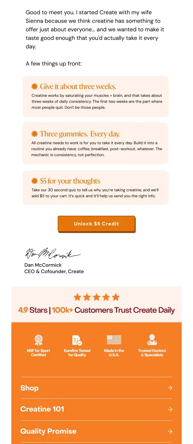
The welcome email is really good. Short, and from the founder. It comes from Dan, and it says give it about three weeks, because the first two weeks are when most people quit. Then three gummies, every day, built into a routine you already have, like coffee, breakfast or post-workout.
And then there is a quiz. Take the quiz and get $5 in your cart. The quiz is really smart, because they learn your preferences early, before you ever think about cancelling. But how will the answers be used? And the $5 can confuse people if it is hard to claim.
Next is the upcoming order email. Your next order is coming up: change your flavours, add more, or move your date. It works. Per a Zaymo case study, Create put skip, delay and swap inside this email, and subscriber churn fell 19%. A customer who delayed an order was 60% less likely to cancel.
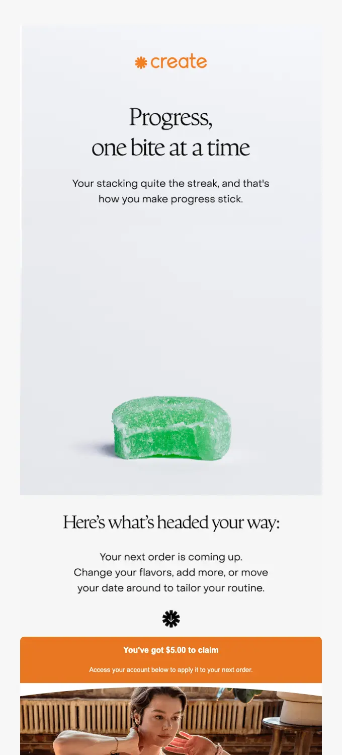
But the email itself is dull. Plain. No cross-sell, no gift, no milestone. And the site promises a reminder without saying how many days before the charge. Only one welcome-type email lands in the first month, so there is no real first 90 days.
What I would change: show what the quiz answers change, and make the $5 easy to use. Put a cross-sell, a gift or a milestone in the upcoming order email. Our guide to subscription onboarding emails lays out the first 90 days.
A strong welcome followed by silence until the billing email is the most common gap we see. The Subscription LTV Maximizer™ builds the first 90 days of email and SMS, with the reminder doing more than billing.
6. Cancellation and dunning: 8.5 out of 15
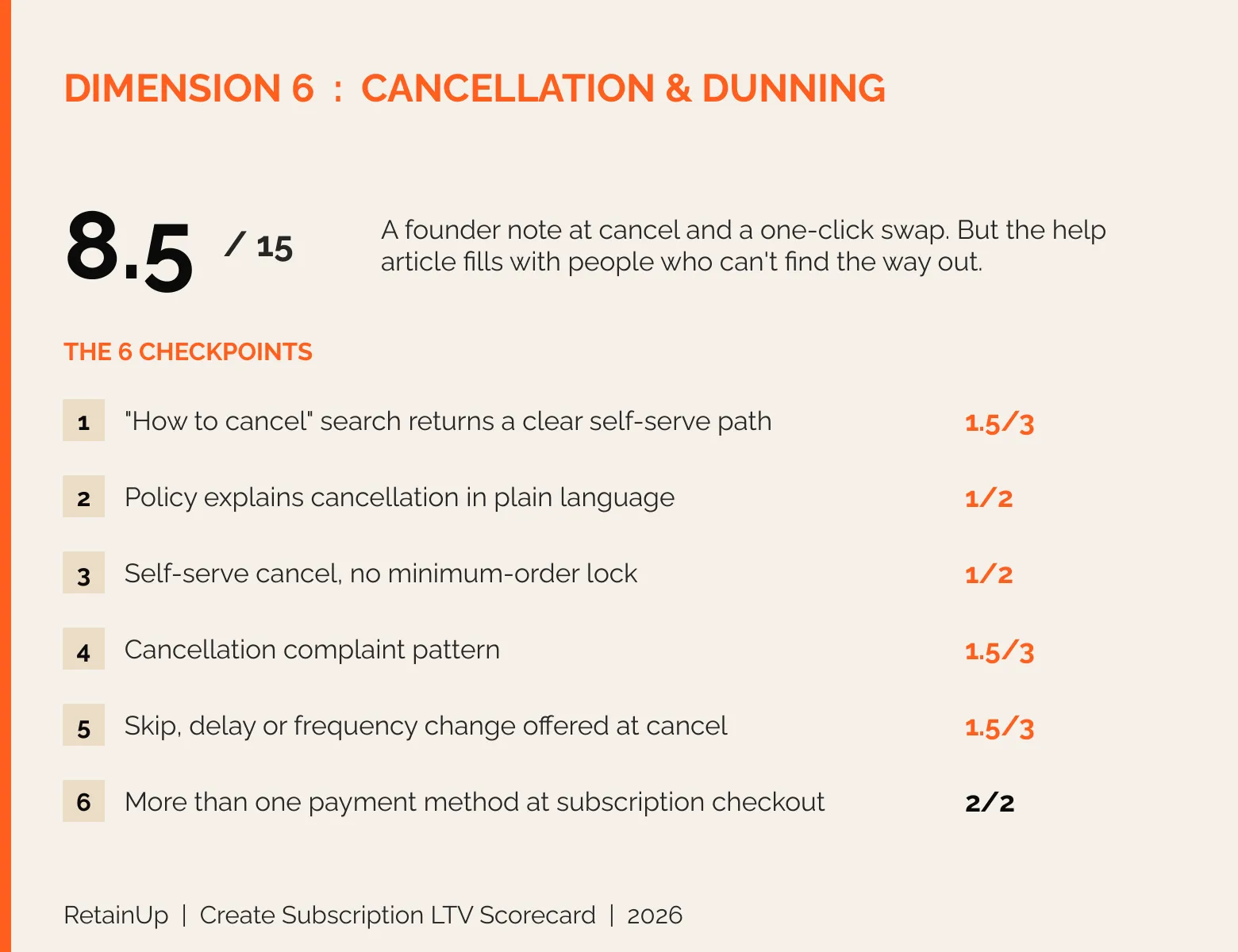
Here I look at how easy it is to leave, and how failed payments get handled. Their biggest gap.
Search "how to cancel Create subscription" and no Create page comes up. The cancel help sits inside an article called "How do I edit my subscription?". It has 13 comments, and almost all of them are people trying to cancel. One says: "Trying to cancel - yet no way to.. Just keeps looping you around." None got a reply.
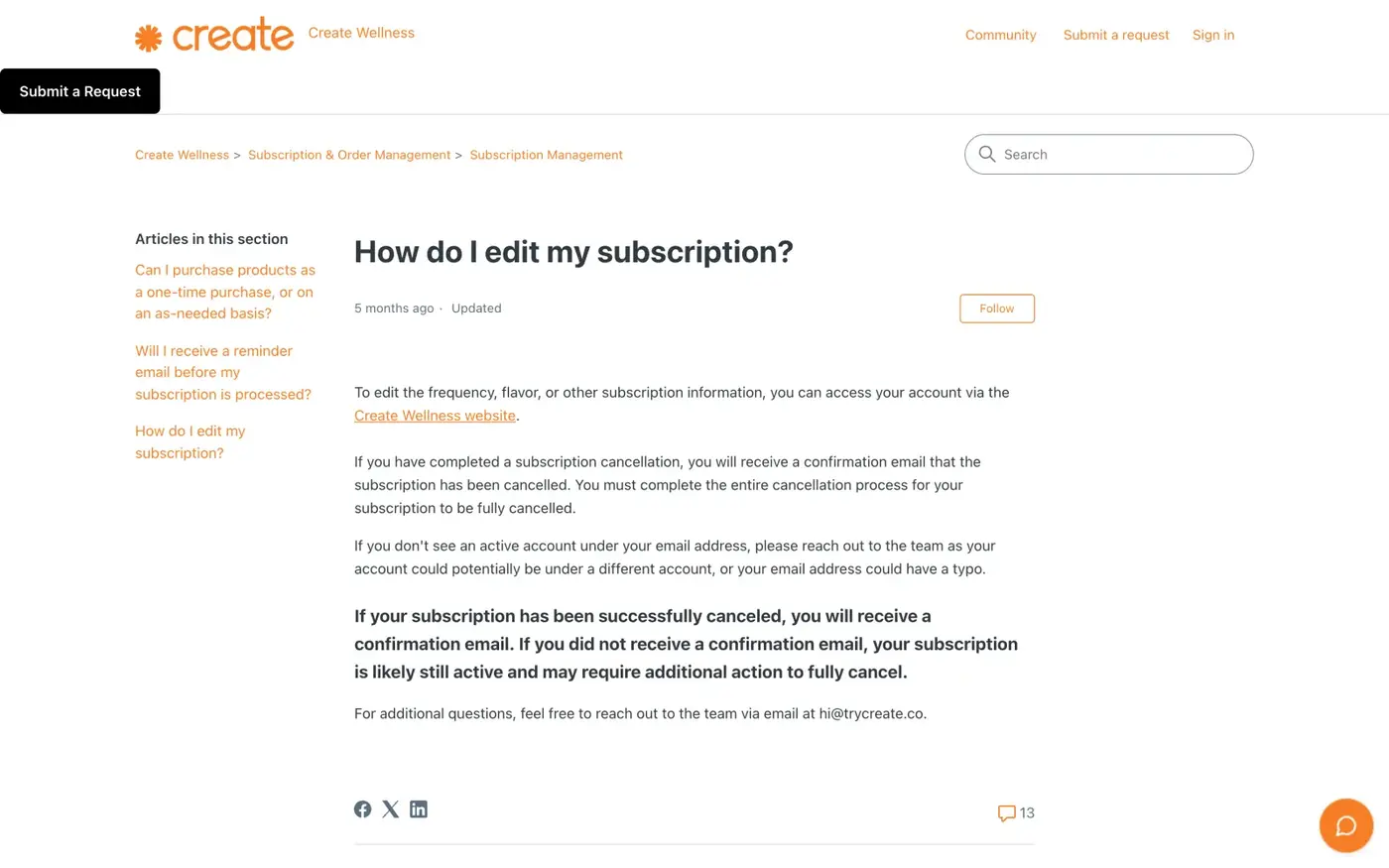
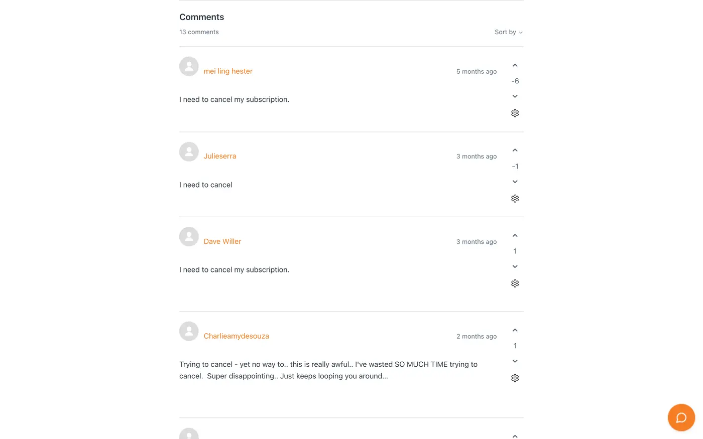
For a $150M brand, the FAQ is underdeveloped. No screenshots, no portal link, nothing that walks you through it. The policy sits in all-caps legal text. And Trustpilot, unclaimed, carries cancellation complaints on a small base of reviews.
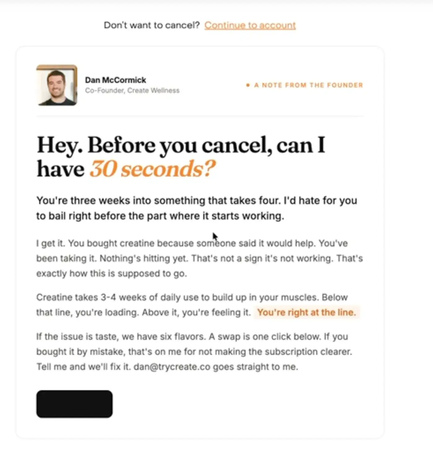
But they do one thing really well. When you start to cancel, the first screen is a note from the founder. "Before you cancel, can I have 30 seconds?" and "You're three weeks into something that takes four." If the issue is taste, a swap is one click away. That is one of the best cancel screens we have seen.
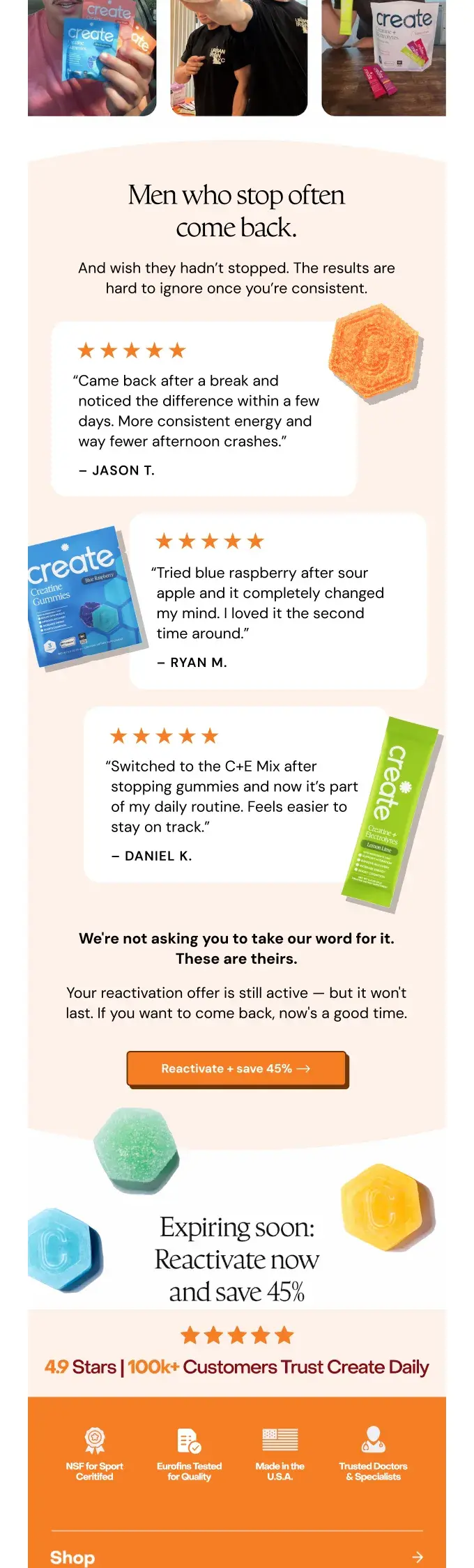
Then the winback emails. Was it the flavour? The format? Something else? Then "It's okay to stop." Then real stories: "They stopped. They started again." The first one is a plain note from Dan with 45% off, bigger than the welcome discount, where most brands go smaller. They also let you reactivate by text, which is cool.
Payments are fine: Shop Pay, PayPal and Google Pay on subscription checkout, and no minimum order lock.
What I would change: build a proper cancel and manage-subscription FAQ, with steps and screenshots, and reply to the comments. The cancel screen is already one of the best. People just need to be able to find it. See how we set up cancel flow routing.
Cancel help people can find, a save path per reason, and winback that reads the exit answer: the Subscription LTV Maximizer™ builds all three in your subscription app and Klaviyo.
7. Flexibility: 6 out of 10
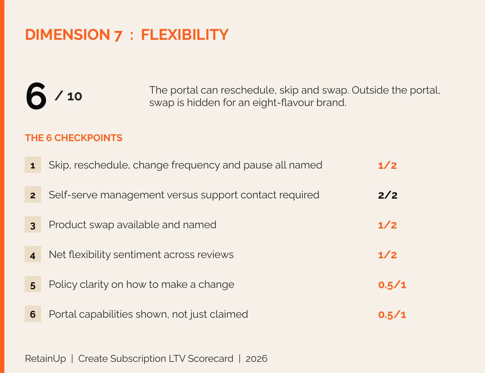
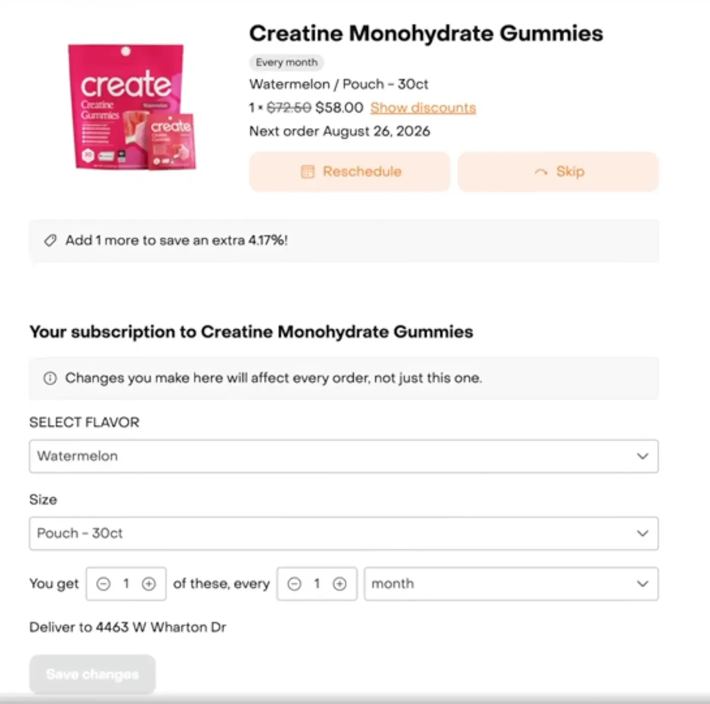
Here I look at whether a subscriber can skip, pause, reschedule, change frequency or swap without contacting anyone. Inside the portal, it is good. Outside, it is thin. Reschedule, skip, change the flavour, change how many you get and how often, all in one place, with a passwordless login.
On the site, pause is named. Reschedule is not. And swap is almost hidden. It shows up on one landing page, on the loyalty page and inside the cancel flow.
For a brand with eight flavours, swap should be the headline. It belongs on the product page, in the FAQ, everywhere. Our flexibility ladder puts swap before pause for exactly this reason.
What I would change: make swap the headline flexibility feature. Eight flavours, swap any month.
If swap exists in your portal but nobody knows, the Subscription LTV Optimizer™ finds it in the monthly check and puts it where subscribers look, on the product page, in the reminder and in the FAQ.
8. Loyalty and surprise/delight: 5.5 out of 10
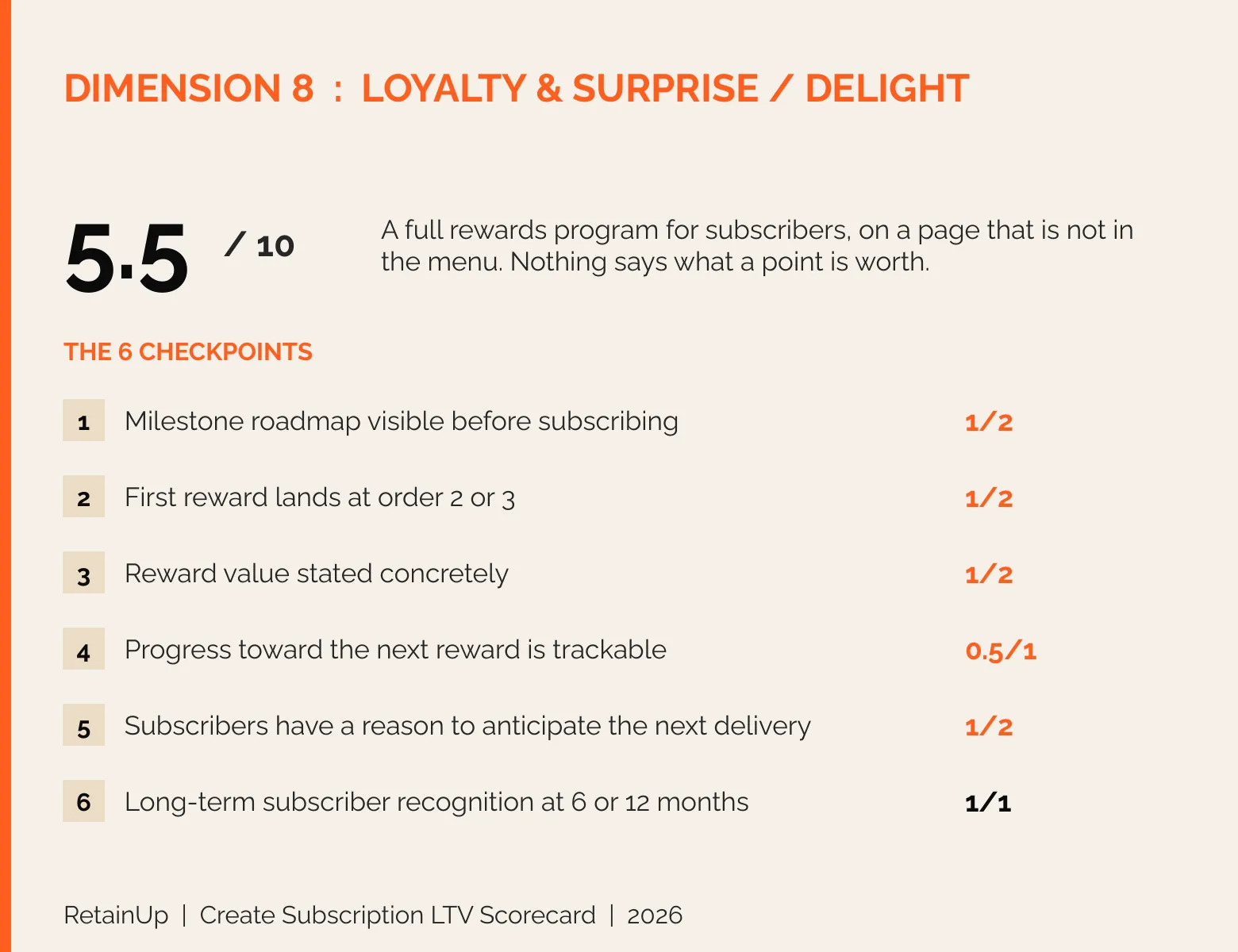
Here I look at what a subscriber gets for staying. This is the 5.5 I teased at the start, because they have actually built a full rewards program.
I am not a big fan of loyalty programs on top of a subscription, but this one is done nicely. Subscribers earn 3 points per dollar, against 2 for one-time buyers. A bonus for every consecutive order, free shipping, early access to new products, and a free swap if they do not like the flavour. There are milestones at the third renewal and at every sixth order.
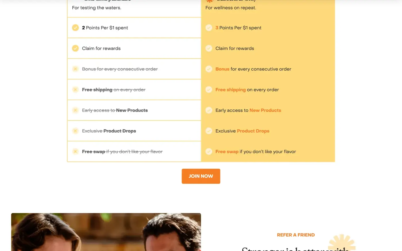
And I really like the ClassPass month on the first screen of the account. It ties a gummy to the gym, where the customer already is.
But nobody sees it. It sits on a page that is not in the menu. The rewards drawer only says sign in. Nothing tells you what a point is worth, and no milestone shows before you subscribe.
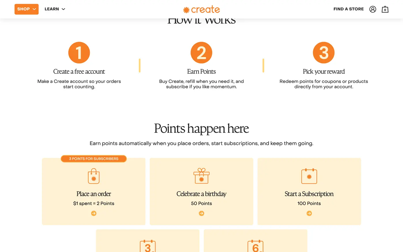
What I would change: show a milestone roadmap before people subscribe, and put the rewards in the menu, the onboarding emails and the portal. Then build one long-term reward, not only a first-order discount. The milestone-based retention guide covers the ladder.
A rewards program nobody sees earns nothing. The Subscription LTV Maximizer™ puts the milestones in front of people before they subscribe and in every renewal email.
How Create compares to Grüns and the other brands
We have scored six big subscription brands on the same 48 checkpoints. Create sits fifth.
| Brand | Product | Score |
|---|---|---|
| Grüns | Daily nutrition gummy | 85.5 |
| Everyday Dose | Mushroom coffee | 81 |
| Dr. Squatch | Natural soap | 73 |
| IM8 | Daily nutrition powder | 72 |
| Create | Creatine gummy | 67.5 |
| Mars Men | Men's testosterone support | 62 |
Create vs Grüns: two gummy brands, 18 points apart
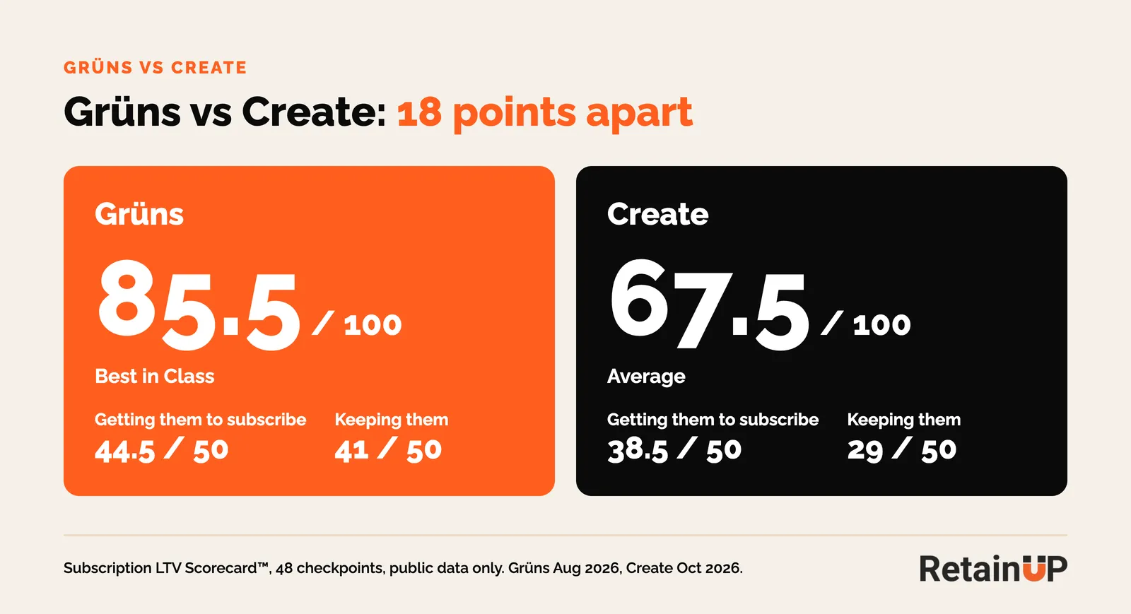
Grüns is the closest match. Both sell a daily gummy habit on subscription. Grüns scored 85.5 and Create 67.5, and the gap is almost all after the first order: 44.5 against 38.5 on getting people to subscribe, 41 against 29 on keeping them.
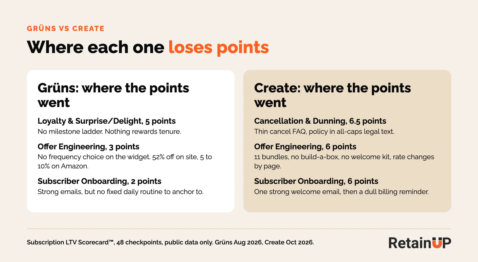
Create wins on frequency choice. Three tiers priced from $1.93 to $1.79 a day, where Grüns sells one cadence and hides the quarterly plan until after checkout. Create also edges Grüns on loyalty by half a point, with a real points program.
Grüns wins everywhere else. It sends an email every day for the first seven days, where Create sends one welcome and then the billing reminder. Search "how to cancel Grüns" and you get Grüns' own click-by-click steps. And yet Create has the better cancel screen. The trouble is getting there.
Full breakdown of the other side: the Grüns subscription strategy.
Growth vs retention
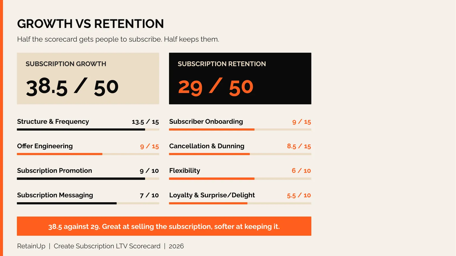
Create won 77% of the growth points and 58% of the retention points. Grüns won 89% and 82%. That shape is common in programs built by a strong acquisition team. Mars Men is the extreme case at 83% against 41%, and Create sits in between. Create built the front half and stopped.
If your program looks more like Create than Grüns, strong at the front and soft at the back, the Subscription LTV Roadmap™ shows which of your cohorts leak and in what order to fix them.
Copy three things, avoid one
- A welcome email from your founder that says how long it takes to work, and when most people quit. Add a quiz, so you know their preferences before they think about leaving.
- A cancel screen that knows where they are in the journey, with a swap one click away.
- Offer the subscription again in the cart, not only on the product page.
And the one thing to avoid: making people hunt for how to cancel. One help article has 13 comments from people trying to cancel, and none of them got a reply.
Want your program scored on the same 48 checkpoints? The free subscription audit runs the same scorecard on your store and ranks your top 3 retention leaks, in 24 hours.
FAQ
How does the Create subscription work?
Create sells its creatine gummies on autoship in 1, 2 or 3-month plans, with 3 months pre-selected. Each pack is a 30-day supply at three gummies a day. Subscribers manage everything in a Recharge portal with a passwordless login: reschedule, skip, change flavour, change quantity or change frequency.
How much does a Create subscription cost?
When we scored it in October 2026, a 1-month supply was $58 on autoship against $67 one-time, about $1.93 a day. The 3-month plan dropped to $1.79 a day. The badge says save 25%, but the real gap on the 1-month tier was about 13%, and landing page codes ran from 25% to 47%.
How do you cancel a Create subscription?
You cancel in the Create customer portal. The help is hard to find, because it sits inside an article called "How do I edit my subscription?" rather than its own page. The first cancel screen is a note from the founder that offers a one-click flavour swap before you go.
Can you change flavours on a Create subscription?
Yes. Create has eight flavours, and the portal lets you change flavour on any upcoming order. Subscribers also get a free swap if they do not like a flavour, as part of the rewards program. The site barely mentions swap, so most people only find it in the portal or the cancel flow.
What can a subscription brand copy from Create?
Copy three things from Create: a founder welcome email that says how long the product takes to work, a cancel screen that knows how far in the customer is, and a subscription upgrade offered again in the cart. Avoid hiding the cancel help inside another article.
One email a week on subscription retention: the numbers, the strategy, and what to fix first.

Rahi Jain
Rahi Jain is a subscription LTV specialist who helps $1M to $10M DTC brands reduce subscription churn and maximize LTV on Recharge, Skio, Stay AI and Loop.
More about Rahi