Key takeaways
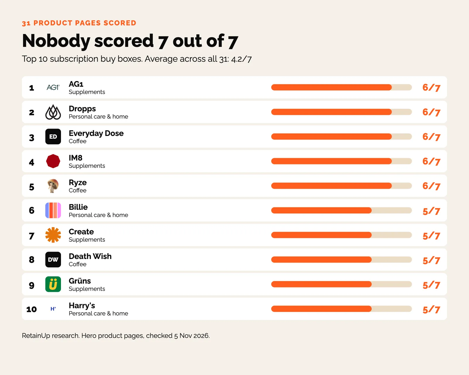
- Of 31 subscription product pages we scored on 7 widget checks, nobody got 7. The average was 4.2.
- 26 of 31 load with subscribe selected. Thorne, Bloom and Cleancult still load with one-time picked.
- Adding "billed every month" next to the price cut same-day cancellations from 10.6% to 4.6% at one of our brands.
The subscription widget is the small box next to the add-to-cart button. Why the buy box? It's where the subscription gets sold.
Most people never leave the product page. So whatever that box shows, and whatever it loads with selected, is the offer for most of your buyers. It's the biggest single lever in getting more buyers to subscribe, and usually the cheapest one to fix.
What 31 subscription product pages get wrong
In November I went through the buy box on the hero product page of 31 subscription brands. 12 supplements. 9 coffee. 10 personal care and home. Same 7 checks, one point each.
- Is subscribe on the product page at all?
- Is it selected first?
- Is the discount stated?
- Does it say why this delivery frequency?
- Gift value shown?
- Is there a price per serving or per day?
- Is the billing cadence next to the price?
Nobody scored 7 out of 7. The average was 4.2.
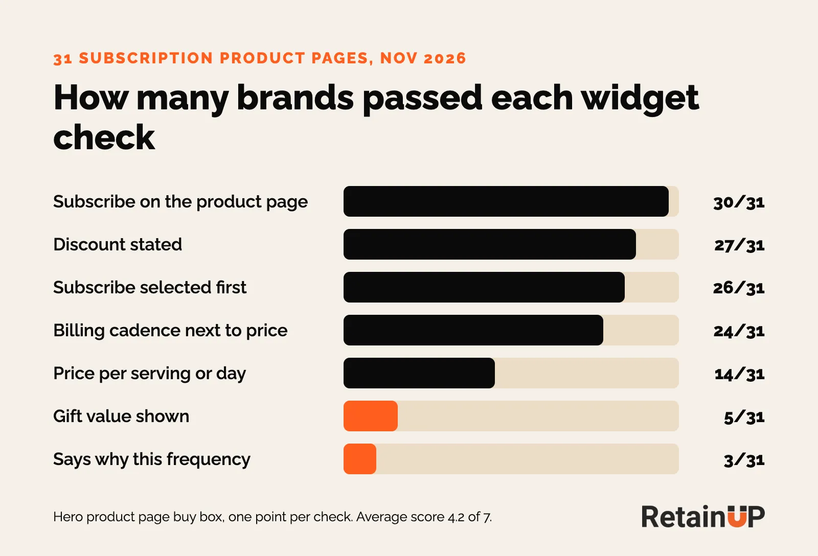
AG1, IM8, Everyday Dose, Ryze and Dropps came top with 6. Supplements and coffee both averaged 4.3. Personal care and home averaged 3.8, and none of those 10 brands showed what a gift was worth.
Check one is easy. 30 of 31 pass. Momentous puts subscribe in its own green box. Blueland fails. Its starter kit page has no subscribe option.
Some brands push subscription through a special landing page instead of the product page. But most people never see it. Put subscribe on every product that can be subscribed to.
And the check almost everyone failed was the frequency one. 3 of 31.
Pre-select subscription and put the terms next to it
26 of 31 pass this one. Most people never change the default. Whatever loads selected is what most of them buy. So pre-select subscription.
The outside tests say the same. Convertibles, a Shopify testing agency, ran one pack builder both ways. With one-time pre-selected, 4.0% of orders were subscriptions. With subscribe pre-selected, 20.5%. Same page, same prices. Recharge puts it at 4 times more subscribers for brands that lead with subscription on the product page. That's their own customer data, not a controlled test.
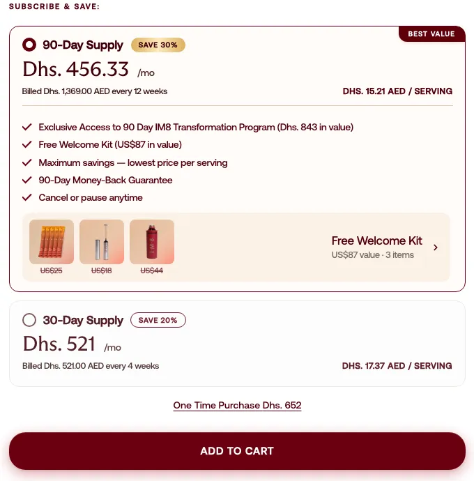
IM8 loads with its 90-day supply selected. The 30-day plan sits under it. One-time is a single underlined text link at the bottom.
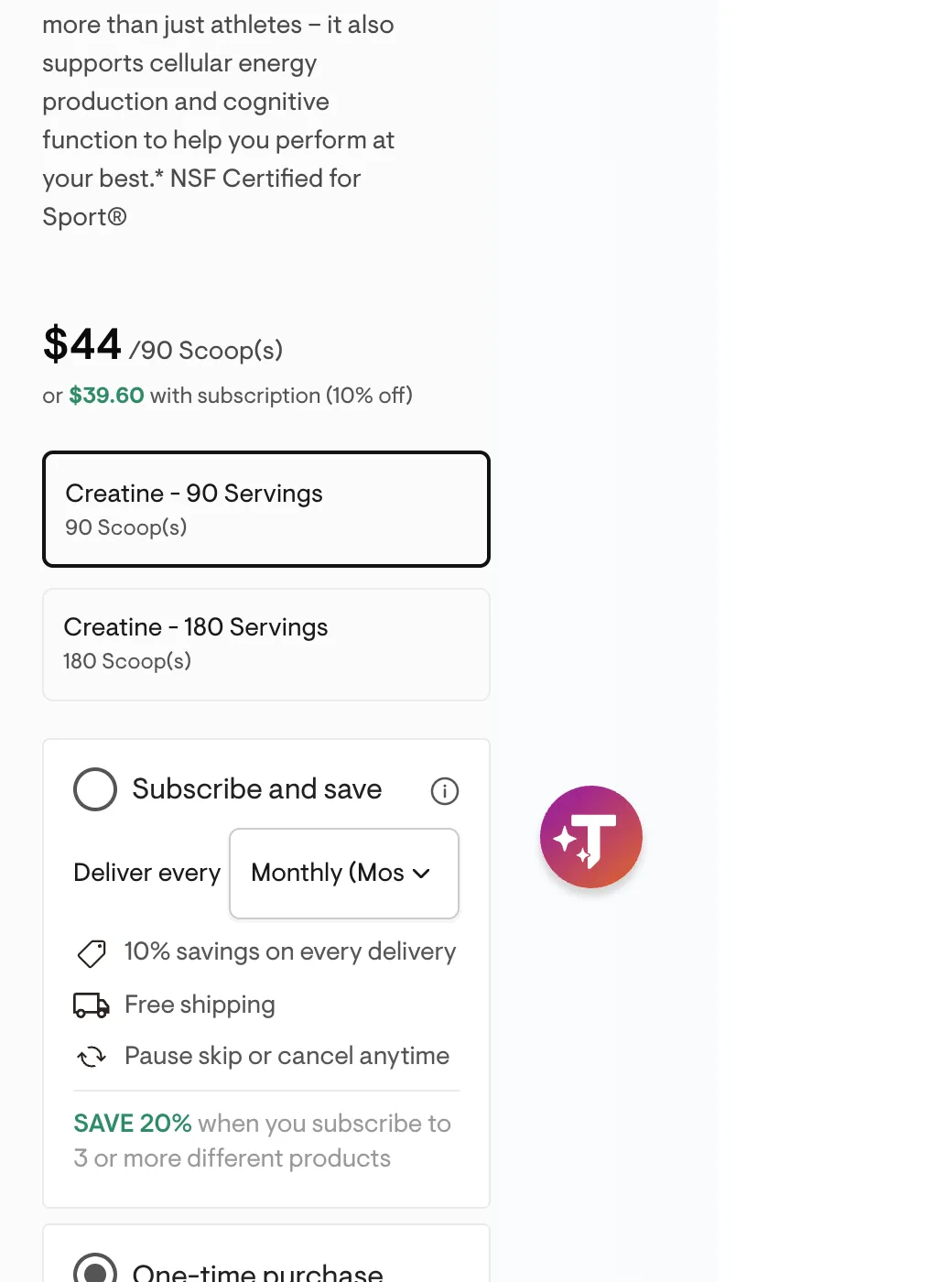
Thorne, Bloom and Cleancult still load with one-time selected. Thorne's 90-serving creatine jar also defaults to monthly delivery when you switch to subscribe. That's three jars for every one a customer can use.
Where to set the default in Recharge, Loop and Skio
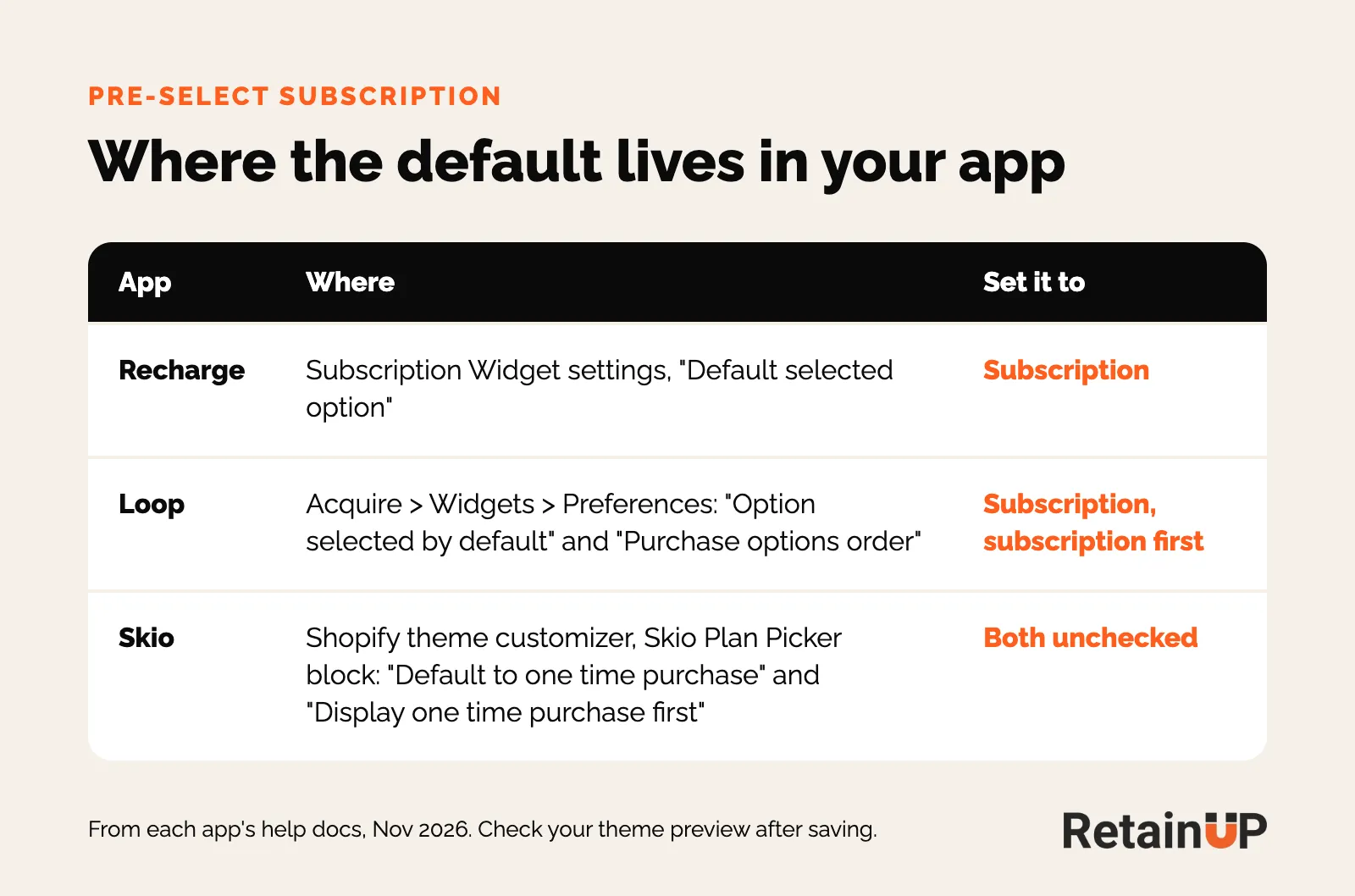
It's one setting. In Recharge it's "Default selected option" in the Subscription Widget settings. In Loop it's Acquire, Widgets, then Preferences, where "Option selected by default" and "Purchase options order" both go to subscription. Skio's plan picker has a "Default to one time purchase" box in the Shopify theme customizer, so check it's unticked.
A default only holds when the terms are in plain sight
One warning. If people don't notice it's selected, you'll see "I didn't know I signed up" in your reviews. Put the delivery frequency and the price right next to the selected option, so nobody is surprised.
One of our brands added "billed every month" next to the price. Same-day cancellations fell from 10.6% to 4.6%. One line of text. So after you switch the default, watch same-day cancellations for a few weeks. If they climb, fix the terms line and keep the default.
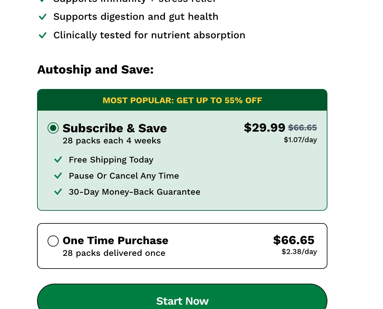
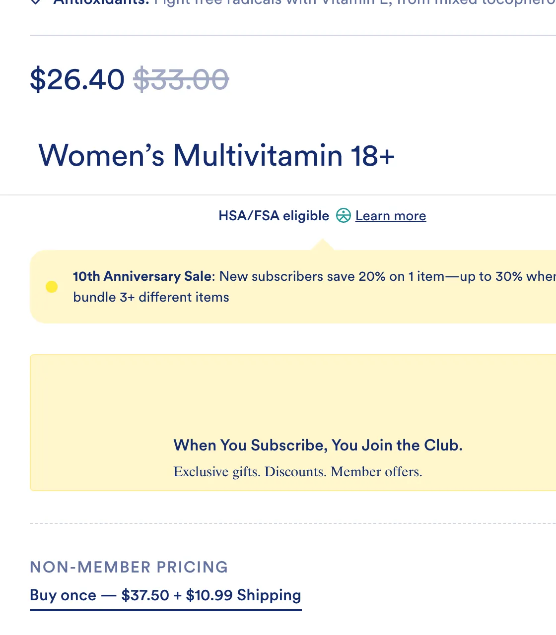
Grüns does this well. The plan reads "28 packs each 4 weeks", right under Subscribe and Save, with $1.07 a day beside it. Ritual shows $26.40 and an add-to-cart button, and never says how often.
The total price appears once, on the button. Terms, cut-offs and the cancel page live in the subscription FAQ and how to cancel page.
Make one-time the smallest row on the widget
Your one-time price isn't really there to sell. It's the decoy. It makes the subscription look like the obvious deal.
So it gets the smallest row. No dropdown, no cost list, no open block. It keeps its delivery line, because it has nothing else to carry it. The option you don't want chosen should be the shortest row on the page.
Keep one-time's true cost on the row
If subscription includes shipping, one-time has to show the shipping it doesn't include. One brand we work with wanted to drop the $6 shipping on one-time. We kept it. With shipping, one-time is $55 against $45 a month on subscription, and people notice the gap. Without it, it's $49 against $45. That feels like the same price, so why commit?
Ritual goes the other way. One-time is a link under the plan: $37.50 plus $10.99 shipping.
A word on free shipping. A benefit everyone gets can't be a gift for anyone. Extend it to one-time and your bottom tier has nothing to show.
Never knock the subscription on the one-time row
We once had "No subscription, nothing to manage" on a one-time row. It came out. It tells the buyer a subscription is a chore.
Some brands want one-time shown in full, for trust. That's fair. Then it becomes a block, and the total stays at three. Two subscribe blocks plus one-time. The third subscribe tier moves to the cart.
Should you drop one-time altogether?
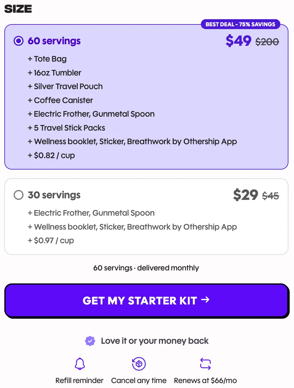
Some big brands do. Everyday Dose's starter kit page has no one-time option, and "Renews at $66/mo" sits under the button. Their site says 99% of people subscribe. With one button, that's not hard.
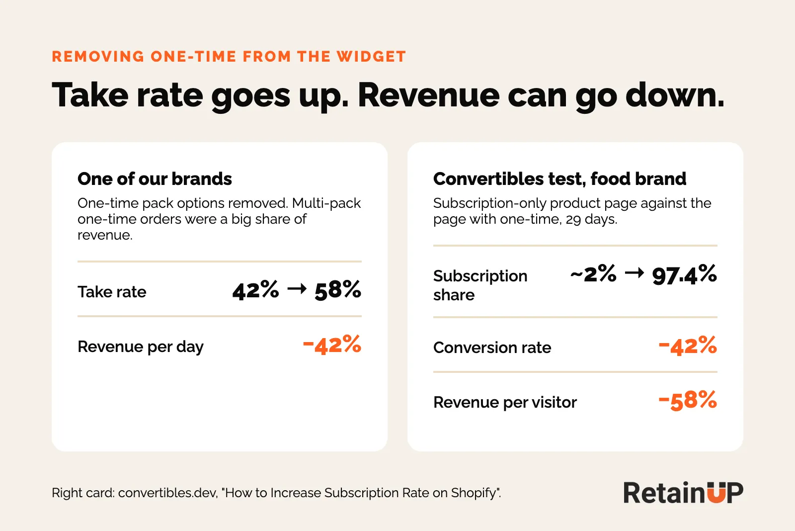
But if one-time buyers already buy big multi-packs, hiding one-time can cost more than it gains. We learned that the hard way. One of our brands removed its one-time pack options. Take rate rose from 42% to 58%. Revenue per day fell 42%.
Convertibles, the testing agency, saw the same thing on a food brand. Going subscription-only took subscription share from about 2% to 97.4% of orders. Conversion fell 42%. That was one 29-day test, so read it as a direction.
So look at your order mix first. Which packs sell one-time, and how much revenue sits there. Over about 30% of revenue on one-time? Show a one-time row for each pack that sells.
Three subscription options plus one-time, at most
More options feel generous, but people freeze and walk away. Keep it to three subscription options and one one-time, at most. The jam study behind this, and four other effects on every widget, are in subscription offer psychology.
Numbers freeze people too. One brand's widget showed 34%, 36%, 48% and 49% off, because two prices were crossed out on every line. We took one out, and now every line reads 25% or 40%. Easy to compare, easy to pick.
Say why this frequency
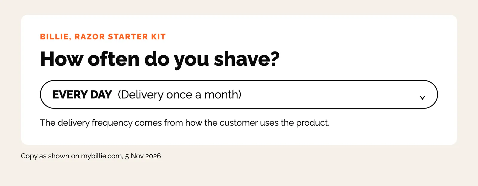
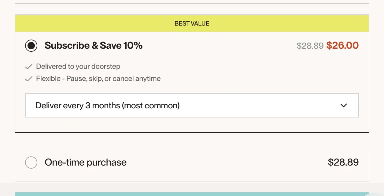
Only 3 of 31 did. Billie asks how you use it, then sets the frequency for you. Dropps marks the default as "most common." Native labels every 3 months as "most popular."
The frequency tick on the widget should come from the consumption maths, units divided by daily dose. Matching frequency to how fast the product gets used covers that maths.
When it's wrong, it shows up later. One of our clients said a bar of soap lasts 4 to 5 weeks. Their customers actually reordered every 86 days. And "too much product" became the top cancel reason.
Check it on a phone
Stack the options in one column, subscription on top. In Loop's button-group layout the frequencies only appear after a tap. So open your own page on a phone. Look at what shows before anyone touches it.
Show the price gap in one unit
Pick one unit of comparison and apply it everywhere. Per month, per serving, or per day. It has to appear on every row, one-time included. Without it the buyer can't compare and defaults to the cheapest sticker.
One reference price, and make it the one-time
MRP plus a one-time price? That's two references. That's how the 34, 36, 48 and 49 happened. Strike the one-time price instead, and the ladder becomes the two numbers the offer sheet already carries.
Strike the single period, never the pack. $33 a month against a struck $49 compares like for like. A struck $147 puts a quarter beside a month and makes your own price look inflated.
And state the gap. 27 of 31 did. Laird says it plainly: "Save 20% on every order, additional 10% off third subscription." Black Rifle's subscription costs exactly what one-time costs, $16.99 both ways, and the only difference is free shipping.
Check other buy routes too. At one of our clients, one-time bundles got 20 to 30% off while subscription got 15%. Its box builder sold 96% one-time. It was paying people not to subscribe. How big the gap should be is a pricing call, covered in how much to discount a subscription.
Break it down to a day, or a person
14 of 31 show a price per serving or per day. Everyday Dose puts "$0.82 / cup" right inside the plan. A $49 bag is a decision. 82 cents a cup is a coffee.
Where the widget sells a quantity, price per person. One brand showed $64.80 a month for two kids, against $36 for one. It looked like the price went up. Priced per person it reads $32.40 each. The volume discount gets its own "+10% for 2" chip.
Biggest pack first, named as a supply
Order the rows largest to smallest. The first thing seen is the thing you want sold. Then the smaller ones feel easy.
And name the term as a supply, not a period. "3 months supply" tells the buyer what arrives. "3 months" reads as a contract length. The 3-month option also skips the month-one renewal decision, which is where 30 to 40% of a cohort dies, so it shouldn't be buried in a dropdown. The trade-offs are in prepaid and longer plans.
Badges matter too. Put the strongest one on the tier you want sold. "Most popular" outranks "best value" because it's social proof.
What goes in the closed strip and the open block
Every subscription tier has two states. Closed, it's a strip. It gets scanned. Open, it's a block that people read. So anything the open block says comes out of the strip.
The closed strip
- Left: badge on the tier you're selling, supply heading ("3 months supply"), free gift count
- Right: discount sticker off the one-time price, volume chip only above quantity one, per-period price, struck one-time price with the billing cadence on the same line, per-day cost
- Out of the strip: pack counts and delivery cadence (they live in the ticks), and the total price (button only)
The open block
- Ticks: recommended consumption frequency, the saving on every order, pause, skip or cancel anytime, delivered every 3 months, free shipping
- Welcome kit, arriving with the first order. Show only gifts that apply, never an empty slot
- Future gifts, condensed: month 2, month 3 and month 6 if you have them
Control language goes in the ticks, not as the headline. "Cancel anytime" as the loudest line on the widget leads with the exit.
Show what the gifts are worth
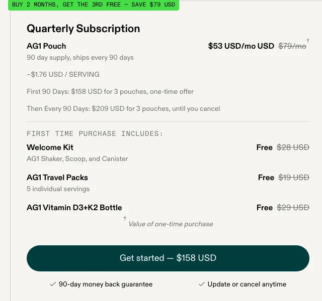
Only 5 of 31 did, all supplements or coffee. AG1 lists every item with its price struck through: $28, $19 and $29, all free.
When we fixed onboarding, gifts and milestones for one supplement client, order 1 to order 3 retention went from 61% to 73%. That was several changes at once. Still, a gift only works if people know it's coming.
Count gifts per tier too. If the count doesn't rise at every step, the ladder persuades nobody. More on that in subscription perks, gifts and welcome kits. Locked gifts shown greyed out read as punishment.
Then one add-to-cart, below everything, with the price following the selection. A button inside each row reads as four competing decisions.
Use the same program name everywhere
If the product page says "Subscribe & Save" but the landing page is called "Auto-Refill Program", customers and AI agents both get confused and skip it. Pick one name. Spell it the same on the widget, the nav and the subscription landing page.
Grüns heads its widget "Autoship and Save" and labels the plan "Subscribe & Save". Small thing. But a buyer reading fast sees two programs.
And it carries past the product page. Shopify's subscription UX guidelines want the same plan name in the cart, at checkout and in the order. The button should read "Add subscription to cart."
How to test a widget change
Read more than take rate. In another Convertibles test, subscription share went from 3.3% to 20.5%. Conversion fell 37%. Desktop fell 27% while mobile held level.
So track take rate, conversion and revenue per visitor together, and split phone from desktop. How long to run it is in subscription A/B testing.
If you want the widget, the offer behind it, the cancel flow and the portal built in Recharge, Skio, Stay AI or Loop, the Subscription LTV Maximizer™ does that, plus email and SMS, live in 30 days for $5,000. To see which of these 7 checks your widget fails, the free subscription audit runs 48 checkpoints and sends your top 3 leaks in 24 hours.
FAQ
Should subscription be pre-selected on my product page?
Yes, if your product gets used up on a schedule, because most buyers keep whatever loads selected. 26 of the 31 brands we scored already do it. The catch is that a default nobody notices turns into "I didn't know I signed up" reviews. So put the frequency and billing cadence right next to the selected option.
How many subscription options should a widget have?
Three subscription options and one one-time, at most. More choices feel generous but make people stall. If you have a fourth tier worth selling, move it to the cart as an upsell. And strike only one reference price, so each row reads one clean percentage.
Should I hide the one-time purchase option?
Usually no. Keep it, but make it the smallest row and let it carry its real shipping cost. Hiding it lifts take rate and can still cut revenue. One of our brands saw take rate rise from 42% to 58% while revenue per day fell 42%, because its one-time buyers bought big multi-packs. Check which packs sell one-time before you remove it.
What is the best subscription widget app for Shopify?
The widget layout matters more than the app. Recharge, Loop and Skio each have a setting to pre-select subscription. Whichever you run, the same rules apply: subscription selected, biggest supply first, a per-day price on every row and one-time as the smallest row. Pick the app for its portal, cancel flow and payment recovery.
One email a week on subscription retention: the numbers, the strategy, and what to fix first.

Rahi Jain
Rahi Jain is a subscription LTV specialist who helps $1M to $10M DTC brands reduce subscription churn and maximize LTV on Recharge, Skio, Stay AI and Loop.
More about Rahi