Key takeaways
- Search "how to cancel Grüns" and you land on Grüns' own help page. Search the same for Mars Men or IM8 and you get third-party guides.
- Lead the FAQ with your top cancel reason. For one of our brands that was taste, about 41% of stated reasons, against 15% for too much product.
- Print only what the live system keeps. One brand promised a 60-day guarantee on the homepage while its terms said 14 days.
The subscription FAQ is the page nobody on the team wants to own. Support thinks it belongs to marketing. Marketing thinks it belongs to support. So it ends up as a few short answers about billing. Nobody opens it again.
And yet it does two jobs. Before purchase, it answers the fear that stops people from ticking the subscribe box, which is why it sits in the take rate hub. After purchase, it decides whether someone who wants to leave finds your cancel flow or finds Reddit, a chargeback form and a one-star review.
Why the FAQ decides who subscribes
People fear getting stuck. A discount does nothing for that fear. A clear answer to "how do I cancel" does.
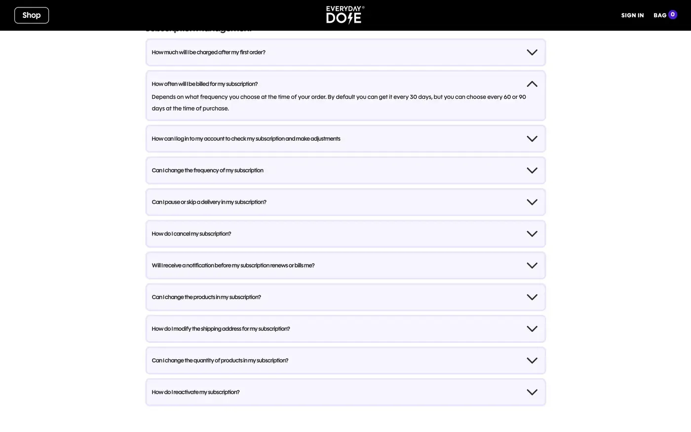
Everyday Dose has no dedicated page that explains how the subscription works. Their FAQ does better. It answers every worry before you subscribe: when you are billed, the reminder three days before renewal, how to skip, swap or change frequency, and how to cancel. That is exactly what a subscription page should cover.
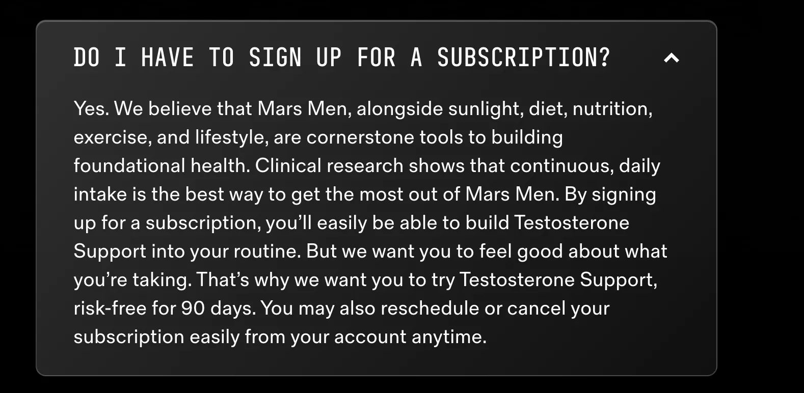
For a subscription-only brand, one question matters more than the rest: "Do I have to sign up for a subscription?" Mars Men answers yes. Then the reason: daily intake is how the product works. Then a 90-day risk-free trial, and they close with control: reschedule or cancel from your account anytime. The why subscribe page walks through how to make that case on the product page.
Keep the names the same. If the product page says "Subscribe & Save" and the FAQ calls it the "Auto-Refill Program", customers and AI agents both get confused.
The 10 questions every subscription FAQ answers
Most FAQs we score cover billing and stop. These are the 10 we check on every store, and the fact each answer has to name.
| Question | What the answer must name |
|---|---|
| When am I charged? | The day, and what the first charge covers |
| Will you remind me before charging? | How many days before, and by what channel |
| How do I skip a delivery? | Where to click, and the cut-off |
| How do I change how often it ships? | The options, tied to how fast the product gets used |
| How do I cancel? | Self-serve steps, in the same place they signed up |
| What if I have too much product? | Skip or a longer frequency, before cancel |
| Can I switch scent, flavour or product? | Swap, and where to do it |
| Do I keep my discount if I pause? | Yes or no, and when billing restarts |
| How does shipping work on subscription orders? | Cost and timing |
| What is your returns policy on a subscription? | The same terms as the policy page, word for word |
Skip, reschedule, change frequency and pause should all be named. Grüns names all four in the help centre and on the product page, and names swap and add a product in the FAQ. Dr. Squatch names skip, pause and delay but not change frequency. A lot of brands keep the rest behind the cancel button, where a subscriber only finds them on the way out. The full flexibility ladder and the order to offer each option live on their own page.
Then add what your inbox asks
The 10 are the floor. Your inbox has the rest. Skio's FAQ template suggests reading 3 to 6 months of tickets before you write a word, and its list adds a few we see in client inboxes too:
- How do I log in to manage my subscription?
- How do I update my card, and what happens if a payment fails?
- Can I add a one-time product to my next order?
- Can I use a discount code on a subscription order?
- How do I change my shipping address?
Because failed payments are a big share of churn, the card question matters most. Answer it with the logged-in update link your card update flow already sends, so the customer fixes it in one click.
Split them by when people ask
Pre-purchase questions go on the product and subscription pages. SUBTA calls an FAQ on the product page its most commonly recommended practice. Post-purchase questions go in the help centre and the portal. Same answer everywhere.
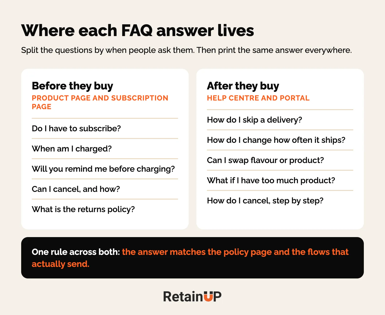
Lead with your top cancel reason, open by default
The question at the top of the FAQ should be the one that loses you the most subscribers. Usually it is not billing.
For one of our pet brands, about 90% of cancel emails said the same thing: too much product. So "What if I have too much product?" goes first. Skip and frequency change sit right in the answer. For a supplement brand we work with, taste was about 41% of stated cancel reasons and oversupply about 15%. So their FAQ now leads with taste. It went live on 31 October, and it took about an hour.
You find yours in the cancel flow data and the support inbox. The cancel reasons page shows how to read them and which fix goes with each.
Open by default matters. A closed accordion reads like a legal page. One open answer at the top tells the reader you expected the question.
Name the reminder and the cut-off for changes
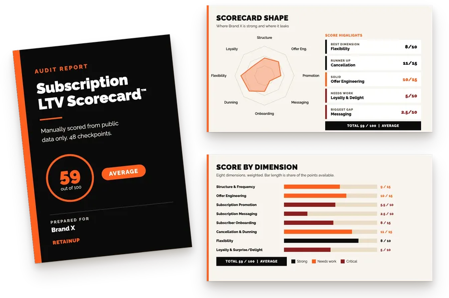
Two facts need a number in the FAQ: when the pre-charge reminder goes out, and the last day to change the next order. On our Scorecard, a policy or FAQ that names the reminder timing is worth 2 points.
Dr. Squatch sends a reminder 5 days before every charge, documented in the help centre. People still say they were charged without warning. It comes up a lot. So some customers just miss the reminder. Say it on the page, then send it. The upcoming billing reminder page covers what goes inside that email.
Everyday Dose shows how small the slip can be. When we scored them, the FAQ said 6 days before renewal and the product pages said 3. They have since fixed it. Small gap. Still the kind that turns into a "charged without warning" review.
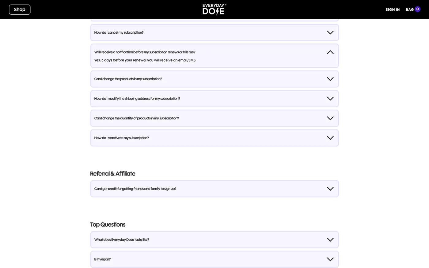
The cut-off is the other half. Savage X Fenty members who miss the skip deadline on the 5th are charged $59.95. A deadline like that only works if it is printed where people look, every month.
One setting to check if you are on Recharge: an empty learnMoreText hides the "learn more" link on the widget, and with it the modal that explains the reminder. So the promise exists. Nobody sees it.
A How to Cancel page that ranks for your brand
Google "how to cancel [your brand] subscription" right now. If the first result is a third-party guide, that is where your unhappy subscribers go, and they read a stranger's steps instead of yours. On our Scorecard this checkpoint is worth 3 points, tied for the most in the cancellation section.
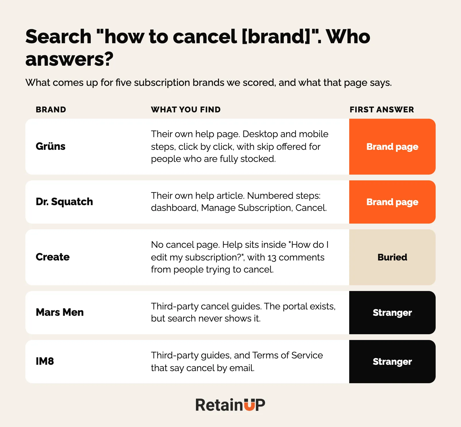
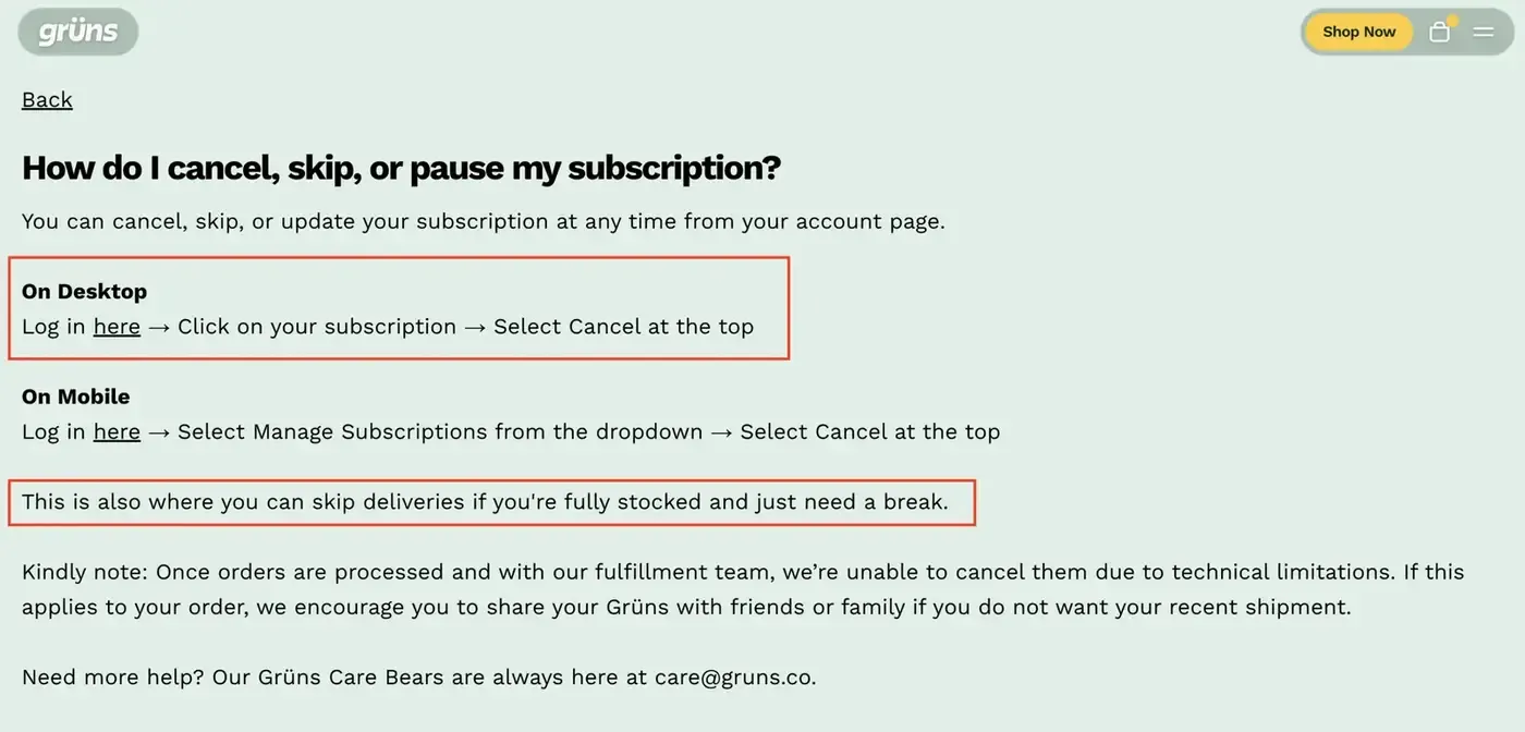
Same search. Very different endings. Search "how to cancel Grüns" and you land on their own page, not Reddit. No hunting. Desktop and mobile steps, click by click. And one line that saves people: "This is also where you can skip deliveries if you're fully stocked and just need a break."
Dr. Squatch does it too. Numbered steps in the help centre: dashboard, Manage Subscription, Cancel.
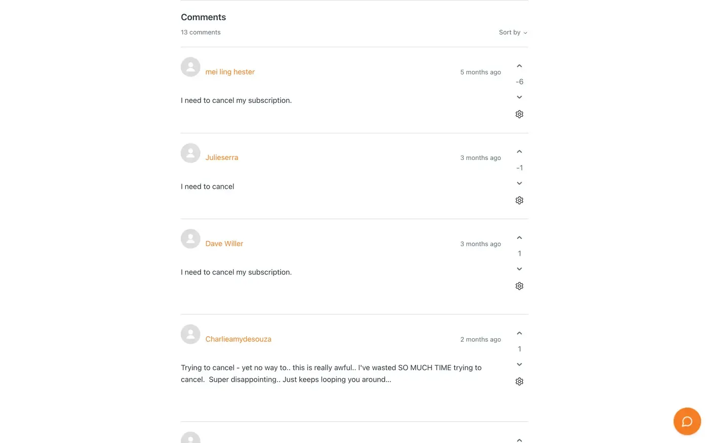
Now Create. Search "how to cancel Create subscription" and no Create page comes up. The cancel help sits inside "How do I edit my subscription?". It has 13 comments, almost all from people trying to cancel. One says: "Trying to cancel - yet no way to.. Just keeps looping you around." Nobody replied.
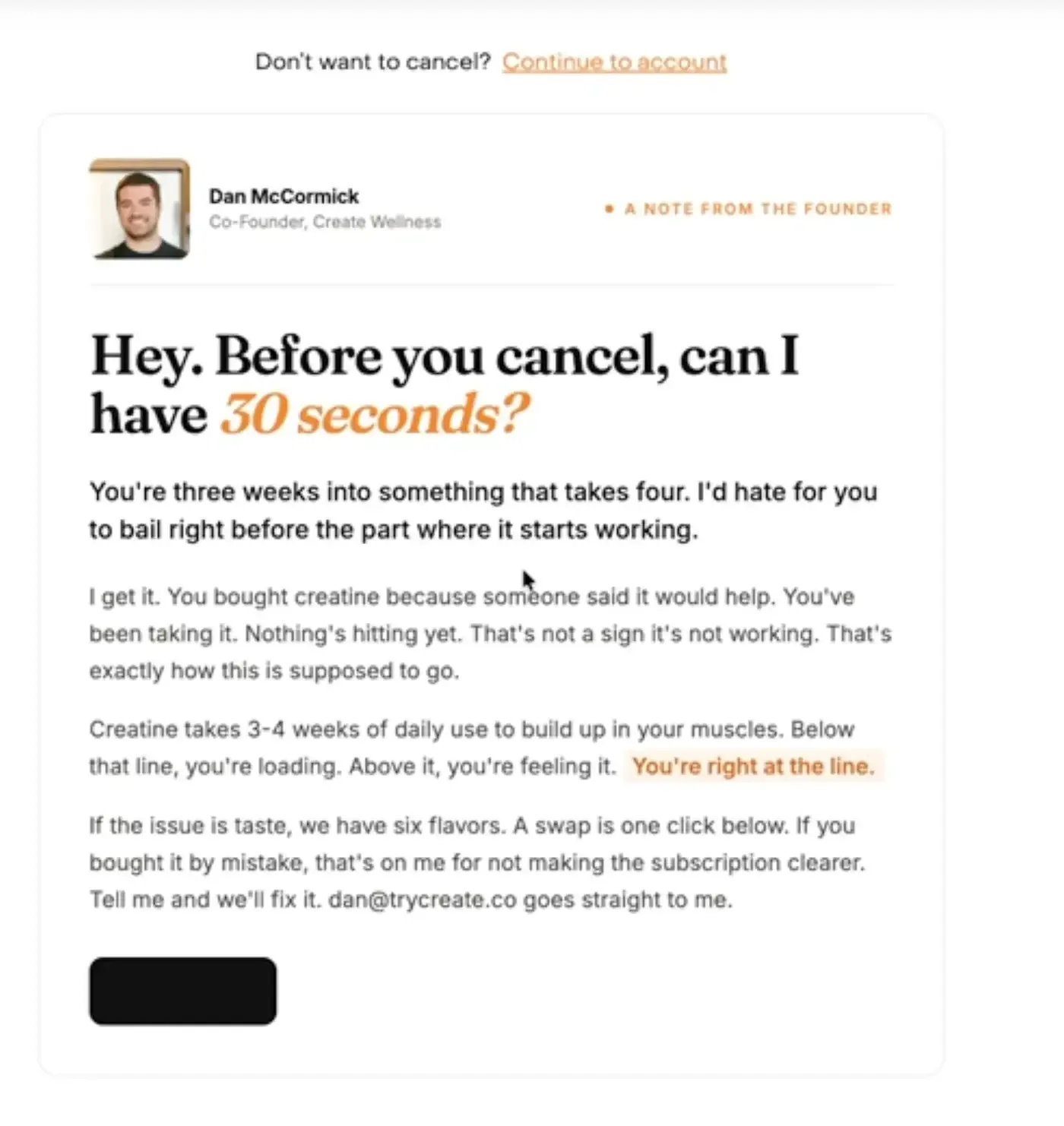
The strange part is Create's cancel flow. The first screen is a note from the co-founder: "You're three weeks into something that takes four." No discount on the first screen. Best cancel screen in the category. People still can't find it.
Same with Mars Men and IM8. Third-party guides, not theirs.
What goes on the page
- A title with the words people search: "How to cancel your [brand] subscription".
- Numbered steps for desktop and mobile, with what they will see on each screen.
- The cut-off: cancel before this day and the next order does not ship.
- What happens to gifts or rewards they have already earned.
- Skip, delay and swap named in the same answer, for people who are only overstocked.
- How they know it worked: the last screen to click and the email that confirms it.
- A support route for anyone whose login fails.
Tell them when the cancel is done
"How will I know when my subscription cancellation is complete?" is something people type into Google. Answer it on the page. Many cancel flows have several screens: a reason, maybe an offer, then a final confirm. Loop's help centre says people sometimes pick a reason and think they are done, and the subscription stays active. Then the next charge lands. To them, you ignored the cancel.
So name the last button. And check the confirmation email actually sends, because Recharge's own help centre lists cases where the cancellation notice does not go out.
Cancel should happen in the same medium they signed up in. Online, self-serve, no phone call, no email, and no minimum number of orders first. The rules and the laws behind them are on the cancellation policy page. And if support or admin cancels skip the flow, cancel flow coverage covers routing them back in.
"Already subscribed? Manage it here"
One line on the subscription page, linked to the portal. That is the whole fix. Most pages are written for people deciding to subscribe and give nothing to the person who already did. That person is the one about to email support or file a chargeback.
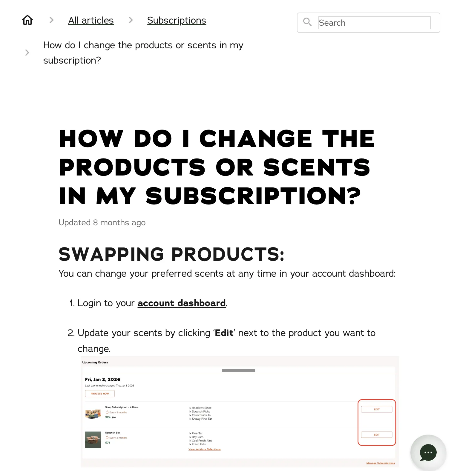
Dr. Squatch goes a step further. The help centre shows a screenshot of the dashboard, so you know what you can change before you log in. Edit Box changes scents and products, and adds or removes items. Grüns publishes an itemised list of what the portal can do. Almost nobody does. An itemised list earns you the point. A video earns you the customer. Everyday Dose puts "Manage Subscriptions" in the footer, next to FAQ and Contact Us. More on what belongs inside the customer portal on its own page.
For a supplement brand we work with, the Loop portal link went live on the subscription page on 31 October. An hour of work.
Only promise what the live system and policy keep
Every claim on the FAQ, the product page and the banner has to match the policy and the flows that actually run. When they disagree, customers remember the stricter one.
The IM8 product page says "cancel anytime with one click, no penalties, no hoops." The Terms of Service say you cancel by email. Both are live. Same website. They run on Skio. Skio supports one-click self-serve cancel, so the policy describes something slower than what the platform does.
We see the same pattern on client stores:
- A homepage promising a 60-day guarantee while the terms say 14 days.
- A banner saying "30-day money back" when the policy covers the first order and one opened unit only.
- An FAQ promising a reminder no flow sends.
- FAQ answers that differ from the product page or the policy.
The fix is boring. Open the Klaviyo flow list, the refund policy and the FAQ side by side, and change the page to match what is live. On one store we swapped a reminder callout for a portal link and scoped the guarantee to what the policy says. Then do it again whenever the offer, the app or a flow changes. That is when the FAQ goes stale.
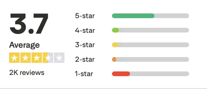
Mars Men shows the cost. They sit at 3.7 on Trustpilot, from about 2,000 reviews, and the complaints are about being charged after cancelling and pauses that do not work. Hiding the button gets you one more charge. Then a review, a chargeback, and a customer who tells their friends.
The FAQ, the How to Cancel page and the portal link are built alongside the offer, widget, cancel flow and portal in the Subscription LTV Maximizer™, in Recharge, Skio, Stay AI or Loop, plus email and SMS, live in 30 days for $5,000. If you only want to know where your FAQ and cancel path stand, the free audit checks 48 points and sends your top 3 leaks in 24 hours.
FAQ
What should a subscription FAQ include?
A subscription FAQ should answer 10 questions: when you are charged, whether you get a reminder, how to skip, how to change frequency, how to cancel, what to do with too much product, how to swap, whether the discount survives a pause, how shipping works and the returns policy. Lead with the question tied to your top cancel reason, keep it open by default, and make each answer match the policy page.
How do I make my how to cancel page show up on Google?
Publish a dedicated help page titled with the words people search, such as "How to cancel your [brand] subscription". Give numbered steps for desktop and mobile, name the cut-off date and what happens to rewards, and link it from the FAQ and the subscription page. Grüns and Dr. Squatch both do this, and their own page is what a cancel search returns.
How will I know when my subscription cancellation is complete?
Your customer should know because the page tells them: the cancel is complete after the final confirm screen, and an email confirms it. Many cancel flows have a reason screen and an offer before that last button, and people who stop early stay subscribed. Name the last step on your How to Cancel page, and check that the confirmation email really sends.
Should I make it hard to cancel a subscription?
No. A hidden cancel button buys one more charge and then costs you a review, a chargeback and the customer. Let people cancel online in the same place they signed up, with no phone call, no email and no minimum number of orders. Put skip, delay and swap in the same steps so people who are only overstocked can stay.
How many days before a subscription charge should I send a reminder?
Pick a number, send it every time, and print that number in the FAQ and policy. Dr. Squatch sends 5 days before every charge, and Everyday Dose states 3. What hurts is a promise the flow does not keep, or a site that names two different numbers. Also state the last day to change or skip the next order.
One email a week on subscription retention: the numbers, the strategy, and what to fix first.

Rahi Jain
Rahi Jain is a subscription LTV specialist who helps $1M to $10M DTC brands reduce subscription churn and maximize LTV on Recharge, Skio, Stay AI and Loop.
More about Rahi