Key takeaways
- Lunar Solar Group puts subscription landing pages at 30 to 40% better conversion than standard product pages. A quote, no data shown.
- AI orders on Shopify jumped nearly 13x in Q1 2026. An agent that sees two program names defaults to the one-time purchase.
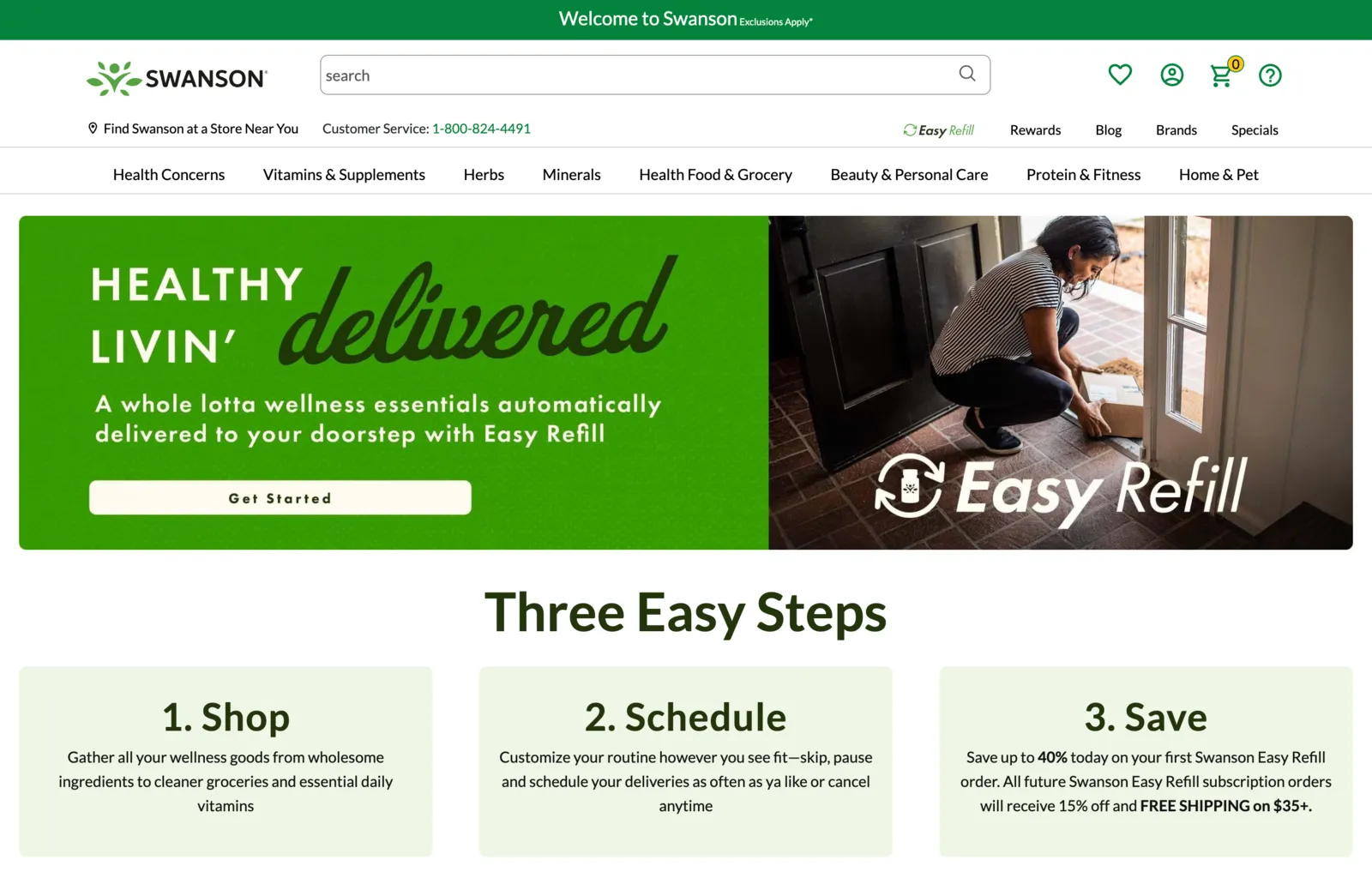
- Swanson calls its program Easy Refill in the nav, the hero, the steps and the benefits. One name, and a buyer never wonders which program they joined.
The widget sells the tier. This page sells the idea of subscribing at all.
It is one part of getting more buyers to subscribe, and the piece most brands skip. Most brands don’t have this page yet. So the product page ends up carrying the choice and the argument, and it does neither well.
What a subscription page does that the product page can’t
Give the program a home. One URL that answers every objection between "I like this product" and "I will let you charge me again".
That frees the product page widget to carry only the choice. Which plan, which frequency, add to cart. The argument for subscribing lives one click away, where it has room.
Lunar Solar Group, in its Subscription Tech Playbook 2025, says landing pages that clearly communicate value, frequency and flexibility can convert 30 to 40% better than standard product pages. They show no data behind it. So take it as a direction.
And check before you call it a replacement. One of our brands already had a live subscriptions page. Another returned a 404 on both likely URLs, so theirs was a new template at a URL the brand still had to pick. That changes the handover, not the page.
The page, top to bottom
Seven blocks, in this order. Not every line survives every brand. Cut against your own facts.
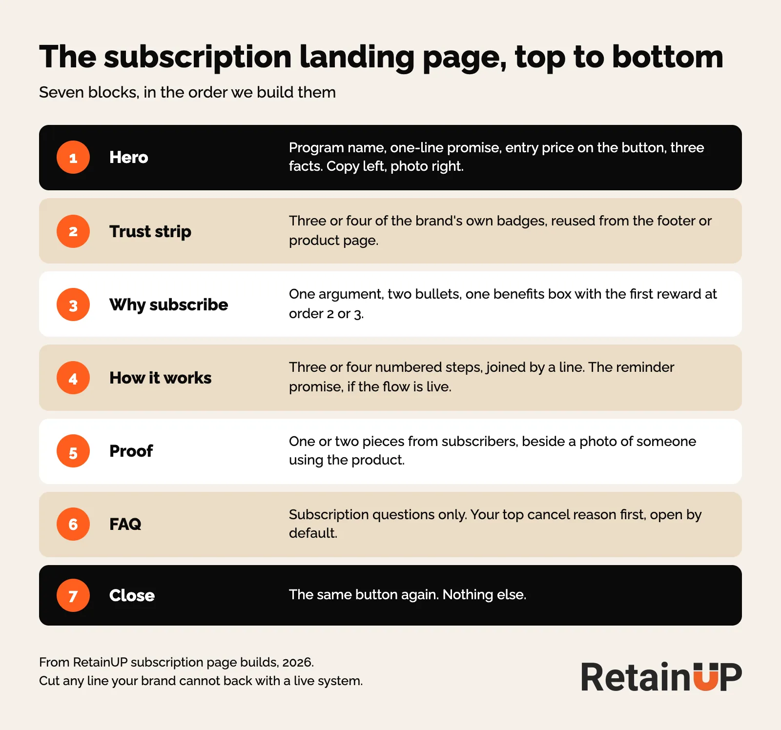
1. Hero
Copy left, image right. Everything that carries information goes left: the program name, the headline, a one-line promise, the button, three facts. The right side holds a picture and nothing else.
Why? Anything printed on the photo vanishes the day real photography lands.
- The program name, spelled exactly as the product page and the nav spell it.
- One line on what it does for them.
- Three numbers on sight: average saving, shipping, how cancellation works.
- One button per product line, with the entry price printed on it.
- One line naming the entry plan and what else exists. Not the ladder.
- A small link for existing subscribers to manage their plan.
Keep the full price ladder off this page. The widget already carries the terms, tiers and per-month figures. Repeat them here and the reader has a pricing decision to make before they have agreed to the idea. And you now have two places holding the same ladder, which drift apart the first time a price moves.
A brand with two product lines gets two buttons, not one button to a chooser. Use the exact pair the nav and homepage already use, with the entry price under each. Same words after every section.
2. Trust strip
Three or four of the brand’s own badges. Reuse what already sits in the footer or on the product page.
3. Why subscribe
A heading, a one-line argument, two bullets, then one benefits box. The case for the recurring version of the product, not just the cheaper version. The words for each reason are in making the case on the product page, so here is only the layout.
Write one box headed something like "Everything a subscription includes", with the order numbers inside the sentences. We tried three columns headed Order 1, Order 2, Order 3. They read as a schedule and got skimmed. The box reads as a list of what you get. Put the first reward at order two or three, and state its value as a figure or a named item. The gift ladder itself is covered in subscription rewards.
Show the roadmap before anyone pays. IM8 does. You can see what arrives in month two, month three, month five, six months of it published in advance. It is the most copyable thing in our IM8 scorecard.
Say each benefit once. A bullet list above a benefits box will repeat the box. Cut from the list, because the box carries the figures.
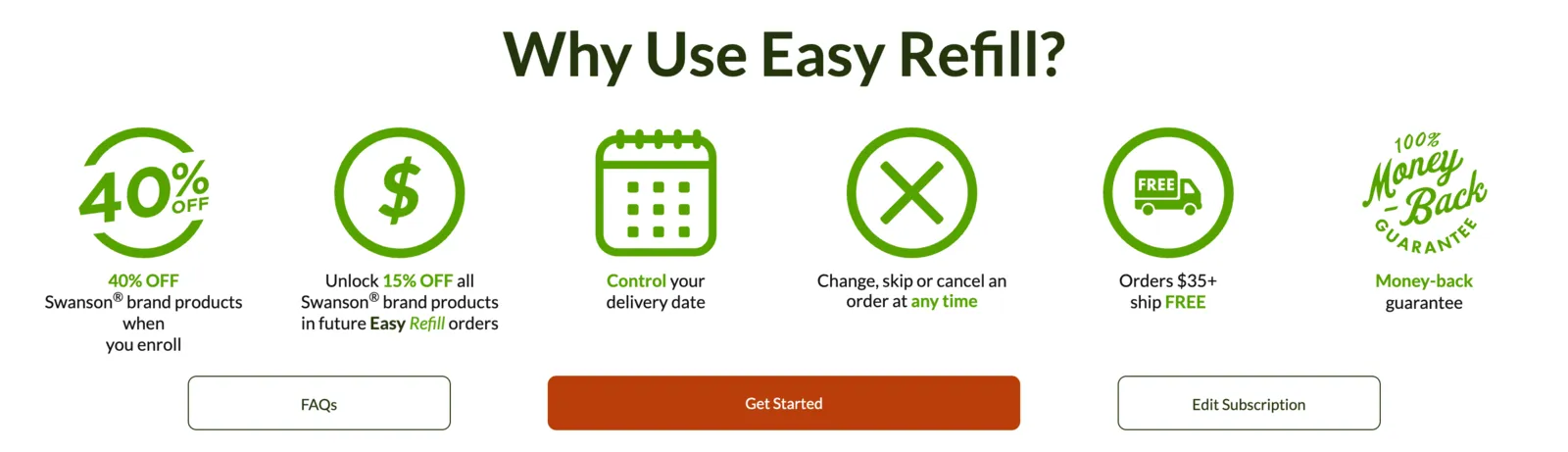
Swanson shows the trap fear answered as control. Change, skip or cancel at any time sits in the middle of the benefits, and an Edit Subscription button sits right next to Get Started for people who already subscribe.
4. How it works
Three or four steps, plainly. Steps have to look like steps. Three equal cards in a row read as three features. Numbered markers, sized up and joined by a line, read as a sequence.
- What arrives and when, so the first charge is never a surprise.
- How to pick a frequency, tied to how fast the product gets used. The logic is in subscription frequency.
- The reminder policy: we tell you X days before every charge.
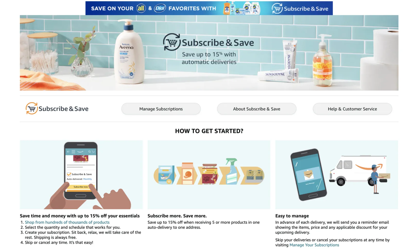
Amazon does the last line well. "In advance of each delivery, we will send you a reminder email", with the skip and cancel route written right under it, plus a Manage Subscriptions button in the page header.
5. Proof
One or two pieces, not more. A photo of a customer using the product on one side. The aggregate claim, two reviews, the guarantee line and the buttons on the other. A score and a list of certifications read like a spec sheet. The photo makes it people.
Reviews should come from subscribers, not general customers. Ideally one long-tenure voice, not a week-one result. Some brands cannot do that yet. One of ours had Order 3 retention between 10.6% and 31.7% depending on the cohort, so there was no deep pool of long-tenure subscribers to quote.
6. FAQ
Subscription questions only. Product, shipping and referral questions belong on the brand’s main FAQ. The full question set, the cut-off and the How to Cancel page are in the subscription FAQ. On this page the one decision that matters is the order. So lead with the question behind your own top cancel reason, open by default, and that page shows how two of our brands picked theirs. Same slot, different question.
Sort by what cancels subscriptions, not by what is logical. Billing questions can wait. And keep it short. Baymard’s research on how-it-works pages for subscription services suggests 5 to 7 page-specific questions, with space between them so the section does not turn into a wall of text.
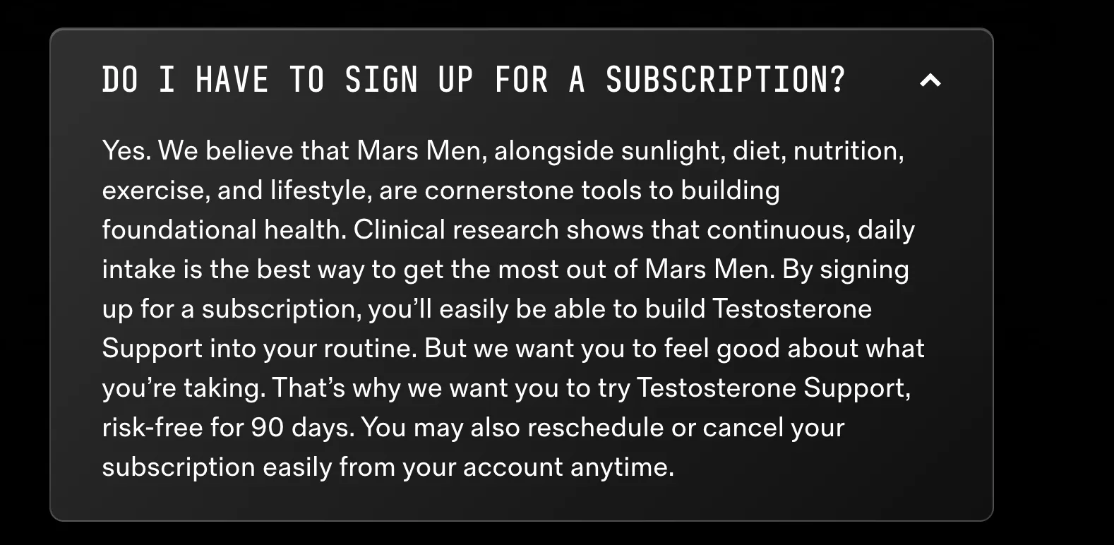
If you sell subscription only, the first question is usually "Do I have to subscribe?". And Mars Men answers it with the reason first and control last, and making the case on the product page breaks that answer down.
7. Close
The button. No heading, no restatement. Some brands add the legal policy and a support route here. Others keep both in the footer. Either works.
One program name on the page, the product page and the nav
If the product page says "Subscribe & Save" and the landing page calls it "Auto-Refill Program", customers get confused. So do AI agents. Both skip it.
Swanson calls it Easy Refill in the nav, the hero, the steps and the benefits. One name.
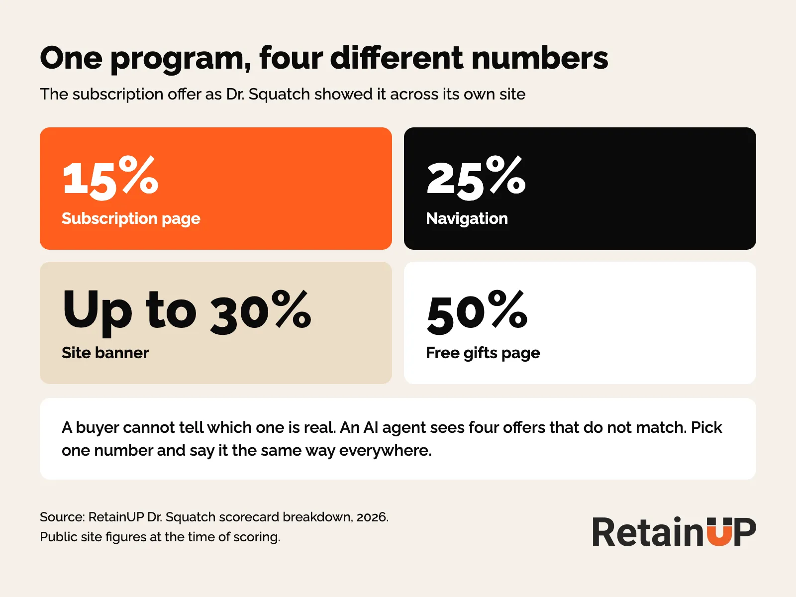
The same goes for the number. When we scored Dr. Squatch, the subscription page said 15%, the navigation said 25%, the banner said up to 30%, and the free gifts page said 50%. Pick one number and say it the same way everywhere. IM8 picked one and repeated it.
If your program has no name, use "Subscribe & Save" exactly as the product page and nav already do. A named program would be stronger. But matching the nav beats inventing a name on one page.
AI shopping agents read your subscription data, not your page
An AI agent is shopping for your customer right now. And sadly, it can’t find your subscription.
Agentic commerce is not a 2027 problem. AI-driven traffic to Shopify stores grew 8x year over year in Q1 2026. Orders from AI searches jumped nearly 13x. Those figures are from Verity Score on Shopify Spring ’26. By the end of 2026, an estimated 25 to 30% of US online purchases will involve an AI agent somewhere in the decision. That last one is an estimate.
Agents don’t read your page the way a person does. They query structured product and subscription data through feeds and APIs. So a beautiful subscription page does nothing if the offer is missing from that data. A "Subscribe & Save" toggle on the product page doesn’t cut it.
A human reconciles two program names. An agent sees a mismatch and defaults to the one-time purchase. Or to a competitor whose data is clean.
What an agent needs to find your subscription
- A dedicated subscription page.
- Terms and conditions on that page.
- Clear FAQs for cancel, skip, swap and the rest.
- The same program name everywhere.
- The subscription option machine-readable, not just visible on the page.
Post-purchase matters too. If subscription actions are not programmatically accessible, the agent can’t complete the flow even if it wanted to.
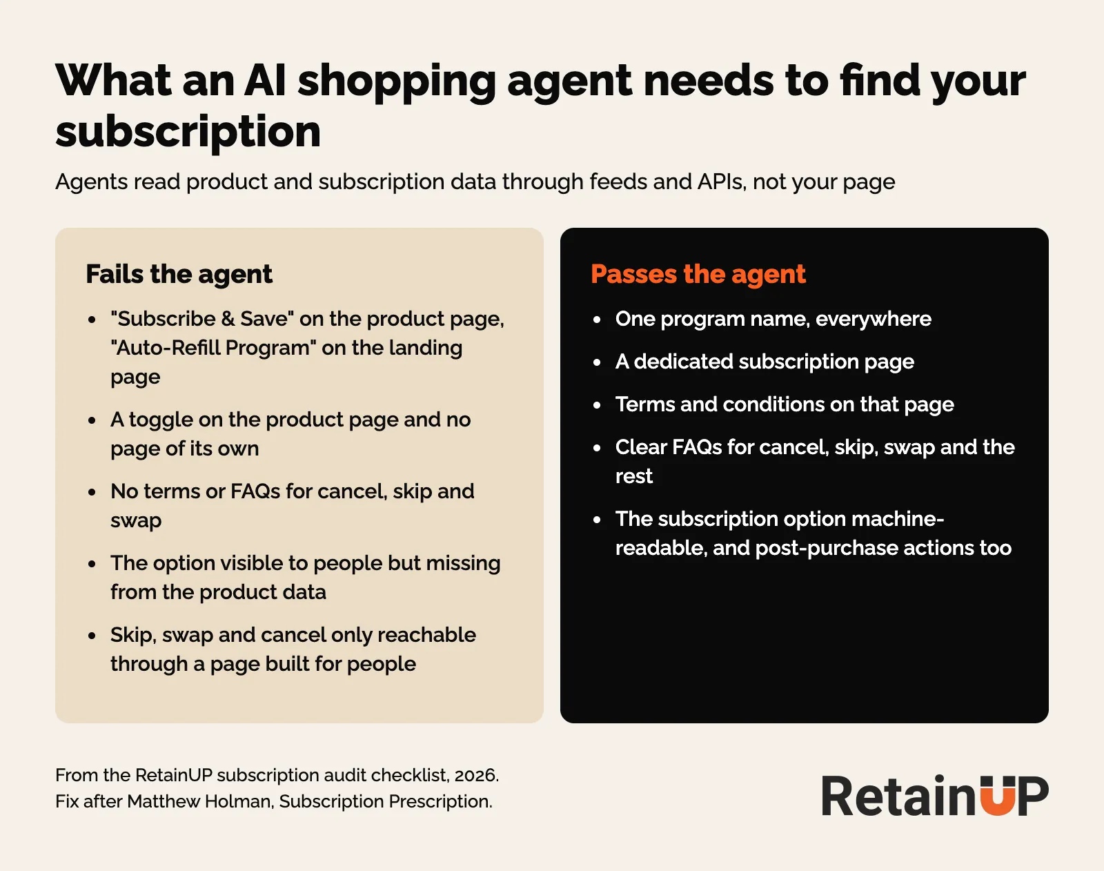
Matthew Holman, who runs Subscription Prescription, puts the fix in three parts. One explainer page. Named the same word everywhere. The option machine-readable, not just visually obvious. Boring work, on purpose. We now check it on every subscription audit. Most brands fail the same way.
Humans forgive a naming mismatch. Agents just move on.
Send people to the page
Recharge lists the places to link a dedicated subscription page from: the homepage banner, every product page, and your emails and campaigns.
The product page link matters most. It frees the widget from arguing for subscribing. One line under it is enough. "How Subscribe & Save works", in the program’s own name.
Ads are the other source. Swanky’s advice is to show the offer that drew the click above the fold, or the visitor leaves to find it somewhere else. So the ad has to promise the same rate the page does. Grüns runs gifts on custom landing pages, separate from the main site. Same product, different funnel, different offer. Fine for a test. The main page stays the program’s one home.
Then watch it. Track visits to the page and how many of them start a subscription, next to your take rate.
Check every promise against a live system
A page that says "we email three days before every charge" is a lie until that flow is live. Ship the flow first or cut the sentence. And the guarantee and reminder mismatches we find most often are in the subscription FAQ page.
- Never write a testimonial. If there are no real subscriber quotes yet, use the brand’s own published claims: homes served, endorsements, the guarantee. An invented quote is a fabricated record.
- Every number must already exist somewhere else. Cross-check the saving against the offer, the social proof against the emails, the guarantee against the policy page. Two live numbers that disagree is worse than one missing.
- Check the site-wide furniture. Another brand ran a permanent "up to 64% off" bar while the new subscription ladder topped out at 33%. Both showed on the same page, about 300 pixels apart.
Copy drifts too. On one build, the writer’s doc named the order 2 and order 3 gifts that were meant to stay a surprise, and changed the social proof number while the email flow still had the old one in three places. Catch it before it is built, not after it is live.
Build it to look like it was always there
Read the live site before writing anything. Pull the colours, fonts and spacing from the page code, not a screenshot and not a brand deck. On one brand none of the deck colours matched what the site actually rendered.
We build an HTML mockup first, with the brand’s header and footer wrapped around it, then a Figma page at the site’s real width. The developer ships only the middle. The theme already renders the header and footer. A page built at a different width and palette looks bolted on.
What the page is not
Clients ask whether it replaces the subscription section in the customer account. It doesn’t. Existing subscribers manage plans in the app’s customer portal. The page links to it, once, small, in the hero. Restyling the portal is separate work.
The subscription page is one of the pieces built in the Subscription LTV Maximizer™, next to the offer, the widget, the cancel flow, the portal and payment recovery, in Recharge, Skio, Stay AI or Loop, live in 30 days for $5,000. If you only want to know whether your page and naming pass, the free subscription audit checks 48 points and sends your top 3 leaks in 24 hours.
FAQ
Do I need a separate subscription landing page if I have a widget?
Yes, if you want more buyers to subscribe. The widget carries the choice of plan and frequency. The landing page carries the argument for subscribing at all, with room for benefits, steps, proof and the subscription FAQ. It also gives AI shopping agents one clear page with your terms.
What should a subscription landing page include?
Seven blocks in order: a hero with the program name and entry price on the button, a short trust strip, a why subscribe section with one benefits box, how it works in numbered steps, one or two pieces of proof, a subscription-only FAQ, and a close with the button alone. Cut any line your brand cannot back with a live system or a real number.
Should I show all my subscription prices on the landing page?
No. Print the entry price on the button and add one line naming the entry plan and what else exists. The full ladder belongs on the product page widget. Two places holding the same ladder drift apart the first time a price moves, and a pricing table asks the reader to choose a plan before they have agreed to subscribe at all.
Which question should go first in a subscription FAQ?
The one tied to your top cancellation reason, open by default. Take it from your own cancel data and inbox. A brand where most cancels say too much product should lead with changing the schedule. A brand where taste leads should open on taste and answer with the guarantee. Subscription-only brands usually lead with whether you have to subscribe.
Can AI shopping agents find my subscription offer?
Only if it lives in your structured product data and goes by one name. Agents read feeds and APIs, not the page a person sees. If the product page says Subscribe and Save and the landing page says something else, the agent sees a mismatch and picks the one-time purchase or a competitor. Give the program one name, one page with terms, and machine-readable options.
One email a week on subscription retention: the numbers, the strategy, and what to fix first.

Rahi Jain
Rahi Jain is a subscription LTV specialist who helps $1M to $10M DTC brands reduce subscription churn and maximize LTV on Recharge, Skio, Stay AI and Loop.
More about Rahi