Key takeaways
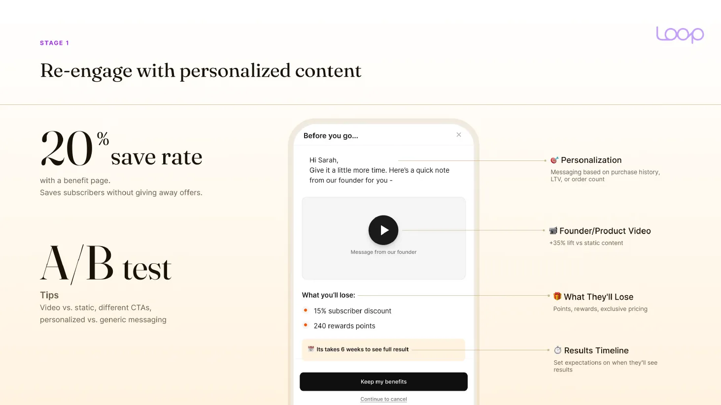
- A benefit page with no offer on it saves about 20% of cancels in Loop data, and a founder or product video adds 35% over static content.
- Concise copy tested 58% better than wordy copy in Nielsen Norman Group research. Aim for under 50 words per cancel screen.
- Write two answers for "too expensive". "I don’t see the value" gets education, and "I don’t have the budget" gets a discount.
Most cancel flows get built once. Someone picks the reasons, drops in a 10% off code, writes "We're sorry to see you go" and never opens it again.
And the words on those screens are the part nobody goes back to.
A subscriber who clicks cancel has already decided. So every line you put in front of them has a few seconds to change that, and most of them get skipped. The order of the screens lives in the subscription cancel flow structure, and the full churn picture is in the subscription churn guide.
The four-part copy structure for every cancel screen
We use the same shape on every screen. Splash, reasons and the last offer.
- Heading. One line. Empathy first, the "we understand" part.
- Connector. One or two lines that expand the heading and point to the fix.
- Solution. Two or three options, with the fix and the offer.
- CTA. One button that keeps them, and a plain link to continue cancelling.
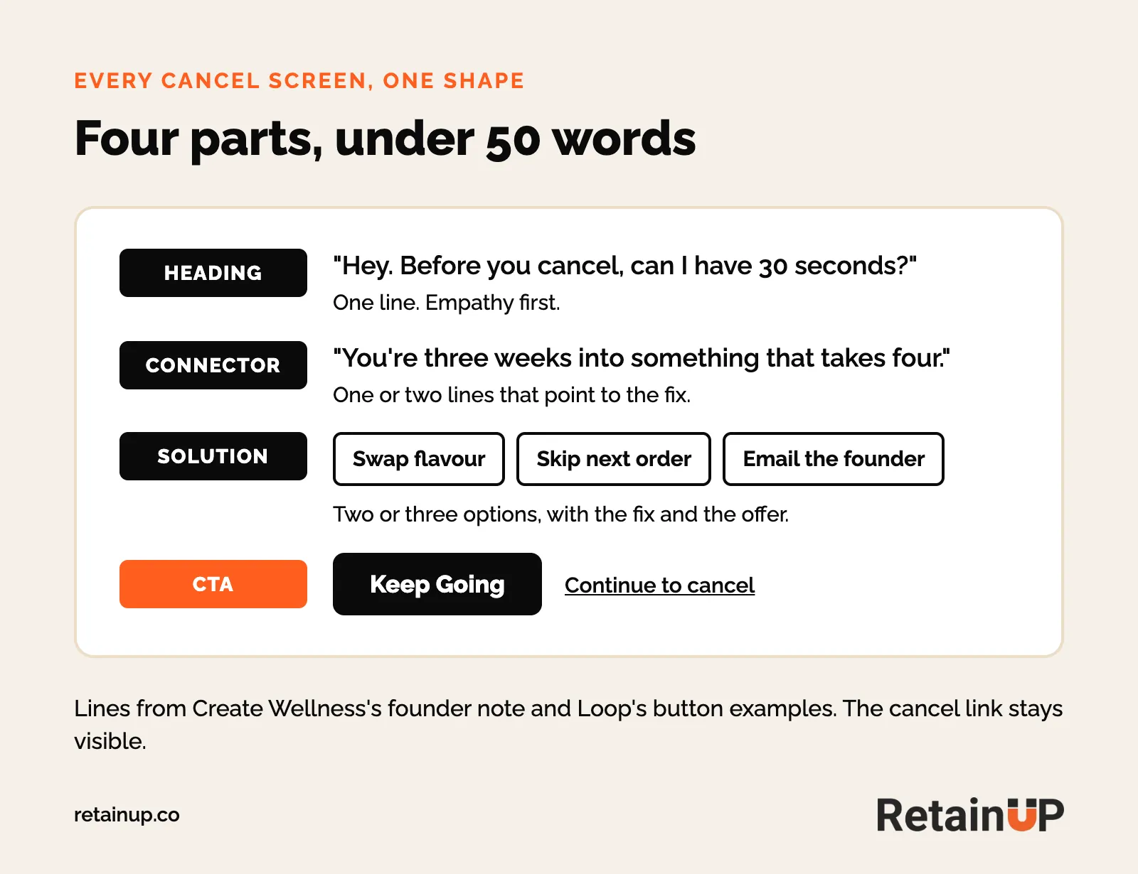
And that is the whole screen. One line of headline, one line of value, one offer per card.
Create Wellness puts a note from co-founder Dan McCormick on the first cancel screen. The heading is "Hey. Before you cancel, can I have 30 seconds?" The connector is "You're three weeks into something that takes four."
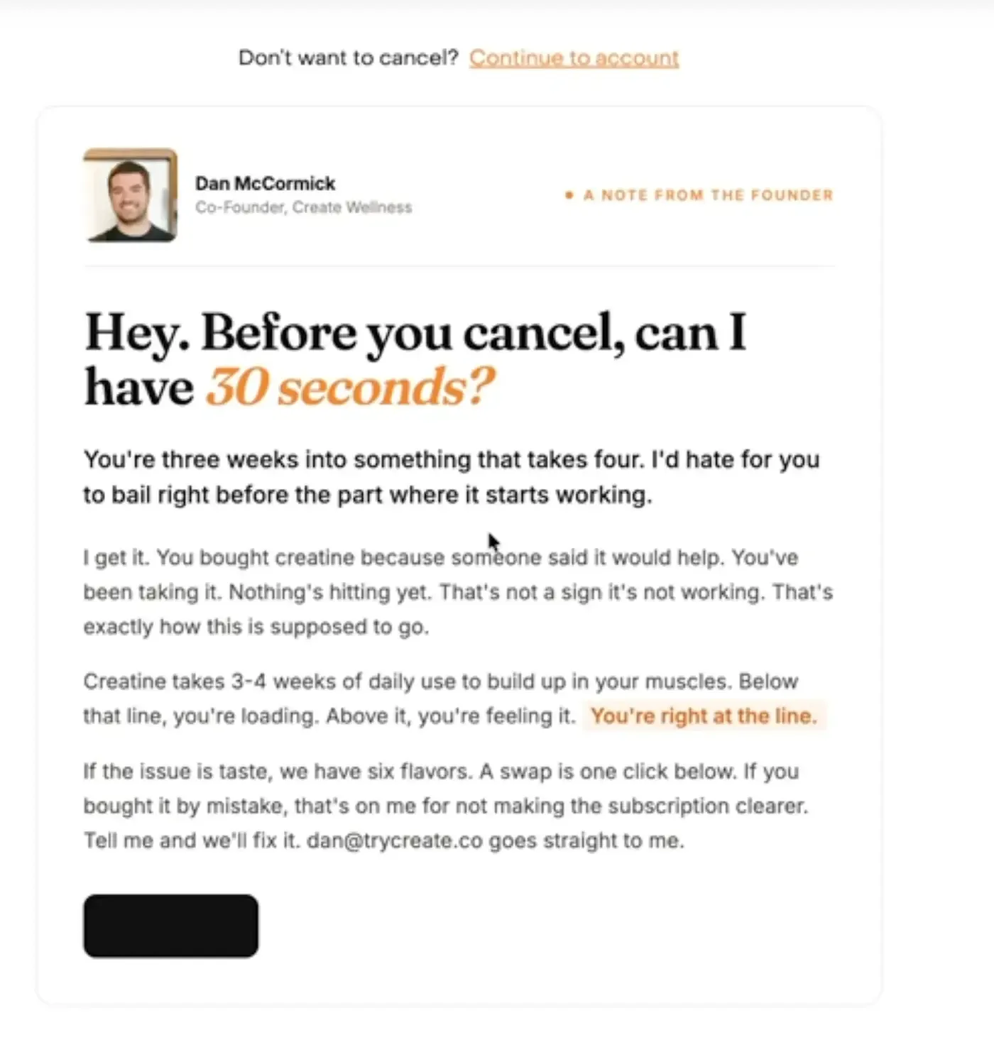
So he explains why creatine takes three to four weeks of daily use to work. If the issue is taste, a flavour swap is one click. If you bought it by mistake, he says that's on him for not making the subscription clearer, and gives his own email.
No discount on that screen. Just a reason to stay, from a real person. (Screens via Matthew Holman's The Cancel Page.)
Keep cancel copy short: people read 20 to 28% of a page
People skim. They don't read.
I checked in October 2026 and found no public A/B test of copy length inside a cancel flow. So the proof comes from web reading research. It is old, but it holds.
- Concise copy tested better. The same 7-page site was written five ways and tested with 51 users. The concise version had 58% better usability than the wordy one. Scannable alone was 47%. Concise, scannable and objective together was 124% (John Morkes and Jakob Nielsen, Nielsen Norman Group, 1997).
- Most words never get read. 25 users were logged on their normal browsing across 45,237 page views. People read at most 28% of the words on a page, and 20% is more likely. Each extra 100 words bought about 4.4 seconds, roughly 18 more words read (Weinreich et al., 2008, analysed by Jakob Nielsen).
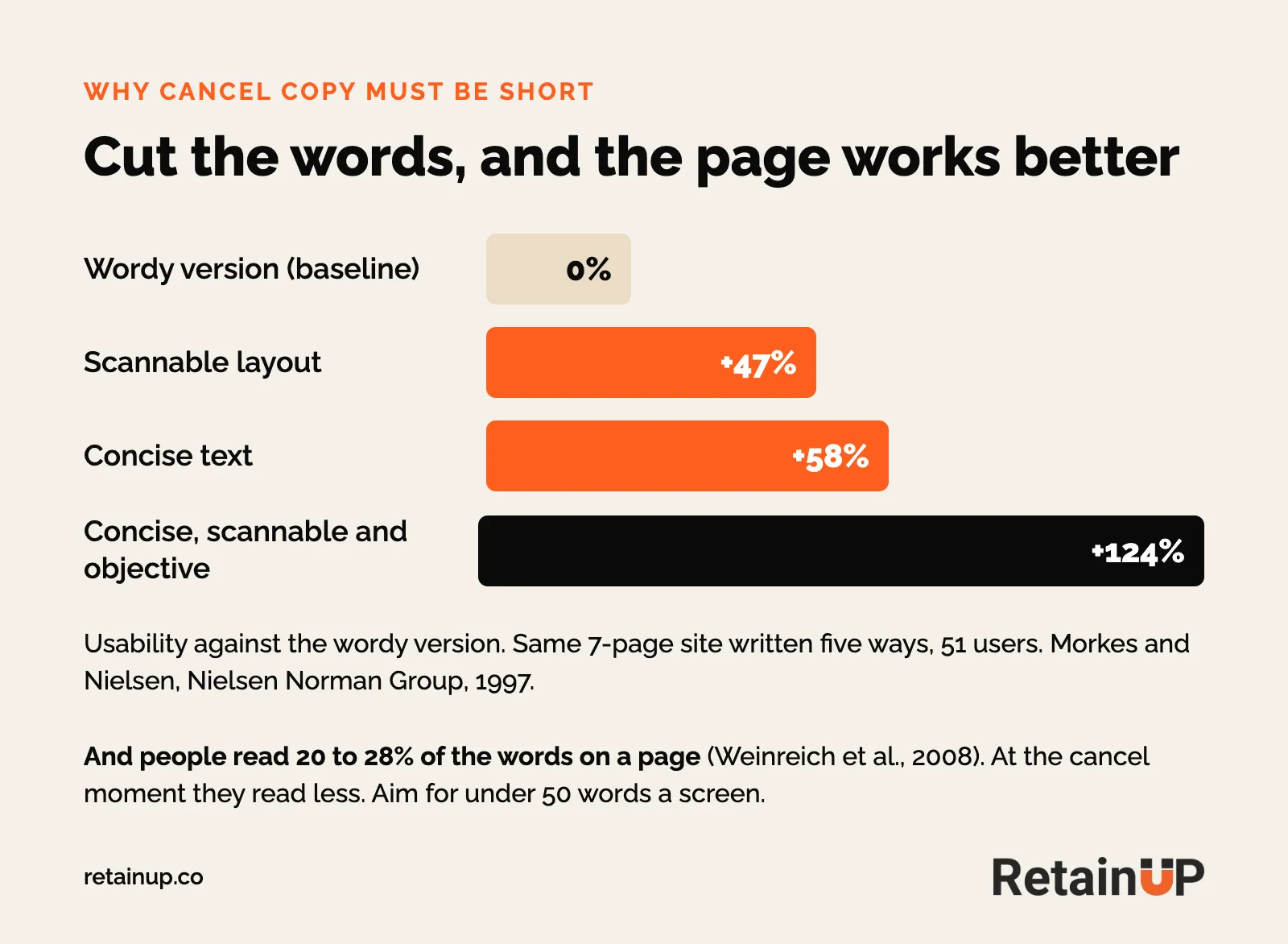
And half the words get read only on pages of 111 words or less. At the cancel moment it is worse. They have already decided and want the exit button.
So our rule is under 50 words per screen. Use bullets. Bold the one thing that matters. If a line needs a second sentence to make sense, cut the line.
Remove shame before you make an offer
Don't tell them they failed. Don't say they weren't consistent.
Tell them this happens to most people. A subscriber who feels judged gets defensive, and a defensive person clicks past whatever you offer next. Disarm that first, then show the fix.
Create does this well. "Nothing's hitting yet" is followed by "That's exactly how this is supposed to go." So the subscriber isn't wrong for wanting to leave. They're three weeks in.
Reframe the decision, keep the door open
Not "you don't need this." Try "Perhaps you feel like you don't need this right now."
Skip and delay make sense to someone who is only stepping away for a bit.
Take accountability when it might be on you
Sometimes the cancel is your fault. A late box, a confusing checkout, a subscription they didn't know they had signed up for. Ask it straight: "Have we dropped the ball?"
One brand started pushing subscription hard last quarter. Their number one cancel reason became "I did not know this was a subscription." Nobody would have guessed that. For that reason the copy should own it, the way Create does, and make the fix easy. The checkout side of that problem sits in stopping day-zero cancellations.
Emotional value beats financial value
"Price is only an objection when value is in question." That line is from No Limit Email, and it matches what we see. People leave because the value they got didn't meet what they expected.
So don't list perks. Trigger the feeling of losing what the product does for them. Fear of losing the result converts better than a discount reminder.
Anchor to future inconvenience
"The only time having your subscription will matter is when you don't have it."
And that one sentence does more than a list of five benefits. It puts them in the week where they run out, with no product, and have to remember to reorder.
When the numbers do help
Financial value still has a place, as long as it is concrete. "You've received $348 in product over 6 months" reframes the cost as value they already have.
So daily cost works too. "$2.63/day" hits harder at cancellation than at purchase. At purchase they're optimistic. At cancellation they're evaluating. Compare it to a coffee.
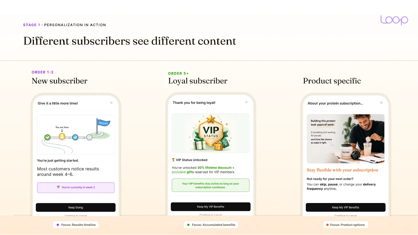
Loop's playbook, built from 441K cancel attempts across 87 brands, breaks the re-engage page into four parts: personalisation, a founder or product video, what they'll lose, and a results timeline. A benefit page alone reaches a 20% save rate without giving anything away.
Change the words by tenure
A subscriber waiting on their first box and one who has been with you a year need different lines. We use three versions, zero day, before the first renewal and loyal, and the full setup sits in the cancel flow structure. Here it is the copy that changes.
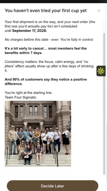
Four Sigmatic runs the zero-day version live. The headline is "You haven't even tried your first cup yet." Below it: "No charges before this date, ever. You're fully in control." Then "It's a bit early to cancel... most members feel the benefits within 7 days." The button says "Decide Later".
Loop's playbook shows the same idea across tenure. The new subscriber gets a results timeline. "Most customers notice results around week 4-6. You're currently in week 2." The loyal one gets what they have built up, like VIP status and its perks.
Thomas Lalas puts the tone part simply. A veteran who has spent $1,000 with you gets a lighter touch. A new subscriber needs more time with the product, so the copy can push harder.
And use the fields your app already has. Skio's splash screen takes variables like first name and next order date (Skio's cancel flow guide), so "Sarah, your next box ships on the 14th" costs nothing to write. The same results timeline should already be in their inbox from subscriber onboarding.
Write two answers for "too expensive"
"Too expensive" is two different people, and one generic response loses both.
- "I don't see the value." This person gets education. Why the product costs what it does, and long-term testimonials. A discount here is wrong. They need a belief shift, not a price cut.
- "I don't have the budget." This person gets empathy and a discount. "We've all been there. Here's 50% off."
Here is how we laid it out for SunMed. Each reason splits into sub-reasons, and each sub-reason gets its own copy and treatment before a founder farewell video at the end.
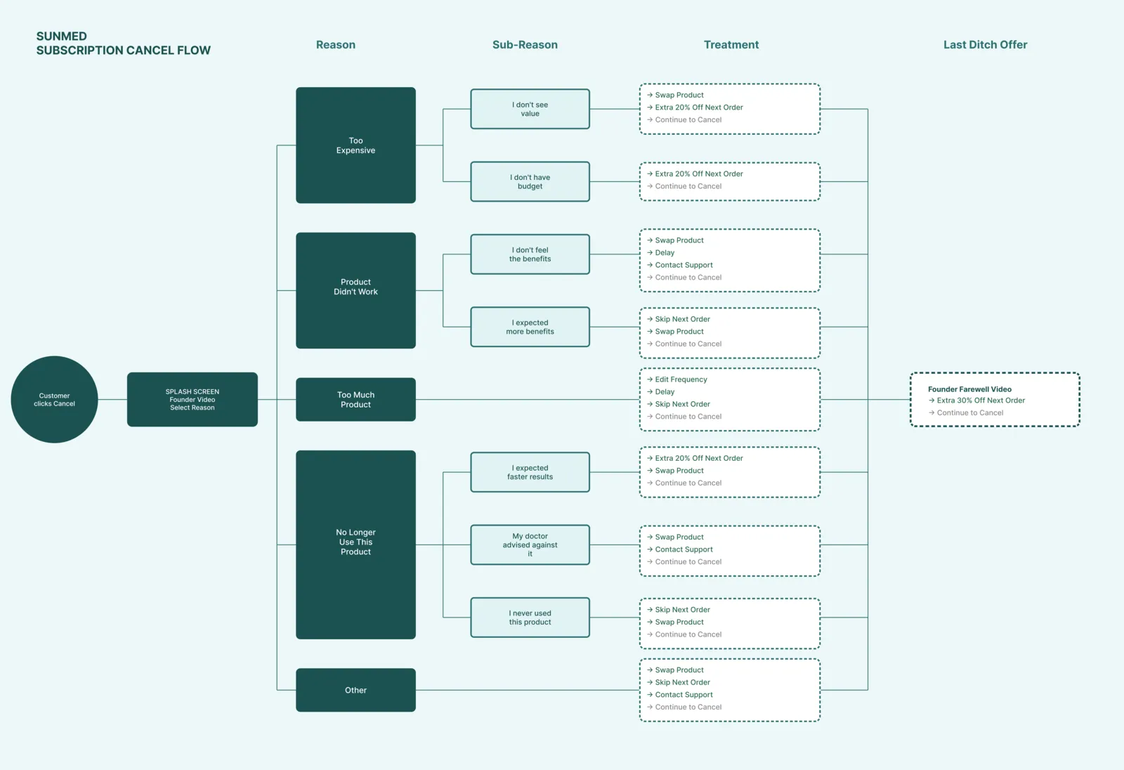
"Too much product" gets a skip or a frequency change before any discount. Nick Shackelford of Brez adds rebuttals first: give it to a friend, or drop from a 12-pack to a 6. The full reason to fix map is in cancel reasons and the fix for each, and the offers themselves are in cancel offers that work.
Some reasons get no offer at all
Some subscribers cancel because their dog died. Most cancel flows offer them 20% off.
You can't save this one. You can still be kind. On a "Don't need it anymore" screen, skip the offer. Say sorry, refund what hasn't shipped, and give your support team a small budget to send something. When customers told Chewy their pet had passed, Chewy refunded the food, told them to donate it to a shelter, and sent flowers. People still share those stories years later.
Real photos, reviews and a founder video
People still buy from people. And a real face beats a generic coupon.
For one of our brands we added a 45-second video from the founder to the cancel flow. Shot on a phone. Three things in it: why he started the brand, what the customer would lose by leaving, and why their support mattered to him. Save rate went from 12% to 24%, with no new discount.
That is the biggest lever on the screen.
What the founder should say
- Why they started the brand.
- That cancelling is fine.
- That they can skip or pause for a while and come back.
A good opening line is "Hey, I saw you're thinking about canceling. Here's what I'd love you to know before you go." Format: iPhone, no studio, 60 seconds, auto-play on.
No video? Use real photos. For one electric toothbrush brand, before and after photos reminded people why the product matters, paired with a skip offer. A review from someone who stayed works too, and the same reviews belong in the subscription customer portal next to skip and cancel.
Tell them they can skip
Twenty to thirty percent of people get saved on that first screen, before any offer. Because many don't know the options. Even if they want to swap or skip, they go straight to cancel. Ordergroove, citing McKinsey, puts it at up to 19% of cancels coming from people who didn't know they could change timing, contents or frequency (Ordergroove).
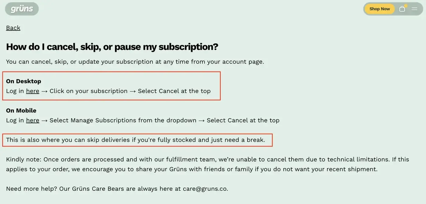
So say it on the splash screen. Grüns does this on its cancel FAQ: "This is also where you can skip deliveries if you're fully stocked and just need a break."
The ending screen and the buttons
Button copy is copy too. Loop's examples use "Keep Going" and "Keep My VIP Benefits" as the main button, with "Continue to cancel" as a plain link under it. Four Sigmatic uses "Decide Later".
Don't write the decline option to make them feel bad. Recurly calls out buttons like "I don't want to save money" as a pattern customers now see through (Recurly). It undoes the heading.
So keep the cancel link visible. Hiding it gets you one more charge, then a review, a chargeback, and a customer who tells their friends. Where that line sits is covered in cancellation rules and dark patterns.
The last screen should thank them and leave the door open. Low conversion. Attach the founder's video here if you have one, with the winback offer.
And tell them the cancel is done. Say it plainly, say if anything still ships, and send the same in a confirmation email. Grüns writes the awkward part straight: once an order is with fulfilment it can't be cancelled, so share it with friends or family. Otherwise they check their bank. That is where the "charged after I cancelled" reviews start.
How to test cancel flow copy
Start on the benefits page. It has the highest impressions, since every subscriber passes through it. Then the highest-volume cancel reason. Niche reasons last.
Copy tests worth running:
- Financial value copy vs emotional value copy
- Perk list vs a single emotional hook
- Video vs no video
- Short video (60 seconds) vs longer (2 to 3 minutes)
- Personalised vs generic messaging, and the CTA wording
One test at a time, at least 4 weeks. Read the result. Move on. A save that skips forever is no save, so judge it on what saved subscribers do after. The method is in how to A/B test a subscription program. For what a good save rate looks like, see subscription benchmarks.
It is also never finished. The reasons people gave in version one are not the reasons they give now. Price moves. The product changes. A competitor shows up. So read the reasons monthly.
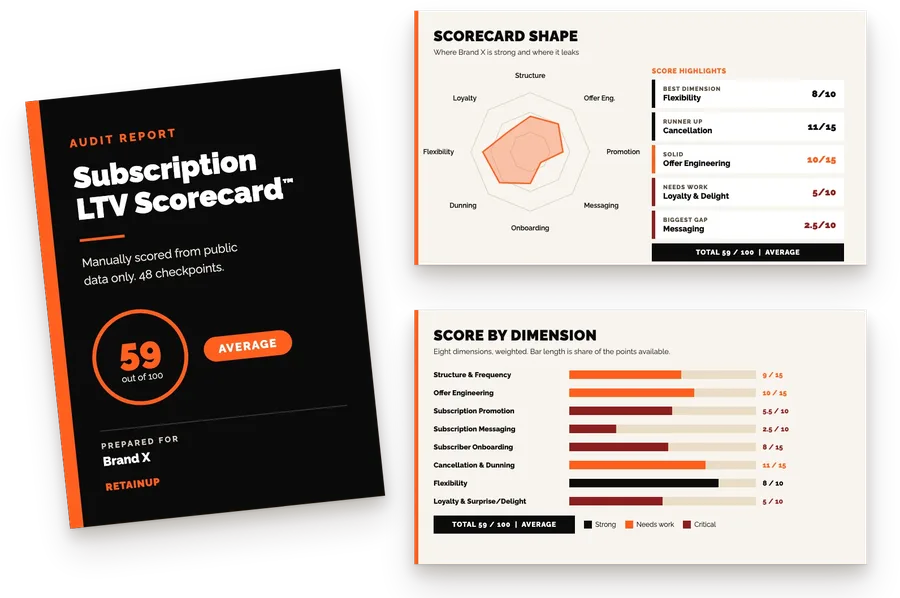
If you have 5,000+ active subscribers and want someone checking the cancel flow, the copy and the reasons every month, the Subscription LTV Optimizer™ covers your store, app and Klaviyo for $3,000 a month, with the fixes shipped. Smaller programs can start with the free subscription audit: 48 checkpoints and your top 3 leaks in 24 hours.
FAQ
What should a subscription cancel screen say?
A cancel screen should say four things in under 50 words: an empathetic one-line heading, one or two lines that point to the fix, two or three options with the offer, and one button to stay. Show what the subscriber gets from the product before any discount. Keep the cancel link visible so they never feel trapped.
How long should cancel flow copy be?
Keep each cancel screen under 50 words. Web reading research shows people read 20 to 28% of the words on a page, and concise copy tested 58% better than wordy copy. At the cancel moment people read even less, because they have already decided and are looking for the exit. Use bullets and bold the one line that matters.
Should I put a founder video in my cancel flow?
Yes, a founder video is one of the cheapest lifts in a cancel flow. Loop data shows a founder or product video adds 35% over static content, and one of our brands doubled its save rate from 12% to 24% with a 45-second phone video. Keep it to 60 seconds, set it to auto-play, and cover why the brand exists and that skipping is an option.
What should a cancellation confirmation screen say?
A cancellation confirmation screen should say the subscription is cancelled, in those words, and whether any order still ships or charges. Thank them, leave the door open, and add the founder video or a winback offer if you have one. Then send the same message as an email. People who are not sure the cancel worked check their bank, and that is where chargebacks and bad reviews start.
How do I respond when a subscriber says it's too expensive?
Split "too expensive" into two answers. Someone who doesn't see the value needs education, such as why the product costs what it does and long-term testimonials, not a discount. Someone who doesn't have the budget needs empathy and a real discount. One generic response to both groups usually saves neither of them.
One email a week on subscription retention: the numbers, the strategy, and what to fix first.

Rahi Jain
Rahi Jain is a subscription LTV specialist who helps $1M to $10M DTC brands reduce subscription churn and maximize LTV on Recharge, Skio, Stay AI and Loop.
More about Rahi