Key takeaways
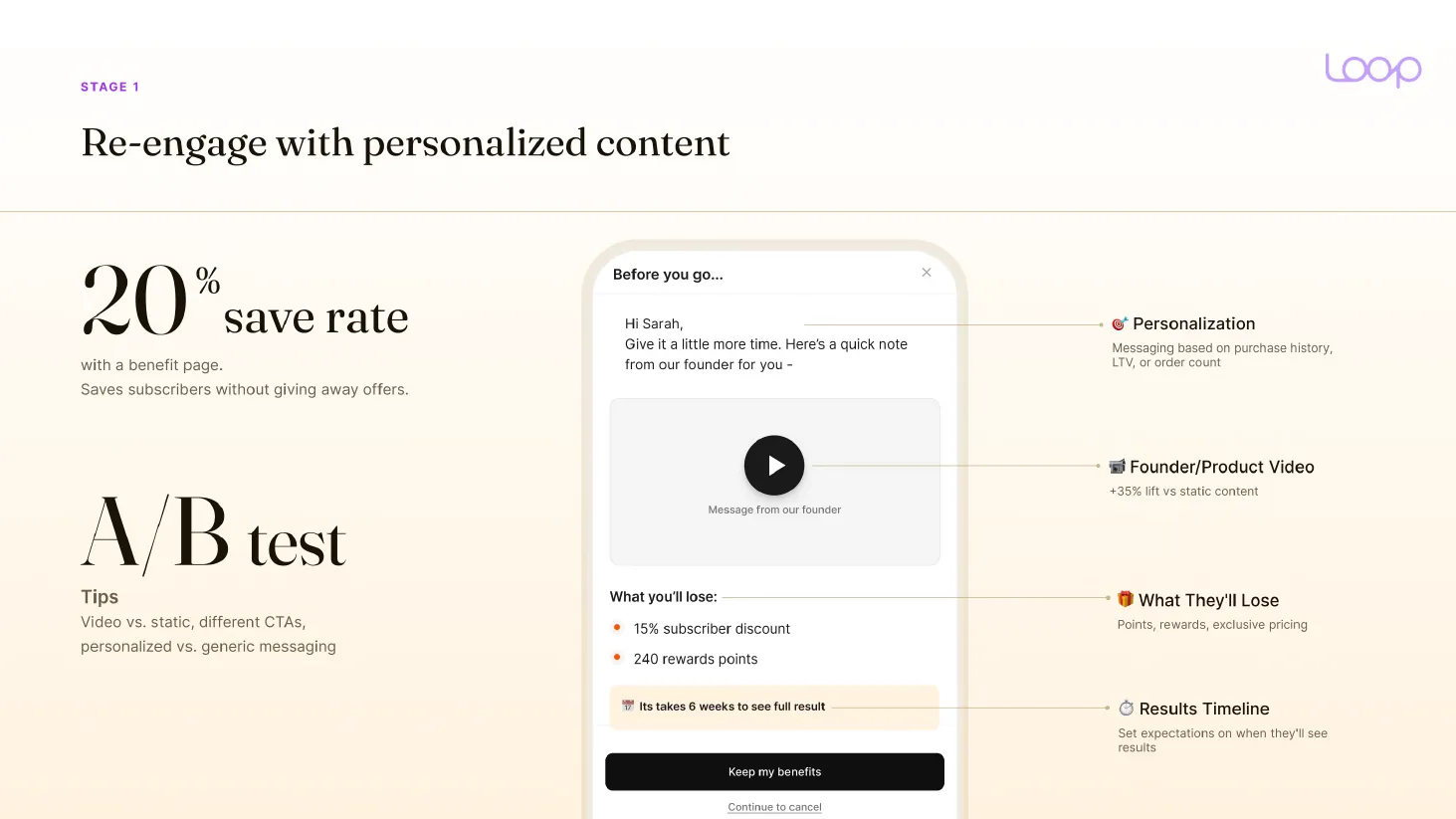
- In Loop's data from 441K cancel attempts, a benefit page alone saves about 20% of cancels, before any offer is shown.
- Cornbread Hemp went from a 9.5% to a 25.6% save rate after adding a splash screen and nothing else.
- Across 8 brands we audited in 2026, the median cancel flow saved 10.8% before any changes. SunMed went from 14.8% to 24.8% on Skio.
This is one part of the subscription churn guide, which walks the whole topic in order.
Every subscription brand has a cancel button. What happens after you press it says more about the brand than the homepage.
The cancel flow is everything a customer sees when they are actively trying to cancel. It is the cheapest revenue in the subscription business, and the last thing anyone touches.
A fixed number of screens, seen only by people who have already decided to leave, and every save is a customer you do not pay to acquire twice. Most brands build it once. Then nobody opens it again.
Here is the structure we use.
What a good cancel flow saves
Save rate is the people who took a deal to stay, divided by everyone who started the cancel flow.
- You will hear 25 to 33% quoted as best in class. One in every 4, or one in every 3, kept when they try to cancel.
- In our own audits of 8 brands in 2026, before we changed anything, the median was 10.8%. About 1 in 9. Seven of the eight sat under 15%.
- So 15% and up, counted as saves only, already beats most brands we see.
One catch. Some tools, like Stay AI and Loop, count everyone who entered and left without cancelling. So the dashboard can show 65 to 80%. Check what your tool divides by before you compare. Vendor case studies sit higher still: Recharge quotes 23% for Lola and 33% for Kollo Health. The full set of numbers, with sources, is on the subscription benchmarks page.
Most of the gap is structure. Loop looked at 441K cancel attempts across 87 brands. A generic "here's 10% off" screen saved about 6%. A three-stage conversation saved about 15%: re-engage, ask the reason, then make an offer.
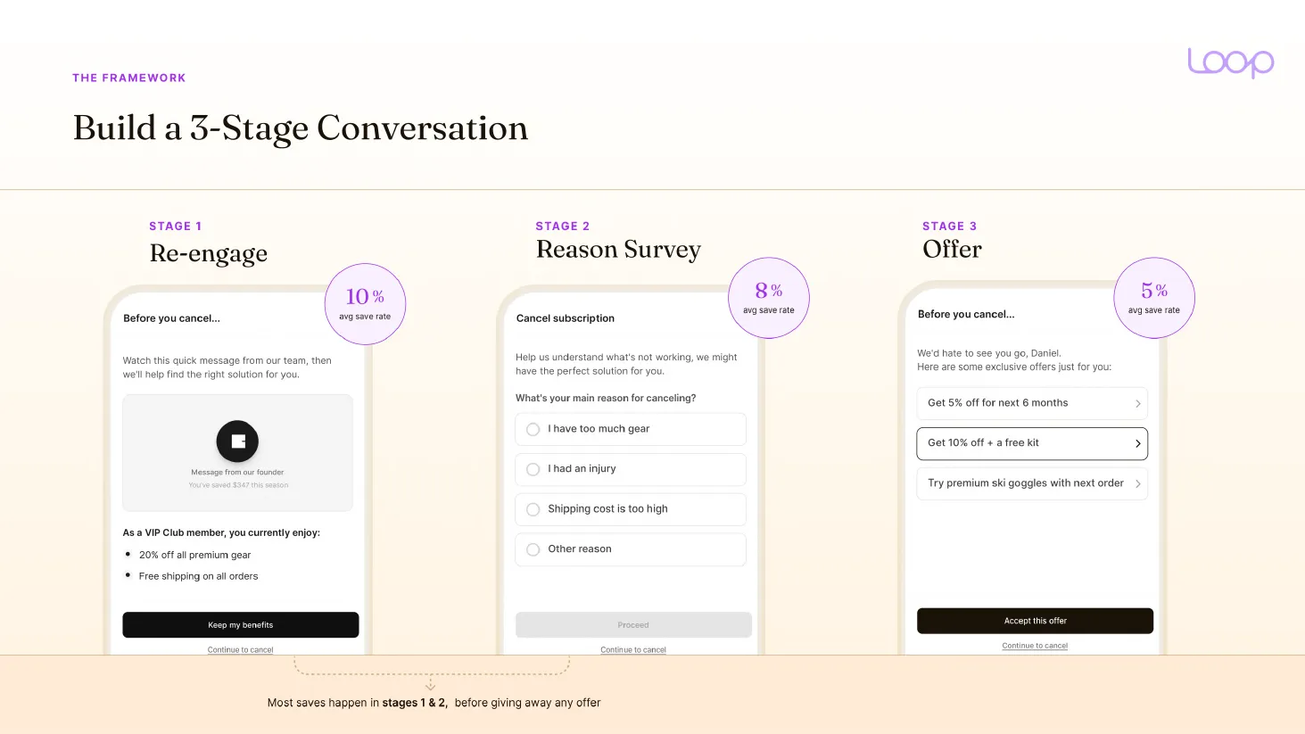
Matthew Holman put it well: "Your cancel flow is the last line of defense. Not the first." If the cancel survey is carrying your retention, the problem is upstream. Still, it is the fastest place to find a short-term win. Changes ship in days.
The cancel flow, screen by screen
The order is the same in almost every tool.
- Customer clicks cancel in the subscription portal.
- Blocker screen: value reminder, founder video, skip reminder.
- Optional loyalty screen, in tools that have one.
- Cancellation reason.
- The fix matched to that reason: skip, frequency change, swap, discount or contact support.
- A last offer, if they turned the fix down.
- Cancellation confirmation.
Then the cancellation email, the survey and the winback take over.
I walked through the whole build on video.

The blocker screen: value before the reason
Every cancel passes through it. So it gets fixed first.
It has three jobs.
- Remind them of the value they already have.
- Remind them they can always skip. That deflects "too much product" before they reach the reason screen.
- Play a founder video. Auto-play, not click-to-play.
That second job matters more than it looks. Twenty, thirty percent of people get saved right there, because many times they don't know the options available. Even if they want to swap, even if they want to skip, they go directly into cancel, and if the subscription portal is not nicely done, the cancel screen is where the whole journey starts.
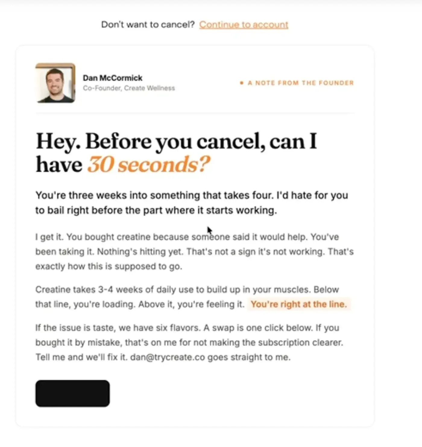
The best one I have seen: Create Wellness
The first screen is a note from the co-founder.
Hey. Before you cancel, can I have 30 seconds?
You’re three weeks into something that takes four.
Then he explains why creatine takes three to four weeks to work. If it is taste, a flavour swap is one click. If you bought it by mistake, he says that is on him for not making the subscription clearer, and gives his own email.
No discount on the first screen. Just a reason to stay, from a real person.
What goes on the page
Loop breaks a good re-engage page into four parts.
- Personalization: copy based on purchase history, spend or order count.
- A founder or product video. It lifts saves 35% against static content.
- What they will lose: points, rewards, their subscriber price.
- A results timeline. "It takes 6 weeks to see full results."
Two more lines work. "You've received $348 in product over 6 months." And the daily cost, "$2.63/day". At purchase they're optimistic. At cancellation they're evaluating.
No founder who wants to be on camera? Fine. For one electric toothbrush brand, before and after photos did the job.
The founder video
So this is the biggest lever on the screen. By a distance. Cornbread Hemp went from a 9.5% to a 25.6% save rate after adding the splash screen alone. Matthew Holman saw 20 to 25 brands move from about 5% to 15 or 16%. A 10-point lift, with no exceptions in his sample.
We saw it too. One of our brands was losing 6 in every 7 people who clicked cancel. We added a 45-second video from the founder, shot on a phone. Save rate went from 12% to 24%.
iPhone, no studio, about 60 seconds, auto-play on. People still buy from people.
Three versions by tenure, and only three
Someone cancelling before their first box arrives is not the same person as someone on order eight. They get different screens.
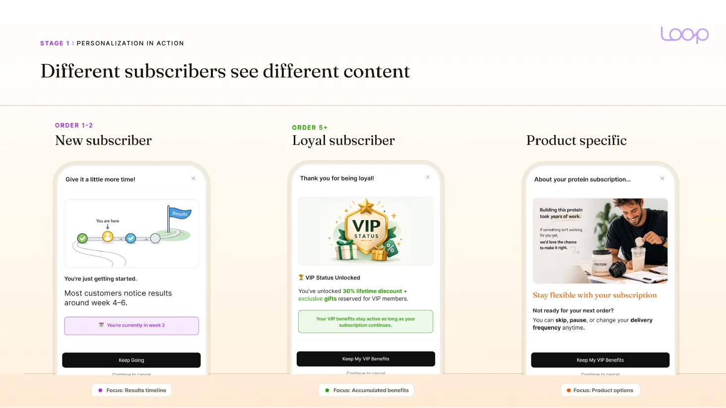
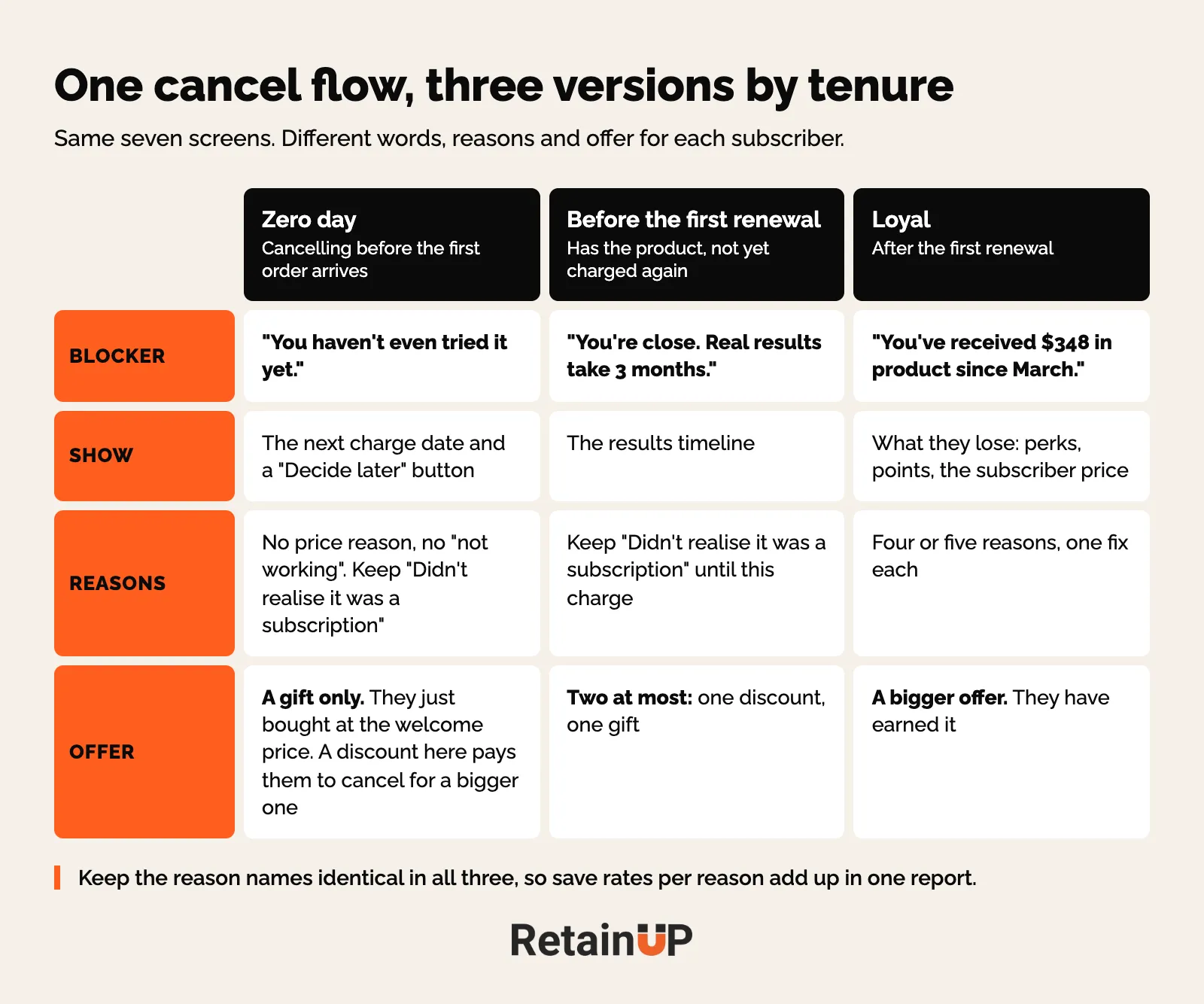
Zero day: before the first order arrives
"You haven't even tried it yet." Show the next charge date and a "Decide later" button. Four Sigmatic does this well: "You haven't even tried your first cup yet", the next charge date, and "You're fully in control." Most of these cancels start at checkout, so the fix lives in stopping day-zero cancellations.
No discount here. Someone who just bought at the welcome price can cancel to take a bigger one. Offer the gift only. And drop the price and "not working" reasons. They have not used it yet.
Before the first renewal
"You're close. Real results take 3 months. You've done the hard part." The results timeline does most of the work. Keep "Didn't realise it was a subscription" on the list up to the first renewal, because the bank message on that charge brings people in.
After the first renewal: the loyal subscriber
"You've received $348 in product since March." Then a bigger offer. Four Sigmatic tells 5+ order members about perks worth $50+ a year. They save 22% overall.
Thomas Lalas puts it simply. Don't treat a veteran who has spent $1,000 like someone who just bought. Cut veterans some slack. Be more aggressive with new subscribers, because someone who cancels in the first 30 or 90 days rarely comes back.
Why only three? More profiles means too few cancels in each to read.
The reason screen: one fix per reason
Ask why. Then answer that reason, instead of answering every reason with the same discount.
- Too much product: skip or delay.
- Too expensive: change frequency, then a discount.
- Not working: the results timeline.
Skip first, discount last. A discount shown to every reason gets taken by few and teaches customers that cancelling pays. One exception. Life reasons, like a pet that passed away, a medical change or a move, get no fix at all. Say sorry, make it easy, and let them go. They may come back. Stay AI routes bereavement straight to the confirm screen.
The full reason-to-fix map, including the two kinds of "too expensive", lives in cancel reasons and the fix for each. And keep each list to four or five reasons.
Here is the flow we drew for SunMed, a CBD brand on Skio. Splash screen with a founder video, five reasons, sub-reasons where the tool allows them, two or three fixes each, then a founder farewell video with the last offer. "Continue to cancel" sits on every screen.
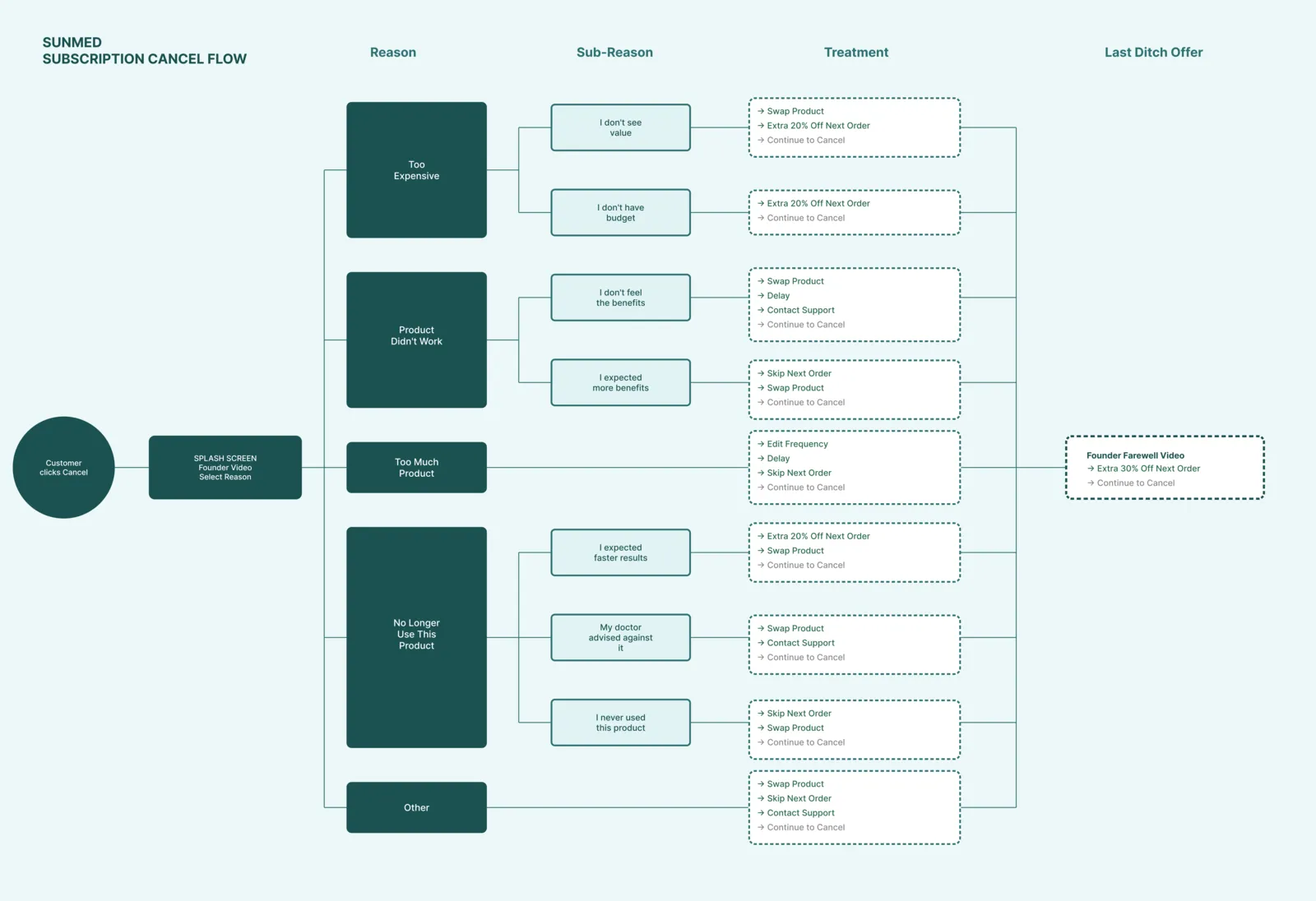
That rebuilt flow saves 24.8% of sessions against 14.8% for the old one. No new discount.
The structure is the same in every app. What each one lets you build at the reason screen is not.
| App | At the reason screen |
|---|---|
| Recharge | One offer per reason. A/B testing at flow level. |
| Skio | A skip or pause prompt before the reason. Sub-reasons. Several fixes per reason, the subscriber picks. A last discount at the end. |
| Loop | Splits saves per reason into benefit page, fix and offer. Shows average orders after each fix. |
| Stay AI | Tests several fixes per reason and picks the winner. Shows one at a time, never side by side. |
Check the Recharge, Skio or Loop setup guide before you design.
One offer, at the end
The cancel offer must beat the welcome offer. If it doesn't, they cancel and come back as new customers for the welcome deal.
Two offers at most: one discount, one gift. More than two and people freeze. In Loop's data, two offers saved 14.7%, the best of any number they tested. What to offer, and how to read whether it worked, is in cancel offers that work.
The offer comes last on purpose. Most saves happen before it. If yours don't, the blocker screen or the reason fixes need work, and a bigger discount will only hide that.
The ending screen: leave the door open
They cancelled. Fine. Thank them and leave on good terms.
This is where the founder farewell video goes, with the highest discount you are willing to give and a 24 hour countdown. Low conversion. And it keeps the door open for next time. Everything after this screen belongs to the winback flow.
And make the cancel actually finish. A lot of "charged after I cancelled" complaints come from people who reached a save screen, closed the tab, and assumed it was done. A clear confirmation screen and a confirmation email end most of those.
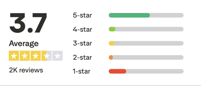
You can see what happens when it goes wrong. Mars Men sits at 3.7 on Trustpilot, from about 2,000 reviews, and the pattern is charges after cancelling.
Everyday Dose has BBB complaints from this year like "I purchased a single starter kit, yet they charged me again the following month."
Hiding the button gets you one more charge. Then a review, a chargeback, and a customer who tells their friends. State rules now cover it too. The survey has to be skippable. The save offer cannot be a wall. The route out should be as short as the route in. More on that in cancellation rules and dark patterns.
Every screen: heading, line, offer
Each screen gets the same shape: a one-line heading with empathy, a line or two that points to the fix, two or three options at most, then the button. Under 50 words. At the cancel moment people skim harder, because they have already decided. The wording itself is in writing cancel flow copy.
How to know the flow is working
The dashboard flatters you.
Loop marks a session "Saved" whenever it ends without a cancel, including people who close the tab and come back an hour later to cancel. Recharge counts a closed tab, or Keep Subscription with no reason picked, as saved. So follow every save. Look for a later cancel of the same subscription, and check whether an order came in between.
And read post-save revenue by treatment, meaning orders, revenue and how long they stayed after the save, split by the fix they took. Loop suggests checking saved subscribers at 30, 60 and 90 days. If they never buy again, you just delayed the inevitable. A flow saving 30% into nothing is worse than a flow saving 20% into people who keep paying.
Three more checks before you tune anything. First, coverage, because a cancel flow only works on the people who reach it, and the cancels your support team keys in by hand, or the ones that arrive by email, never see a single screen of it. Count those, see cancel flow coverage. Second, read saves by stage, per profile. Splash, reason fix and offer separately. Most saves should come before the offer. Third, cancel your own subscription on your phone. Skio says the same. Look for dead ends.
Where to start? Impact is conversion rate times impressions. So the blocker screen first, the highest-volume reason second, niche reasons last. Review it monthly. One test at a time, at least four weeks, read the result, move on. The setup for that is in how to A/B test a subscription program.
It is never finished. One brand started pushing subscription hard last quarter, and their top cancel reason became "I did not know this was a subscription." It only showed up because someone read the reasons.
A cancel flow drifts. A treatment that saved a third of one reason last year can save almost none of it today, and nothing in the dashboard tells you until you go looking. The Subscription LTV Optimizer™ checks your store, subscription app and Klaviyo every month and ships the fixes, cancel flow included. It is $3,000 a month, for brands with 5,000+ active subscribers. If you just want to know where your flow leaks, the free subscription audit covers 48 checkpoints and sends the top 3 leaks in 24 hours.
FAQ
What is a good cancel flow save rate?
Counted as saves only, 15% or more beats most brands. Across 8 brands we audited in 2026, the median saved 10.8%. Best in class is 25 to 33%. Check how your tool counts first. Loop and Stay AI count everyone who left without cancelling, so they can show 65 to 80%.
Should a subscription brand offer a pause or a discount when customers cancel?
Neither first. Lead with skip or a frequency change matched to the reason, and keep the discount for the last screen. A generic 10% off screen saves about 6%, while a three-stage flow saves about 15%. We leave pause out of most flows, and where a brand keeps it, it gets a resume date and a 90-day cap.
Should new and loyal subscribers see different cancel screens?
Yes, in three versions. Zero day, before the first order arrives, gets the next charge date, a "Decide later" button and a gift, never a discount. Before the first renewal gets the results timeline. Loyal subscribers see what they received so far and a bigger offer.
How will a customer know their subscription cancellation is complete?
They should see a confirmation screen that says the subscription is cancelled, then get a confirmation email. Most "charged after I cancelled" complaints come from people who reached a save screen, closed the tab and assumed it was done. A clear last screen and an email end most of those.
One email a week on subscription retention: the numbers, the strategy, and what to fix first.

Rahi Jain
Rahi Jain is a subscription LTV specialist who helps $1M to $10M DTC brands reduce subscription churn and maximize LTV on Recharge, Skio, Stay AI and Loop.
More about Rahi