Key takeaways
- Most subscribers open the portal for the first time when they want to cancel. Show progress before you show the exit.
- A Pup Above added a punch card to its portal. Month-over-month churn fell over 20%.
- Auri built milestone gifts from order 3 into the portal. Active churn fell 21.4%.
Most people visit the customer portal to cancel.
That's the only reason they log in. Everything else just sits there.
And the journey often starts before the portal. On your support page, on Google, or asking AI how to cancel. Then they follow through. So the question is simple: if someone is determined to cancel, what does the page show them first?
Right now most brands build a portal so people can cancel without emailing support. That's it. This page is part of the subscription retention hub, which covers what keeps a subscriber after month 3.
Nobody knows the portal exists
Before the design problem, there's a discovery problem.
And most subscribers never open the portal until they want out. So they never see the skip, the swap, the milestone, the add-ons. Four months of paying you, and they never knew a delivery could be moved.
They didn't miss it. Nobody told them.
Most customers search first. "How to cancel [brand] subscription." For most brands the answer is a generic help page or an old Reddit thread. So write the FAQ for every step: how to skip, how to move a delivery, how to change frequency, how to swap. Each as its own question, in the words a customer would type. Grüns does this properly.
Tell them early, and in more than one place
- One email around day 14 saying you can skip anytime, swap anytime, change frequency anytime, no questions asked.
- The portal link in every shipping and renewal email.
- Magic link login switched on, so the link in the email opens the portal without a password.
- An "Already subscribed? Manage it here" link on your help centre and subscription FAQ, next to the cancel steps.
- A "Manage subscription" link in the site footer and account menu. Skio's own best-practice guide asks for the same, plus portal steps in the first welcome email.
- The portal shown on the site, not just claimed. A screenshot or a short video of what to click.
Passwordless login matters more than it sounds. A forgotten password is the biggest reason people never open the portal, and the one time they push through it, they are angry and on their way out. Loop now lets you pick Shopify customer account login or its own magic link (Loop product updates, June 2026).
Or skip the login and put the portal inside the email. Harry's puts Swap, Send Now and Delay right in its upcoming shipment email through Zaymo, then two add-ons, then its subscriber perks. There's no login. Create Wellness embedded the whole portal in its billing reminder the same way.
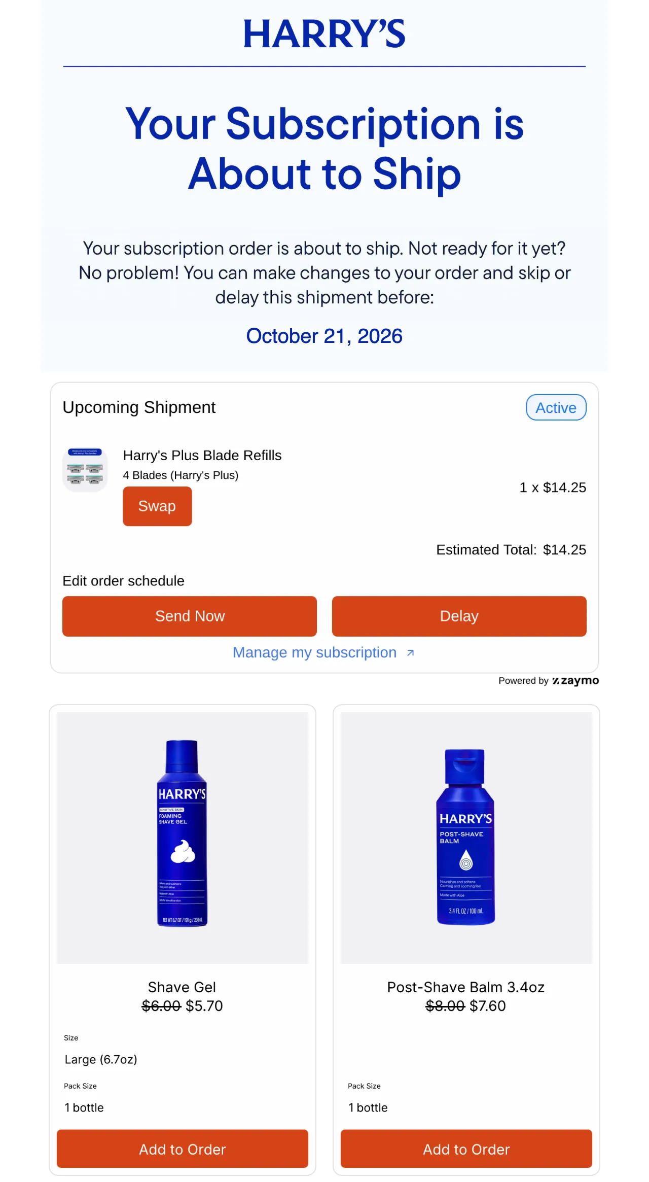
Most portal visits come from an email on a phone. So build it phone first, and make the email that sends people there part of your core subscription email flows.
What a subscription customer portal should include
Order matters. The page has one visit to show progress before it shows the exit.
1. Milestone first
How much they have done. Orders completed, months on, what they have saved. The punch card. Show progress before you show the exit.
Name the gift, never the deadline. "Your next box brings the drying towel" beats "You need to complete next order by". The gifts themselves, and when they land, are covered in subscription rewards.
2. Benefits that cost you nothing
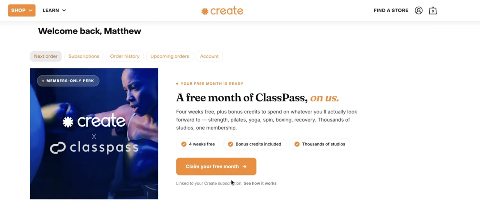
Partner perks. Create Wellness gives subscribers a free month of ClassPass as a members-only perk, and it sits on the first portal screen, tagged "Members-only perk" and "Linked to your Create subscription". Partner-funded.
3. Cross-sell
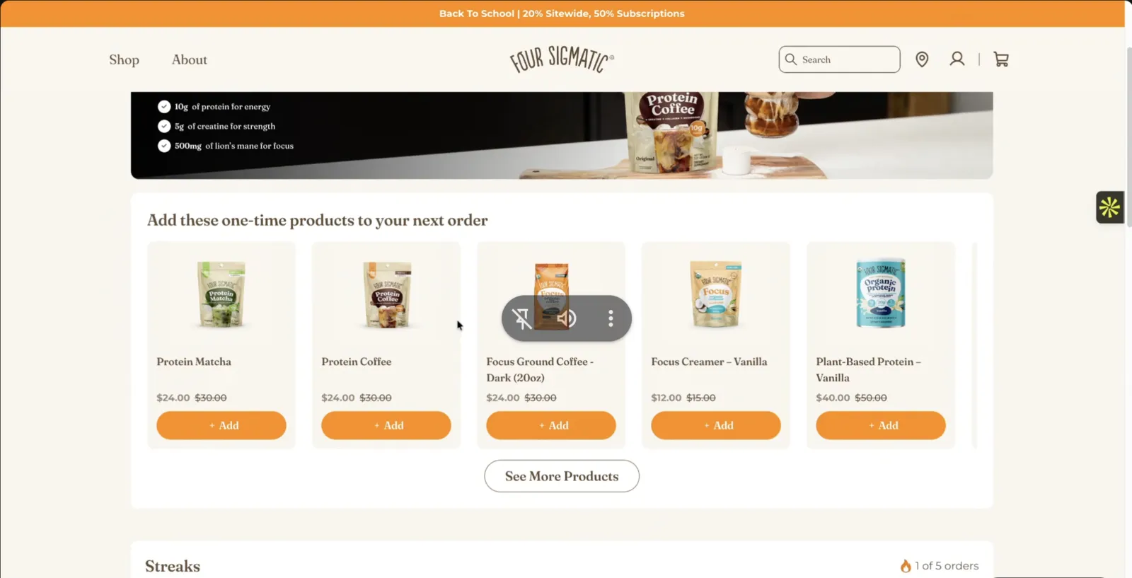
An add-on carousel. Build-a-box. Items attached to the next order at zero acquisition cost, in the same place you show the milestones. Four Sigmatic puts a one-time add-on carousel at subscriber prices right above its Streaks tracker. What to offer each subscriber, and in what order, lives in add-ons, cross-sell and upgrades.
4. Something about the brand
Why you exist. What's coming, like new flavours and drops. Not just logistics.
5. Then the options
Skip, pause, reschedule, swap, change frequency. They live in the portal, not behind the cancel button. Which one to push first, and when pause should be capped, is in the flexibility ladder.
So drop any layer the brand cannot fill. A single-product brand with free gifts has nothing to cross-sell, and an empty carousel full of the products they already own is worse than no carousel.
How we lay out the Home tab
When we rebuild a portal, the Home tab gets five blocks at most, in this order, using only the ones that apply.
| Order | Block | Shown to |
|---|---|---|
| 1 | Payment problem banner with one Update payment button | Only subscribers whose last charge failed |
| 2 | Streak or milestone tracker, naming the next gift and its value | Everyone on a plan with gifts |
| 3 | What you have saved against the one-time price | Everyone |
| 4 | Next delivery: Get it now as the main button, Delay beside it, More holding Skip, Pick a new date and Cancel | Everyone |
| 5 | Upgrade banner to the longer plan | Only the plan it upgrades |
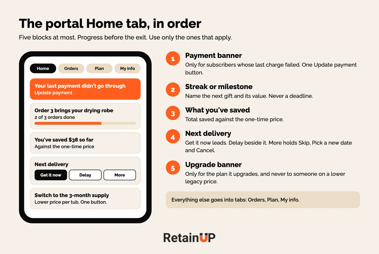
And everything else goes into tabs. Orders, for the next box line by line and past orders with tracking. Plan, for the current plan and the upgrade side by side with one switch button. My info, for address, payment, backup card and reminders. Keep cancelled subscriptions visible with a Restart button, so a past subscriber who logs in can come back in one tap.
Why the payment banner comes first
On one of our brands, 16.8% of renewals fail first time, and subscribers who update their card recover 62% against 26%. On another, 35% of failures were dead cards that only a card update fixes. Yet the portal showed a black "Payment failed" tag on a card that still said Active, with no explanation and no update button. The banner fixes that. The emails that drive people to it are in the card update flow.
Why the upgrade banner earns its spot
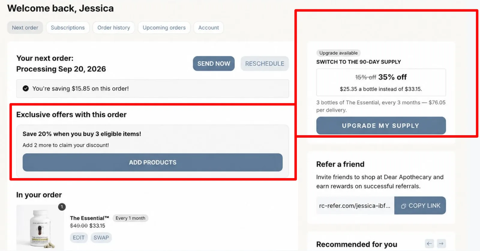
On that second brand, 96% of subscribers were monthly. The upgrade to a 3-month supply was the biggest lever on the page, and it was hidden behind a Plan edit button with no price. Dear Apothecary, in a screen from Recharge's upsell deck, shows how it can look: a card that says "Upgrade available", the new rate against the old, the per-bottle price and one button.
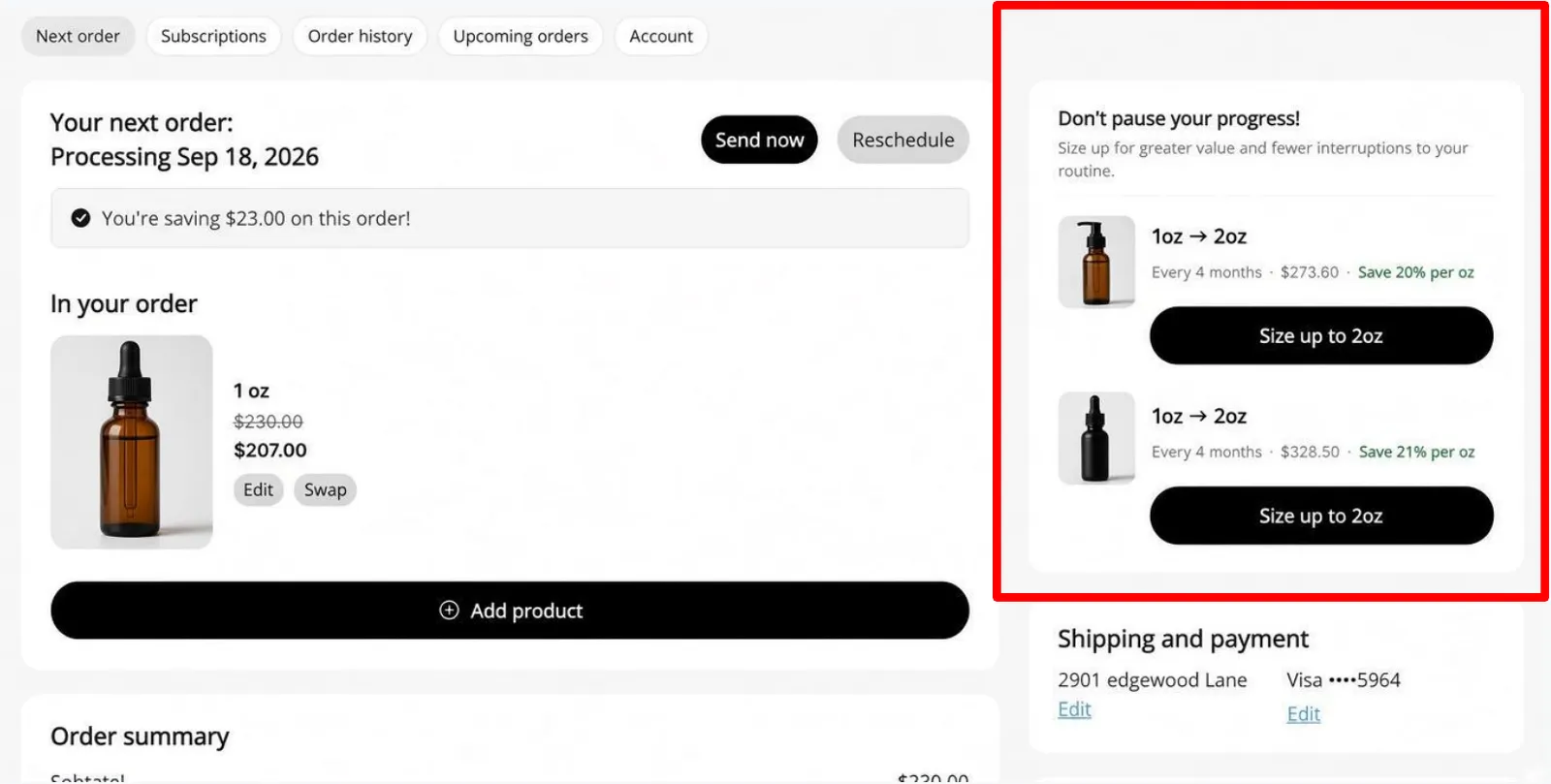
A size-up works the same way when the product comes in bigger packs. One card, the saving per ounce, one button.
Skip the banner for anyone on a legacy price lower than the upgrade.
What to remove from the portal
Most portals we walk through have more buttons that lead out than buttons that add value. On one brand, the count was four out (Skip Order, Re-Schedule, Delay, Cancel) against one real value action (Order Now). Four buttons of the same size. Skip was as loud as Order Now.
- The discount code field. It sends subscribers hunting for codes. Save offers belong in the cancel flow.
- The quantity stepper when supply is a variant. Quantity 2 on a 3-month plan ships six tubs.
- Duplicate delivery buttons. One main action per card, and Get it now leads it. Everything else sits in a menu.
- Retired plans and test products. Plan switches use the current variants, never the old ones.
So count the buttons on yours before you add anything.
Social proof, only where doubt happens
Yes to reviews in the portal. But only where doubt happens, not across the whole page.
Where it works
- New subscribers, orders 1 and 2. A banner with reviews or short videos from people who saw results at month 2 or 3. "Not working yet" is the top supplement cancel reason, and it peaks here.
- Next to skip, pause and cancel. One line from someone who almost quit and stayed. "I nearly cancelled at week 3. By month 2 my skin cleared."
- On add-ons and swaps. "Most popular add-on with your plan." Helps them pick, lifts order value.
What to skip
Generic star ratings, like "4.8 from 12,000 reviews". That sold the first order. They already bought. Skip first-week reviews too. Show long-term subscribers.
One honest limit: no test we have seen shows portal social proof lifts retention on its own. So run it as a test. Banner for half of new subscribers, compare cancels before order 3.
Portal vs cancel flow
Keep them separate. The subscription cancel flow is reasons, routing and save offers. The portal is everything before it.
So where cancel sits in the portal still matters. Put it as the last item in the More menu, labelled "Cancel subscription", under Skip this box and Pick a new date. Never on a separate tab. Never behind a vague label. And it opens the cancel flow, so the reason screen and the offer do their job.
Amazon Prime's cancel maze is the counter-example. Auto-renewal laws such as California's want online cancel to be easy to find, and a hidden button reads as a trap. More in cancellation rules and dark patterns.
For box brands, the portal is the box editor
Add, remove, swap items each cycle. If someone has 5 to 7 items and wants fewer, they should be able to reduce it in the panel, not cancel. Beauty this month, laundry next month. That swap is what turns a cancel into a change.
Portals that give people a reason to open them
A few brands have rebuilt the portal into something other than an exit.
- A Pup Above gamified the portal with a punch card. Every order fills the card toward a reward, so subscribers watch progress climb each time they log in. Month-over-month churn fell over 20%. New subscriber rate rose 14%.
- Auri built a punch card into the portal with milestone gifts from order 3. Active churn fell 21.4%, and rewarded subscribers spent 3.2x more.
- Oats Overnight added likes and notes. Subscribers rate flavours and leave notes, and those notes feed product development.
The closer people get to a goal, the harder they push to reach it. And people keep what they help build.
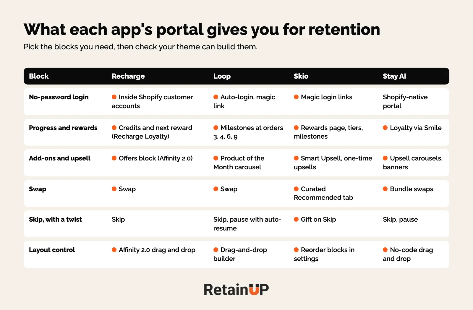
What Recharge, Loop, Skio and Stay AI let you build
Check what the builder allows before designing anything. In Loop, a hand-built Advent theme can show only View and a greyed Duplicate, and a new Nova theme starts blank and cannot copy Advent. We found that out on a live build. The settings themselves are in the Loop, Recharge and Skio setup guides.
| App | What the portal can do |
|---|---|
| Recharge | Skip, pause, swap, reschedule, quantity change, send now on one order-centric page. Embedded in Shopify customer accounts, so no second login. Referral link, credits and progress to the next reward for Recharge Loyalty users. |
| Loop | Pause with auto-resume, skip, swap, payment update. Reward milestones as a visual journey at orders 3, 4, 6 and 9. Cancel interception by order history and LTV. One-click winback. Drag-and-drop builder with hero banners and a Product of the Month carousel. Auto-login. |
| Skio | Get order now, skip, pause, change frequency and date, merge and split subscriptions, swap with a curated Recommended tab. Gift on Skip, Smart Upsell, magic login links and backup payment methods. A Rewards page with tiers, credits and milestones. |
| Stay AI | No-code drag-and-drop portal. Bundle swaps, pause, trial add-ons, upsell carousels and banner ads. Smile points, VIP tier and referral link inside the portal through the Smile integration (Stay AI app listing). |
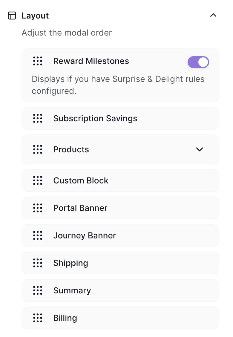
Skio's layout settings let you drag Reward Milestones, Subscription Savings and Products above Shipping and Billing. Most brands leave the default. Moving three blocks is the cheapest portal fix there is.
Gift on Skip is worth a look. Instead of skipping, the subscriber sends that order to someone else. Billing stays the same. A skipped order becomes a shipped one.
And vendor numbers deserve a pinch of salt. Loop cites OSEA Malibu going from 10% to 5% churn, and one-click winback at 40% success. Recharge says save rates run up to 65% higher for brands on its loyalty tools when earned credits and gifts show at the cancel moment. Useful directionally. Not audited.
Test it before you publish, then track it
Log in as two real subscribers, one on each main plan. Screenshot every tab, menu and popup. Then check three things: the plan switch lands on the right variant and selling plan, Get it now creates an order and keeps the cadence, and Cancel opens the cancel flow.
And then send the day-14 email. A strong portal nobody opens is the most common failure we see.
After launch, watch card updates made in the portal, upgrades taken from the banner, skips and delays against cancels, and support tickets asking to change an order, which should fall. Appstle's portal guide tracks a similar list. Compare each against the month before the rebuild.
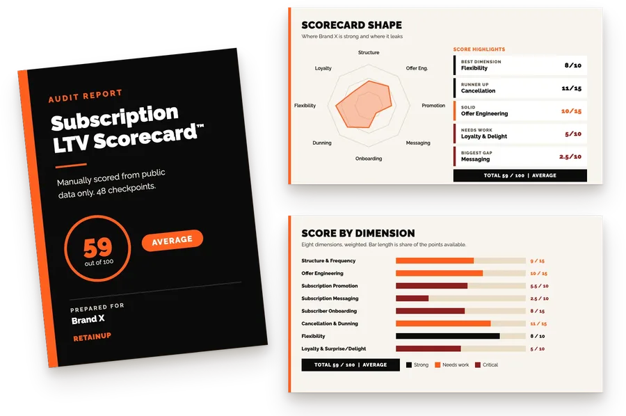
If you'd rather have the portal built than build it, the Subscription LTV Maximizer™ sets up the offer, widget, cancel flow, portal, payment recovery, pause and skip in Recharge, Skio, Stay AI or Loop, plus email and SMS, live in 30 days for $5,000. To see where your portal sits first, the free subscription audit checks 48 points and sends your top 3 leaks in 24 hours.
FAQ
What should a subscription customer portal include?
A subscription customer portal should show progress first, then options. Put the milestone or streak tracker and savings at the top, then partner perks, add-ons and something about the brand. Skip, pause, swap, reschedule and frequency changes come after that. Cancel sits last in a More menu, labelled plainly, and opens the cancel flow.
How do I get subscribers to use the customer portal?
Tell them it exists before they need it. Send one email around day 14 saying they can skip, swap or change frequency anytime. Add the portal link to every shipping and renewal email, switch on magic link login so nobody needs a password, and link the portal from your help centre and FAQ.
Should the cancel button be hidden in the customer portal?
No, the cancel button should be easy to find. Put it as the last item in a More menu under skip and reschedule, with a plain label, and have it open your cancel flow. Auto-renewal laws such as California's expect online cancellation to be simple, and a hidden button reads as a trap.
What is the difference between a customer portal and a cancel flow?
The portal is everything a subscriber sees before they decide to leave: progress, perks, add-ons and the skip and swap options. The cancel flow starts when they press cancel, and handles the reason screen, routing and the save offer. Keep them separate, and let the portal give a reason to stay first.
Which subscription app has the best customer portal?
Each app covers the basics, so pick on the retention blocks you need. Skio has Gift on Skip and curated swaps, Loop shows milestones as a visual journey, and Recharge sits inside Shopify customer accounts with no second login. Stay AI has a no-code builder with upsell carousels. Check what your theme can build before you design.
One email a week on subscription retention: the numbers, the strategy, and what to fix first.

Rahi Jain
Rahi Jain is a subscription LTV specialist who helps $1M to $10M DTC brands reduce subscription churn and maximize LTV on Recharge, Skio, Stay AI and Loop.
More about Rahi