Key takeaways
- Mars Men answers "Do I have to sign up for a subscription?" with yes, a reason, 90 days risk-free, then control.
- Lead with results from daily use and put control last. Mars Men opens its subscription FAQ with daily intake, and the cancel line comes at the end.
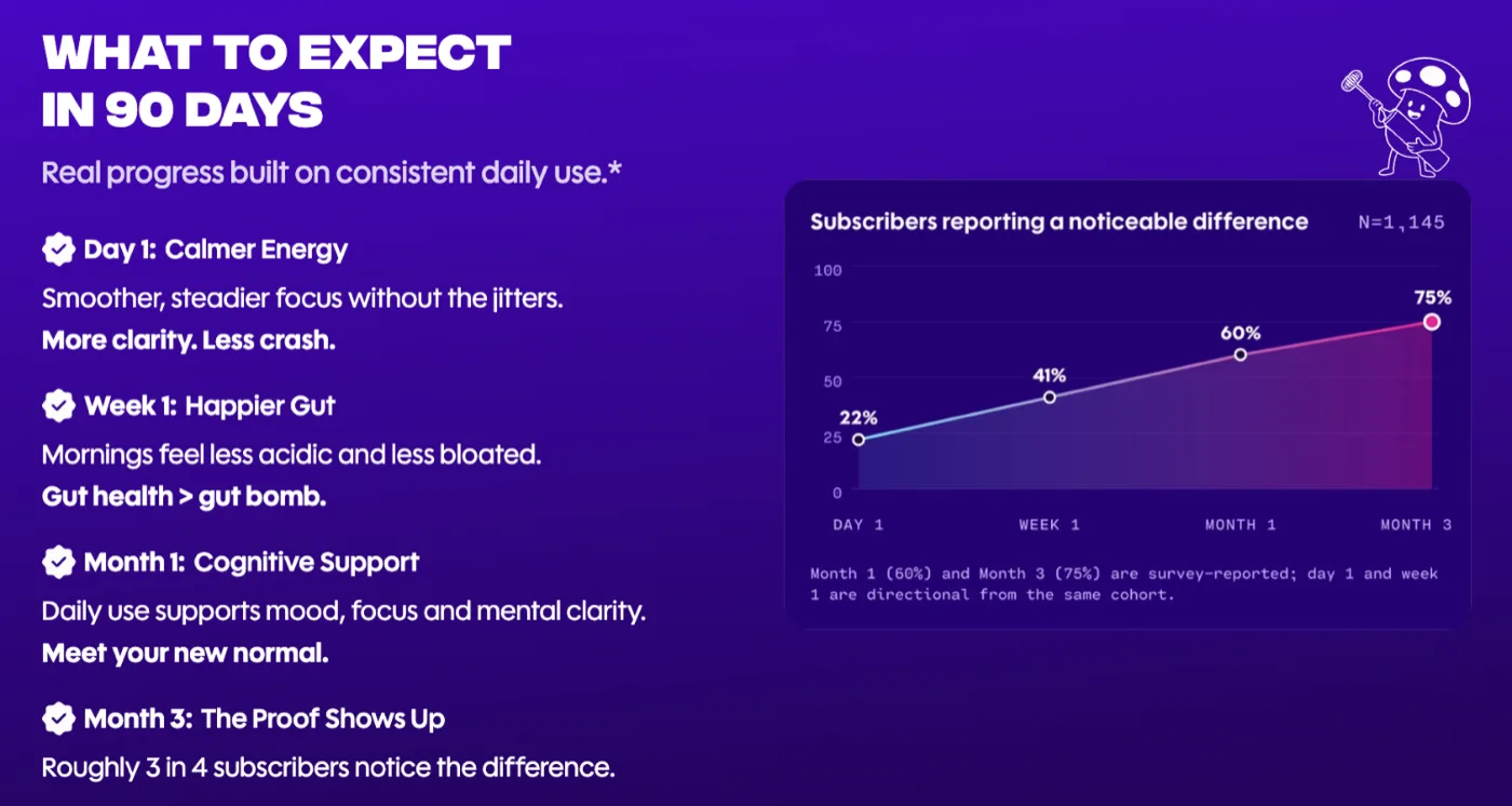
- Everyday Dose shows 22% of subscribers noticing a difference on day 1 and 75% by month 3, right on the product page.
Subscribe and save means the buyer gets the product on a schedule, at a lower price, until they change or cancel it. Most brands offer it and never argue for it. A discount badge and a toggle. So the buyer compares two prices. And anyone who doesn't trust the program picks one-time.
This page is the copy around the widget. It's one piece of getting more buyers to subscribe.
What the widget can't say on its own
Two jobs. Two places. The subscription widget carries the choice: which plan, which frequency, which price. The why subscribe section carries the argument for subscribing at all.
So when the argument is missing, the widget has to do both. It can't. A 15% badge says the subscription is cheaper. It doesn't say why you'd want this product to keep showing up.
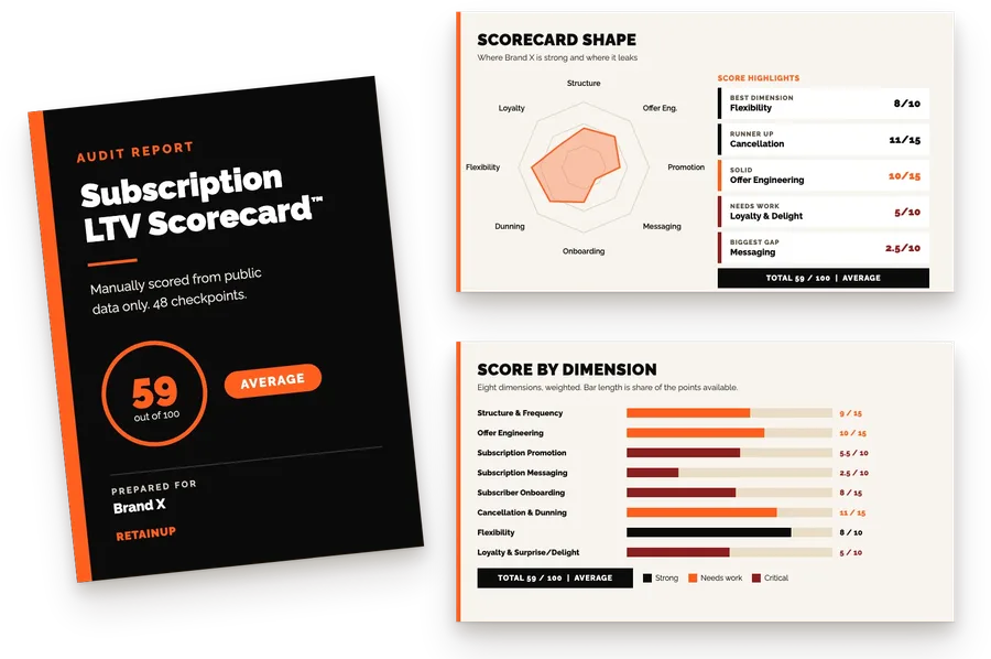
In our Subscription LTV Scorecard™ this is a whole dimension, Subscription Messaging, worth 10 of the 100 points. We read the copy for six things. Here is how five brands we scored did on it.
| Checkpoint | Points | What we look for |
|---|---|---|
| Why subscribe rather than buy once | 2 | A reason tied to the product: habit, daily use, the long term |
| Answers the value objection | 1 | Why it costs what it costs |
| Long-term commitment, not a trial | 2 | "For life", 90-day framing, no "try it now" |
| Long-term subscriber social proof | 1 | Reviews from people who stayed, not first-week results |
| Daily cost framing | 2 | $X a day, not $X a month |
| Results timeline set | 2 | Day 1, week 2, month 1 to 3 |
| Brand | Messaging score | Where it lost points |
|---|---|---|
| Grüns | 9.5 / 10 | Widget testimonials are mostly first-week reactions |
| Mars Men | 9 / 10 | Heavy risk-free trial framing next to "50% off for life" |
| Everyday Dose | 9 / 10 | "TRY IT NOW" and "No monthly commitments" on landing pages |
| Create | 7 / 10 | Timeline never tied to subscribing, value objection unanswered |
| Dr. Squatch | 6.5 / 10 | Convenience only, no long-term case, no tenure proof |
The pattern is plain. The supplement brands that need daily use argue for it. The soap brand leans on convenience, and convenience alone is the weakest reason on the list.
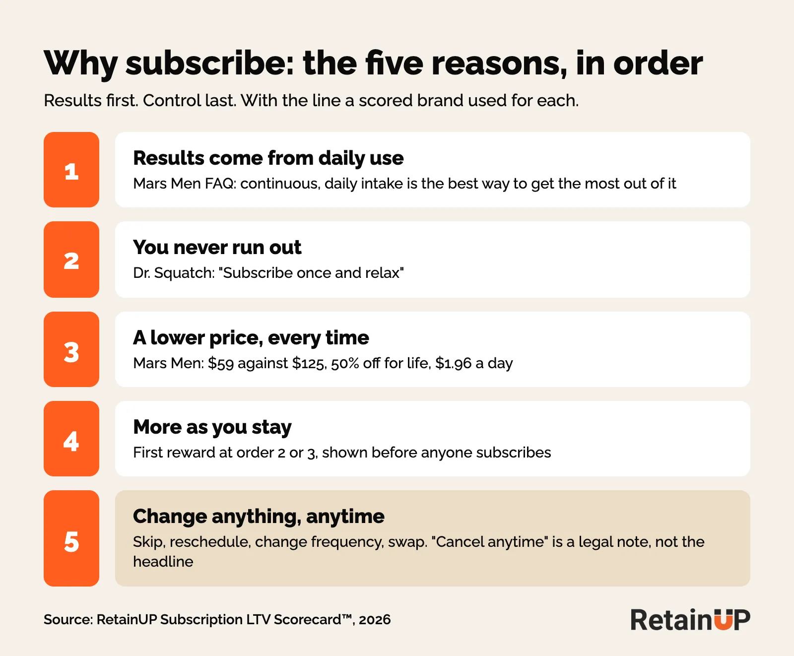
Five reasons to subscribe, in the order customers weigh them
Put them in this order. Results first. Control last. Most pages run it backwards. "Cancel anytime" is the loudest line. And that order tells the buyer the main thing to know about this subscription is how to leave it.
1. Results come from daily use
This is the case for the recurring version of the product. The discount only makes it the cheaper version. If the product works through consistent use, say so, and tie it to the subscription.
Grüns does it in one line. "A habit that tastes so good, you'll actually want to keep it." Everyday Dose says 99% of people subscribe because the point is changing your life long-term. Mars Men puts it in the FAQ. Clinical research shows continuous, daily intake is the best way to get the most out of the product, and a subscription builds it into your routine.
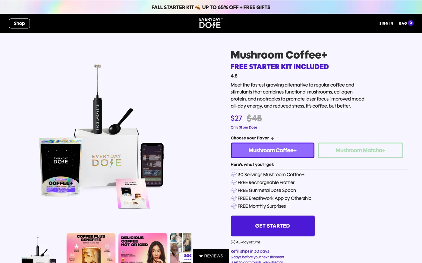
Create has the raw material. The timeline angle is good. But they argue consistency and saturation with a week 1 to week 4 timeline. And then never tie it to subscribing. The argument is sitting right there.
2. You never run out
Convenience is real. It's also the reason every brand gives. Dr. Squatch says "subscribe once and relax". That's most of their case. So they scored 1.5 out of 2 on why subscribe. Use it second, and make it true: the ship date has to match how fast the product gets used. Our page on subscription frequency covers the math.
And write the benefit, not the setting. Recharge's product page guide gives the example: "Delivered to your door every 90 days" instead of "recurring every 90 days". Same fact. Only one answers the fear of running out.

3. A lower price, every time
State the saving once, as a number, and say it lasts. Mars Men sells one-time at $125 with shipping and subscription at $59, "50% off for life". Nobody has to think. How deep to go is a separate decision, covered in how much to discount a subscription.
And if the monthly price stings, put it in days. $90 a month feels painful. $3 a day feels like less than a coffee. Mars Men writes "Only $1.96 Per Day". Grüns shows $2.14 a day, Create $1.79, Everyday Dose $0.82 a cup. The anchor and framing effects behind this sit on the widget too.
4. More as you stay
Benefits beyond the discount, listed. Perks, gifts, early access, free shipping. And the milestone schedule visible before anyone subscribes, with the first reward at order two or three, not order six. State the reward as a figure or a named item. The gift design itself lives in subscription perks and gifts.
The discount doesn't have to carry the case. Blue Stout added three subscription bullets to a supplement product page and conversion went up 9.1%. None of the bullets mentioned the 15% discount. Ordergroove, in early access, now lets brands show order-based incentives on the widget itself, so a gift at order three can sit next to the price.
Mars Men is the warning here. $70 of gifts, 50% for life, free shipping, all of it at order one. Then nothing. No milestone, no reason to reach order three.
5. Change anything, anytime
The fear of being trapped is real, so answer it as control: what you can change, and when. Skip, reschedule, change frequency, swap flavour. Name them. Say when the reminder goes out before each charge, and only if that reminder actually exists. The full flexibility ladder has its own page.
So keep it last. Never open with "cancel anytime". You're reminding people to cancel before they have a reason to.
Put a results timeline on the page
Supplements have one main problem. You can't feel them working. A timeline pins each change to a date. And a subscriber who knows what day 30 should feel like doesn't quit in week three.
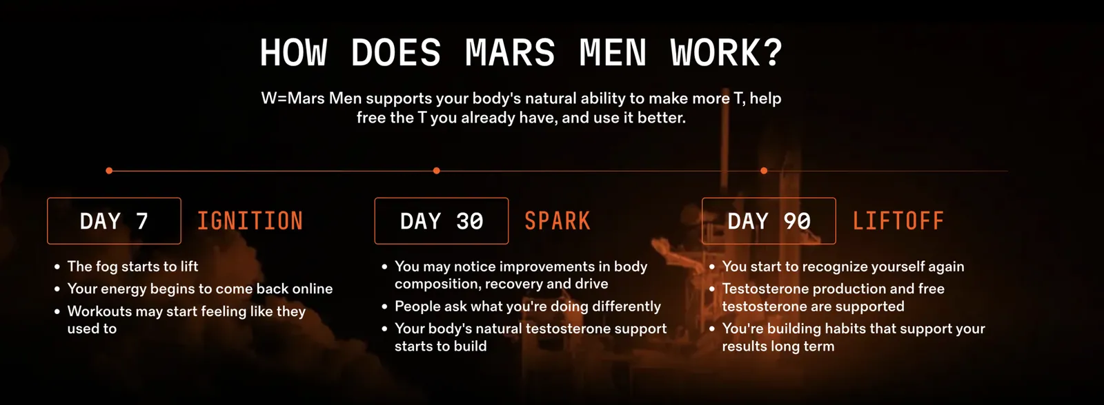
Mars Men names three dates. Day 7, the fog starts to lift. Day 30, people ask what you're doing differently. Day 90, you start to recognise yourself again. For a product whose benefits are mood and energy, invisible and slow, telling the customer when to expect what is the only way to survive month two.
Everyday Dose does it very nicely. "What to expect in 90 days": day 1 calmer energy, week 1 happier gut, month 1 cognitive support, month 3 "the proof shows up". Beside it, a chart of subscribers reporting a noticeable difference: 22% on day 1, 41% at week 1, 60% at month 1 and 75% at month 3. The day 1 and week 1 points are directional, and they say so on the chart. That's the qualifier you want.
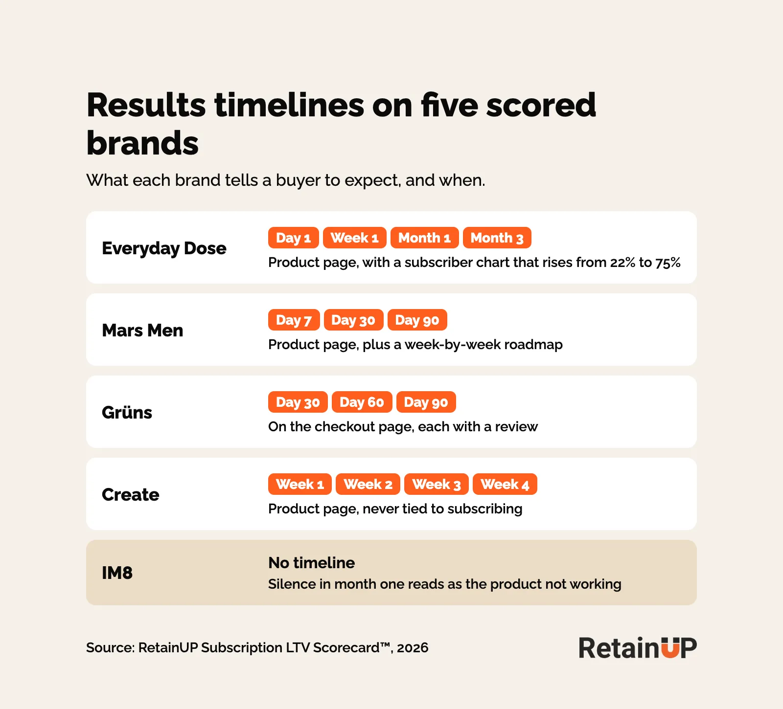
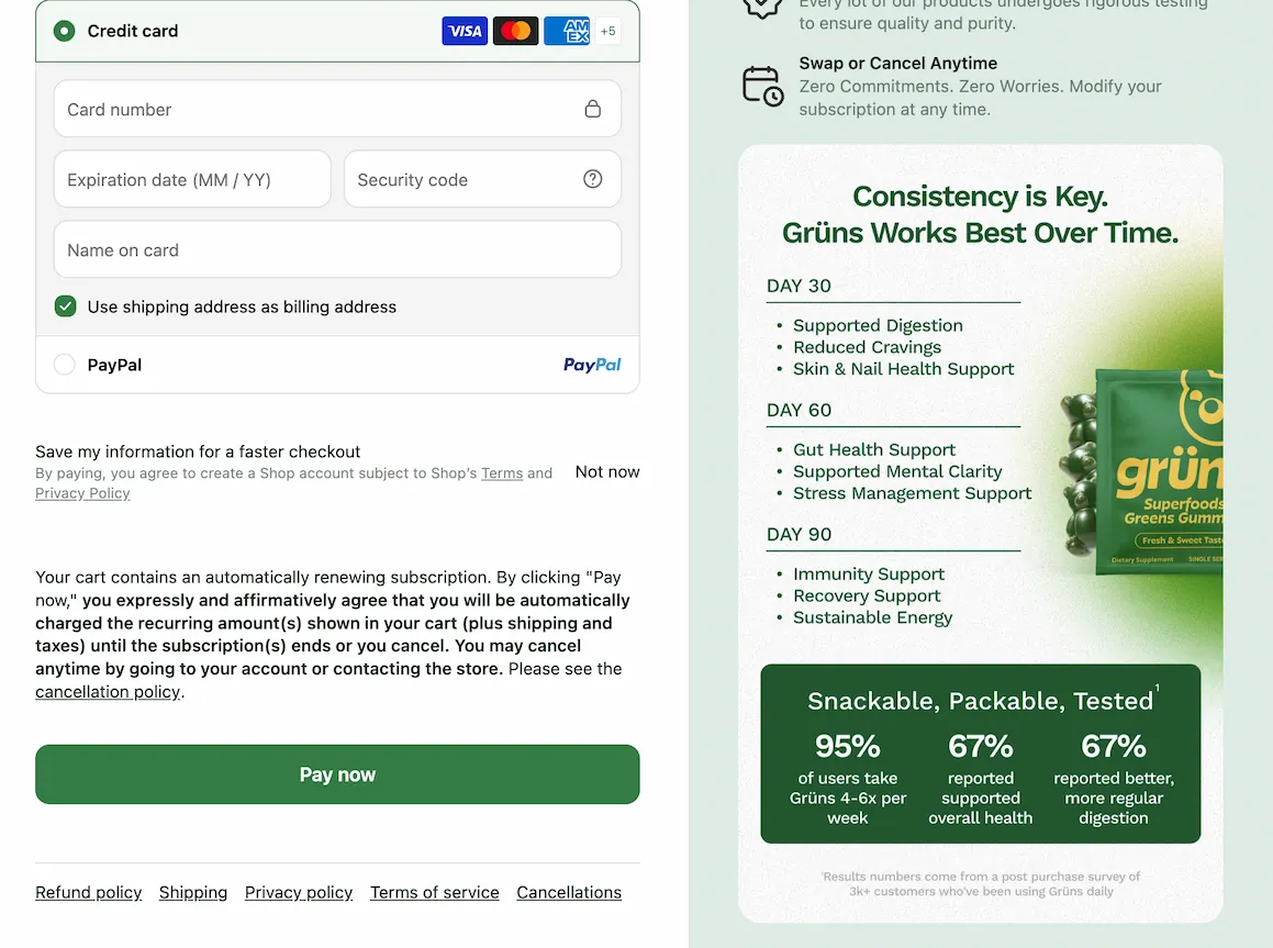
And Grüns puts its 30, 60 and 90 day results, each with a review attached, on the checkout page. Most brands put this on the product page. Grüns puts it where the wallet is. Smart.
IM8 sets no results timeline. A subscriber with no timeline reads that silence as the product not working, and cancels with a reason they believe.
And it moves churn. Mixers explained the gap between starting the supplement and seeing results, and churn dropped 40%. "Too expensive" almost never means too expensive. It means "I don't see enough value", and a missing timeline creates that objection all by itself.
Skio puts the gap in days. Supplements take 30 to 90 days to show results, they say, and most subscribers cancel around day 45 to 60. No source given. So people quit right before the product starts working, and the timeline has to reach past the second charge.
When the product isn't result-heavy
Soap doesn't need a day 90. Dr. Squatch still lost half a point here. Not a result-heavy product, but some benefits should still show.
Answer each objection on the page
Every objection has a home on the page. The survey numbers live in why customers subscribe and why they don’t.
| What the buyer thinks | Answer it with | Example |
|---|---|---|
| "I'd rather buy when I need it" | Results from daily use, a ship date that matches use, skip named | Mars Men FAQ: daily intake, routine, reschedule anytime |
| "Not worth the price" | Why it costs what it costs, in their units | Grüns comparison table against AG1 and a cited 12-week study |
| "I'll get stuck in it" | Control, stated plainly, after the value | Skip, reschedule, change frequency, cancel from the account |
| "Will it even work?" | A results timeline and long-tenure reviews | Everyday Dose 90-day chart, reviews from 1 and 2 year customers |
The value objection
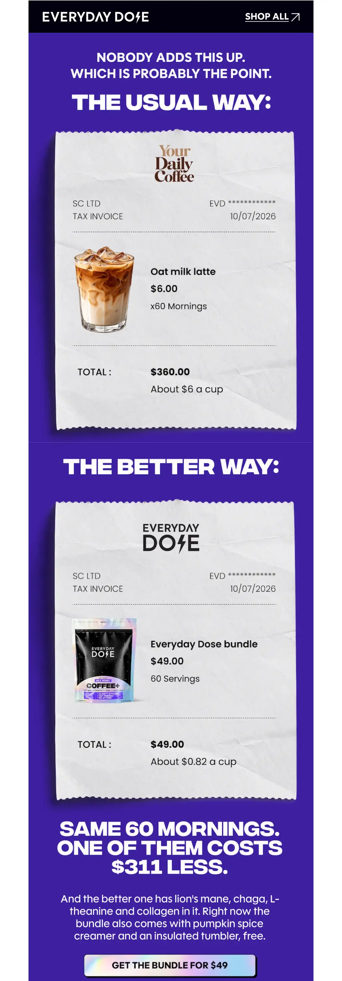
Most brands answer price with a discount. The better answer is why it costs what it costs. Mars Men lists 8 ingredients at full clinical doses. Zero fillers. Then a cost comparison against competitors. Everyday Dose writes "$200 value for $49" and, in email, "Same 60 mornings. One of them costs $311 less."
Create scored zero here. Zero points. Nothing on why a gummy costs about twice what powder does. That's the first question a buyer comparing the two formats will ask.
Write "too expensive" copy for two different people. "I don't see the value" needs education: how it works, what's in it, long-term testimonials. "I don't have the budget" is a price problem, and the daily cost is the page's answer to it. One generic line loses both.
Sell years, not weeks
Copy that promises fast results attracts people who try and cancel. AG1's testimonials focus on years of use. "I've been taking AG1 since 2012" does more retention work than "I felt better in a week."
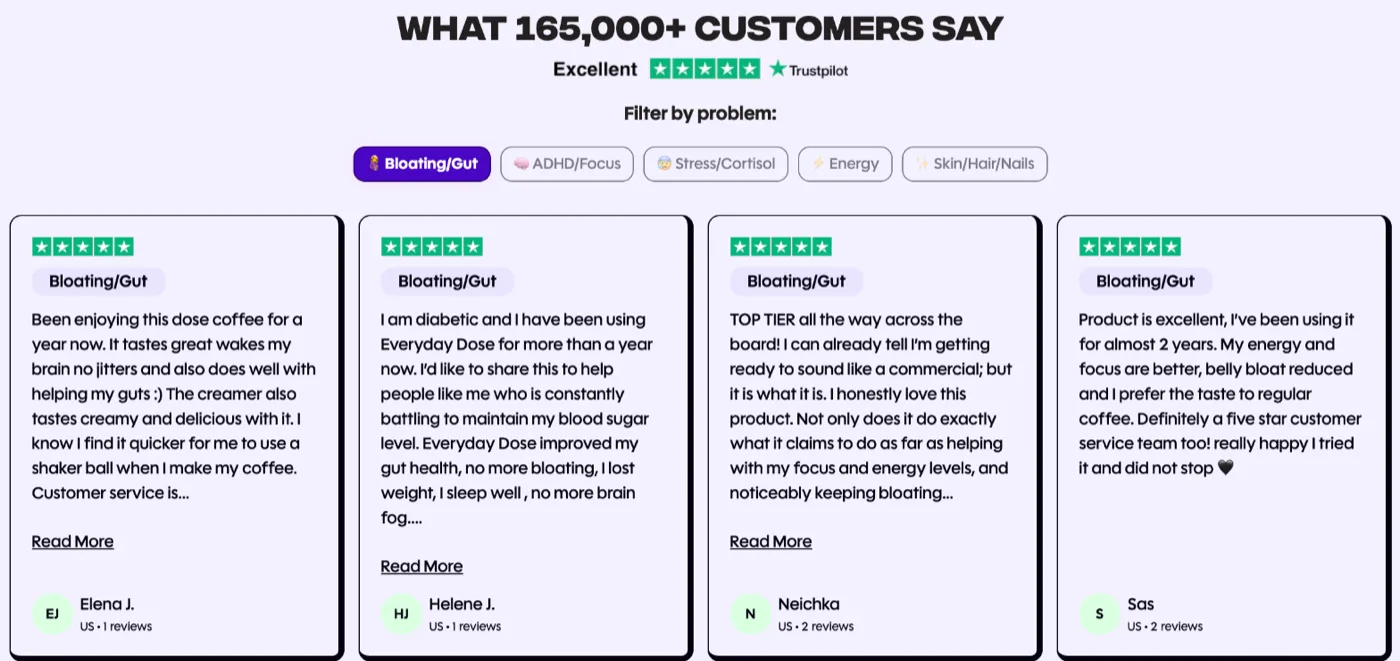
So look at your reviews. Everyday Dose puts reviews from one and two year customers on the product page: "for a year now", "for almost 2 years". Create has one 6-week testimonial and none at 6 or 12 months. Grüns has a survey saying 80% take it daily, but the widget testimonials are first-week reactions.
And watch the trial language too. Everyday Dose writes "Real progress built on consistent daily use" and then runs "TRY IT NOW" and "No monthly commitments" on its landing pages. The only miss is a few landing pages. Both can't be the message. Small issue. Worth fixing. Frame the subscription as a long-term commitment from day one, and keep "risk-free" as the guarantee, not the headline.
Subscription-only brands: answer "Do I have to subscribe?"
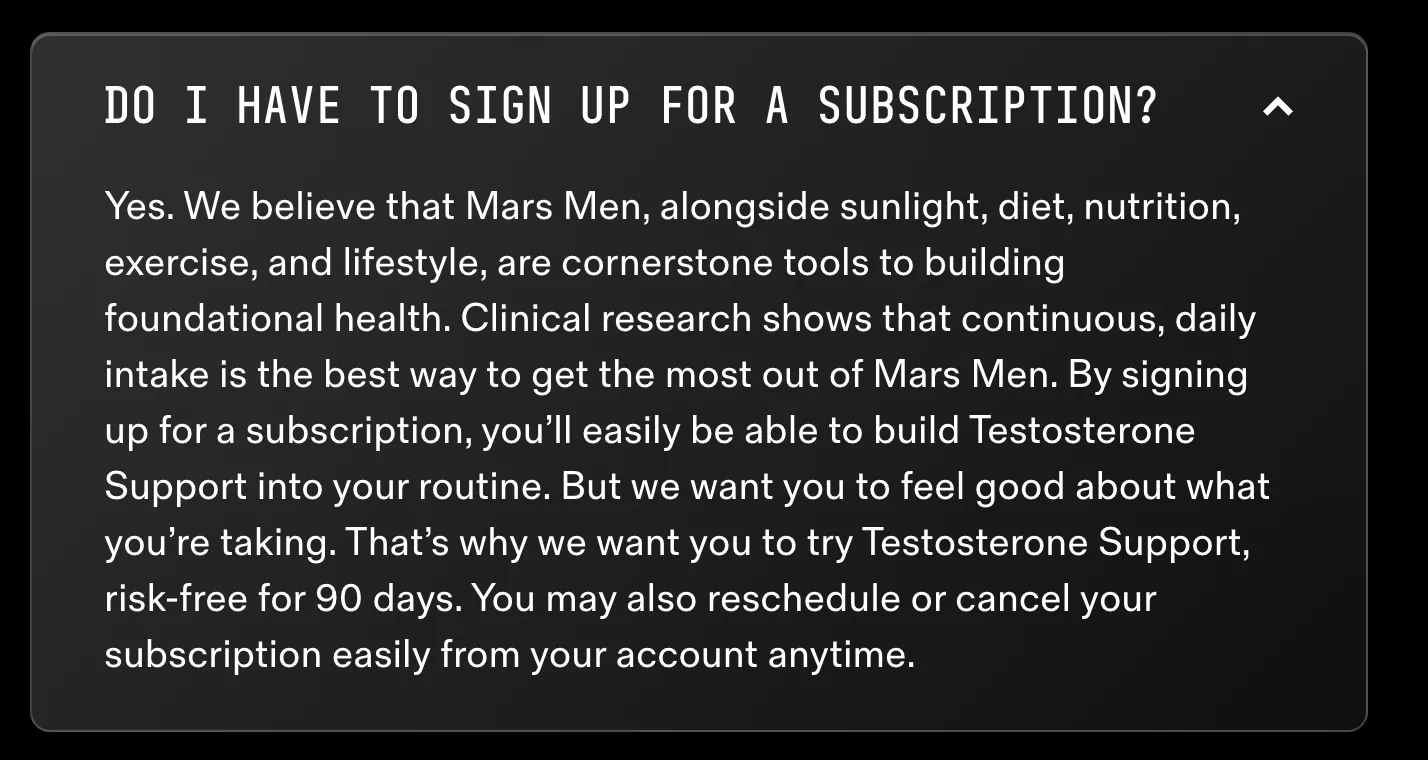
So if one-time doesn't exist, the question comes up anyway. Mars Men answers it in the FAQ, and the answer has three parts worth copying.
- Answer "Yes", then give the reason: continuous, daily intake is the best way to get the most out of it.
- Pair it with a risk-free period: "try it risk-free for 90 days".
- Close with control: "reschedule or cancel your subscription easily from your account anytime".
In that order. Best part of the program. Most brands offer subscription and never argue for it.
The whole Mars Men scorecard is on video, with the FAQ and the timeline on screen.

Where the case goes
Three places, the same words in each. A short why subscribe section on the product page, under the widget: one-line argument, the benefits that the widget doesn't already show, the timeline. Then the FAQ. Sort it by your top cancel reason. It has its own page: the subscription FAQ and how to cancel page. Then the subscription landing page, which carries the full argument for anyone who clicks through from the nav.
And don't hide it behind the subscribe option. The person who needs the case is the one with one-time selected. In Recharge, the widget editor has a setting called "Display benefits only on the selected purchase option", and it's on by default. Turn it off so the benefits stay on screen whichever option is picked.
Say each benefit once per page. A bullet list above a benefits box will repeat the box. And every promise has to exist somewhere live. A page that says "we email three days before every charge" is a lie until that flow is running.
If you'd rather have this built, the Subscription LTV Maximizer™ builds the offer, widget, cancel flow, portal, payment recovery, pause and skip in Recharge, Skio, Stay AI or Loop, plus email and SMS. Live in 30 days, for $5,000. Or start with the free subscription audit: 48 checkpoints, your top 3 leaks, in 24 hours.
FAQ
What is subscribe and save?
Subscribe and save is a way to buy a product on a schedule at a lower price than buying once. The order repeats every few weeks until the customer skips, changes or cancels it. For a consumable like a supplement or coffee, the saving is usually the first reason people sign up, and the habit is the reason they stay. The product page has to argue for both.
What should a why subscribe section say?
It should give the reasons to subscribe in order: results from daily use, never running out, a lower price, more as you stay, then control. Tie each one to your product. Keep it short, put it under the widget, and add a results timeline if the product takes weeks to work.
Should I put cancel anytime on my product page?
Yes, but not as the headline. Buyers do fear being trapped, so control belongs on the page, stated plainly as what they can change and when. Put it last, after the value. When "cancel anytime" is the loudest line, it reminds people to cancel before they have any reason to.
How do I answer do I have to subscribe on a subscription-only store?
Answer yes, then give the reason the product works best on subscription, usually consistent daily use. Add a risk-free period if your policy has one, and close with how easily they can reschedule or cancel from their account. Mars Men uses exactly this order in its FAQ, and it reads as care rather than a lock-in.
What are the benefits of subscribe and save?
The discount is one benefit, and on its own it attracts deal seekers. List the benefits beyond it: perks, gifts at order two or three, early access, free shipping, and the flexibility to skip or swap. The strongest benefit for a consumable is the result that only comes from using it every day, so lead with that.
One email a week on subscription retention: the numbers, the strategy, and what to fix first.

Rahi Jain
Rahi Jain is a subscription LTV specialist who helps $1M to $10M DTC brands reduce subscription churn and maximize LTV on Recharge, Skio, Stay AI and Loop.
More about Rahi